Concise, Animated Messaging
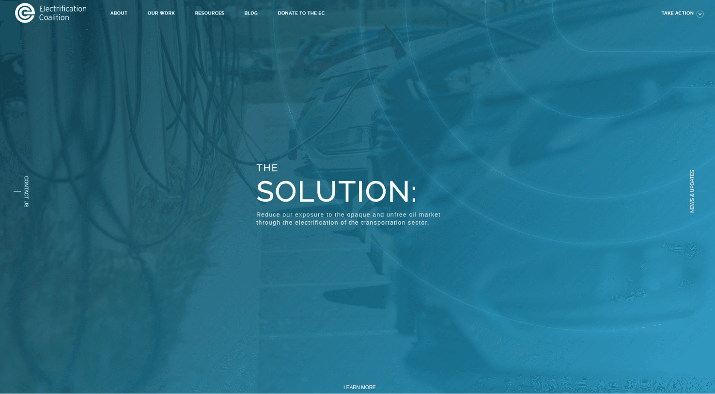
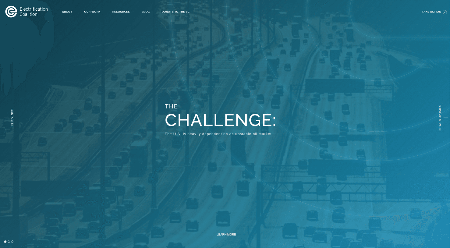
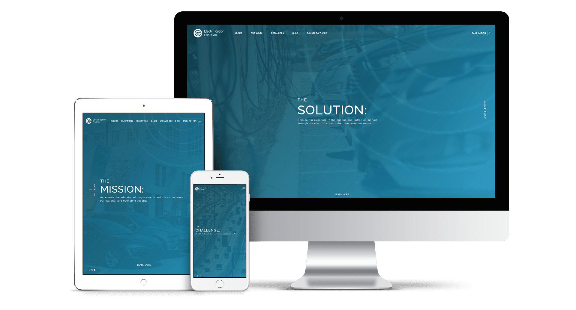
The homepage starts with an animated hero banner that clearly spells out EC’s challenge, solution, and mission. This makes for an engaging first impression that sums up the basic messaging in a quick and concise manner.
Breaking Down Big Ideas
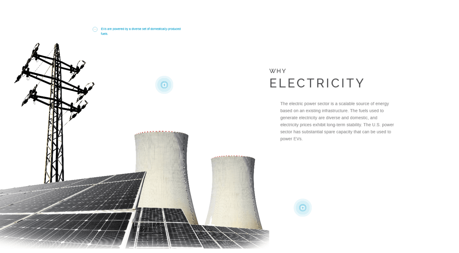
Switching an entire industry’s energy source is no small idea. We worked with EC to break down their messaging into small blocks of text paired with clean images and pulsating icons that the user can click for more information.
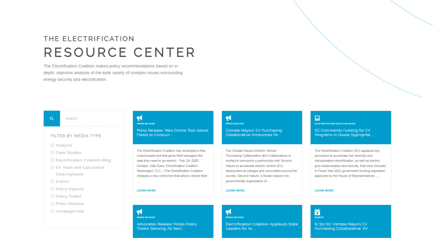
A Robust Resource Hub
EC’s mission requires a lot of research, case studies, analysis, and reports to back up their big ideas. They know that to get people on board with their work, they need the facts and figures readily available. That’s why we helped them create a robust resources page that houses all these documents in a clean, filterable manner for easy browsing.
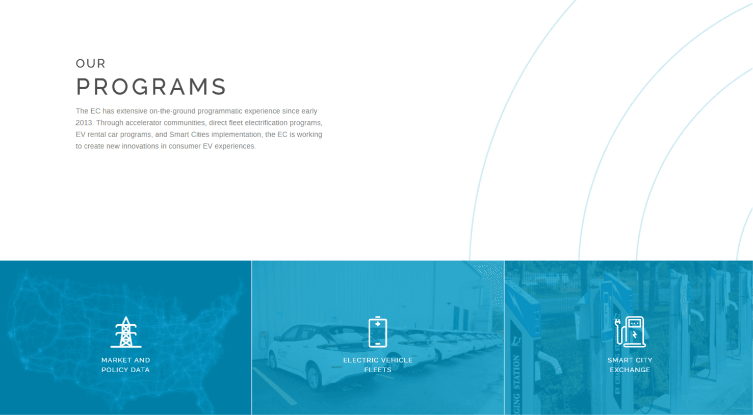
An Organized Programs Grid
We arranged EC’s programs in a neat grid with a background image and branded blue overlay with icons to represent each program. When the user hovers over a program tile, they’ll get a roll-over effect that reveals a quick overview of that program.
Let's work together to bring your vision to life.

PROJECT TEAM
Ben Blodgett
Technical Lead
Maggie Nugent
Content Director
Orion Alden
CREATIVE DIRECTOR
Milos Misic
Snr Developer
Creating a Website for the Future
The Electrification Coalition wanted a clean, futuristic design that could break down its big ideas into digestible, bite-sized pieces that wouldn’t overwhelm users. While their mission remains extensive, we spent a lot of time in the discovery and design phases to ensure that every page of the website is engaging and accessible, so that the core of their work doesn’t get lost in the enormity and importance of their vision.
Ready to See the Future?
Visit Site
Let’s talk!
See how we can elevate the
voice of your brand.
voice of your brand.
