
During the Discovery phase of a web design project, we always do what we call “image discovery,” in which our design team pulls together different types of imagery — people, faces, landscapes, illustrations, etc. — in order to get the client’s gut reactions on the different general aesthetics of each image.
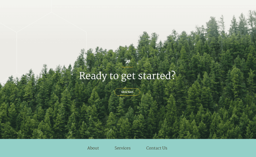
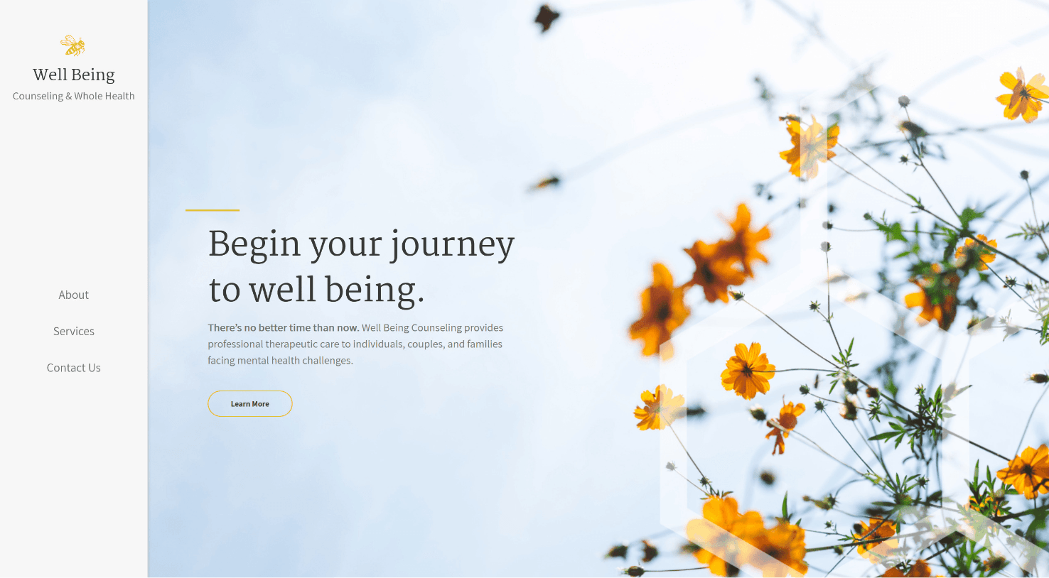
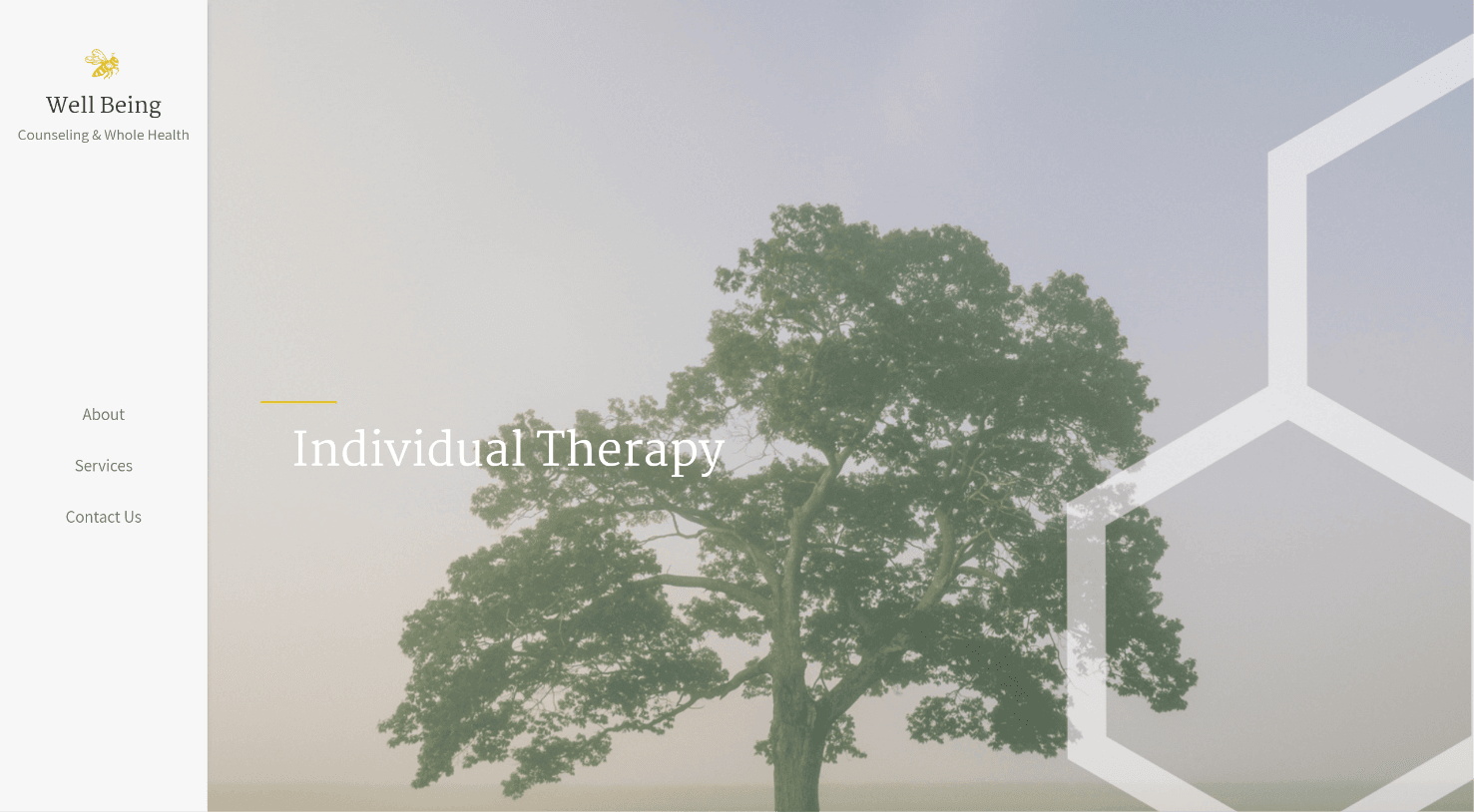
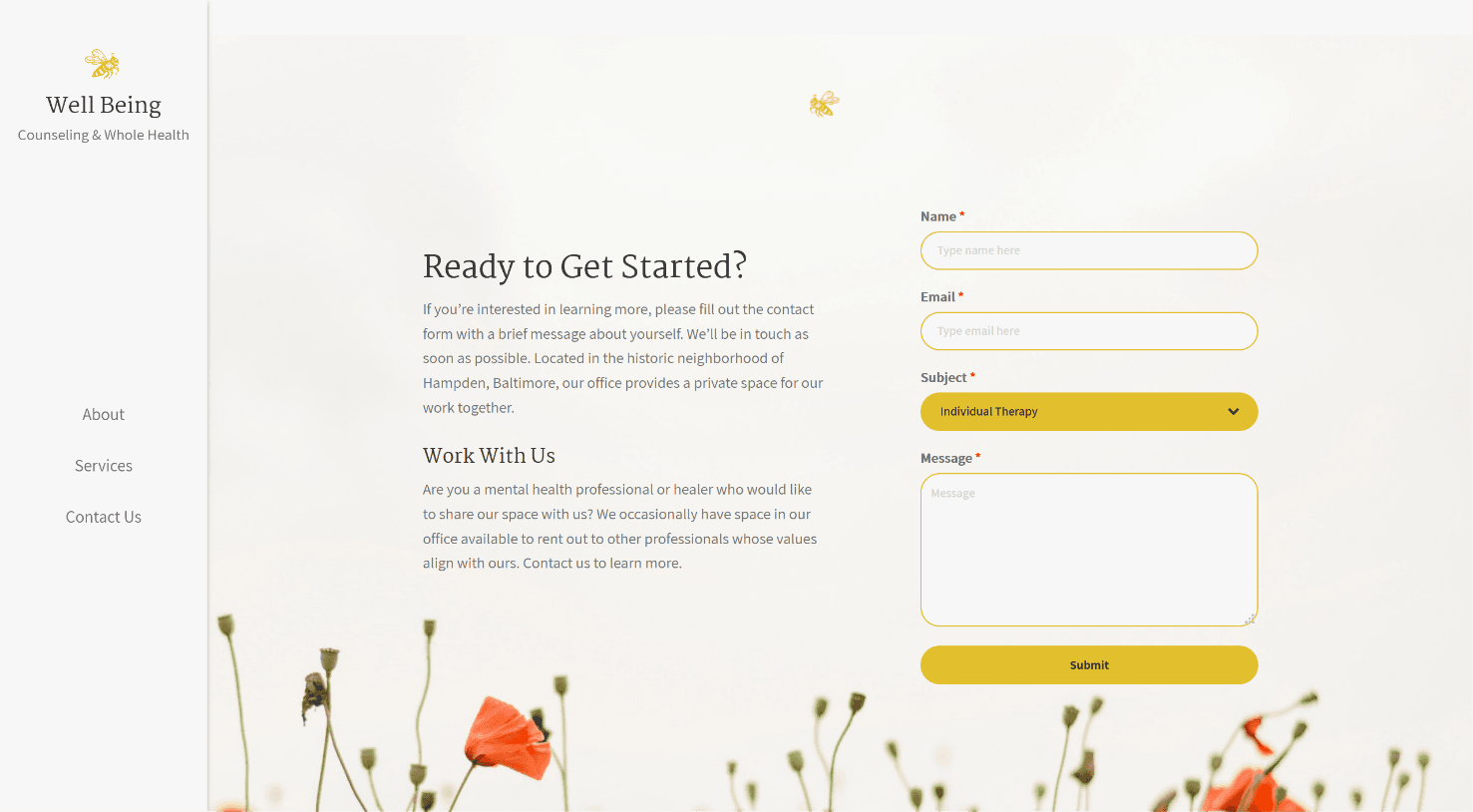
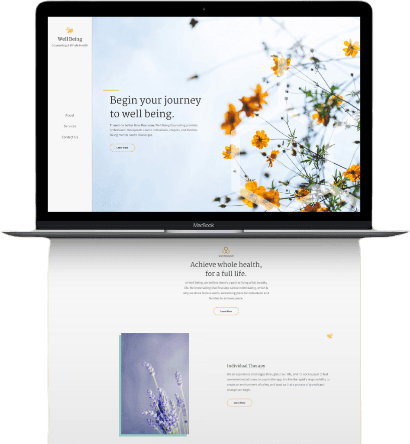
During this image discovery process, we found that our client was drawn toward the images that depicted nature, especially flowers and trees. Because Well Being Counseling’s logo is a bumble bee, using images of nature really pulled the brand aesthetic together into a beautiful and cohesive idea that tied in the healing power of nature and the natural cycle of life.
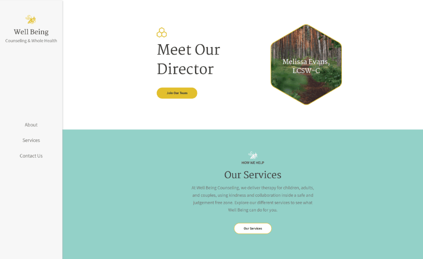
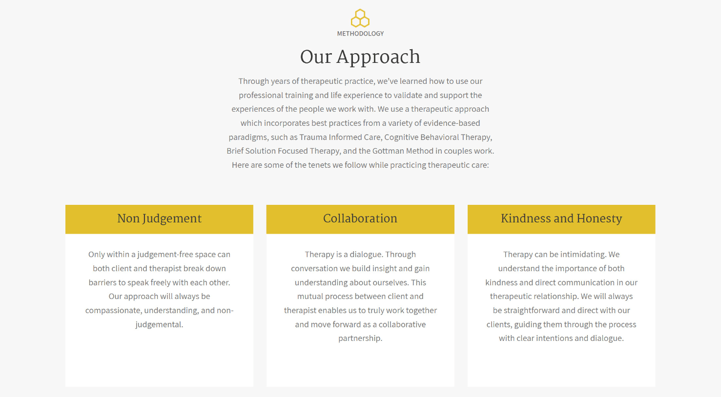
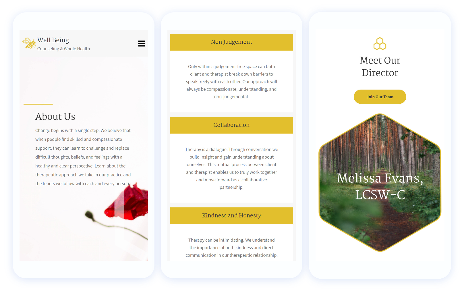
We further tied in their bumble bee logo by using the hexagonal shape of honeycomb as a design flourish throughout the site, and employing a golden yellow as the primary brand color, reminiscent of honey. When all these elements are put together, we have a clean, soothing aesthetic that feels like breath of fresh air.


voice of your brand.