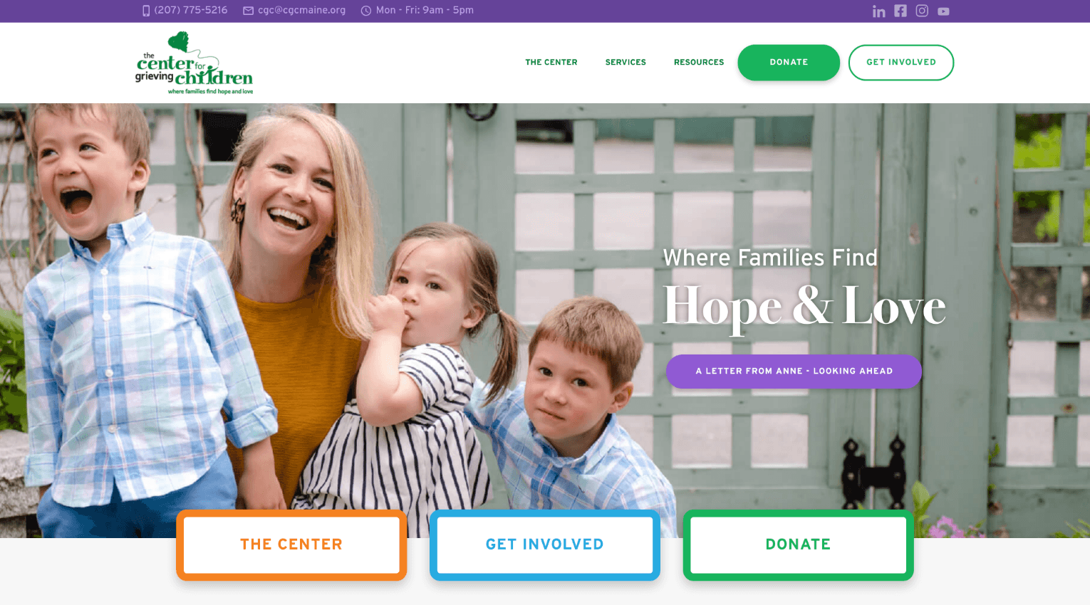
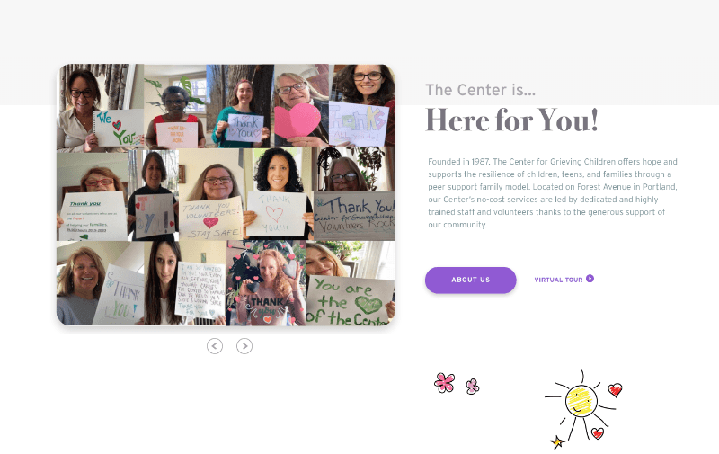
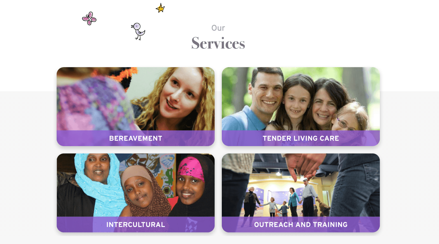
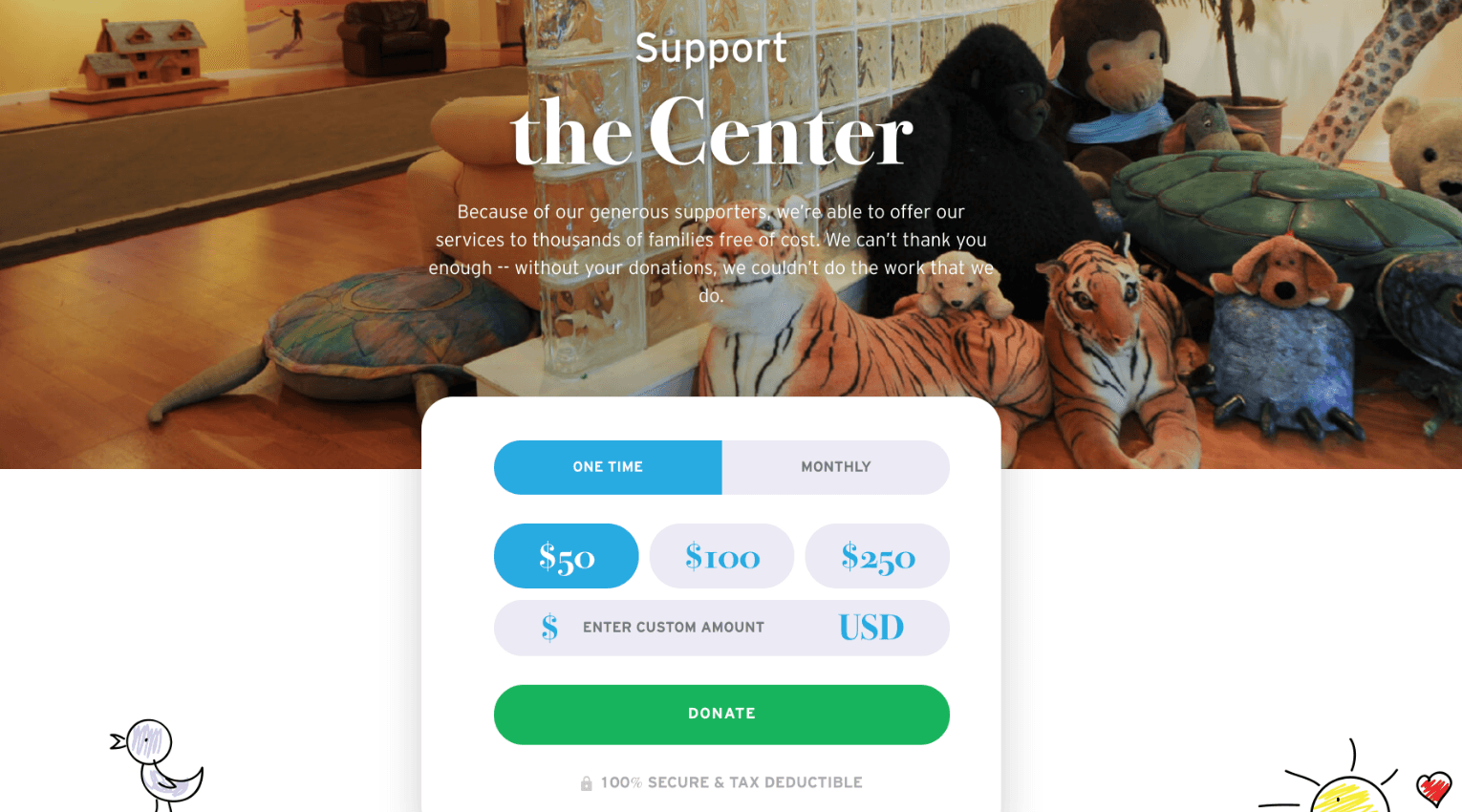
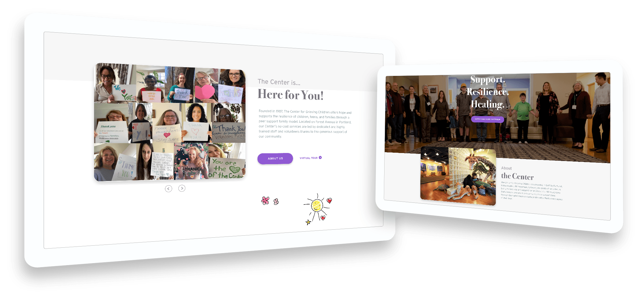
The Center for Grieving Children, or CGC, deals with tough topics with compassion, warmth, and grace. It was really important to our client that their website reflect that warmth and compassion that they extend to all their visitors. One way we did this was to utilize the photographs they provided to us, which feature the real families and volunteers who frequent the center.
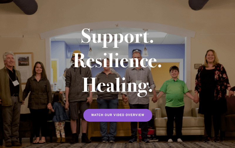
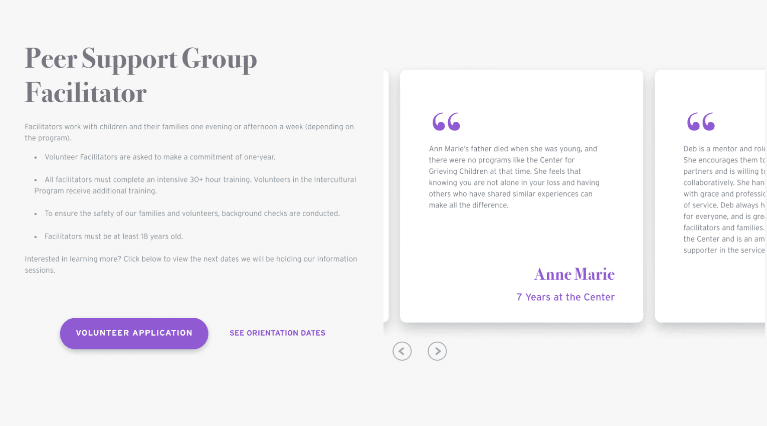
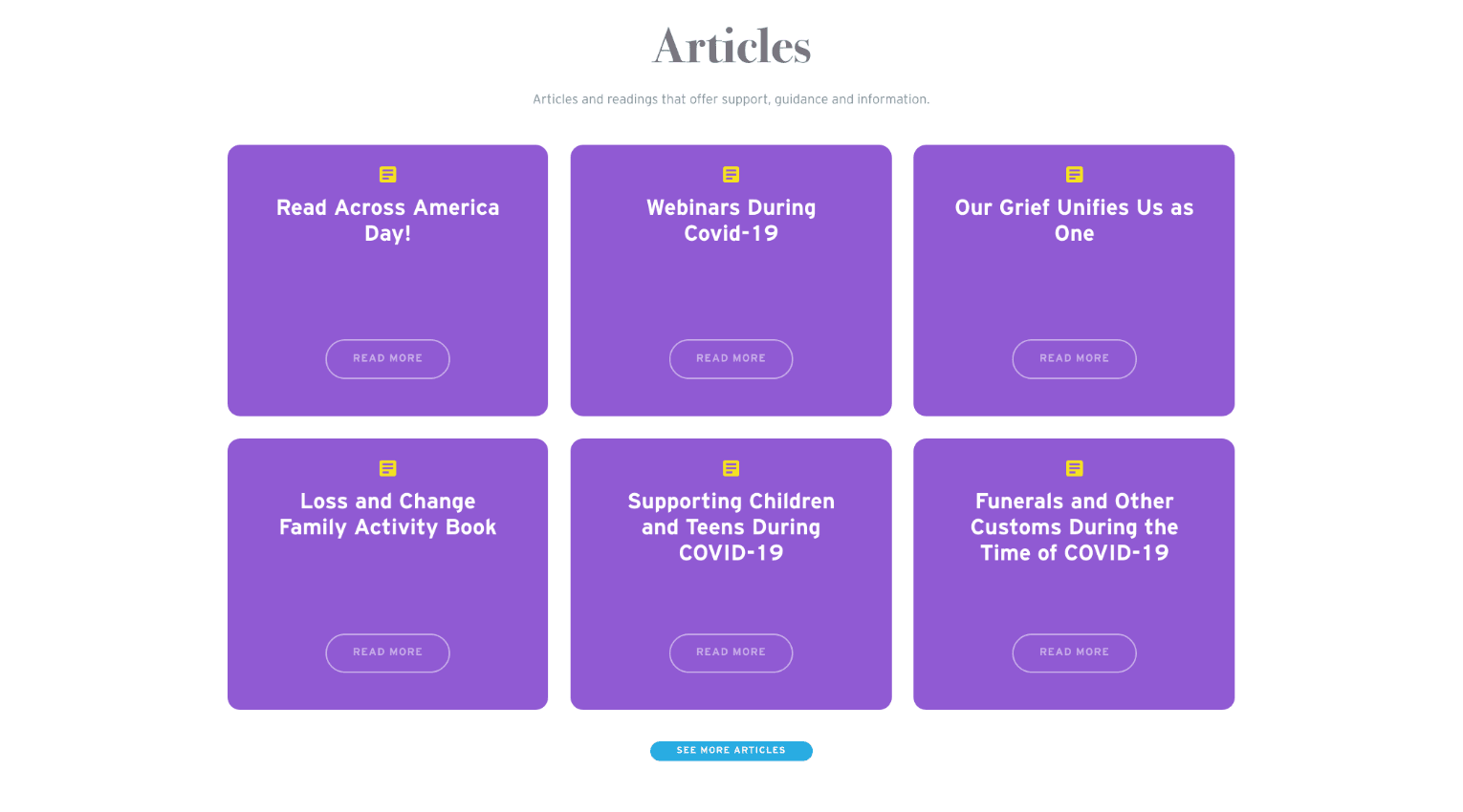
We also wanted to ensure that our design was upbeat and fun, and that it reflected the fact that a majority of its work is with children. We created a bright, friendly color palette of purple, blue, orange, yellow, and the green from their logo. We relied heavily on the green and purple, and used the other colors as pops and flourishes throughout the pages.
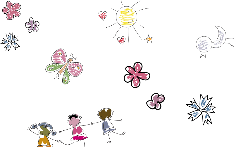
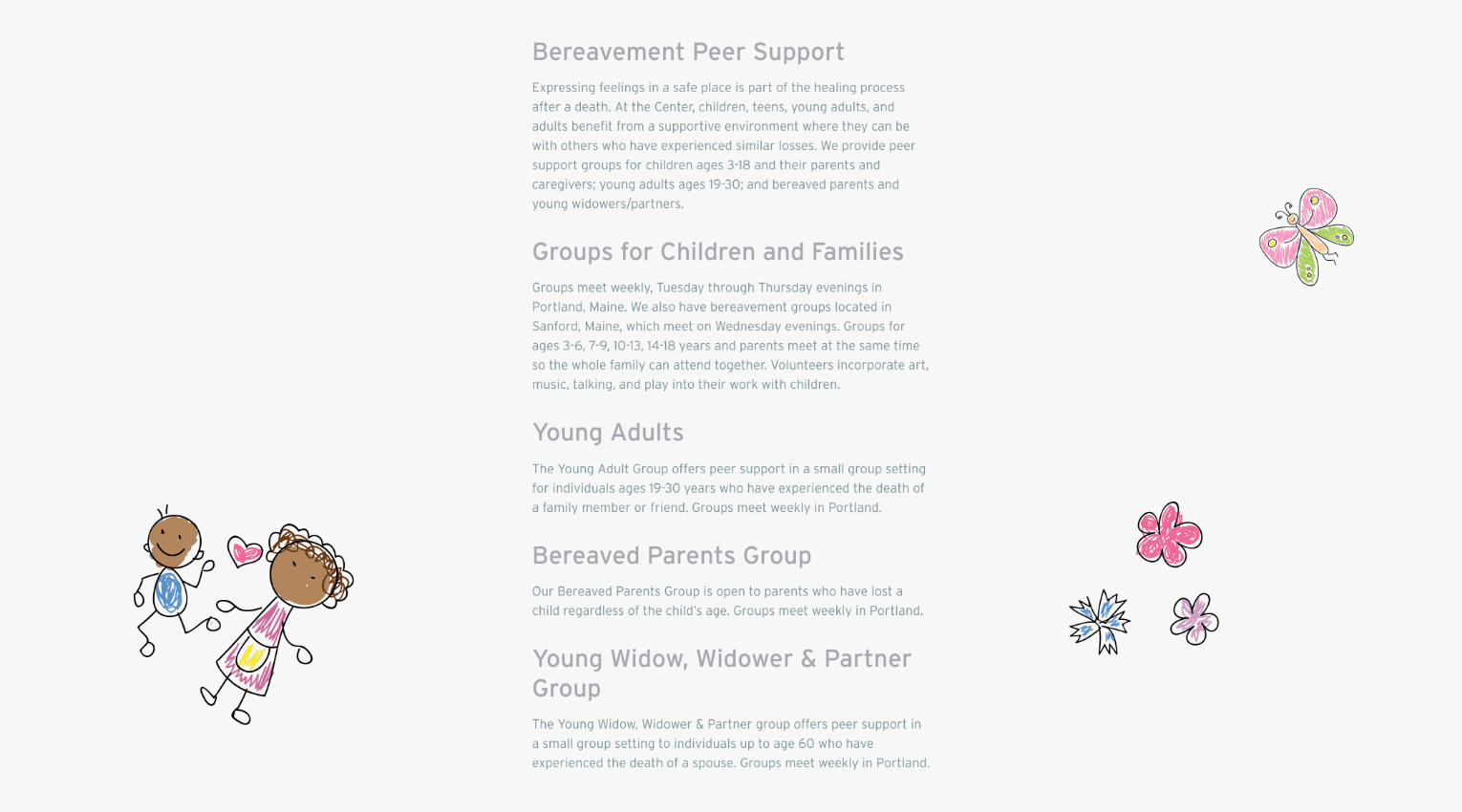
We also utilized these fun, child-like illustrations to break up the page and add some tenderness to the heavy content. The illustrations appear hand-drawn and create that kid-friendly feel that the CGC wanted to reflect. Although the website is geared for adults, it was important to maintain a playful, hopeful aesthetic that showed that the CGC is a place for kids.


voice of your brand.

