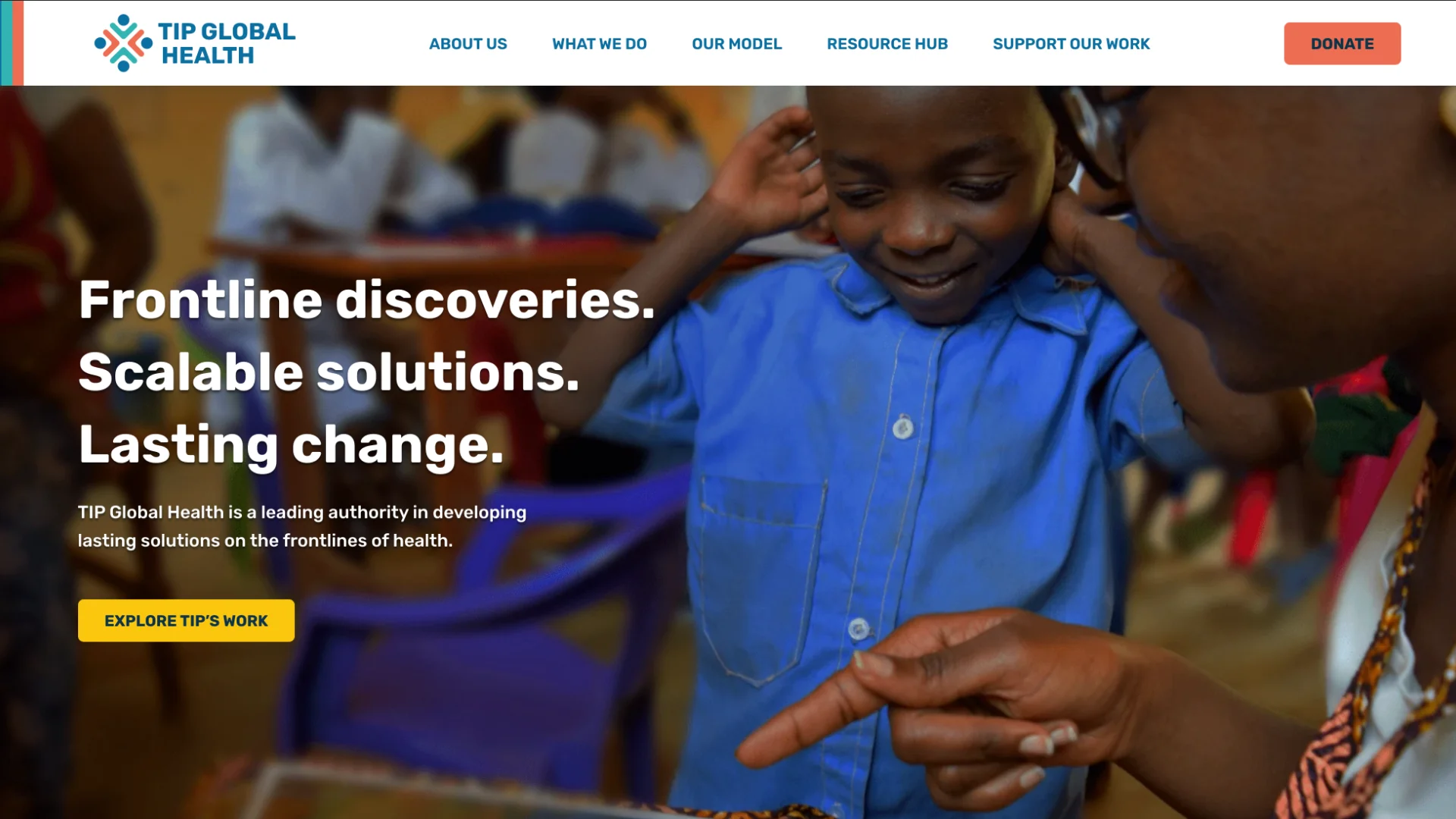
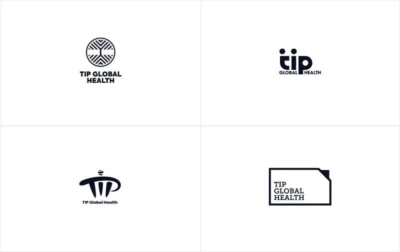
The first phase of this project was creating a new logo for TIP that reflected their six brand attributes: forward-thinking, authentic, expert, agile, hands-on, and people-centered. Our design team set about their usual process, rapidly ideating and prototyping several logo concepts, before settling on four to present.
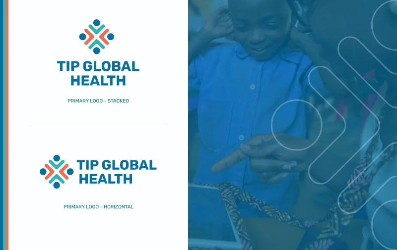
After a few rounds of revisions and collaborating with TIP, they decided on a logo we called “The Collective Good.” The sophisticated, versatile mark represents a group of people holding each other up through collective support, which speaks well to TIP’s hands-on, people-centered approach to their work. The modern sleekness of the design positions TIP as a leader in the field of health.
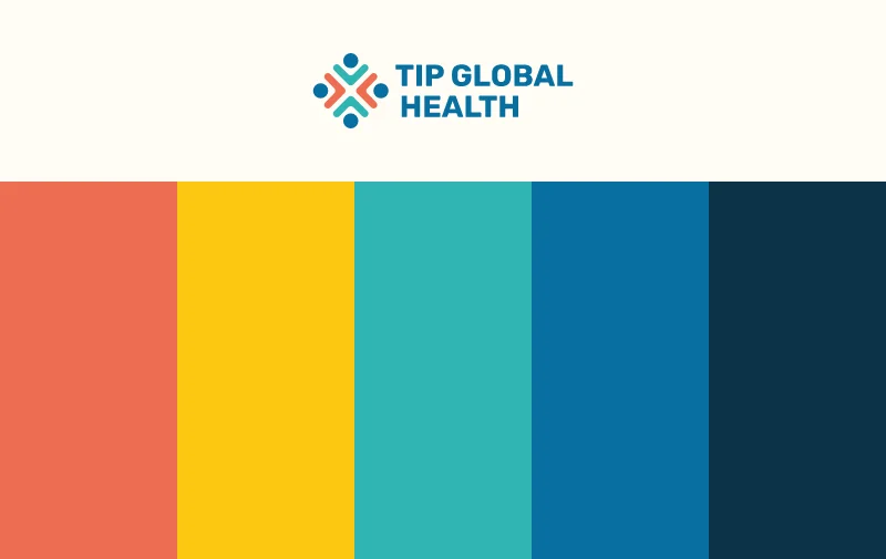
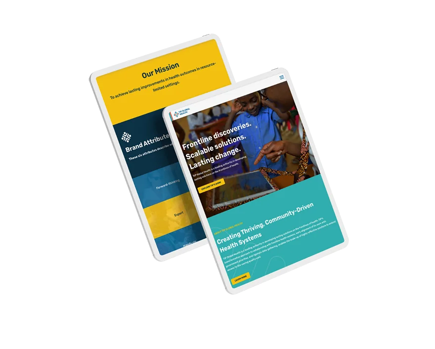
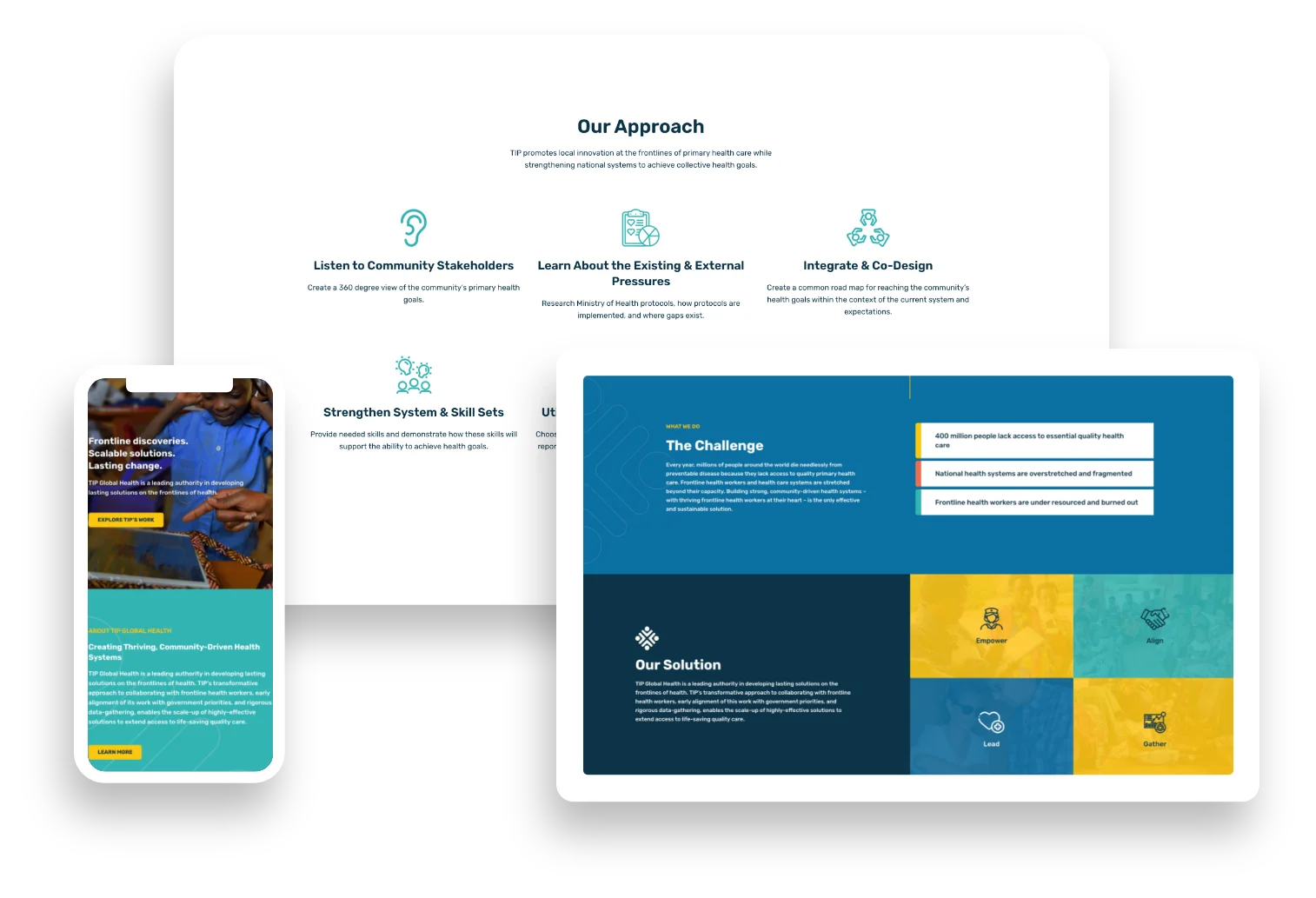
Choosing a color palette is another super important part of the branding process. Our design team tries to present palettes that not only look good, but also have meaning behind them that works for the overall brand. The palette TIP chose uses a muted, dependable blue as its base, with pops of soft orange and bright teal and yellow, which have a calming but optimistic and vibrant effect.
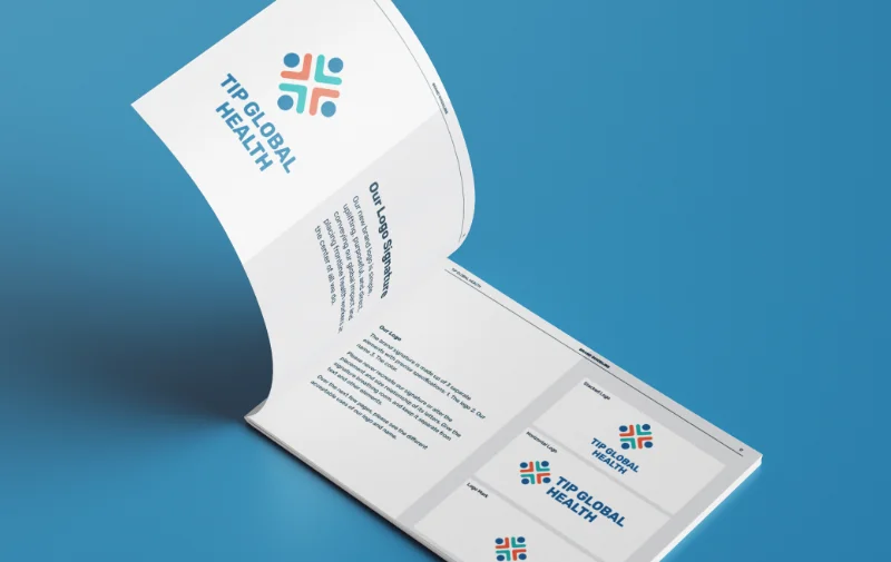
Once the logo and color palette are finalized, we start the process of putting together a comprehensive brand guideline that everyone within the TIP organization can turn to when they need to reference the best practices for using TIP’s brand. Issuing a definitive brand guideline to your organization is crucial in keeping branding and messaging consistent across all departments and outward-facing marketing materials.
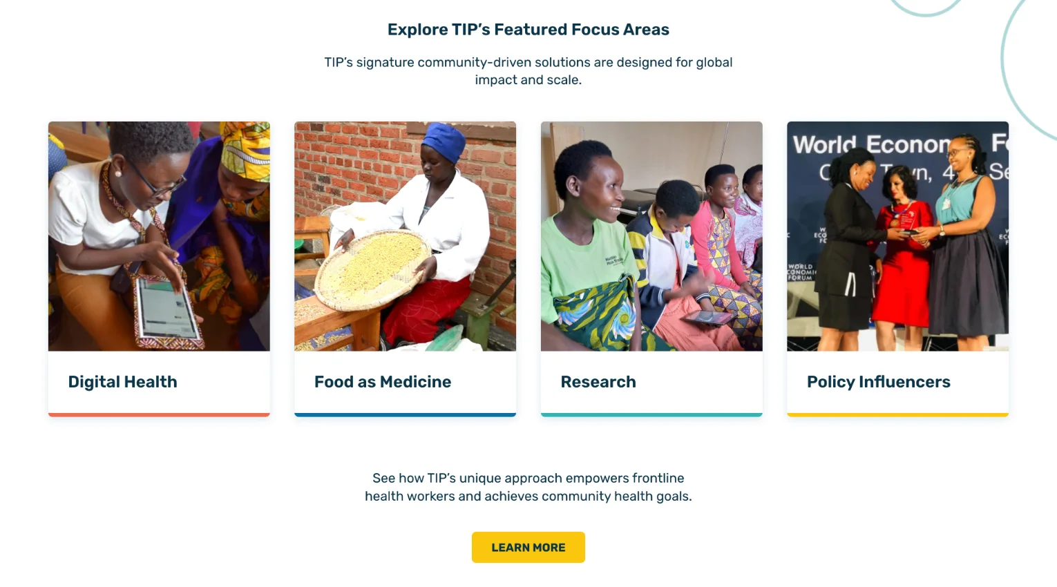
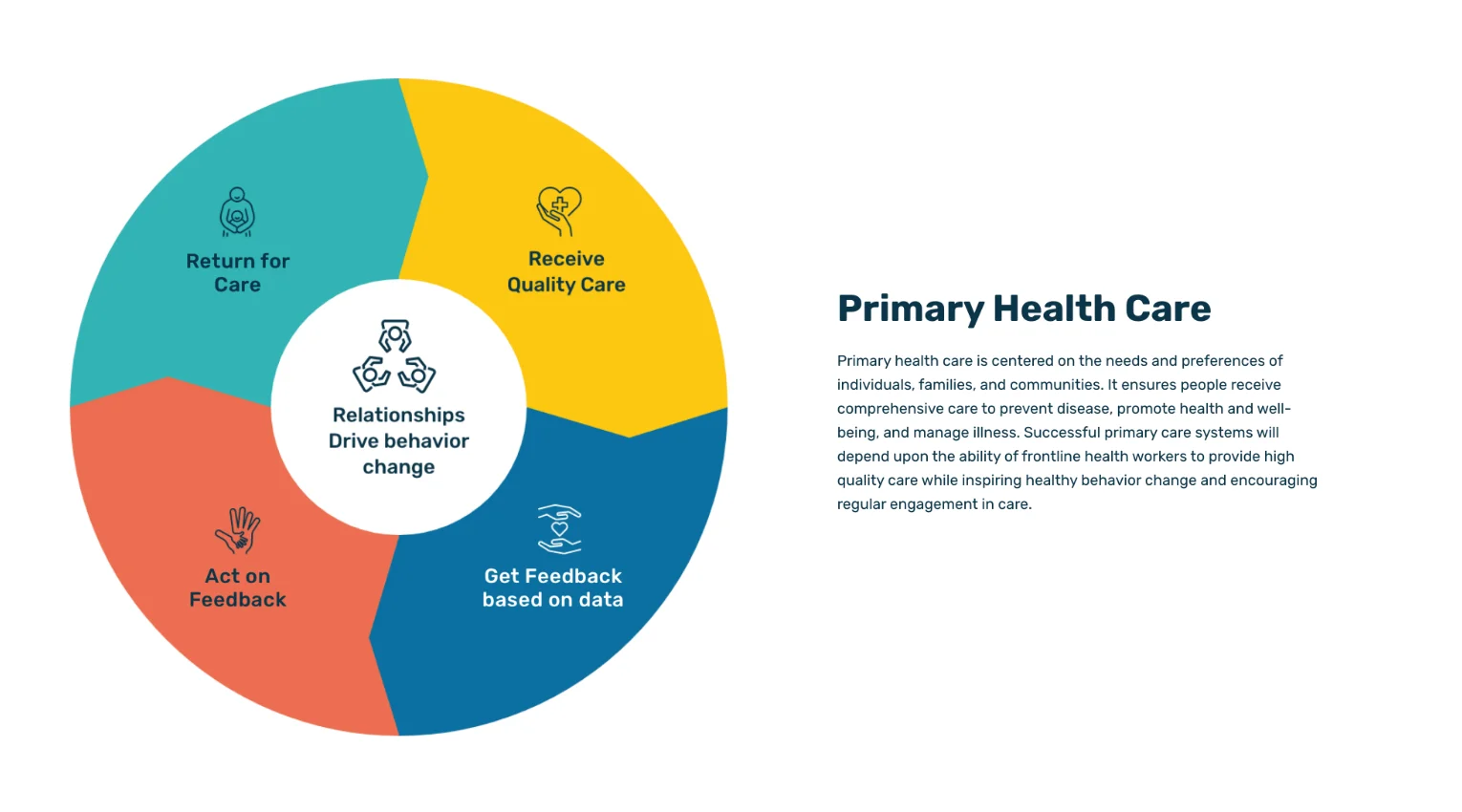
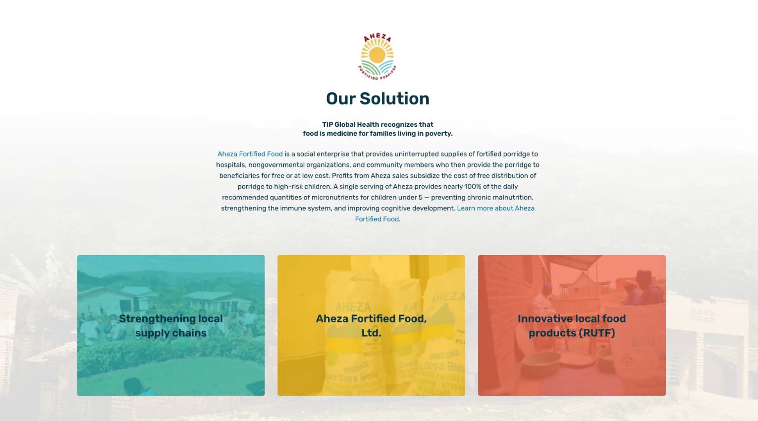

voice of your brand.
