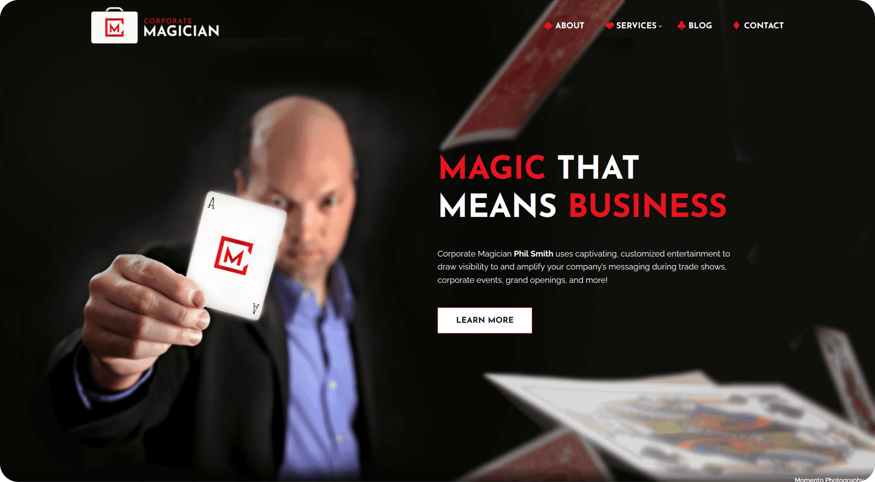
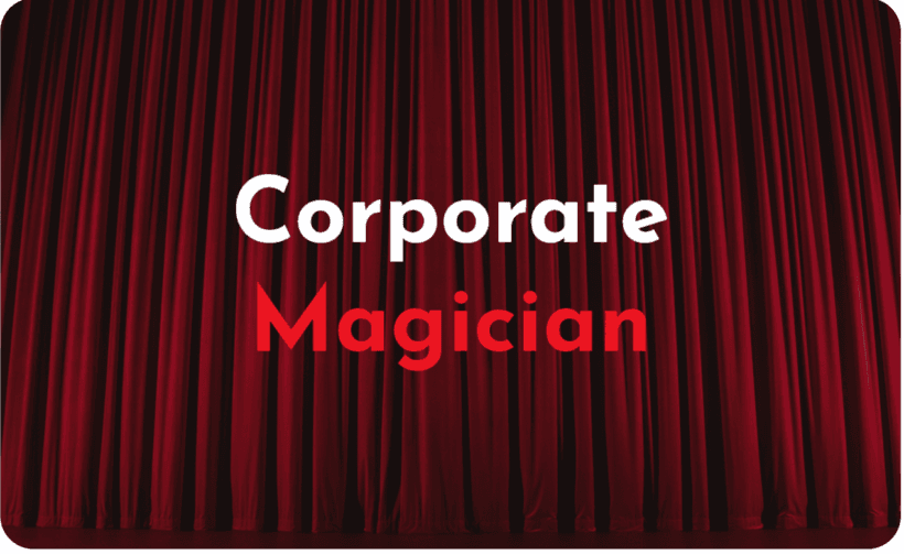
Our design team put together a series of stylescapes to show to Phil to get a sense of his aesthetic preferences. By creating stylescapes, we’re giving our client a visual reference to better understand what a design aesthetic is made up of. We weren’t surprised that Phil leaned toward the theatrical elements—dark backgrounds and bright reds that evoke the magic and mystery of performance.

When creating the Corporate Magician brand, it was important to differentiate Phil from a typical party entertainer. His shows are tailored to professional audiences, and we wanted that sophistication to show in his logo and brand. Our logo colors were inspired by a magician’s most reliable asset – a deck of cards – and we set the lettering on briefcase background, tying in the business aspect of Phil’s offerings.
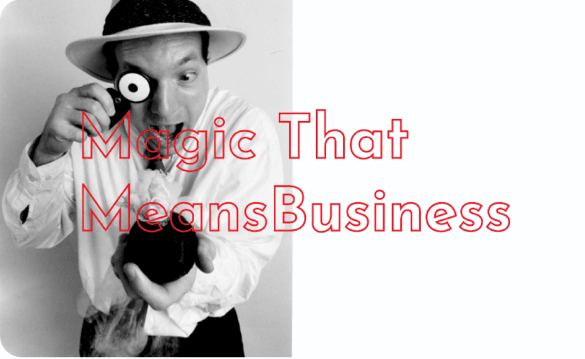
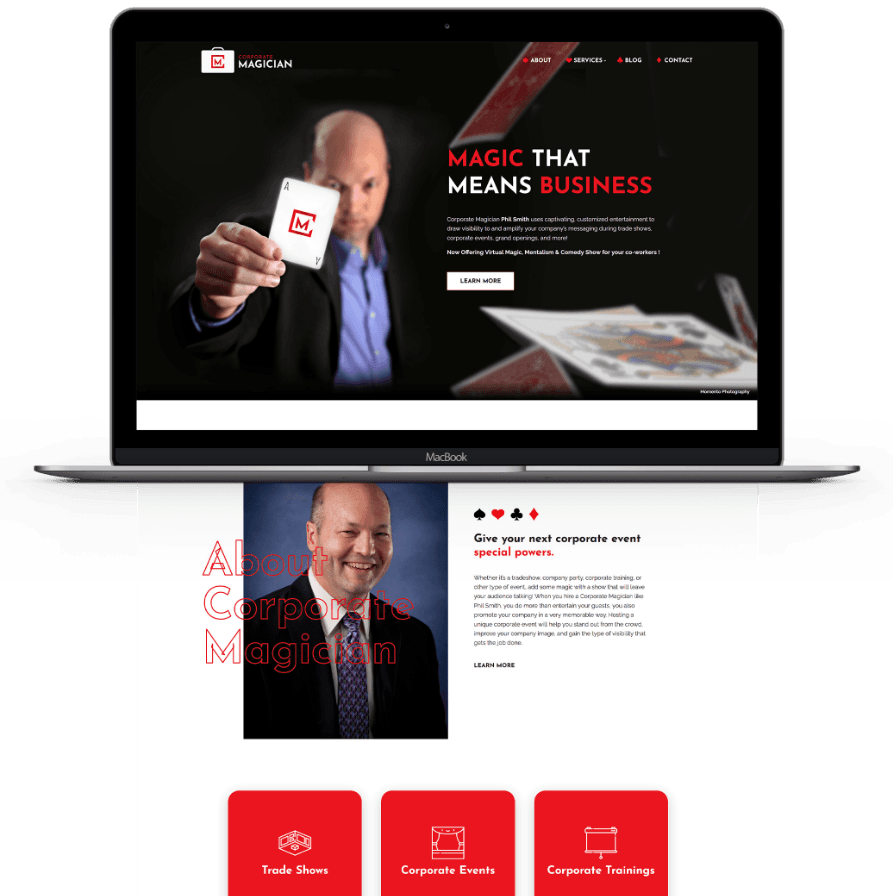
Another important part of solidifying the Corporate Magician brand was the messaging. A big concern of Phil’s was his business being lumped together with party entertainers. We needed messaging that worked with design to differentiate Phil as a magician for professional atmospheres. Our copywriter created the tagline “Magic that means business” to drive home the intent of his work.
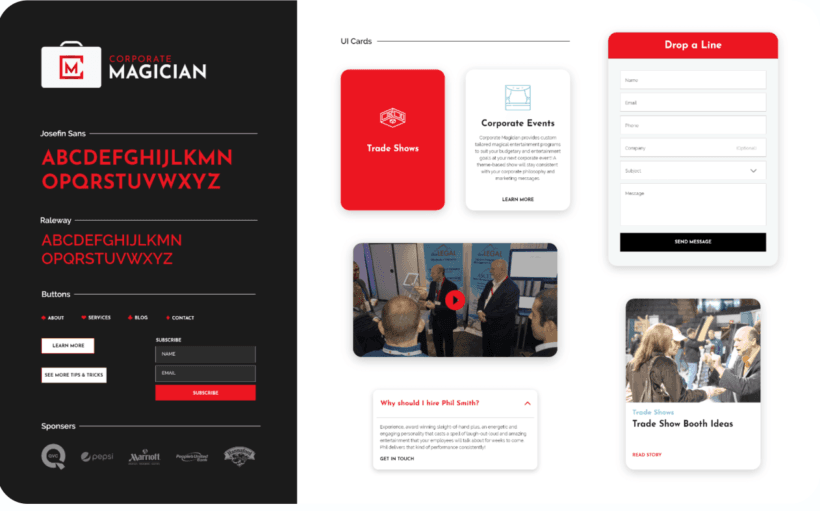
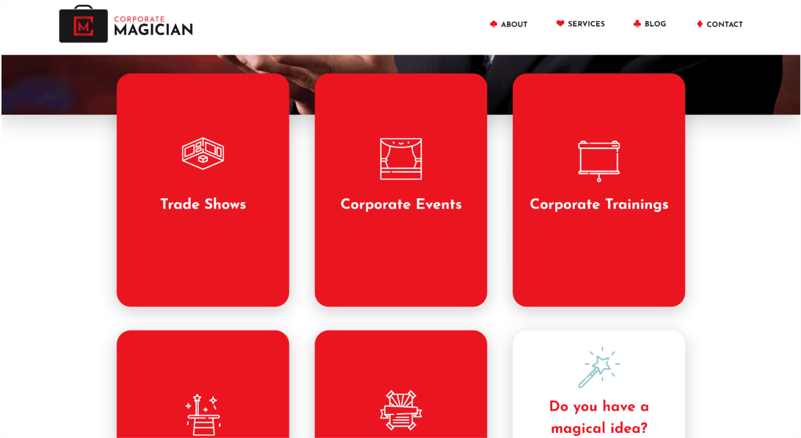
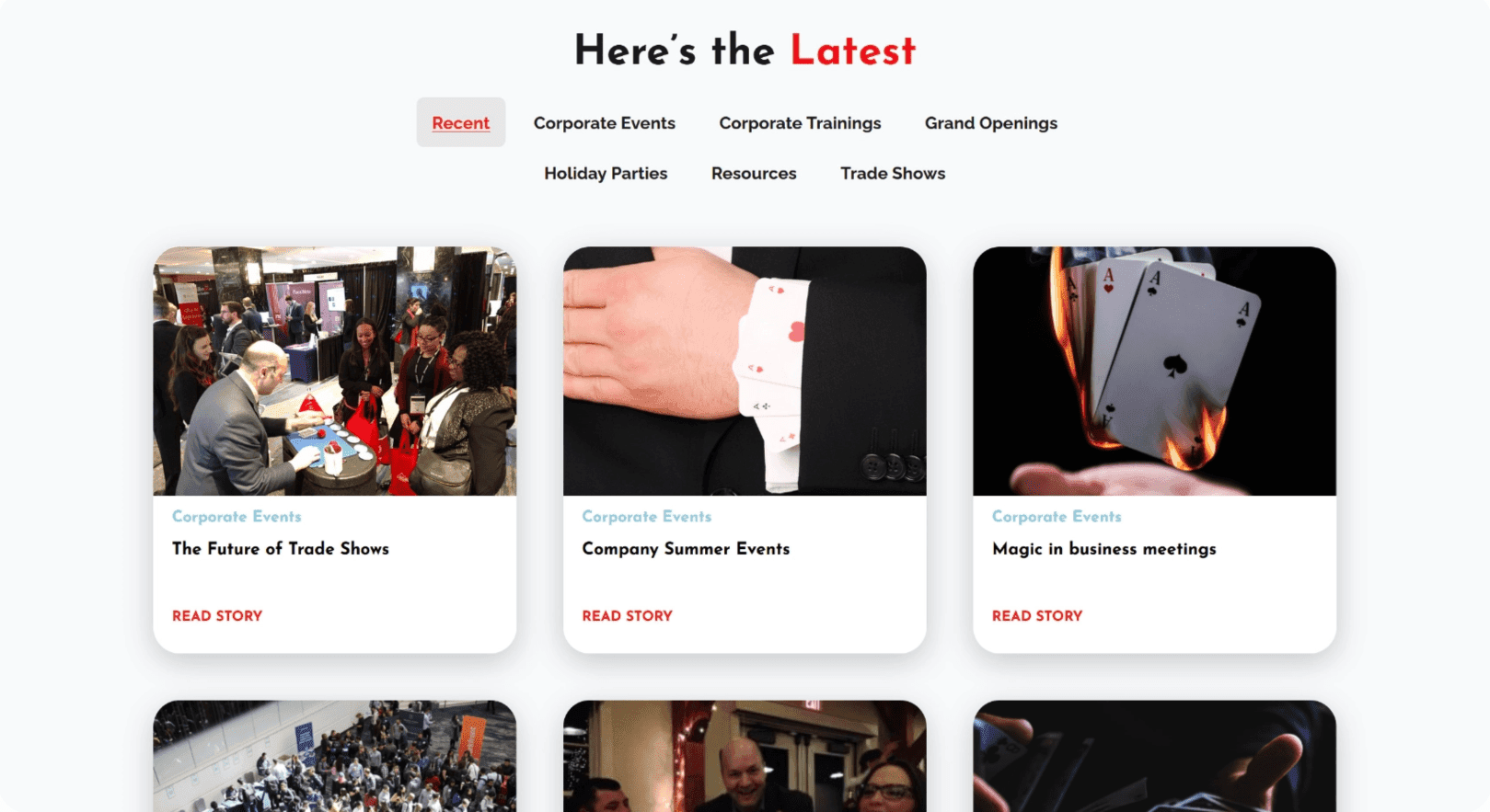
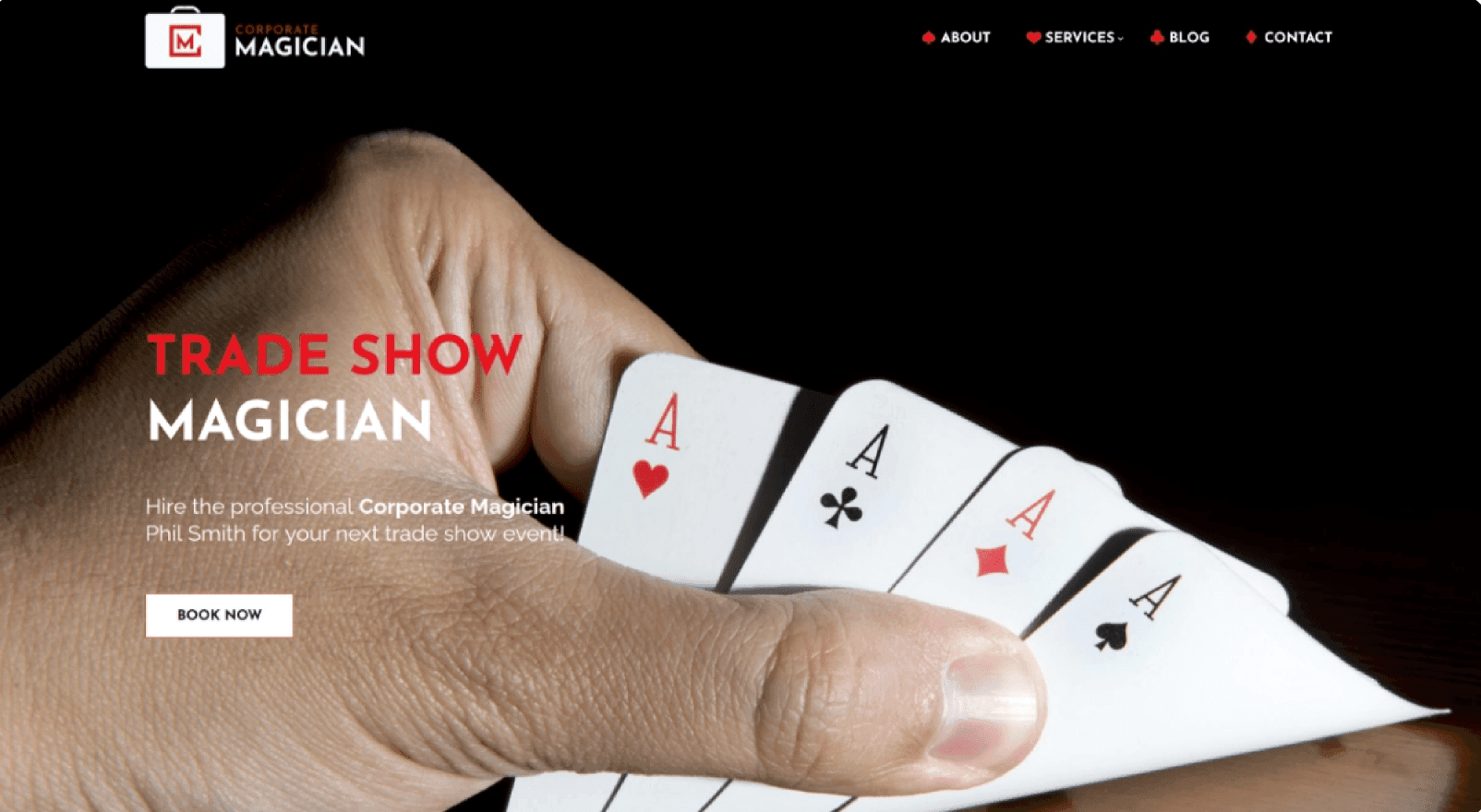
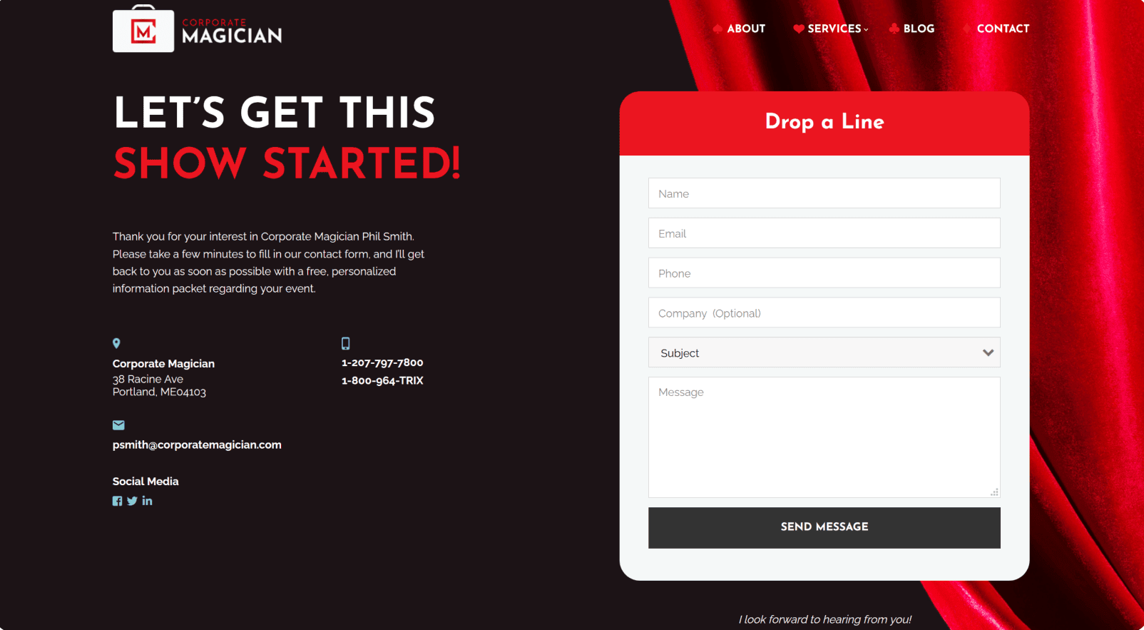
During web design, our team continued to be inspired by Phil’s commitment to performance. We created a color palette reminiscent of a classic theater. The blackness of sitting in the dark before the stage lights come on, the dark red of the velvet curtain, the pops of incredible imagery and brightness – all of these elements evoke the excitement and anticipation of a breath-taking night at the theater.


voice of your brand.
