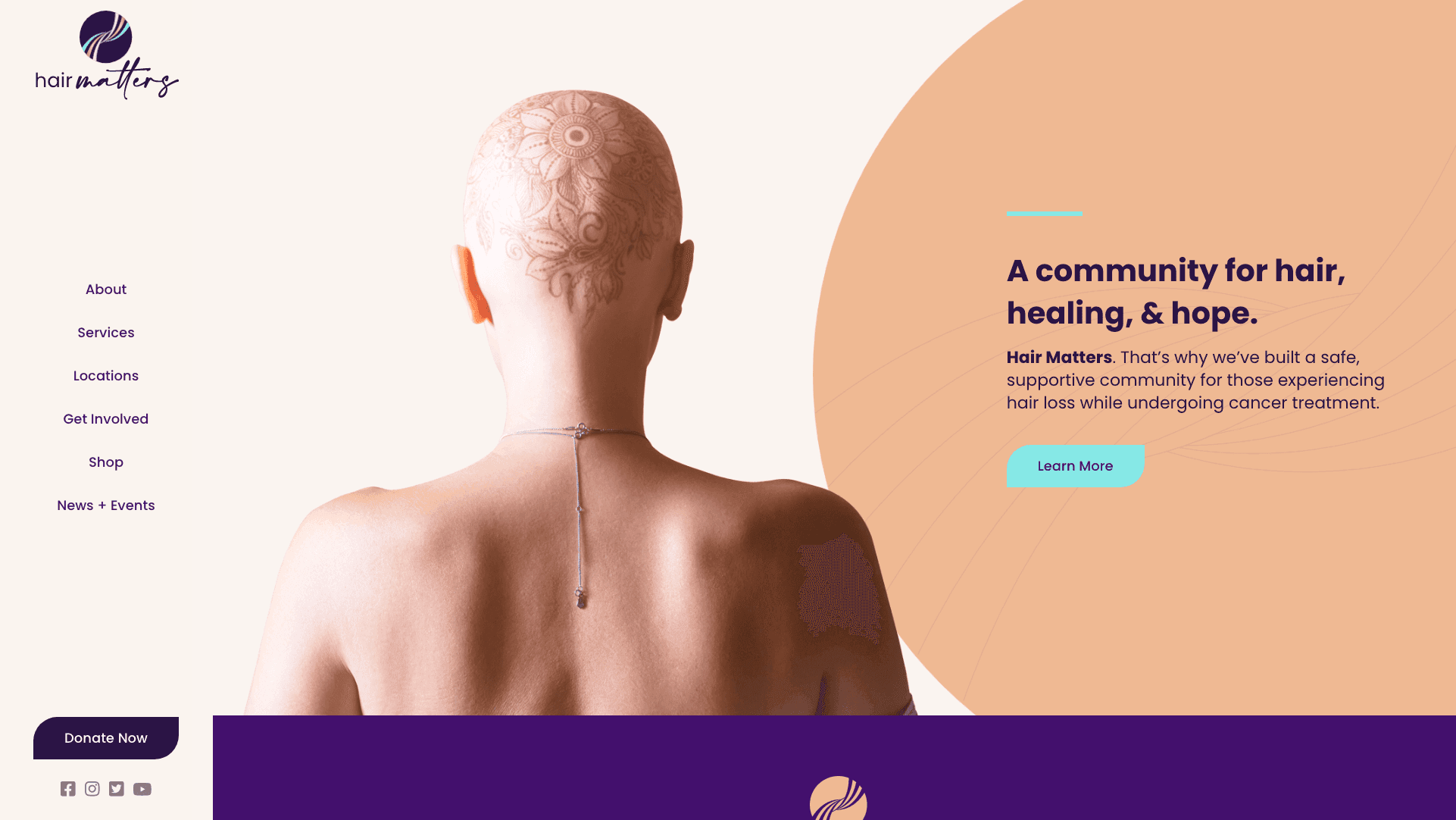
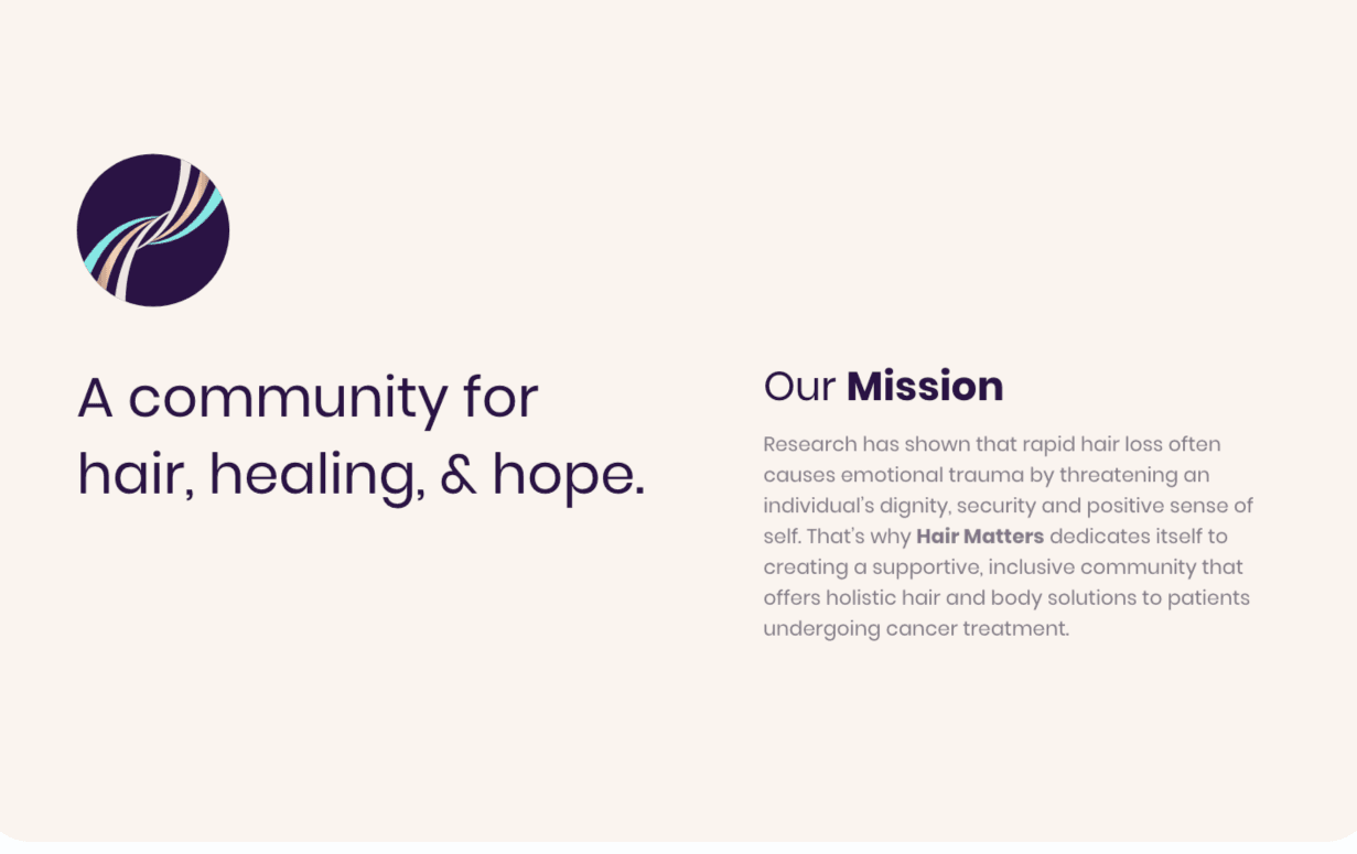
A foundational part of an organization’s brand is its messaging. Our copywriter did an exercise with the client during the Discovery phase that helped us identify Hair Matters’ defining features as an organization. From there, we pulled out words that encapsulated these features and played around with them until we had a tagline that struck a chord.
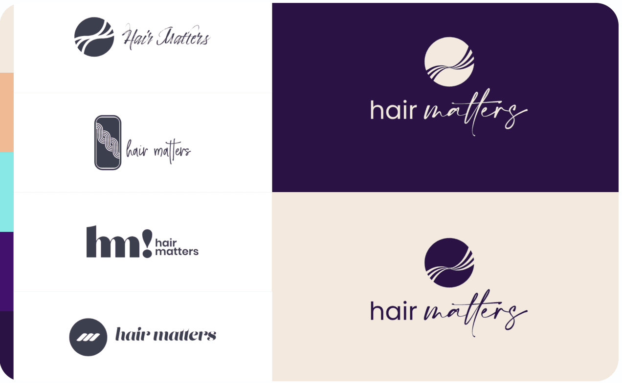
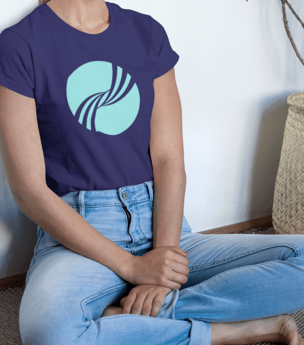
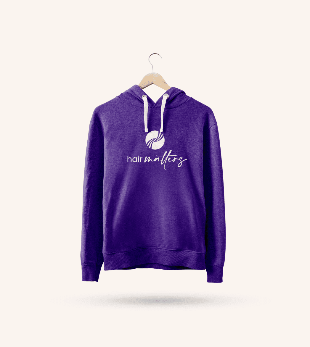
Creating a logo from scratch is always an exciting process for both client and our design team. Our designers drew upon key elements of the brand, like hair, hope, and community. After presenting a variety of options, Debby picked a winner – a colorful, elegant mark that symbolized strands of hair coming together.

Another important part of our branding process is the creating of stylescapes. By presenting the client with a curated collage of different images and elements, we’re able to get a solid idea of what the client’s aesthetic preferences are.
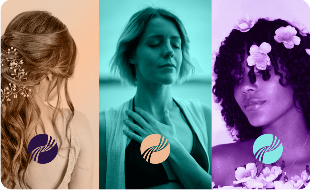
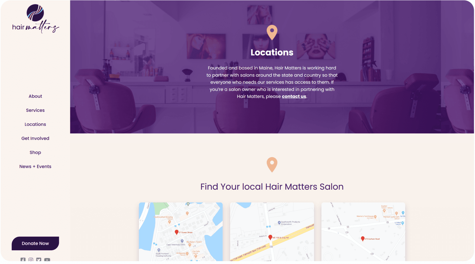
When looking at colors, we use color theory and psychology to create a cohesive, evocative palette. We started with purple, the color of the imagination and intuition, and turquoise, the color of communication and clarity of mind. We complemented these colors with a muted gold — the color of success, achievement, and triumph. Together these create a bright palette of calming, hope, clarity, and success.


voice of your brand.

