
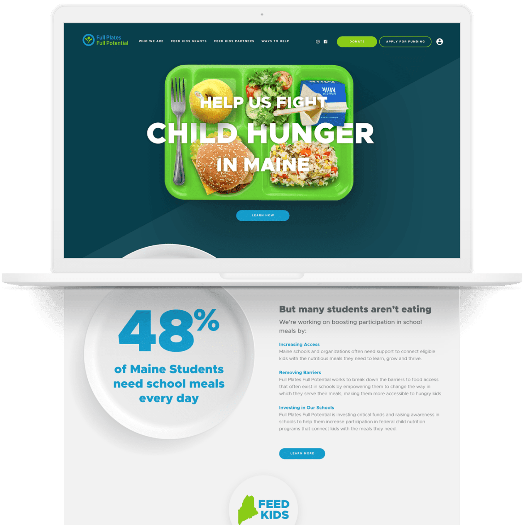
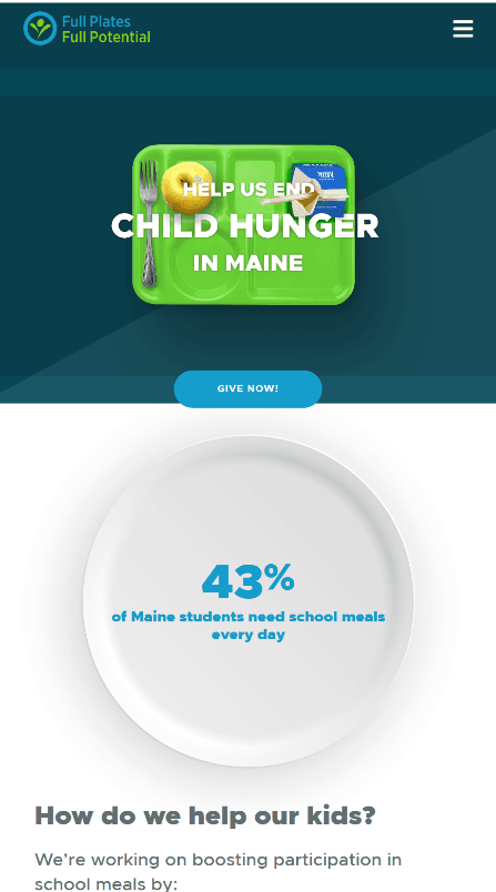
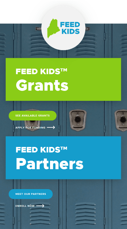
What’s the first image that comes to mind when you hear the name “Full Plates Full Potential?” A plate heaping with food, right? While it was our gut reaction to use plate imagery, we quickly realized during our Discovery process that a classic cafeteria tray was a much more potent symbol of what FPFP was all about.
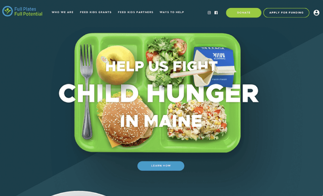
Moreover, adding animation to the tray to show it slowly filling up with food drove the message home: Full Plates Full Potential is facilitating the process needed to put food on the trays of hungry kids all over the state. This created a hero banner that became the foundation of the design aesthetic we used throughout the site.
With an animated tray in FPFP’s branded green, filled with colorful food, our design team began adding complimentary colors to our palette – Dark navys and clean, white space offset the brand’s saturated blue and green and struck a nice balance between playful and serious.


voice of your brand.