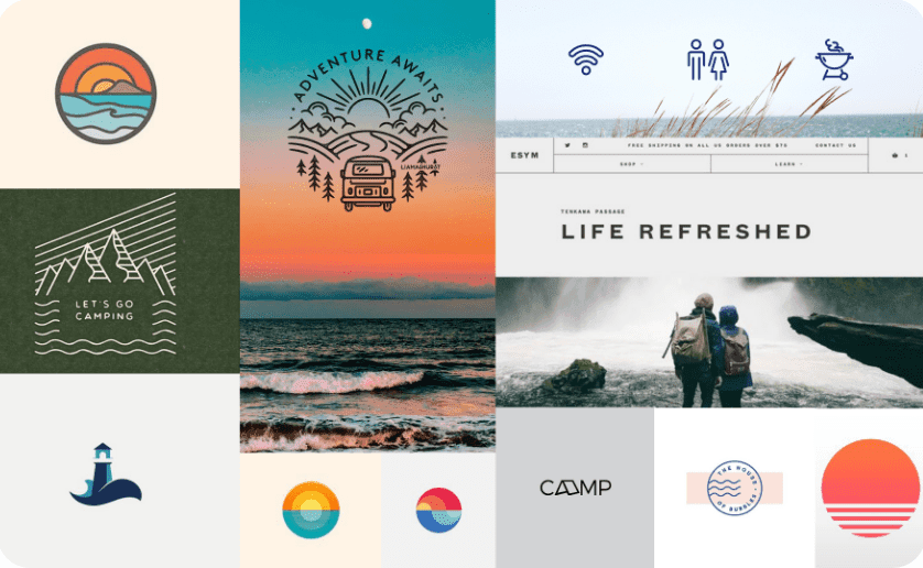
As always, the first thing we want to do at the start of a branding project is to get a feel for our client’s design aesthetic. Our design team puts together what we call “stylescapes,” three different collages of imagery, colors, and type, each with its own distinct aesthetic. We used OOB’s gut reactions to each of these to help determine their overall visual preferences.
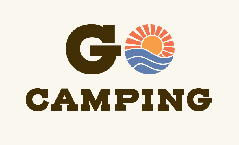
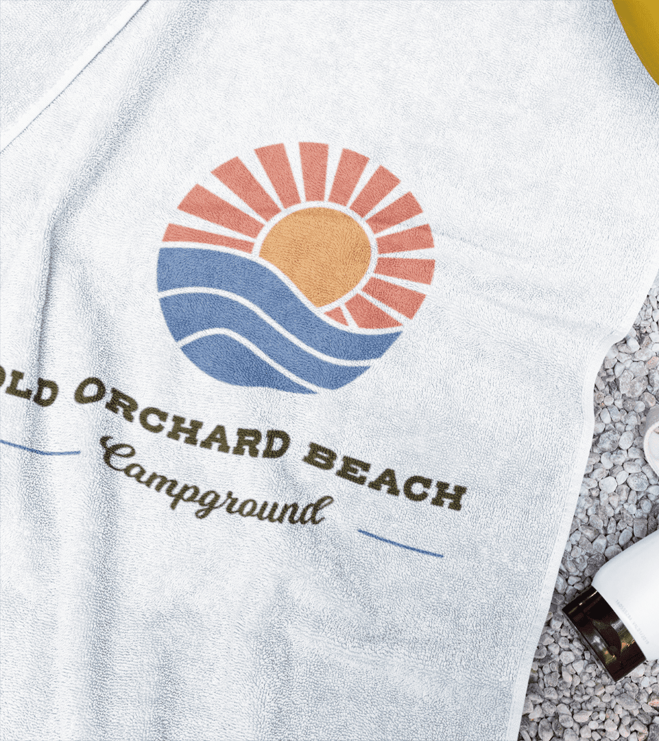
Next, the logo. OOB Campground actually loved their current logo, but knew it needed a refresh. So we set to work and presented two new logo options that used the same elements of their old logo — a sun setting over the water — but gave it a modern treatment and added their brand colors.
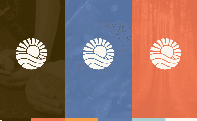
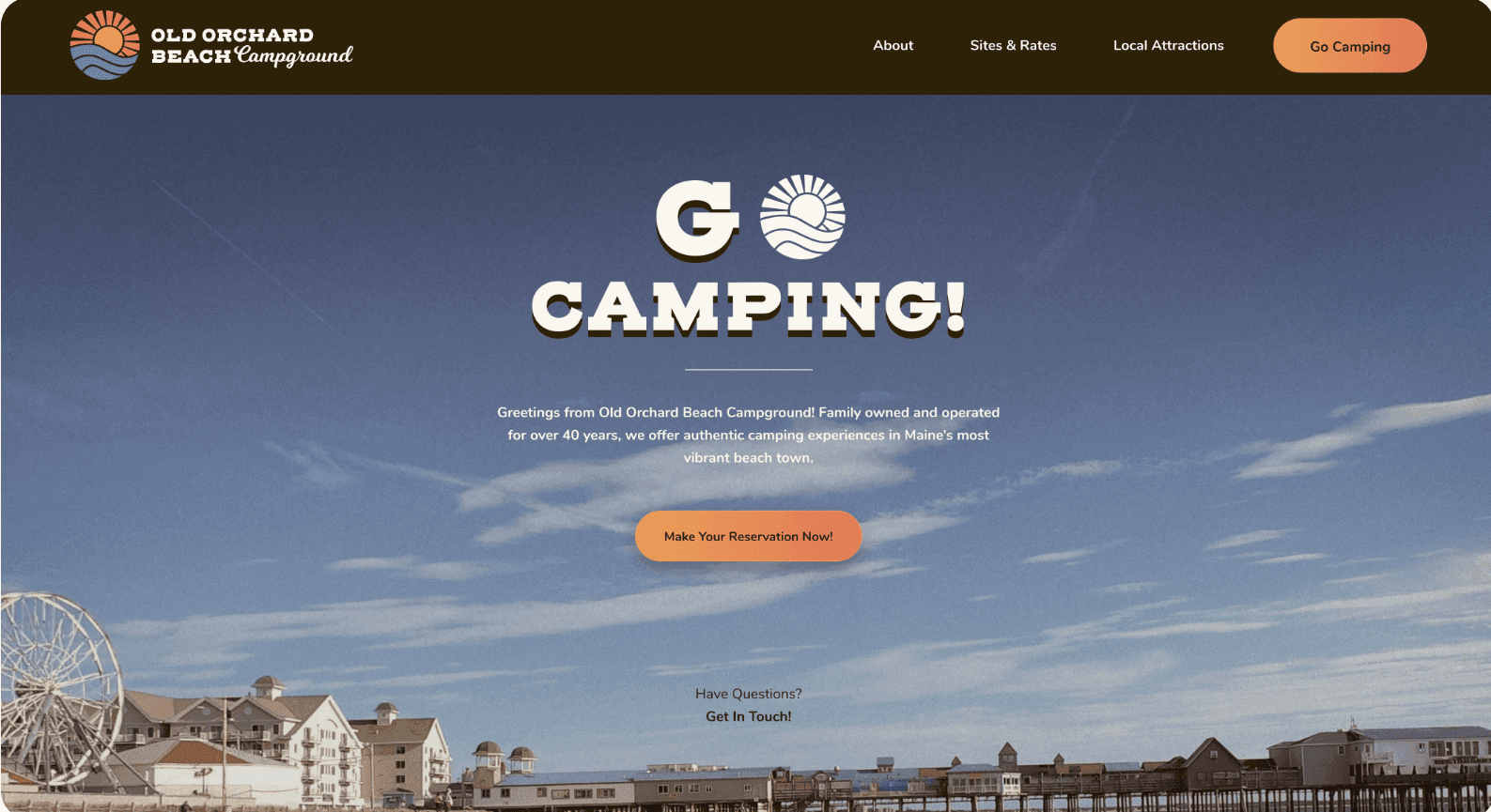
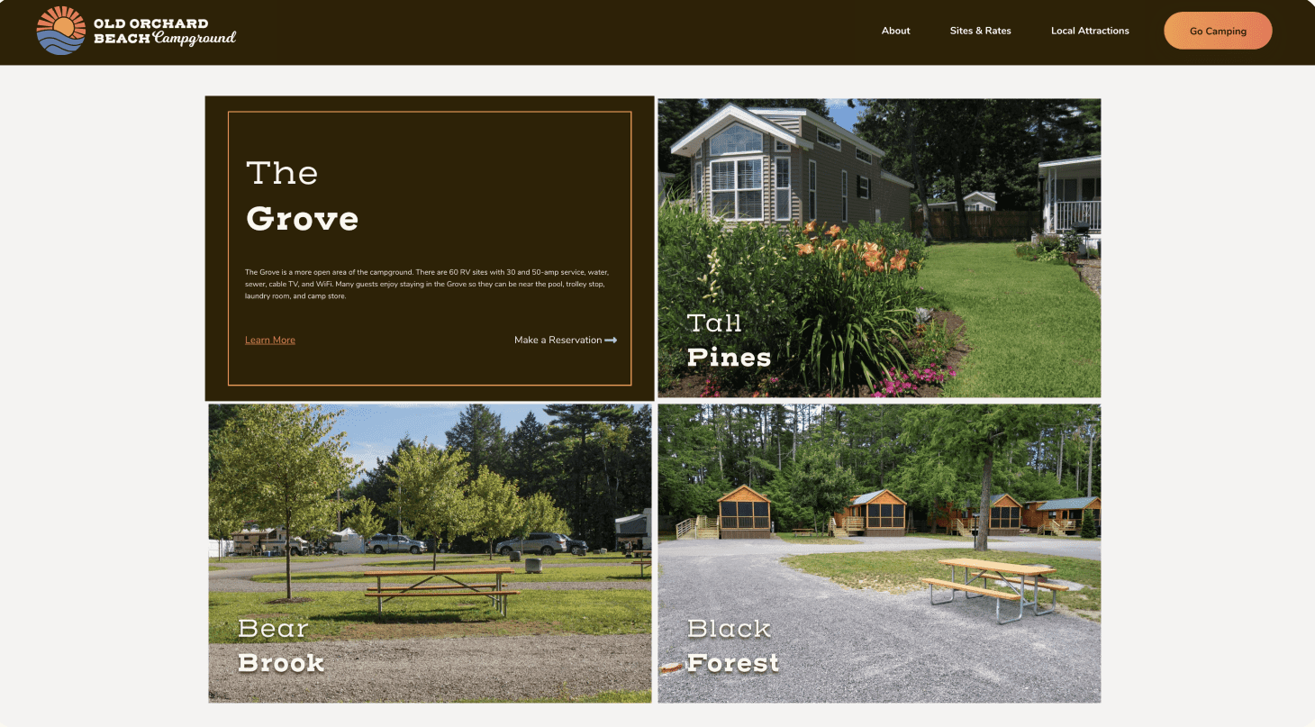
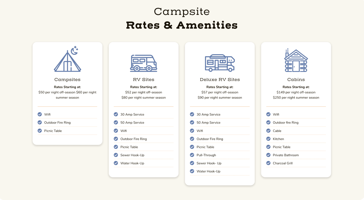
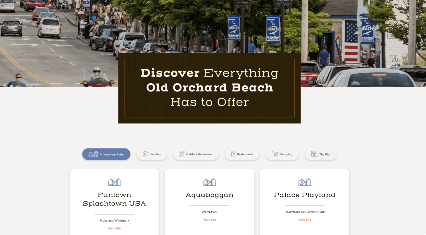
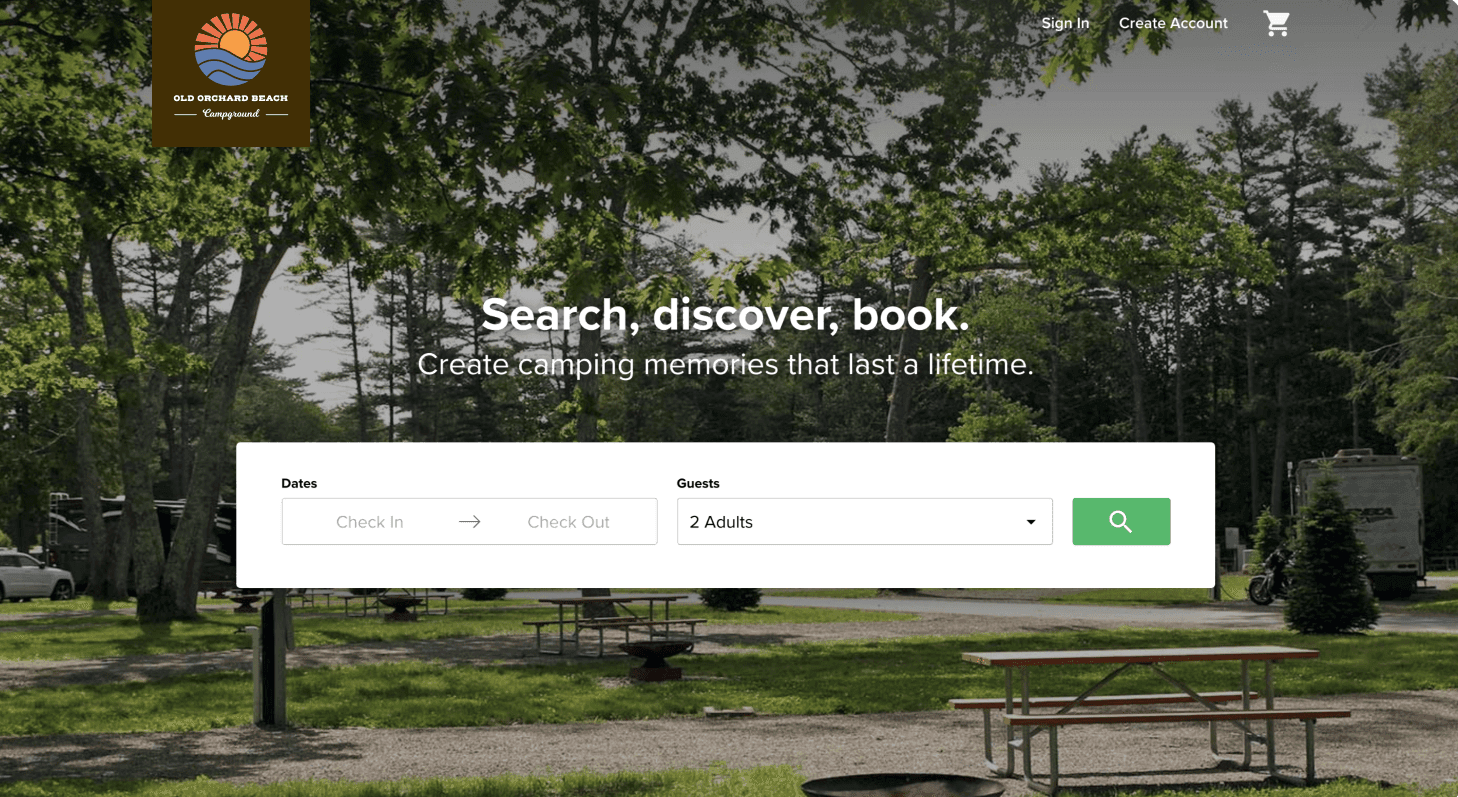
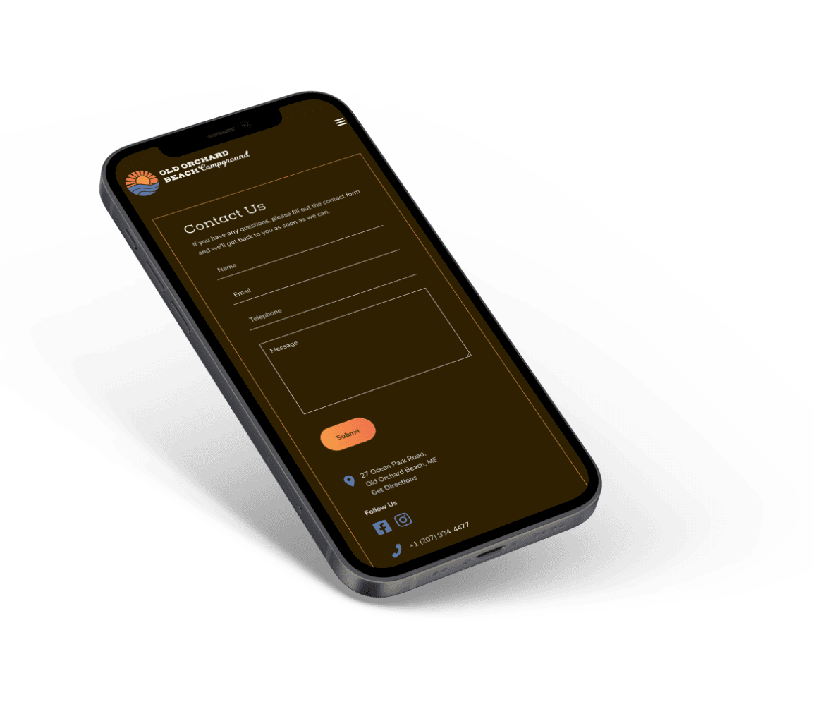
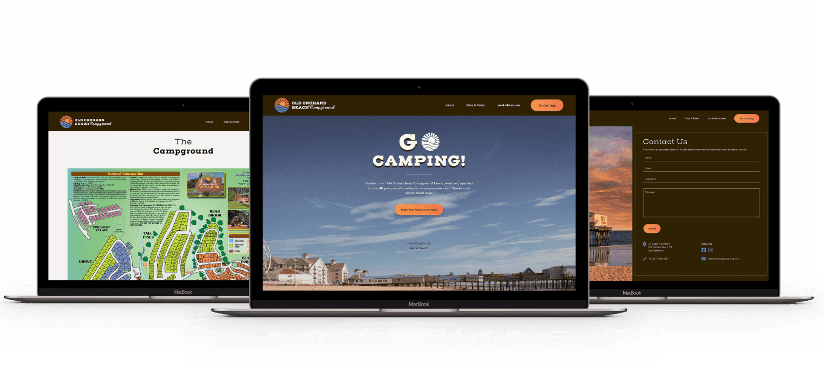
With a clean, refreshed brand, we got to work on web design. We pulled together a color palette inspired by their logo colors — ocean blue and sunset orange — and added a complimentary brown. We ended up pairing that brown color with a wooden texture overlay throughout the site, evoking the image of a campfire or a log cabin.
bring your vision to life.

voice of your brand.

