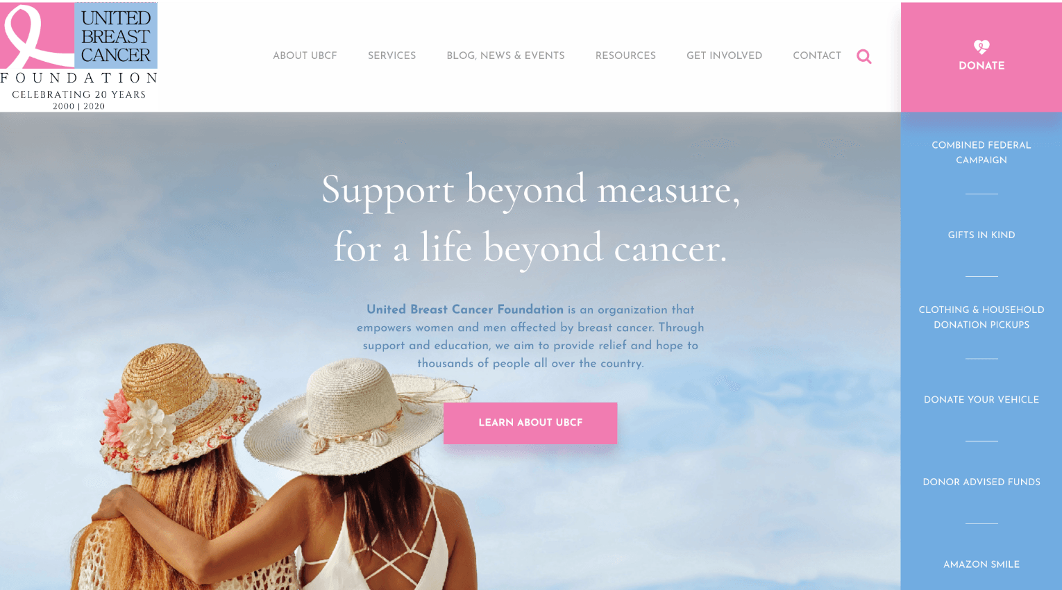
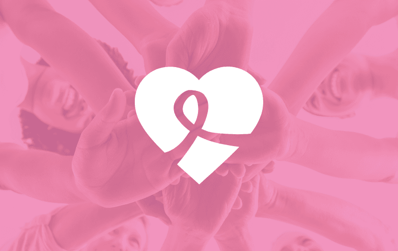
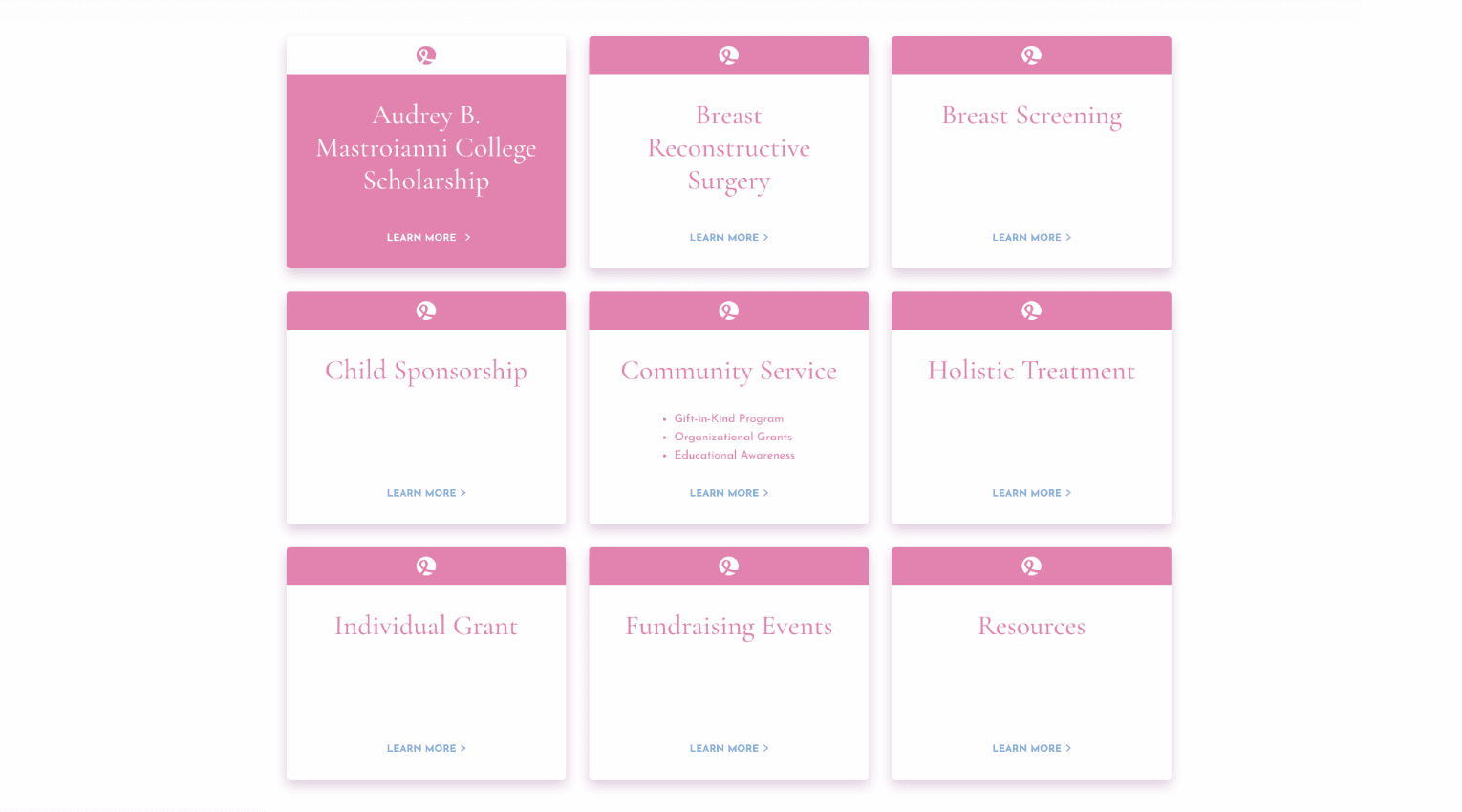
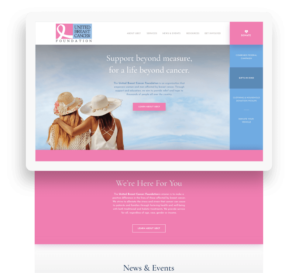
The “Pink Ribbon” is such an important and recognizable symbol for breast cancer awareness, it felt like a no-brainer to both the client and the side • sea team that we should use the ribbon as the starting point and foundation of the design. It not only informed the color palette but also appeared throughout the site as a design flourish, helping tie together a cohesive and branded aesthetic.

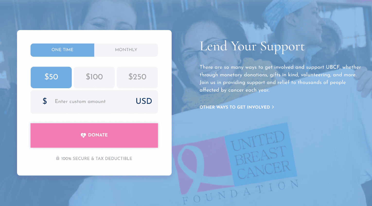
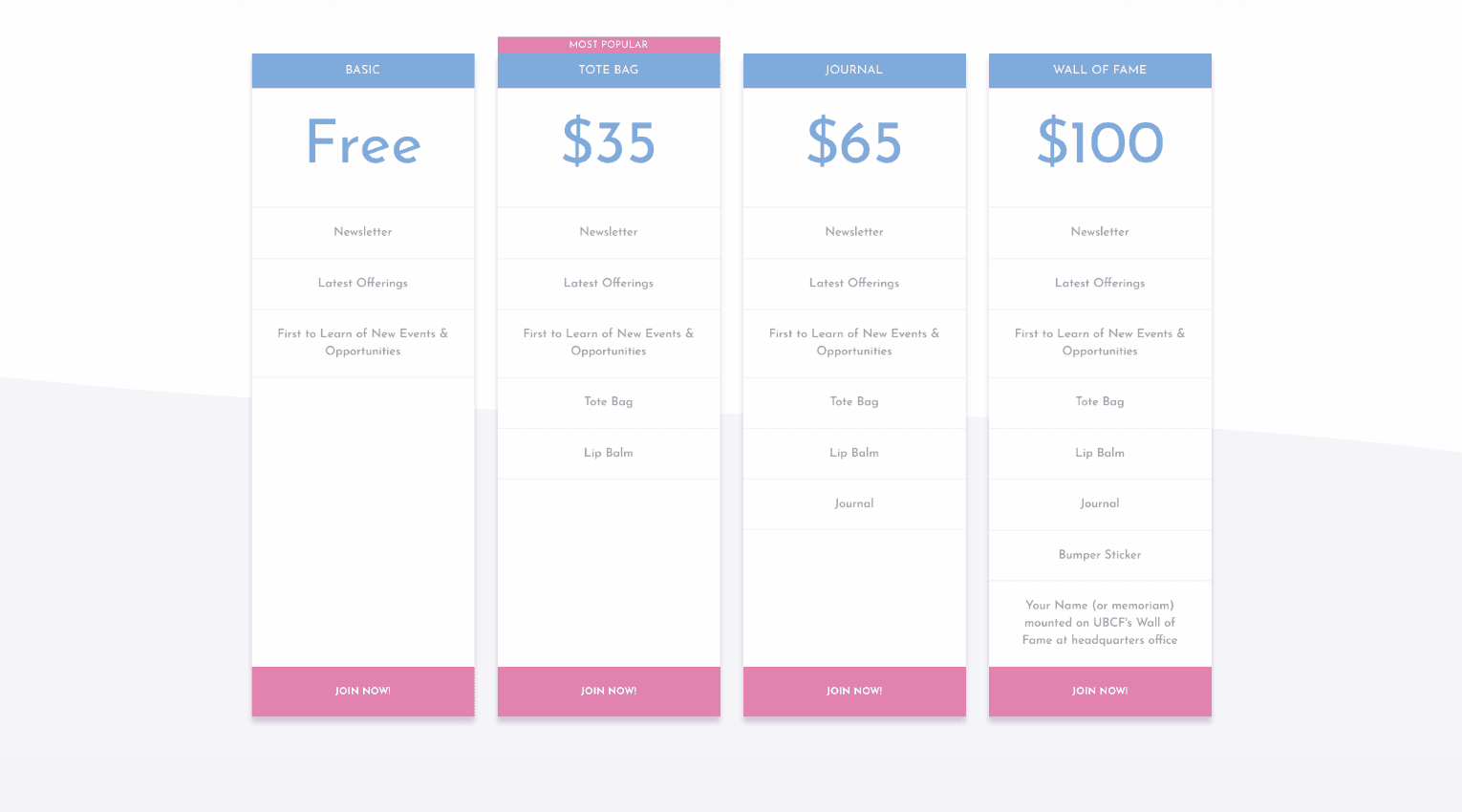
Starting with the bright pink of the breast cancer ribbon, our design team began to build a color palette. We offset the pink with a calming and harmonious cornflower blue, and used a liberal amount of white space to create a super clean, modern feel to the site that focused the attention on the content and didn’t distract from the amazing work UBCF is doing.

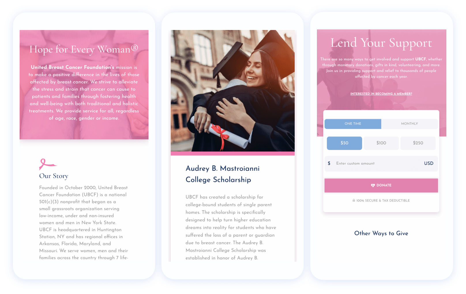
voice of your brand.
