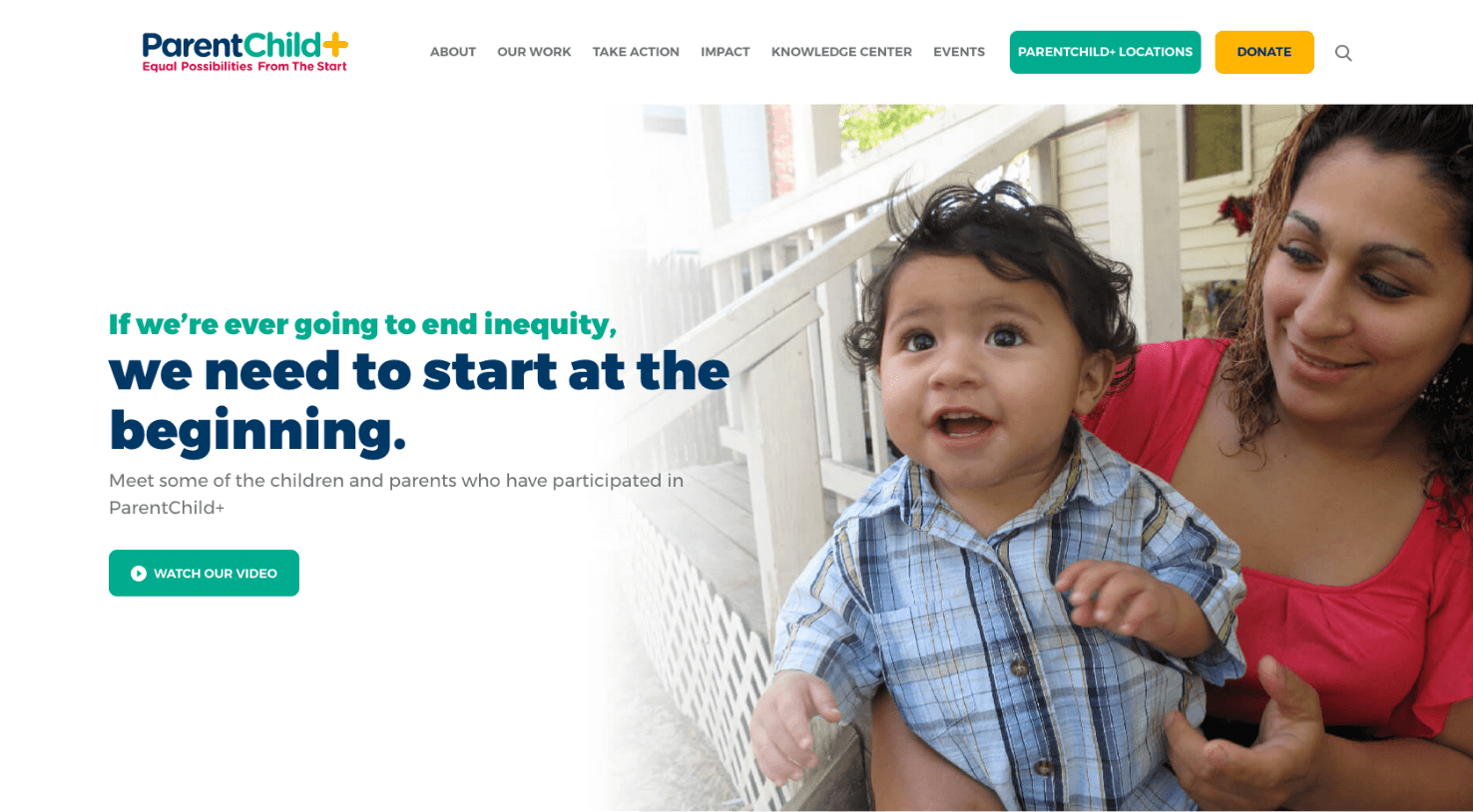
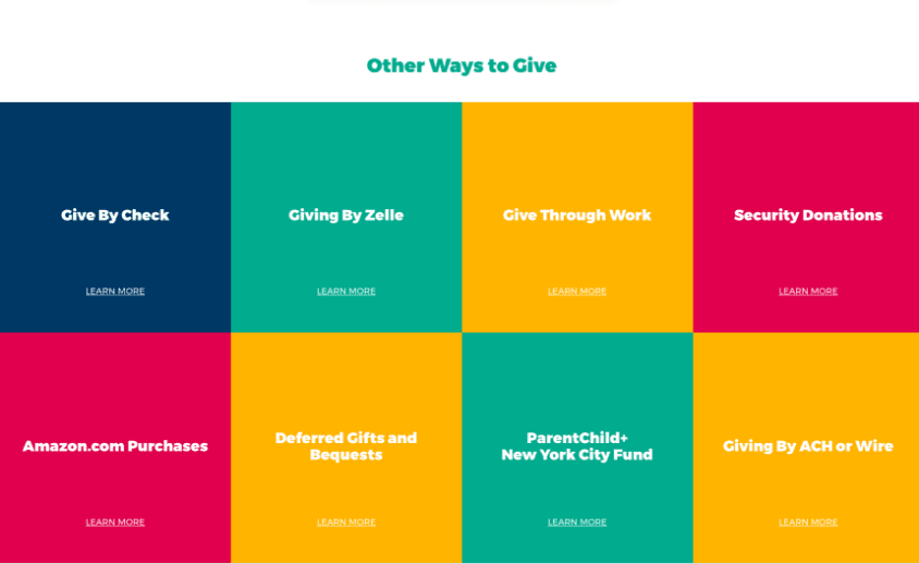
A Bright, Colorful Journey
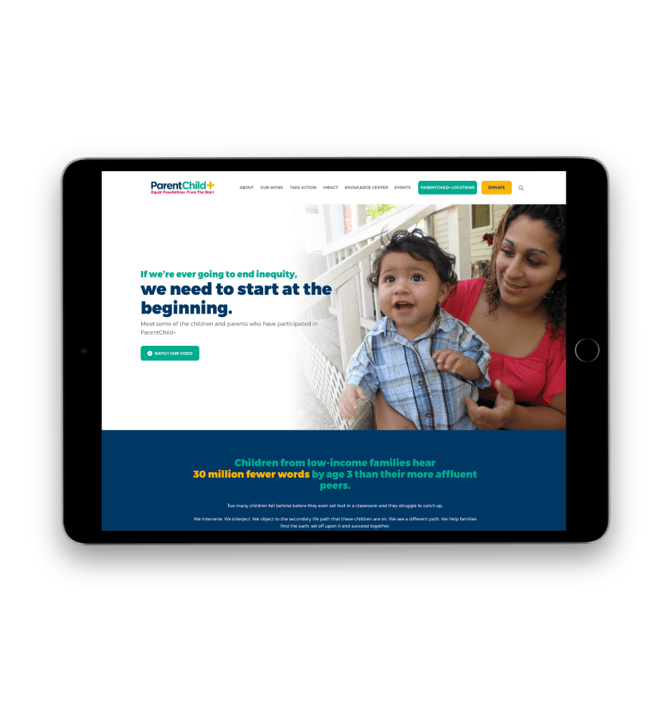
Siegelvision worked with ParentChild+ on branding before we joined the project, so our design team had a solid foundation to build off of. We used the established color palette and aesthetic to build bright, lively pages that really highlighted their messaging and impact.
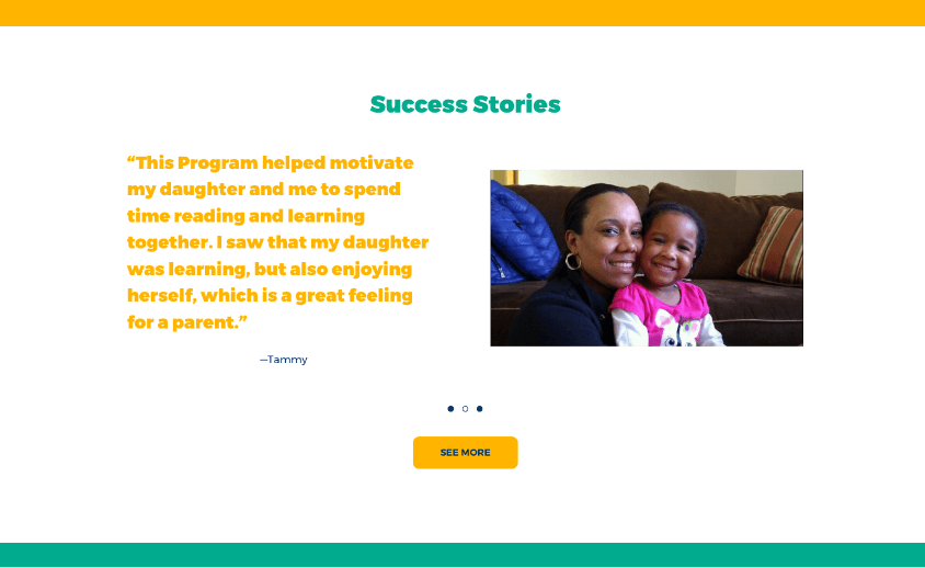
Showcasing Their Success
Testimonials are an important part of the ParentChild+ website. Because one of the objectives of the website is to prove that their methods are effective, testimonials and success stories are a great way to build that credibility and trust with users.
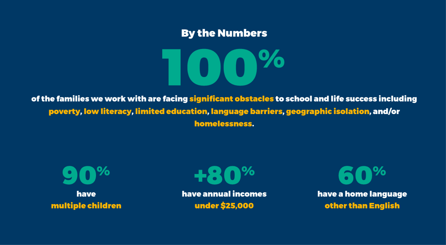
Proving Their Impact
Another way to build credibility? Impact stats. We carved out a few different spots throughout the site’s architecture to showcase the impressive statistics associated with their work. It’s important to be consistently reinforcing the message that their model and approach really works.
Putting Them on the Map
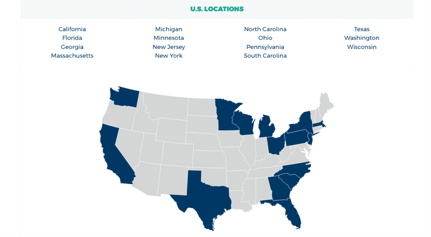
ParentChild+ chapters are spread throughout the country, with multiple locations in a number of states. Our development team created an interactive map that allows the user to click into a state and then click into a specific location within that state. Each location directs to its own unique page with staff and contact information.
Member Portal
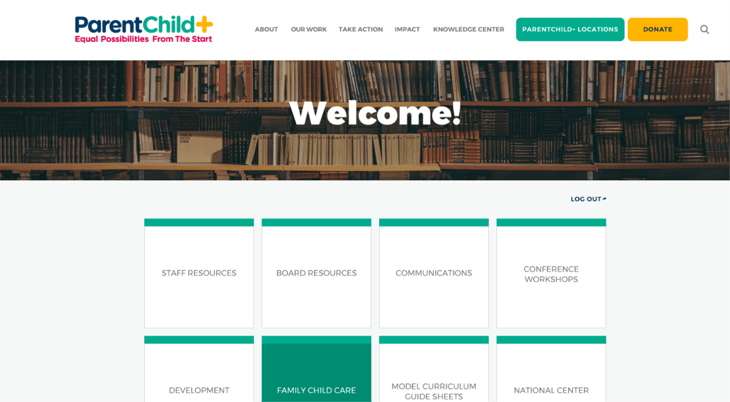
We created a gated member portal for staff and board members so that they could access materials and resources relevant to their positions. For an organization spread throughout the country, this was a great way to centralize resources and communications.
A Resource Library
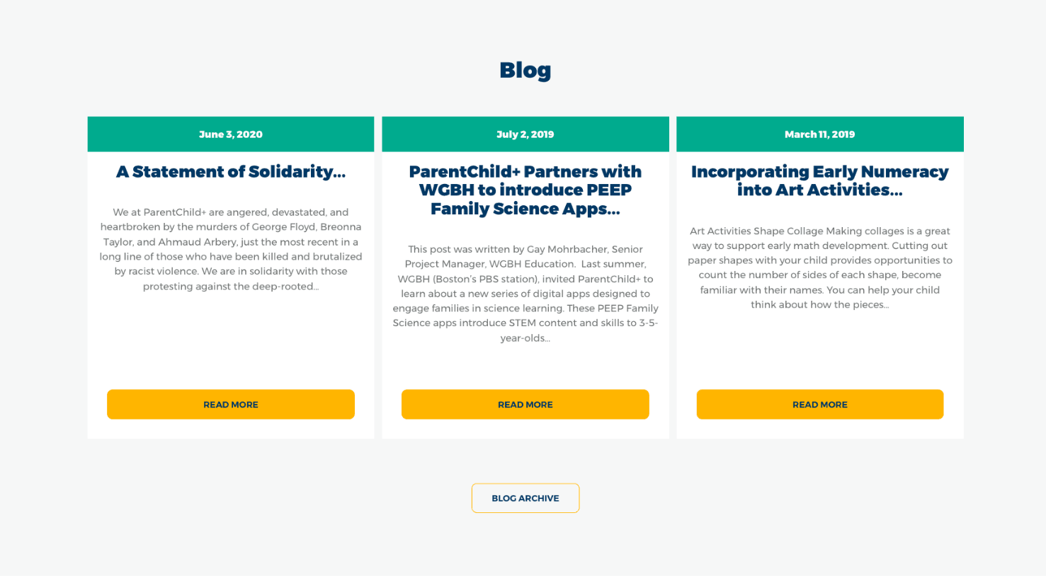
For users who aren’t staff or board, ParentChild+ offers a robust library of research and resources. We created a page called the Knowledge Center, where we categorized different report topics into accordion menus. When the user clicks, the accordion expands to show a grid of resources. Each tile links to an individual report.
Let's work together to bring your vision to life.
PROJECT TEAM
Orion Alden
CREATIVE DIRECTOR
Hunter McPeak
DESIGNER
Maggie Nugent
Content Director
Jennifer Chew
PROJECT MANAGER
Eric Fernandez
CTO

"Working in partnership with other agencies is always an enlightening creative experience. It helps our team explore directions we wouldn't normally think to go. The vibrancy of this design pairs nicely with the pared-down, straightforward content. "
Orion Alden
Creative Director
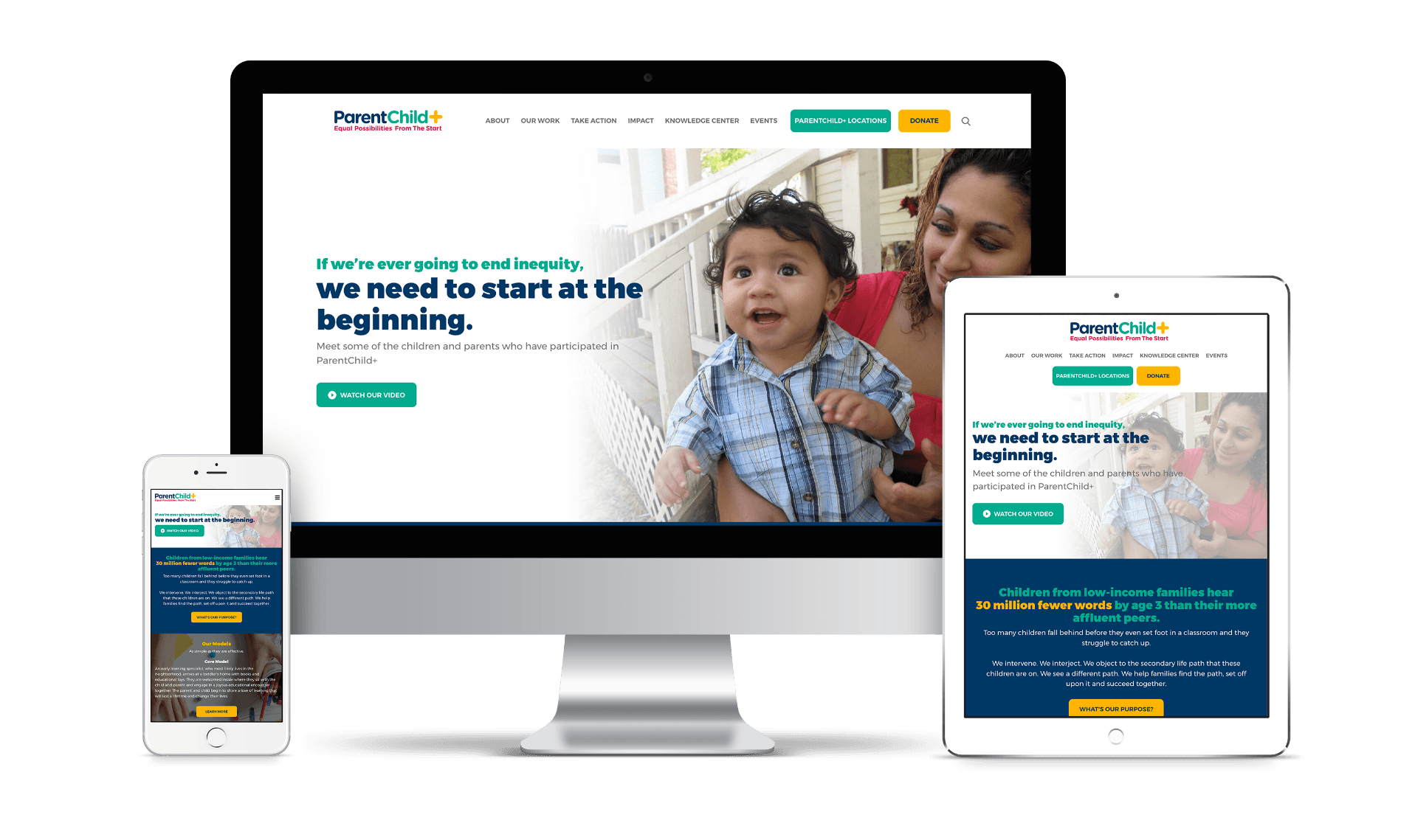
Explore the Finished Product!
Visit Site
Let’s talk!
See how we can elevate the
voice of your brand.
voice of your brand.
