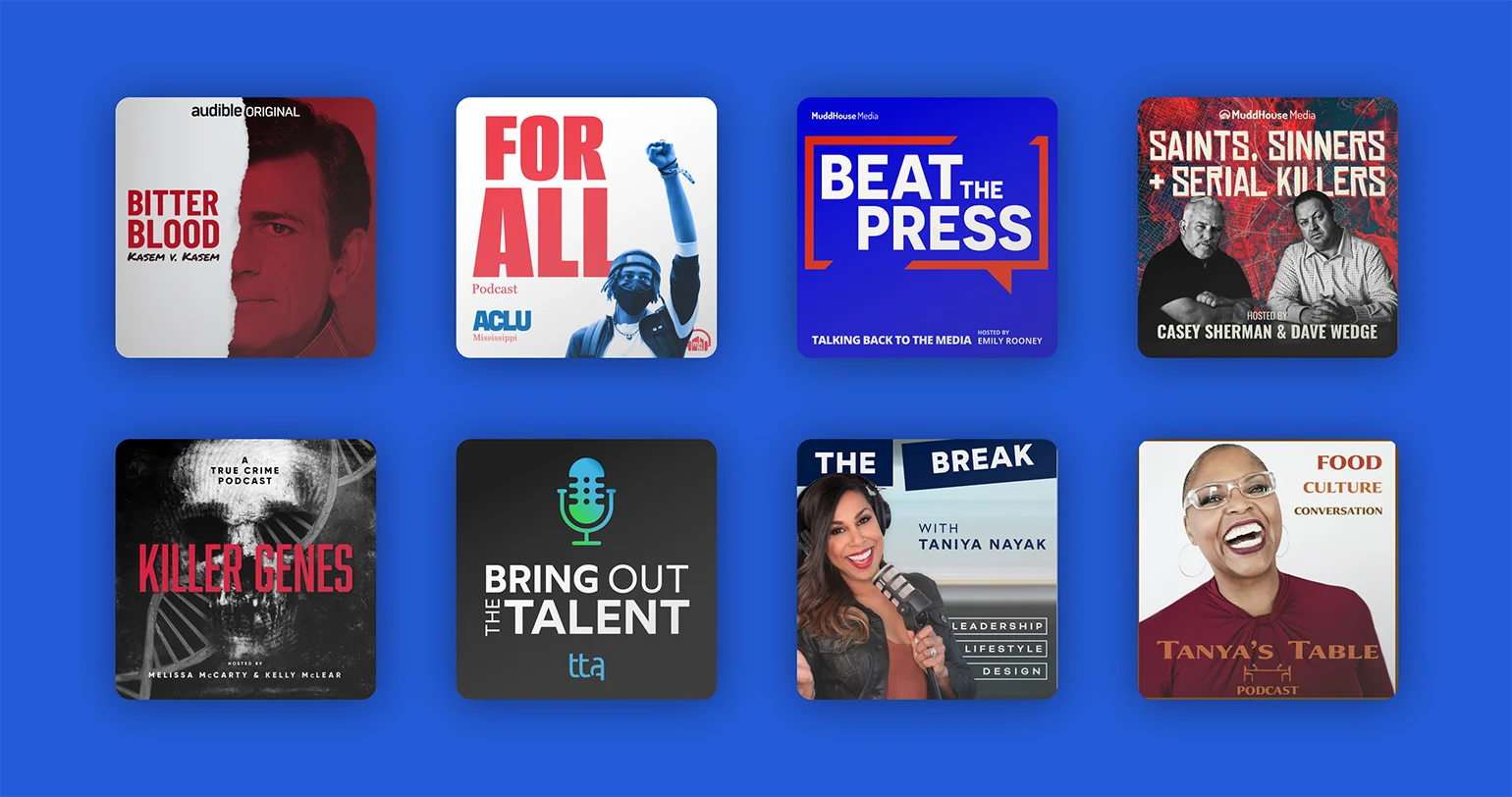
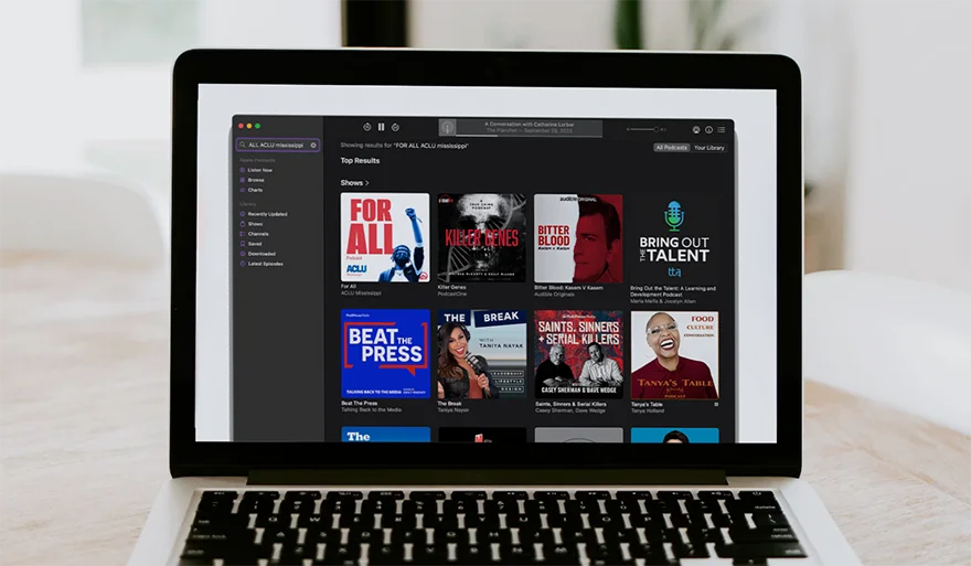
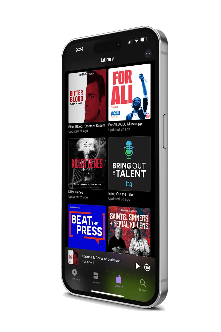
Podcasts pose a unique challenge compared to web design. Despite being static, they must captivate on their own or amidst a sea of options. It’s their simplicity that brings an exciting edge to the challenge and gives a potential listener some food for thought.
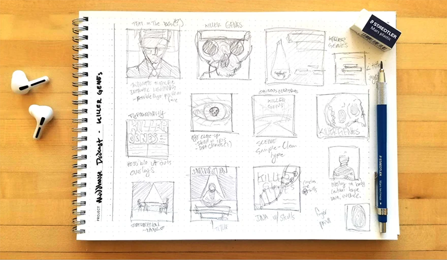
Our process starts with the simplicity of paper and pencil, allowing us to brainstorm freely. Through initial research and competitor awareness, we aim for innovative designs. We draw inspiration from key elements that define the podcast, anything from skulls to DNA, blending imagery and typography in a uniquely creative way.
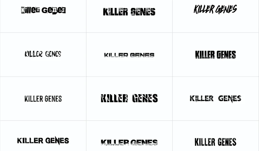
Our typographic audit marks the first digital step, drawing inspiration from our sketches to inform our next decisions. In this phase, we’re pulling as many options to choose from while still trying to inspire any new ideas.
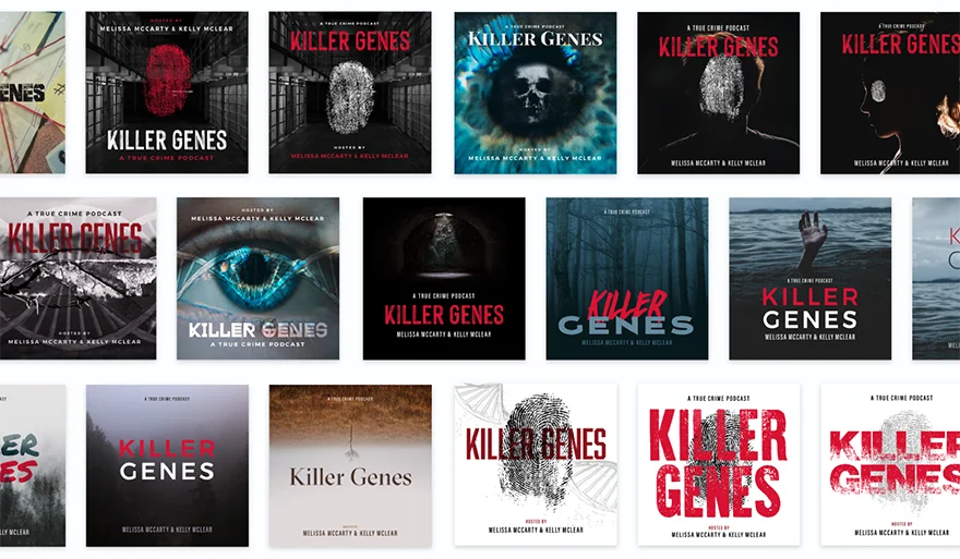
Our groundwork simplifies our task at this point. We blend and rework our ideas on composition and typography through creative ideation and iteration. Then, we bring in textures, colors, moods, photography, and other visual elements to enrich the design’s vision. This foundation makes swapping images at the last minute seamless.
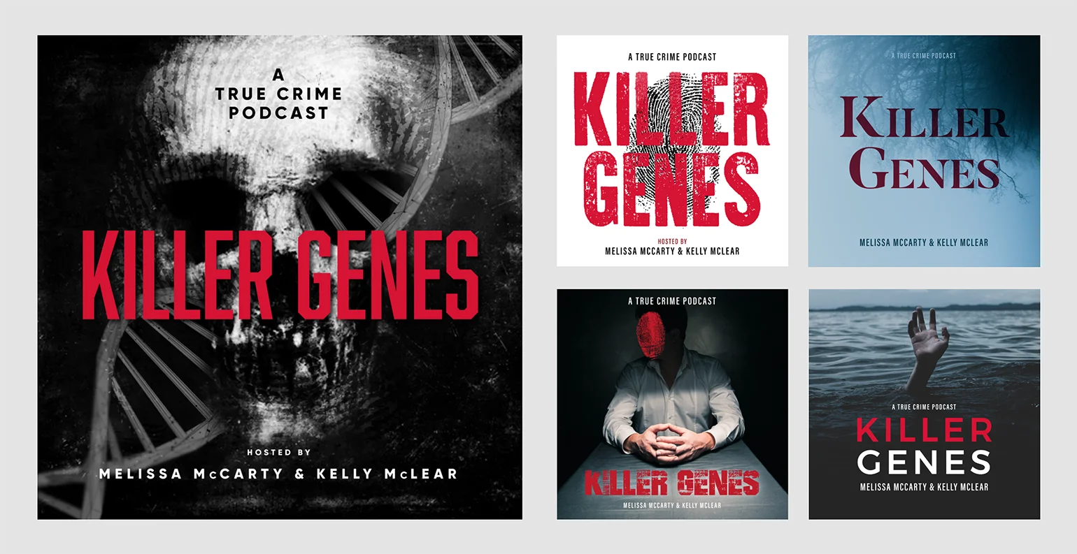
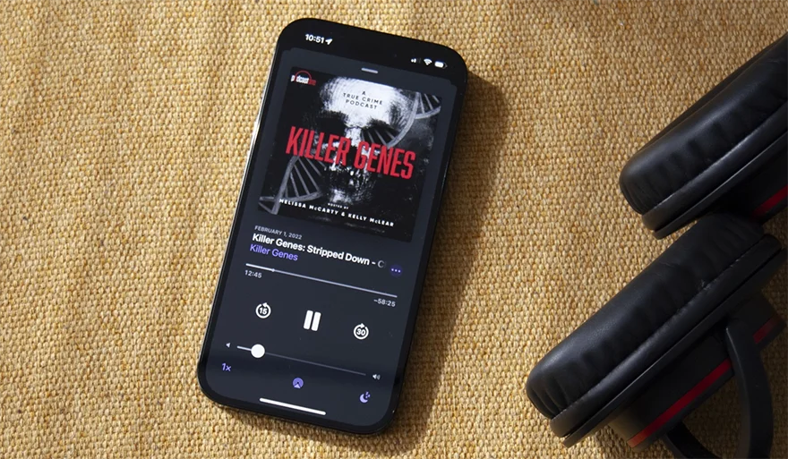
The final selection is curated by weaving together the various ideas, images, graphics, and types to create a visual ambiance that offers the user an idea of what to expect from the podcast. Our goal is to create something that will work within the podcast genre and stand uniquely on its own.
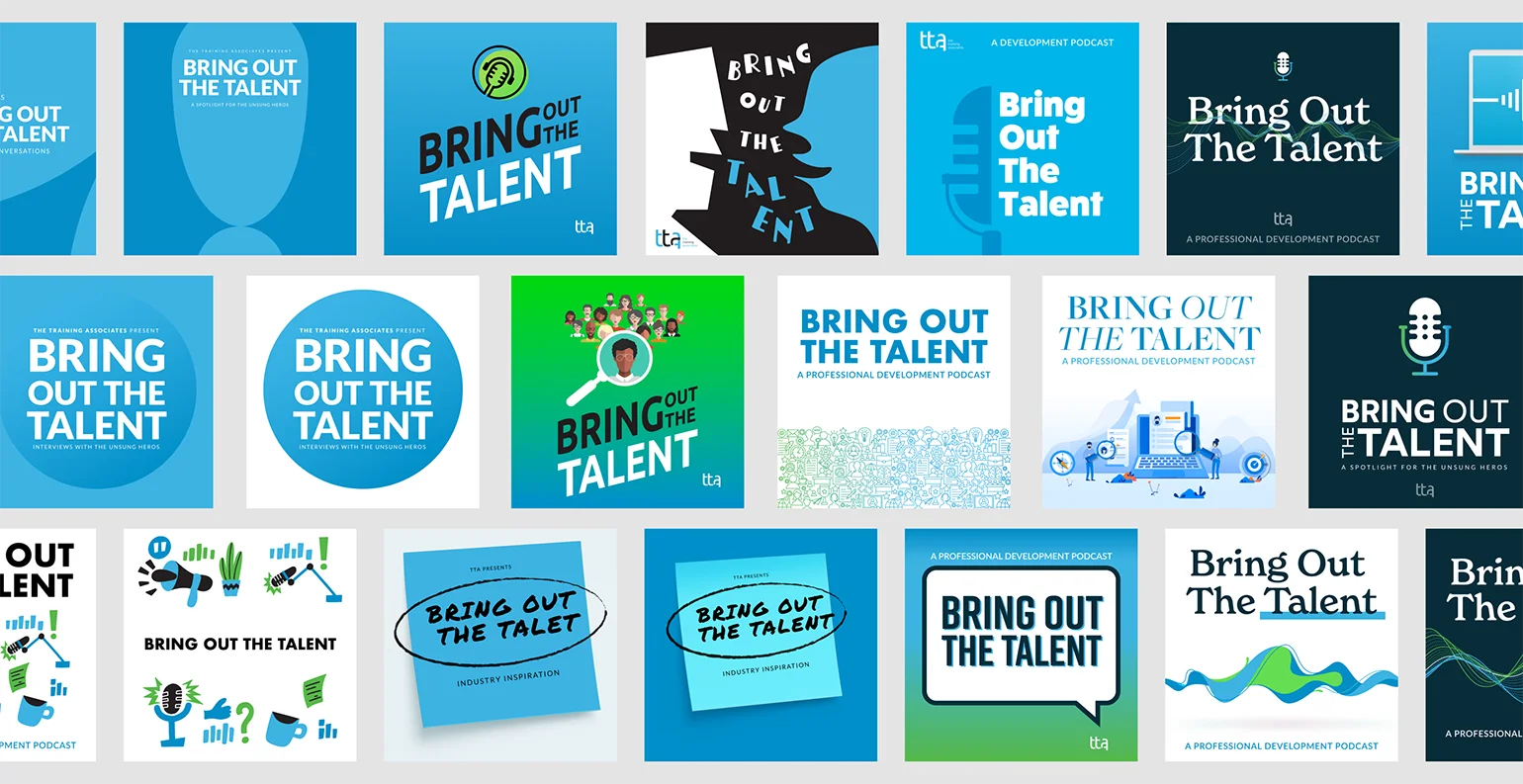
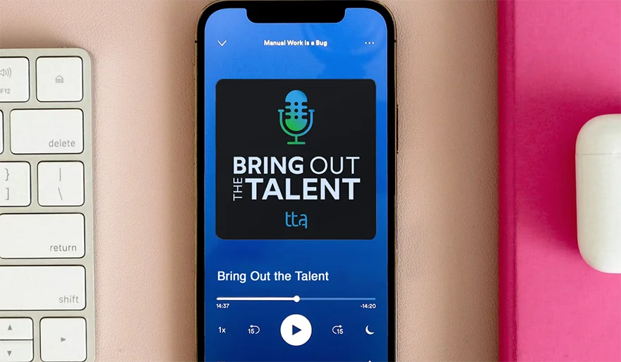
While the final selection in this illustrative example may appear subdued compared to the vibrant examples above, rest assured it is informed by the entirety of our exploration, encompassing both the wild and the refined.
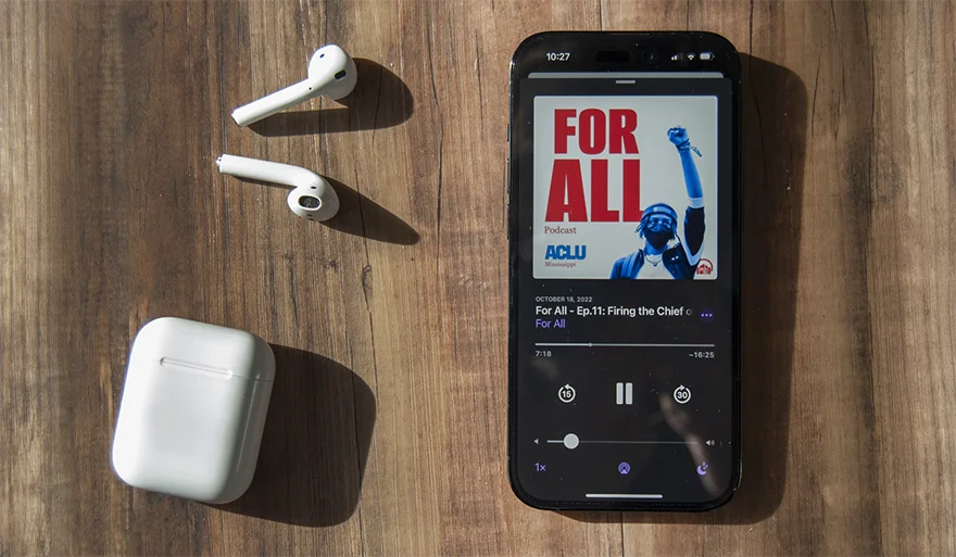
In podcasts, simplicity is key, especially in topics like politics and civil rights. Bold and straightforward messages resonate best.
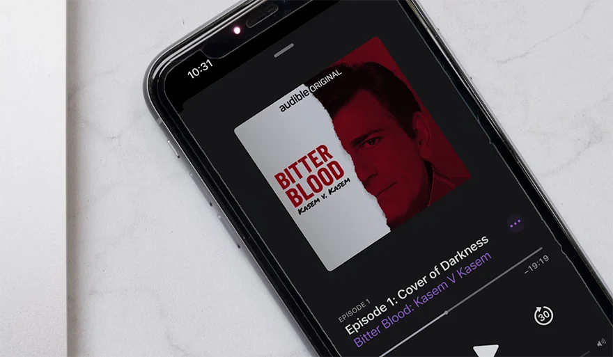
In this example, the imagery of torn paper, coupled with the stark contrast of white and red, creates a compelling narrative of ‘paper violence,’ invoking a powerful and abstract sense of action.
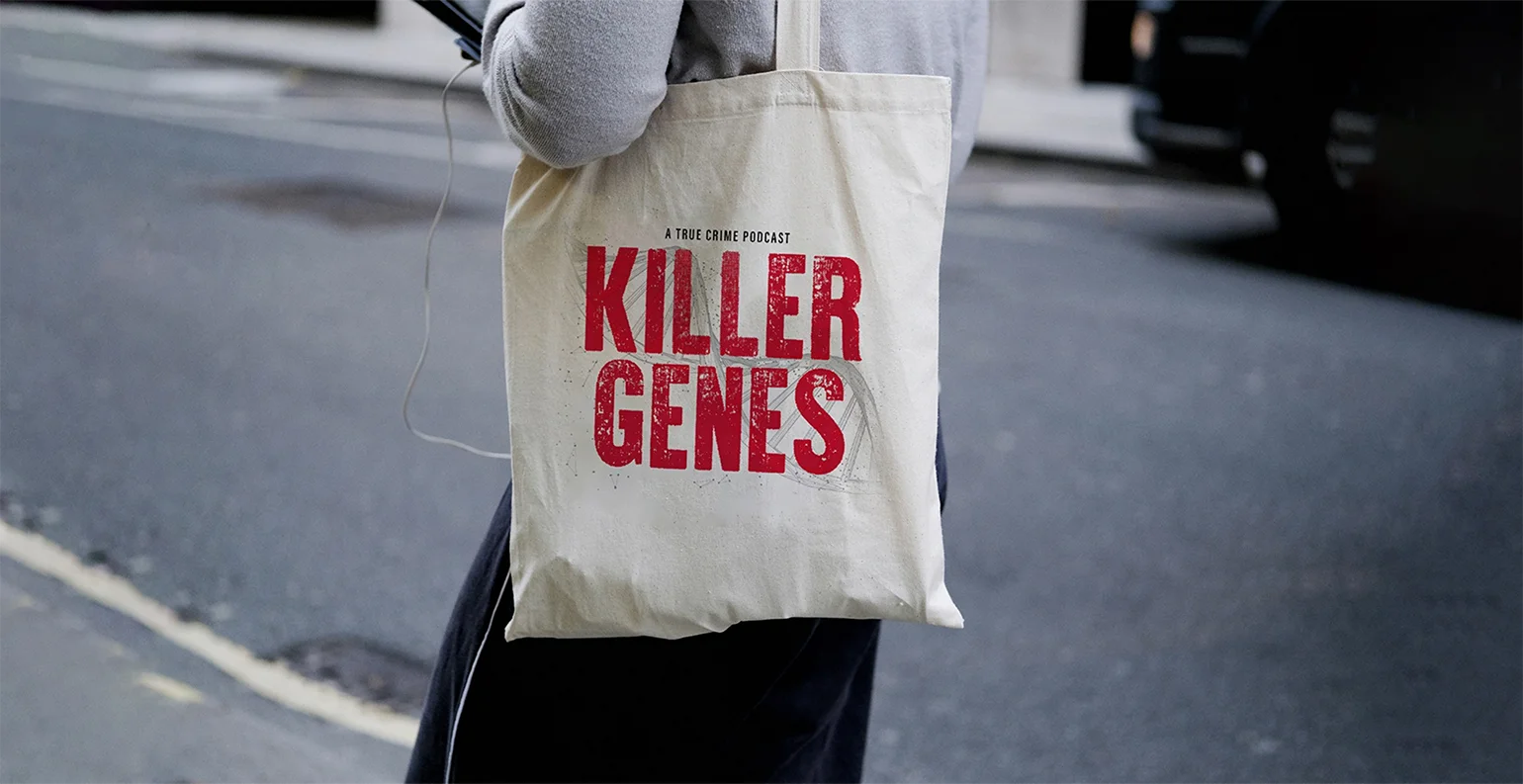
voice of your brand.

