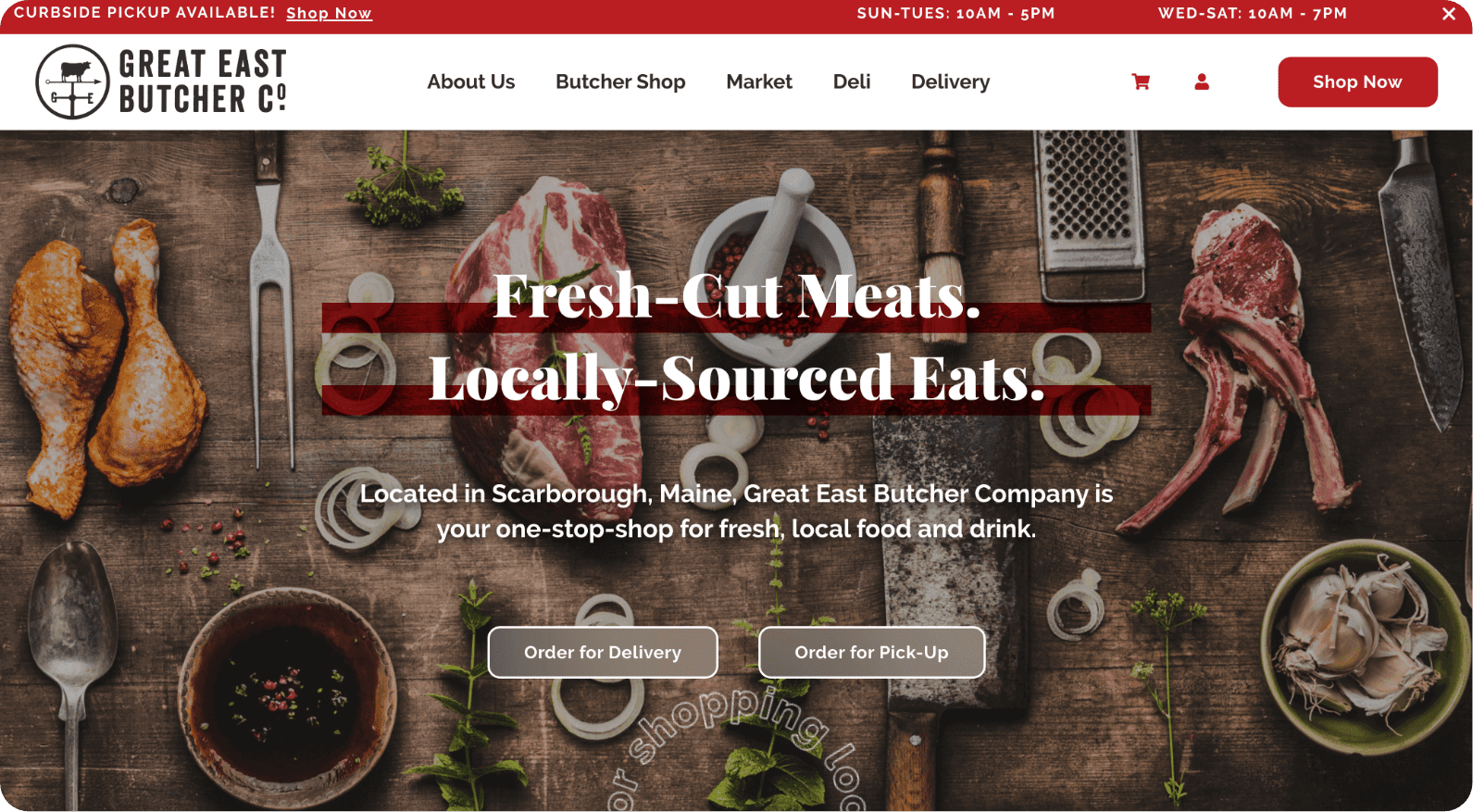
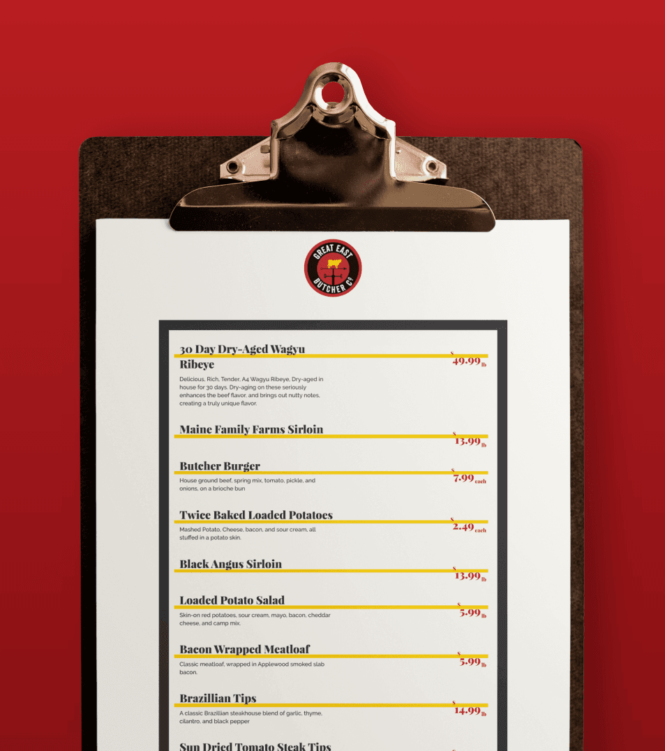
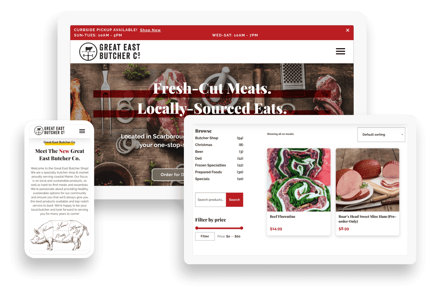
First and foremost, Great East Butcher Company needed a design refresh. They’re a business particularly focused on local and artisan foods, so we wanted to create a website with that same local, “hand-crafted” vibe.
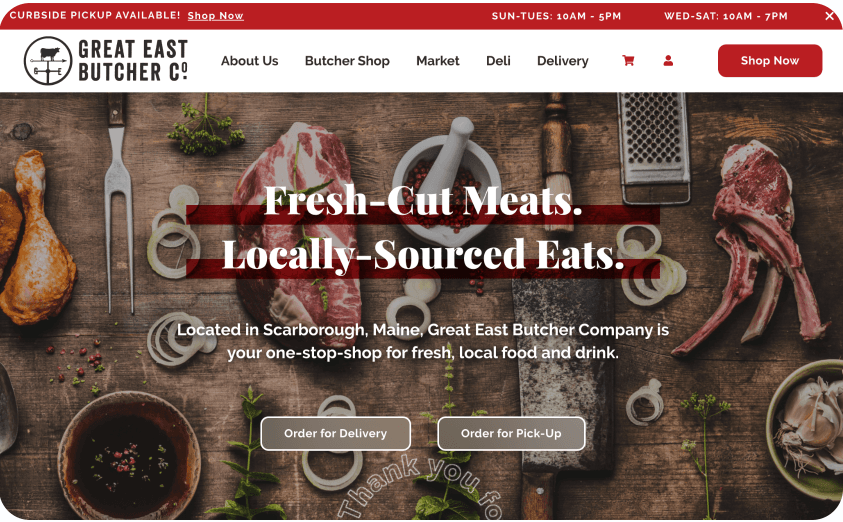
Our hero banner was a collective effort between our design and content teams. Design selected a beautiful, rustic looking meatboard full of delicious-looking, high-quality cuts, which played into the hand-crafted, artisan aesthetic we mentioned above. Our copywriter came up with a tagline that emphasized the fresh and local quality of Great East’s offerings.
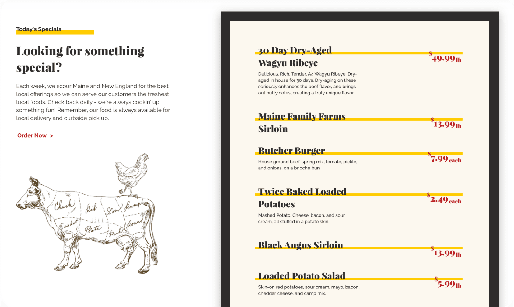
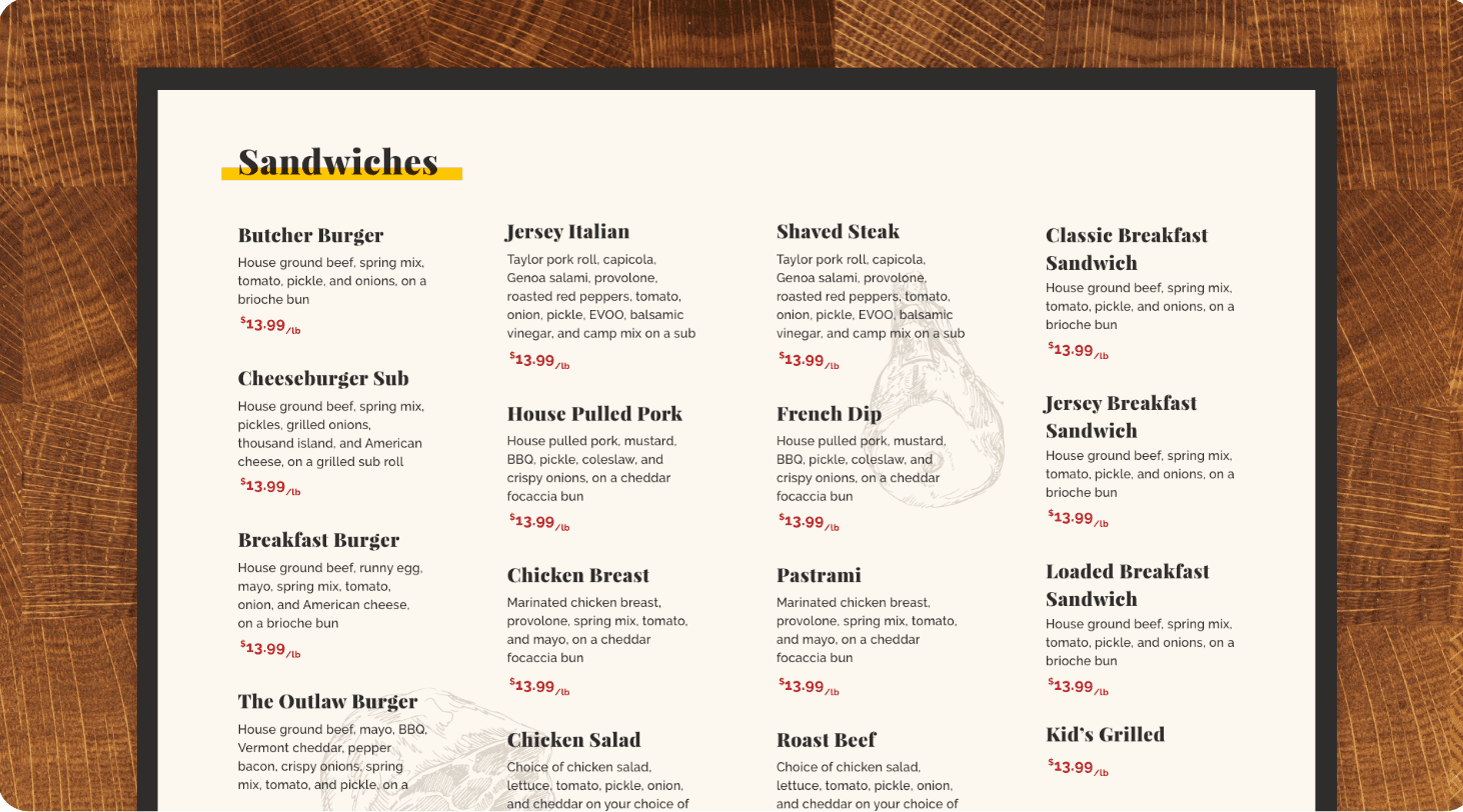
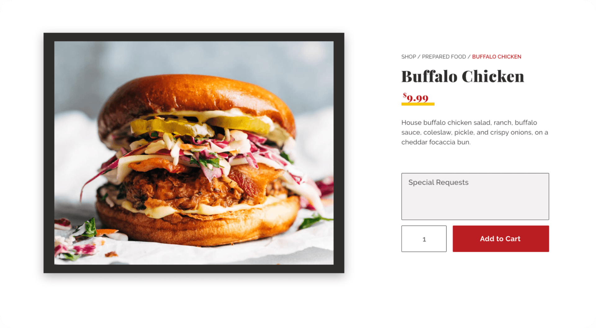
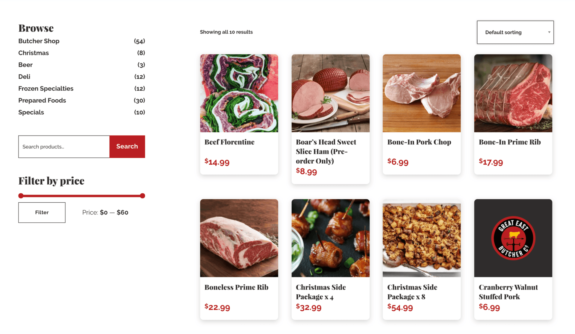
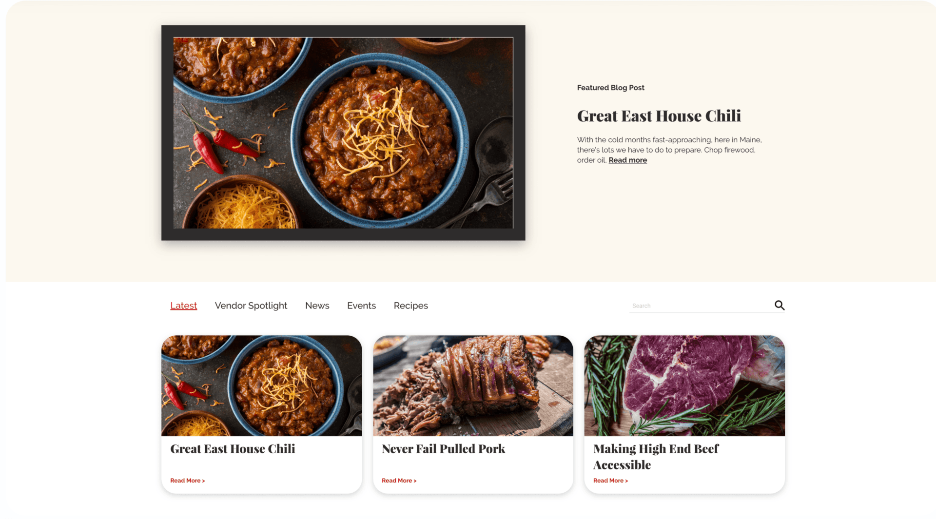
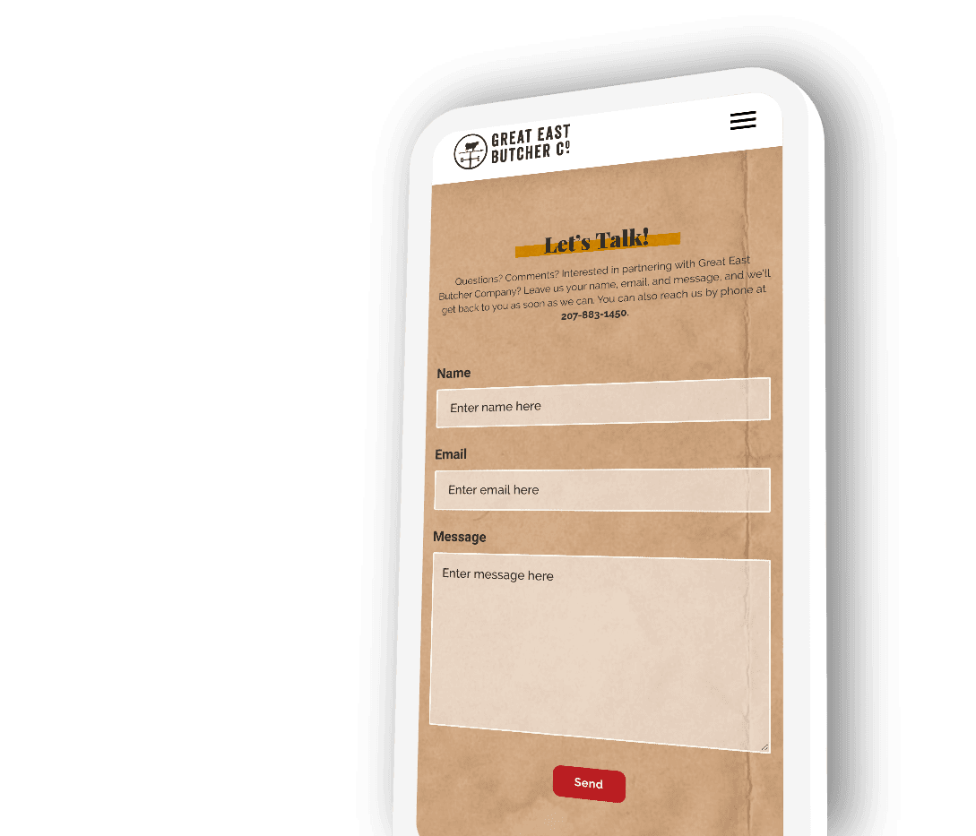
We pulled in classic butcher design elements where we could – you’ll see hand-drawn illustrations of cuts of meat, butcher paper backgrounds, and beautiful, vivid food imagery that draws the eye and sets a high standard for Great East’s products.

voice of your brand.

