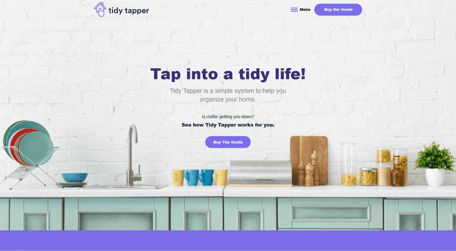

As always, we kicked the branding portion of this project off with a Discovery process that involved showing our client different imagery, typography, color palettes, and logo styles in order to get a sense of their aesthetic preferences. Bettina was really drawn to bright, clear imagery and pop colors.
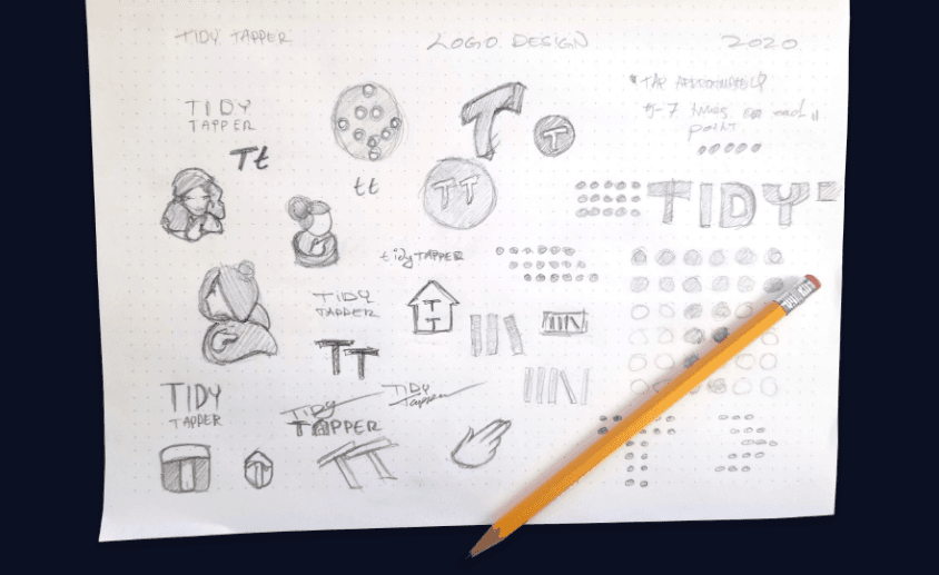
Once we got a clear sense of what Tidy Tapper was drawn to visually, we started the logo creation process. This always starts the old-fashioned way: by putting pencil to paper. Once logos have been digitized in Adobe Illustrator, the team picks three finalists to present. We want to make sure the three options are incredibly diverse, giving the client three different directions they could pursue.
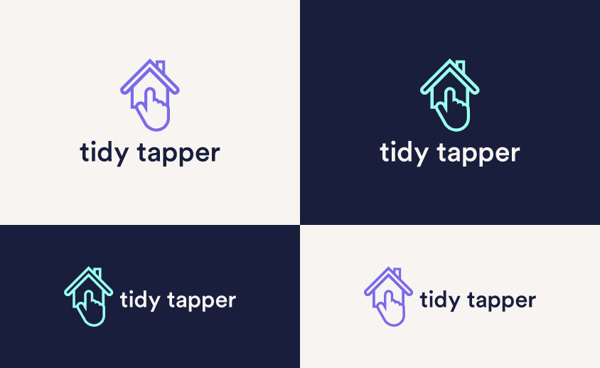
Bettina was drawn to the house icon with the pointed finger, which combined her two methods of organization – decluttering and tapping. We finalized the mark with a few small tweaks, like adding a chimney to the house icon, and then incorporated the color palette to the logo for the finished product.
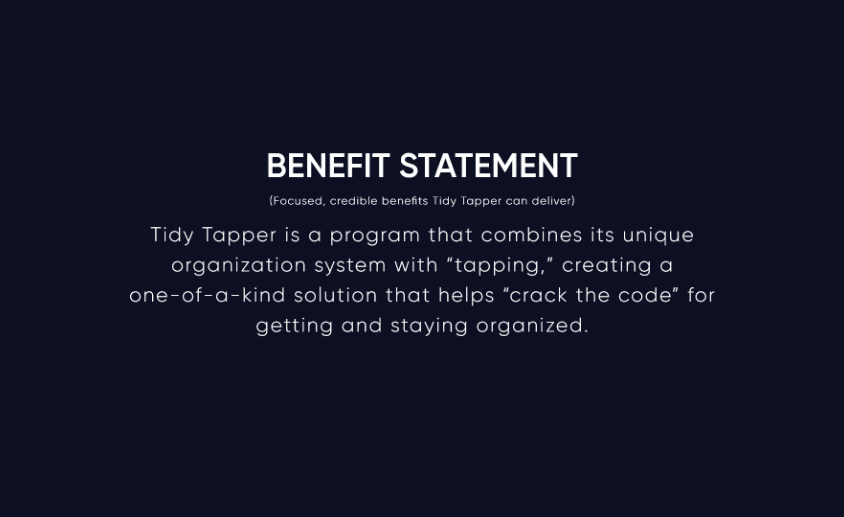
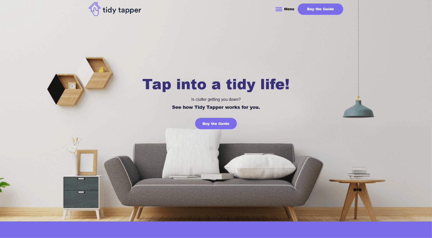
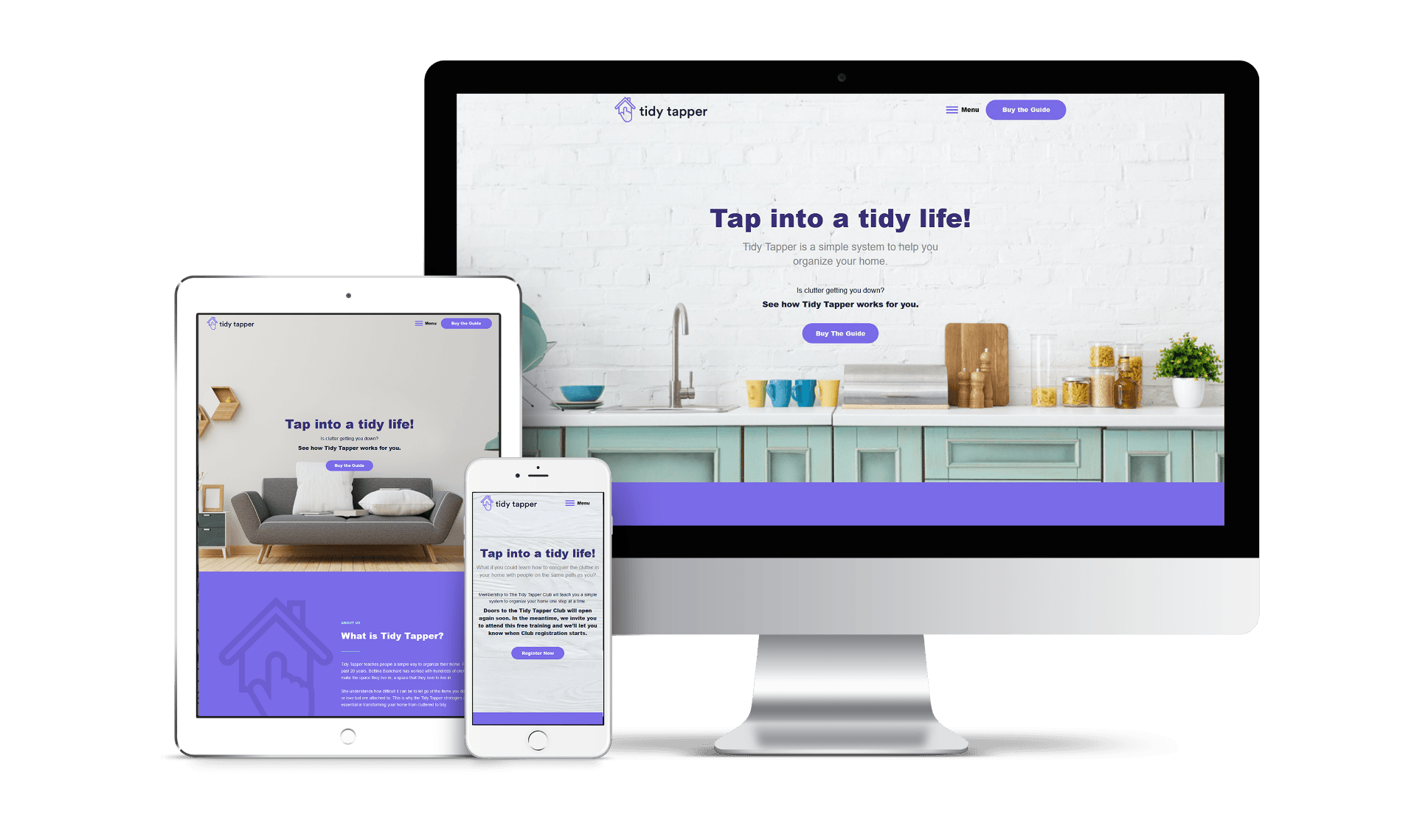
Another important part of the branding process was the messaging framework. We always start this process by identifying the client’s Key Features, or the things that set them apart and make them unique. From there, we take those Key Features and boil them down further into a Benefit Statement – a 1-2 sentence description of the benefits they provide to their customers. Next, we create a Value Proposition, which is often used as the company’s tagline. Bettina chose the “Tap into a Tidy Life!”
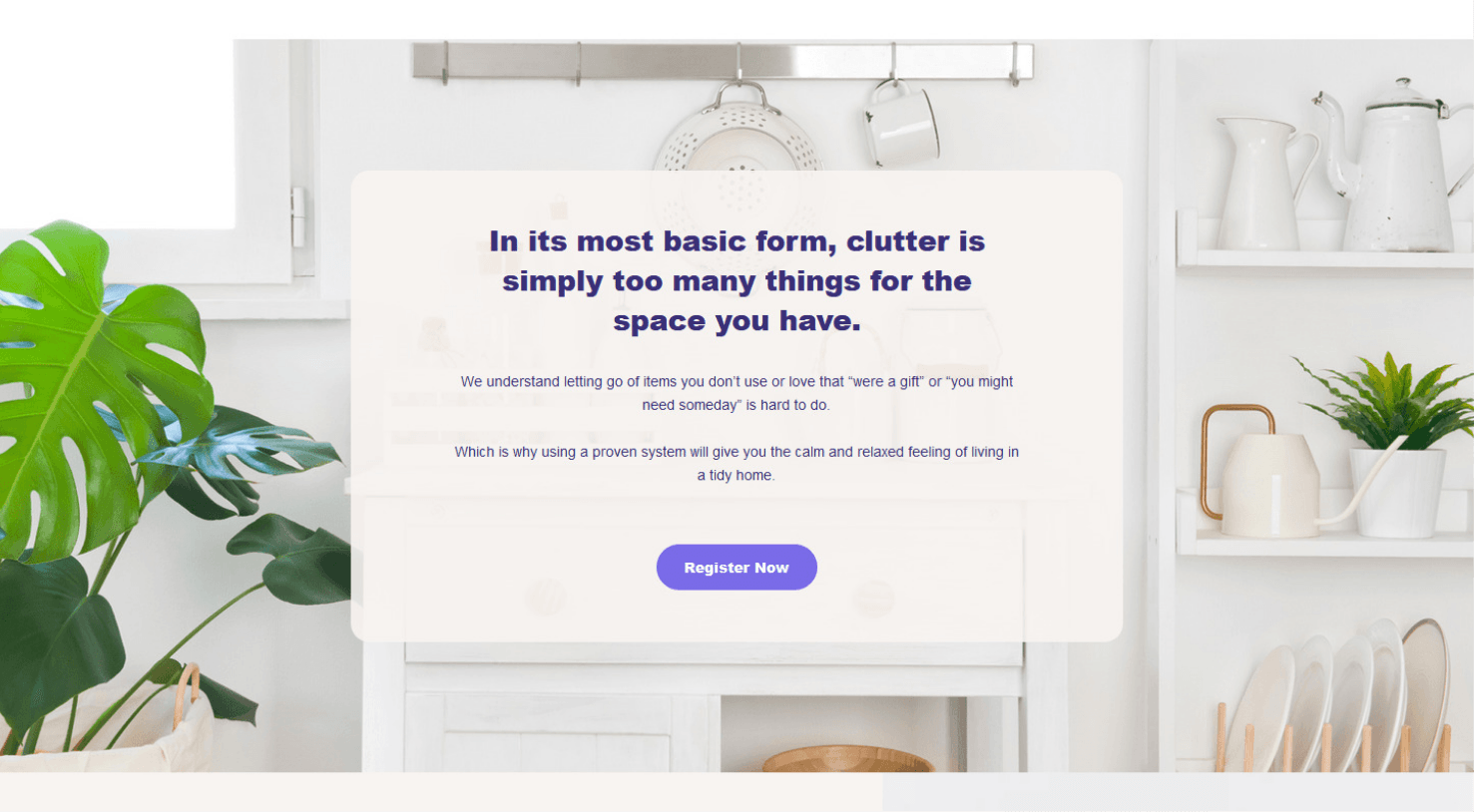
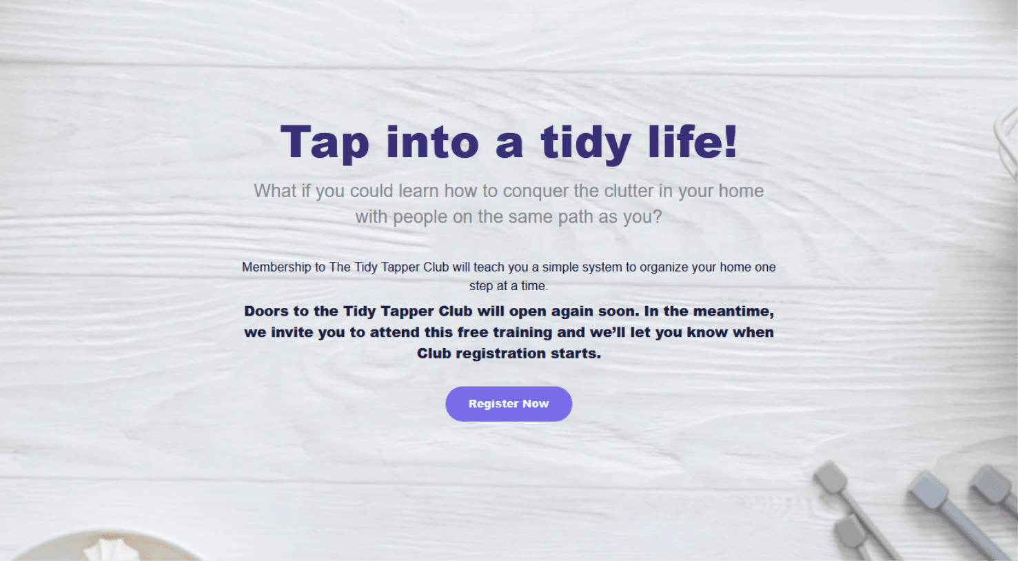
Once logo, messaging, and other branding elements are finalized, we put it all together in a branding guide, which Tidy Tapper can use as a resource as they continue to expand and create assets. A branding guideline includes the brand’s typography, color palette, messaging, logo, and guidelines on how to best use these assets.

voice of your brand.

