Apprisen • Nonprofit
Committed to Your Financial Well-Being
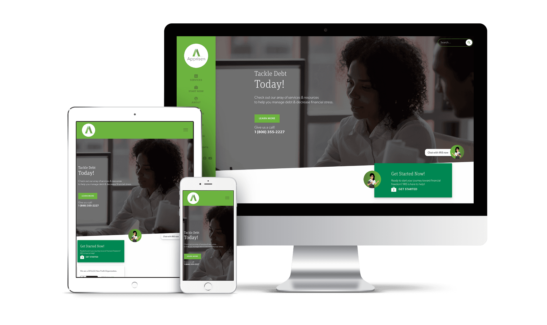
Apprisen is a nonprofit that helps people tackle their debt and forge a path to financial freedom. In order to make their services more accessible, they needed a new, modern website and web application.
Web Design
• 
Copywriting
• 
Software Development
• 
Branding
HERE’S THE LOWDOWN
Apprisen is a unique nonprofit organization that uses financial education, financial coaching, community outreach, and counseling to help individuals tackle their debt and achieve financial health and freedom. When we first met Apprisen, they were dealing with an outdated website with a confusing user experience and a design that didn’t accommodate all their impressive content and resources. They were also looking to create a web application that would analyze users' financial circumstances and send them a tailored plan that would get them started on their journey to financial health.
The Creative Consultation

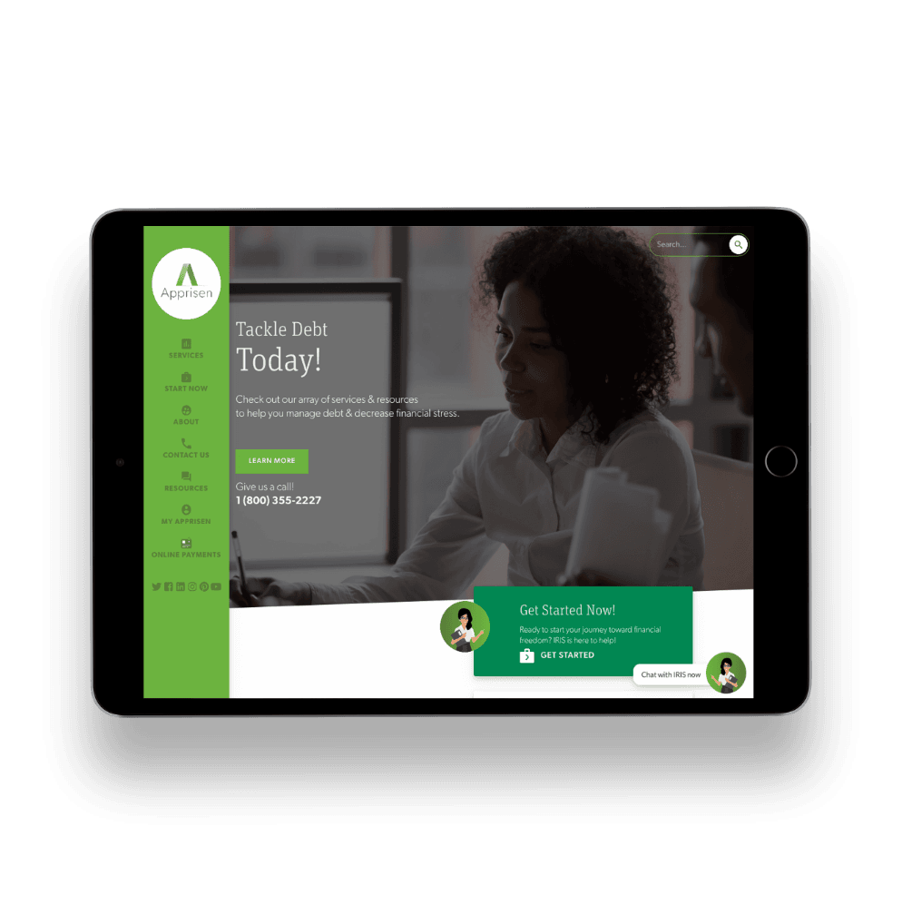
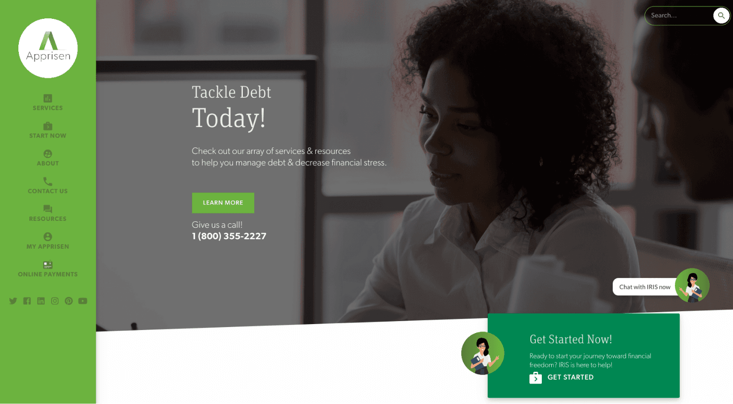
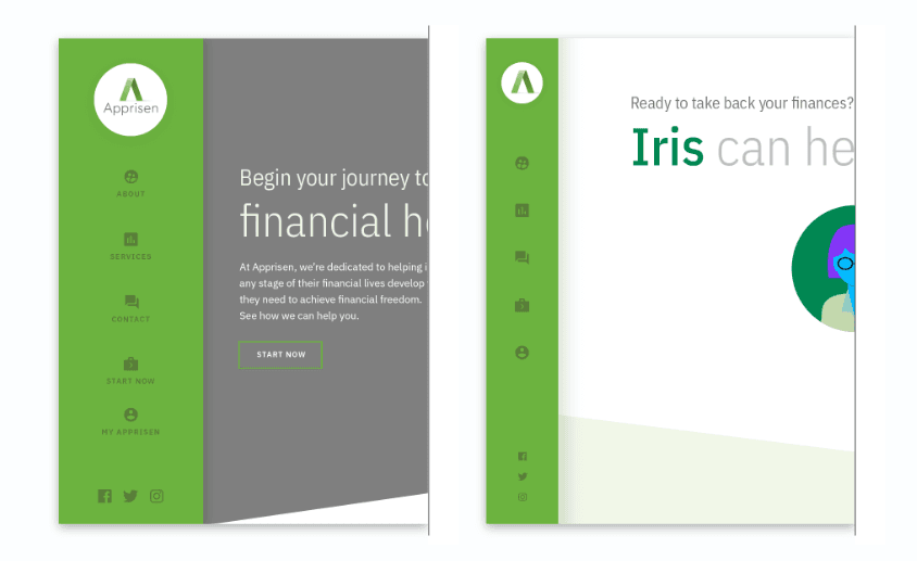
Apprisen came to us with an already established brand and logo, so during our Creative Consultation meeting, we focused on the general aesthetics of the key elements of the site, like the navigation, typography, image treatment, banners, and the footer. We use a Creative Consultation to gauge the clients visual preferences before we start designing.
Building an On-Site Assistant

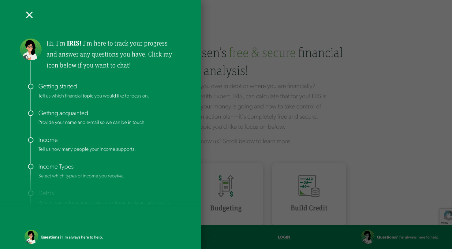
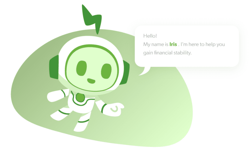
Another aspect of the site we had to think about was creating an avatar. Apprisen came to us with the idea of a virtual assistant avatar named Iris that would guide users through Apprisen’s sign-up process and would remain fixed on the screen as a chatbot throughout the site. Our design team created some iterations and also searched Shutterstock for some premade options.

Meet Iris

We presented Apprisen with a few different iterations of Iris before they settled on their favorite concept — a friendly, professional looking woman who came with a pre-designed package of accessories and positions so that she could have a more dynamic presence on the site.
Find Your Financial Help
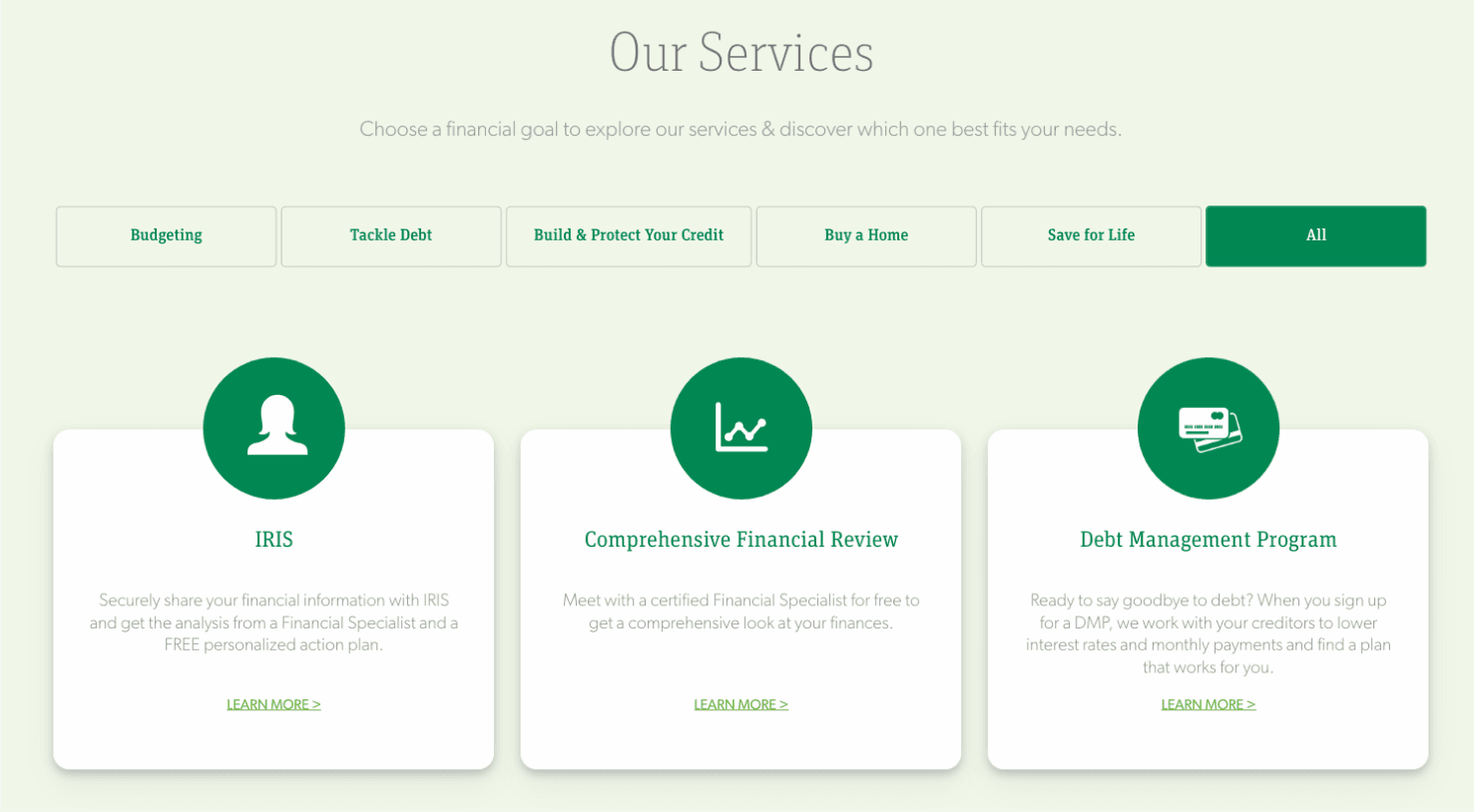
The meat of Apprisen’s site belongs in each of their service pages. We created a Services page with a clean, organized grid that users can filter depending on what type of financial help they’re looking for. When you click into a particular service, it takes you to a dedicated interior page that gives you all the information you need to get started with that program or service.
A Library of Evergreen Resources
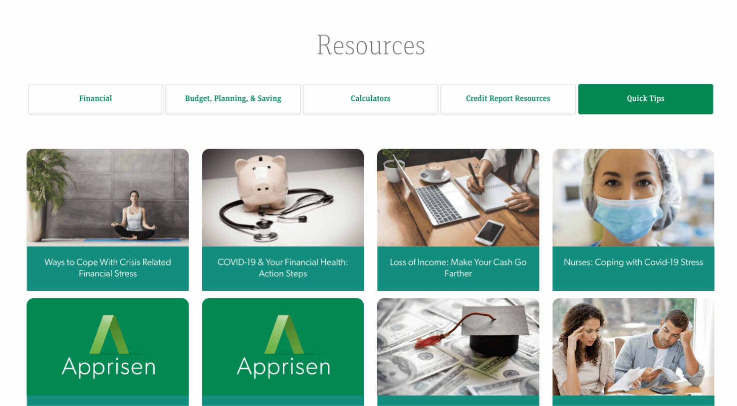
For those already enrolled in a service, or those who aren’t yet ready to enroll, Apprisen offers a robust library of free resources that include forms, worksheets, financial calculators, and a blog dedicated to all topics financial. These evergreen resources keep users coming back to the site, even after they have completed Apprisen’s programs.
Building Their App
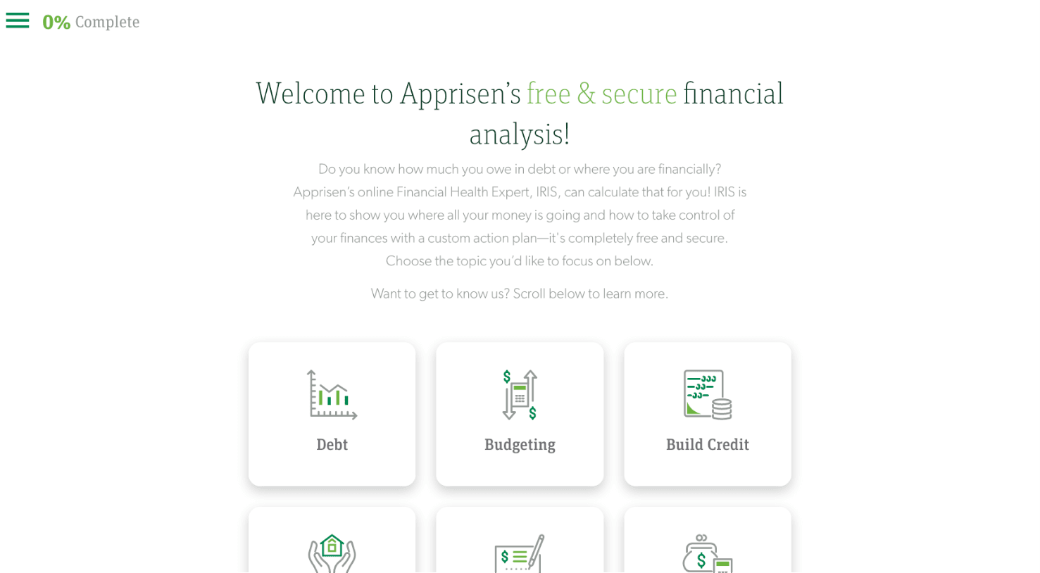
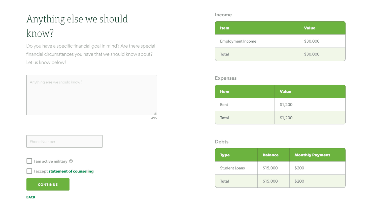
The most important call to action on the site is to get users to sign up for Apprisen’s free and secure financial analysis. This is a web application we designed and built that takes users through a step-by-step analysis of their circumstances so that Apprisen can create a customized action plan to help tackle each user’s financial issues.
Clarity at Every Step
Our design and copywriting team focused specifically on creating a highly intuitive user experience and using straight-forward, conversational language that would make each step as clear and coherent as possible. Iris stays fixed at the bottom of the screen, available to chat with anyone who has questions.
An App for Two Audiences
We then created a modified version of the web app to specifically accommodate Apprisen’s Bankruptcy Counseling session, which is a mandated program for anyone declaring bankruptcy. While the Bankruptcy app is similar to the Financial Analysis app, it required some extra elements, like the functionality to pay the standard counseling fee, built-in explainer videos, and a more robust sign-up form.
Let's work together to bring your vision to life.
PROJECT TEAM
Orion Alden
CREATIVE DIRECTOR
Hunter McPeak
DESIGNER
Maggie Nugent
Content Director
Jennifer Chew
PROJECT MANAGER
Ben Blodgett
Technical Lead
Alex Brown
Developer
Steve Stromick
Developer
Meet Side•Sea
side•sea redesigned our website & the team couldn't be happier with the results. They designed it according to all the goals we had: Clean Design, User-Friendly, Mobile-Friendly, Clear CTAs, and Clean Text/Copy. We've gotten so many compliments about the newly designed website from our partners and big brands. Further, we saw positive conversion results immediately after the launch. I've never been more proud of being a part of a site redesign, as much as this one. side•sea understood our vision and goals and delivered above and beyond."
Irene Bernhardt
Digital Content Strategist, Apprisen
Explore the Finished Product!
Visit Site
Let’s talk!
See how we can elevate the
voice of your brand.