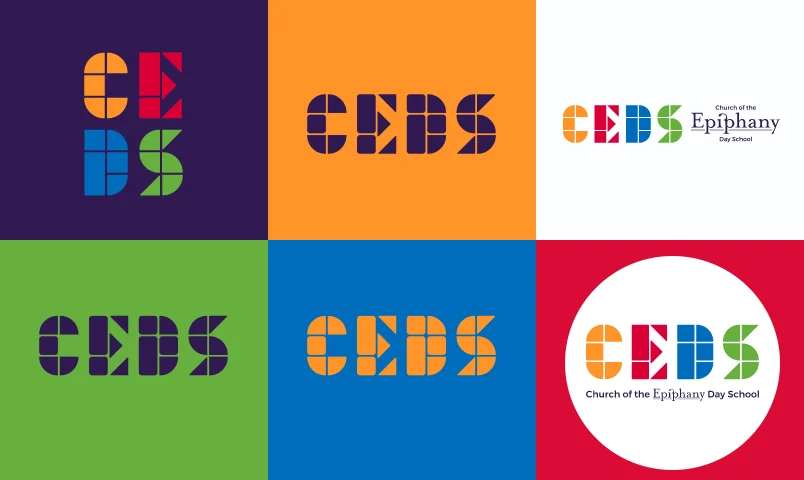
We always present clients with four distinct logo options, giving them a full aesthetic breadth of directions to choose from. We were happy with the option CEDS chose – the letters CEDS created with the building block shapes typically found in classrooms. Paired with the bright color palette, the logo is both educational and playful.
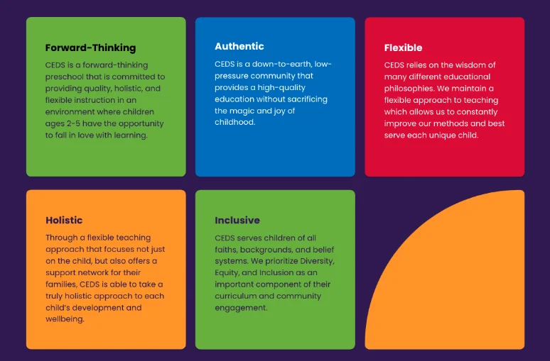
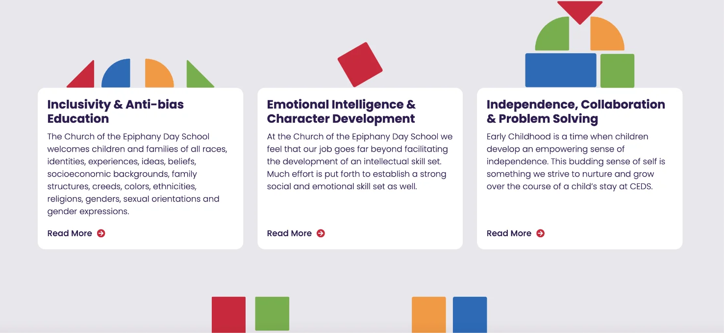
CEDS had done a ton of work establishing a set of values and curriculum that was forward-thinking and progressive. Although they already had an established tagline, our copywriter worked with them on developing a set of Key Features – five things that truly set CEDS apart from their competitors. Establishing these pillars helps inform the messaging throughout the site.
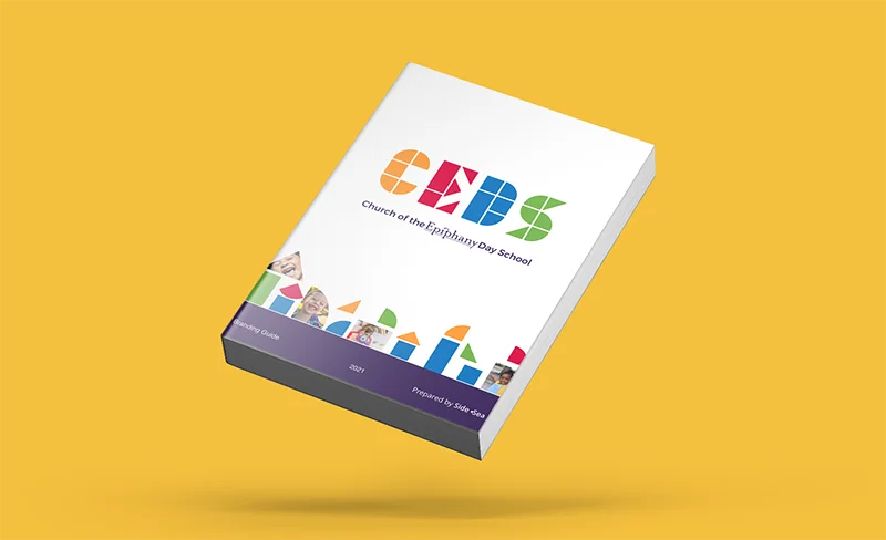
At the end of the branding phase of the project, we sent CEDS their final brand guide – a 14 page document that acts as a reference for all things branding. It holds their color palette, logos for several different use cases, typography, messaging, and more.
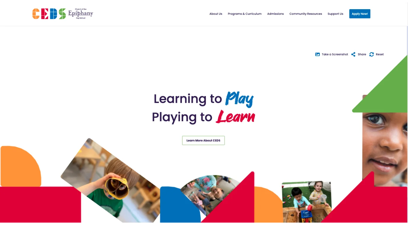
voice of your brand.

