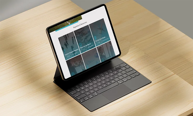
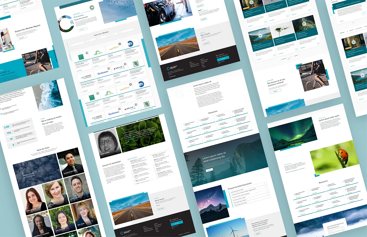
The design for this site focuses on using asymmetric design principles and utilizing negative space to its full potential, creating a light and airy feel. Additionally, they created a gallery of images that spoke to TCR’s brand, rich in color, showcasing the beauty and wonder of the natural world and featuring images of solar and wind energy.

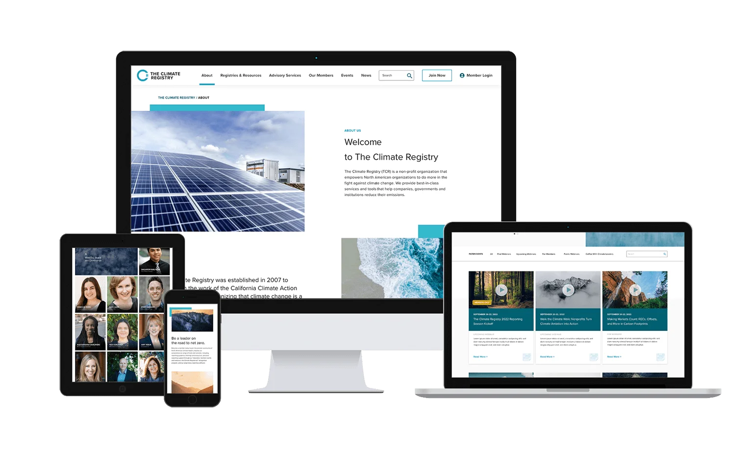
With recent studies showing that 60% of site traffic comes from mobile devices, creating a responsive website that can adjust to various devices was imperative. The Climate Registry had lots of content that needed to be digestible, including registries and resources. Our new design creates a pleasant user experience by presenting content in an easy-to-understand format.

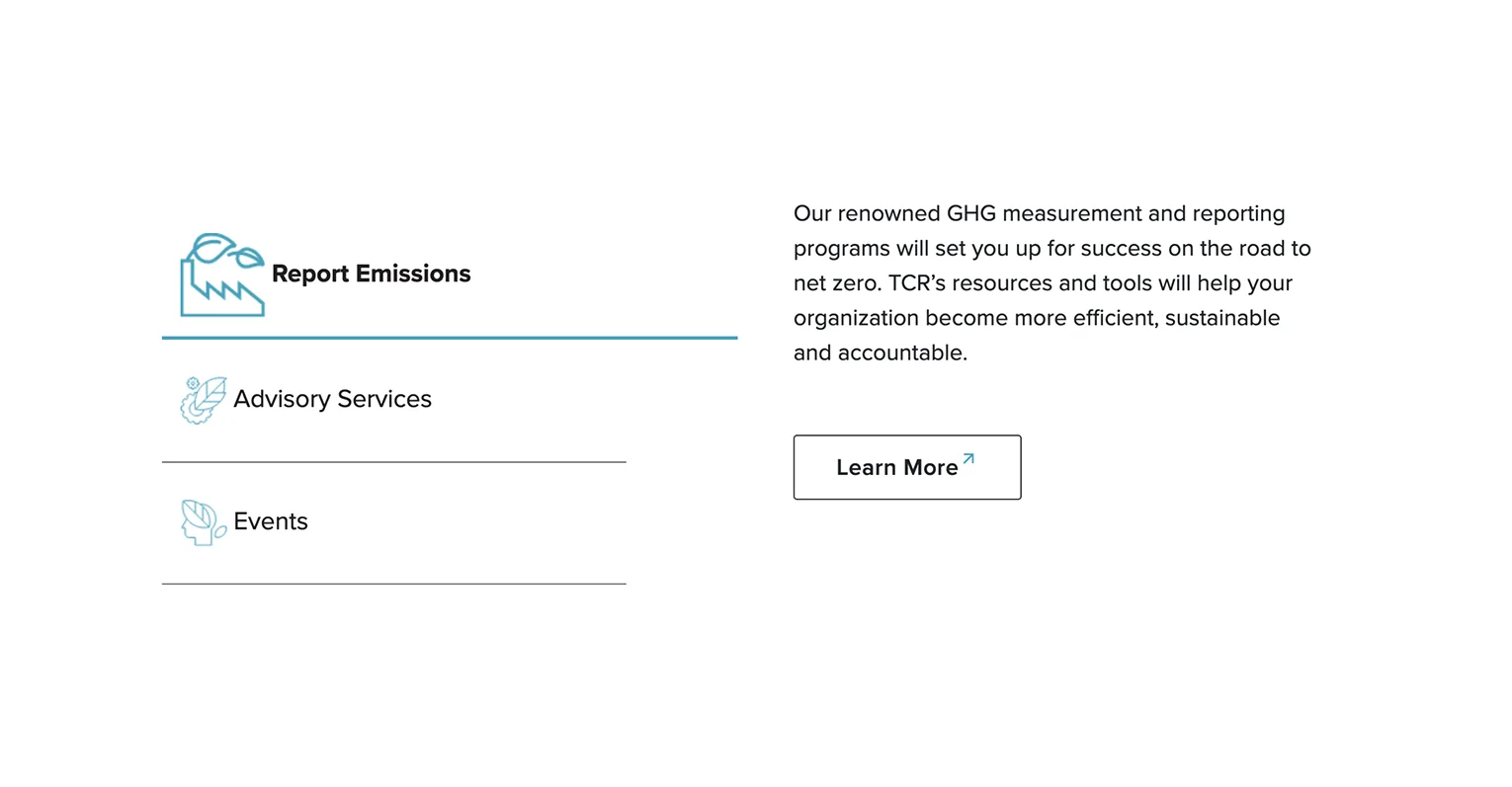
Icons are a great way to demonstrate a literal, visual representation of the thing it represents. With The Climate Registry’s text-heavy site, we needed to make it more visually appealing. The design team curated a collection of icons with the same style to represent the resources and services The Climate Registry provides.
voice of your brand.
