Main + Tenacious
You Got This
Main + Tenacious is a community that helps homeowners overcome any and all hiccups to home maintenance so that they can fully enjoy and relax in their home. They needed help crafting a brand that resonates with their audience and bringing their beloved mascot to life.
Branding
• 
Logo Design
HERE’S THE LOWDOWN
Main + Tenacious helps you fit home maintenance into your life by combining instructions, scheduling, assessing, budgeting, support and shopping lists in one place with actual maintenance professionals. Looking to amplify their reach and highlight their comprehensive services, Main + Tenacious wanted to create a refreshed brand identity and revitalize their Honey Badger mascot.
Logo Redesign

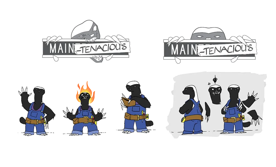
The client came to us with an existing mascot and it was very important to them that the new branding prominently showcased the Main + Tenacious Honey Badger.

Sketches and Rough Ideas

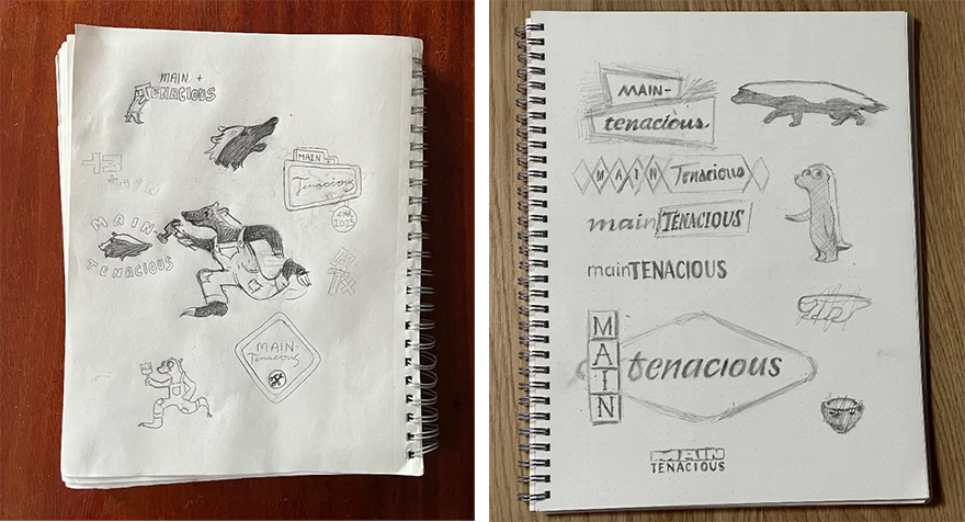
Kicking off the first stage of logo exploration with pencil and paper, the team came together and sketched out some rough ideas of both the logo and the honey badger to provide a tangible starting point for our creative direction.

Choosing the Logo

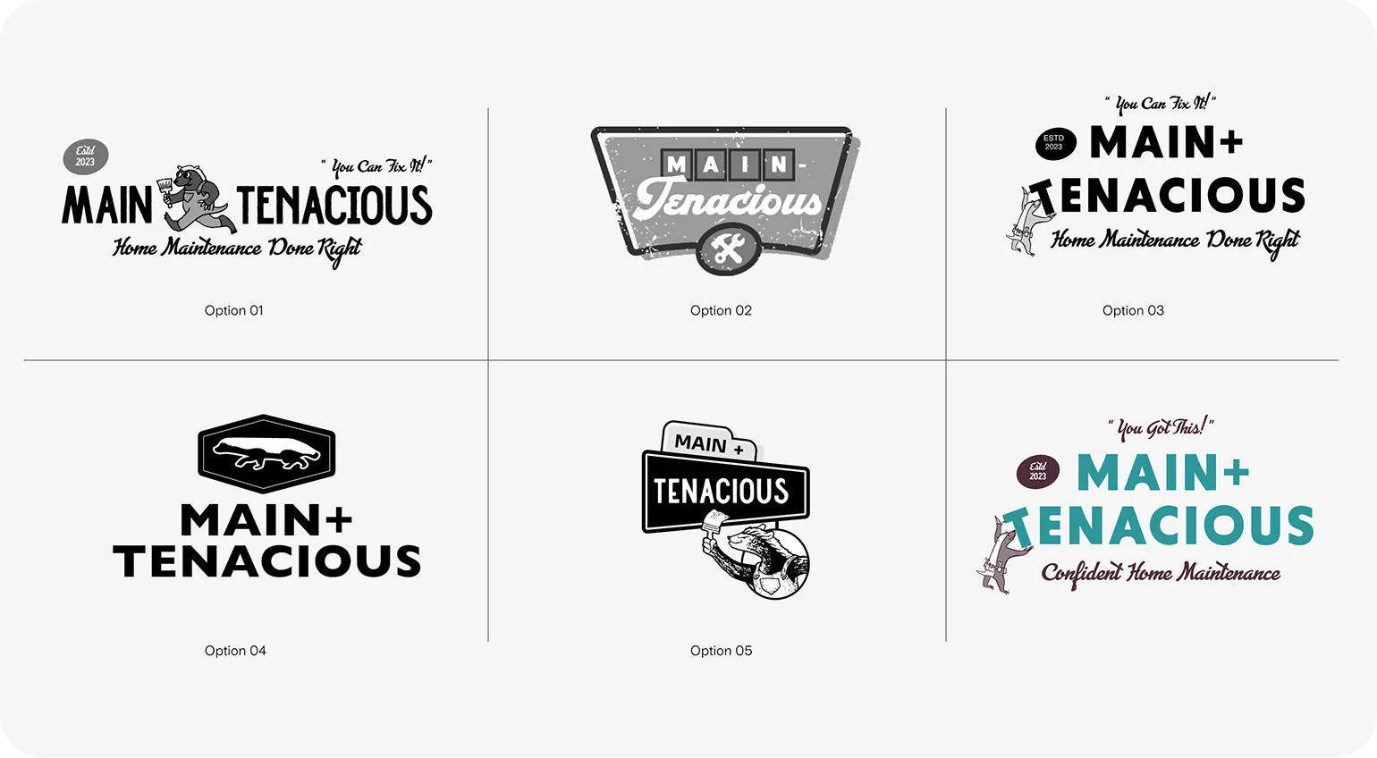
Following several rounds of logo design and collaboration, the client selected Option 03 and the design team was able to get started on the exciting phase of constructing the comprehensive brand system.

Real World Application

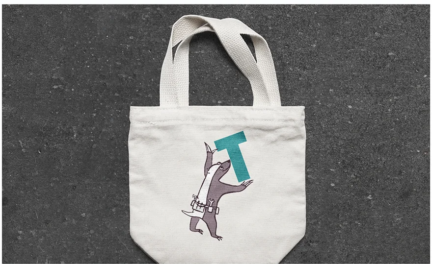
Beyond the realm of design, we also explore how specific components of the logo and the comprehensive system manifest in real-world applications, like on merchandise and business cards to ensure a seamless transition from digital to physical.

Bringing the Honey Badger to Life

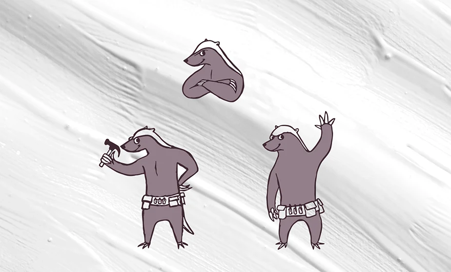
To really bring the Honey Badger mascot to life, we crafted a collection of additional poses. These animated poses help infuse personality and vibrancy into the mascot’s character.

Color Palette Experimentation

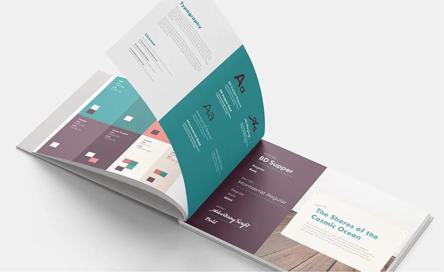
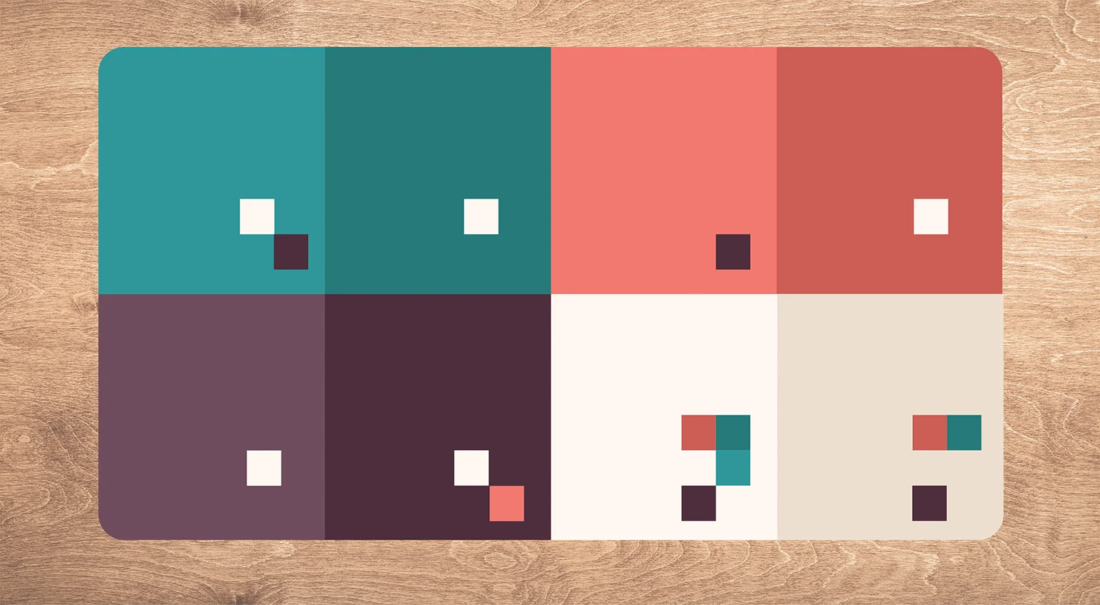
With the logo selection process behind us and design revisions completed, we dove into color palette experimentation. This phase allows us to observe the logo’s adaptability within a broader system, embracing elements such as color, imagery, texture, and pattern.

Color Adaptation
One crucial aspect of our logo design process is envisioning its adaptability across a multitude of applications, particularly when color variations are introduced. This process ensures that the logo remains effective and resonates across various use cases.
PROJECT TEAM
Jennifer Chew
PROJECT MANAGER
Orion Alden
CREATIVE DIRECTOR
Maggie Nugent
Content Director
Hunter McPeak
DESIGNER
Elena Ovacharenko
DEVELOPER
Meet Side•Sea
Brand Guide Colors Pass ADA
Our design team worked together to provide clear guidance on color combinations that align with ADA requirements. Incorporating this essential information into the brand guide is pivotal in ensuring that the brand not only looks good but is also accessible and inclusive.
Want to Explore the Finished Product?
Visit Site
Let’s talk!
See how we can elevate the
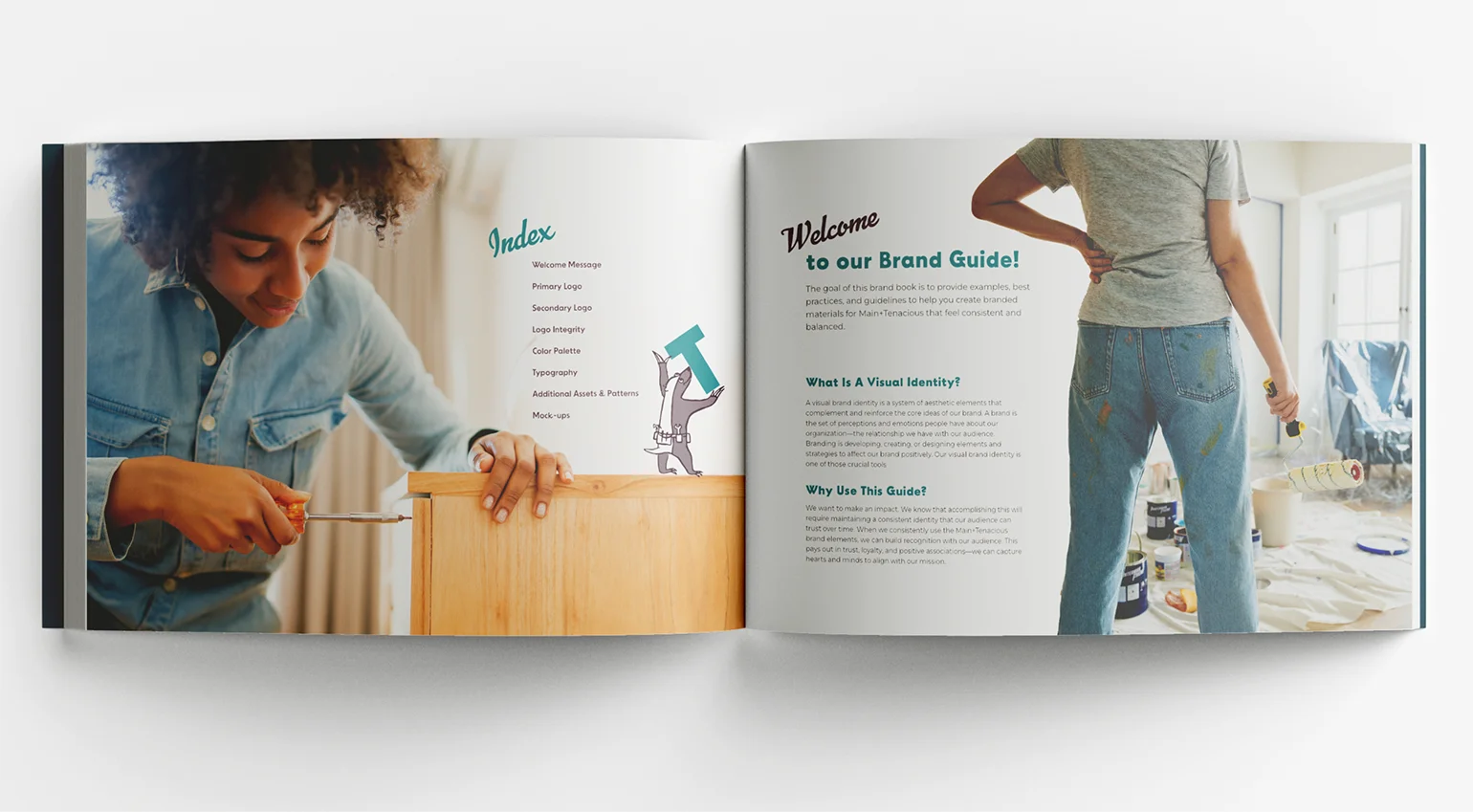
voice of your brand.