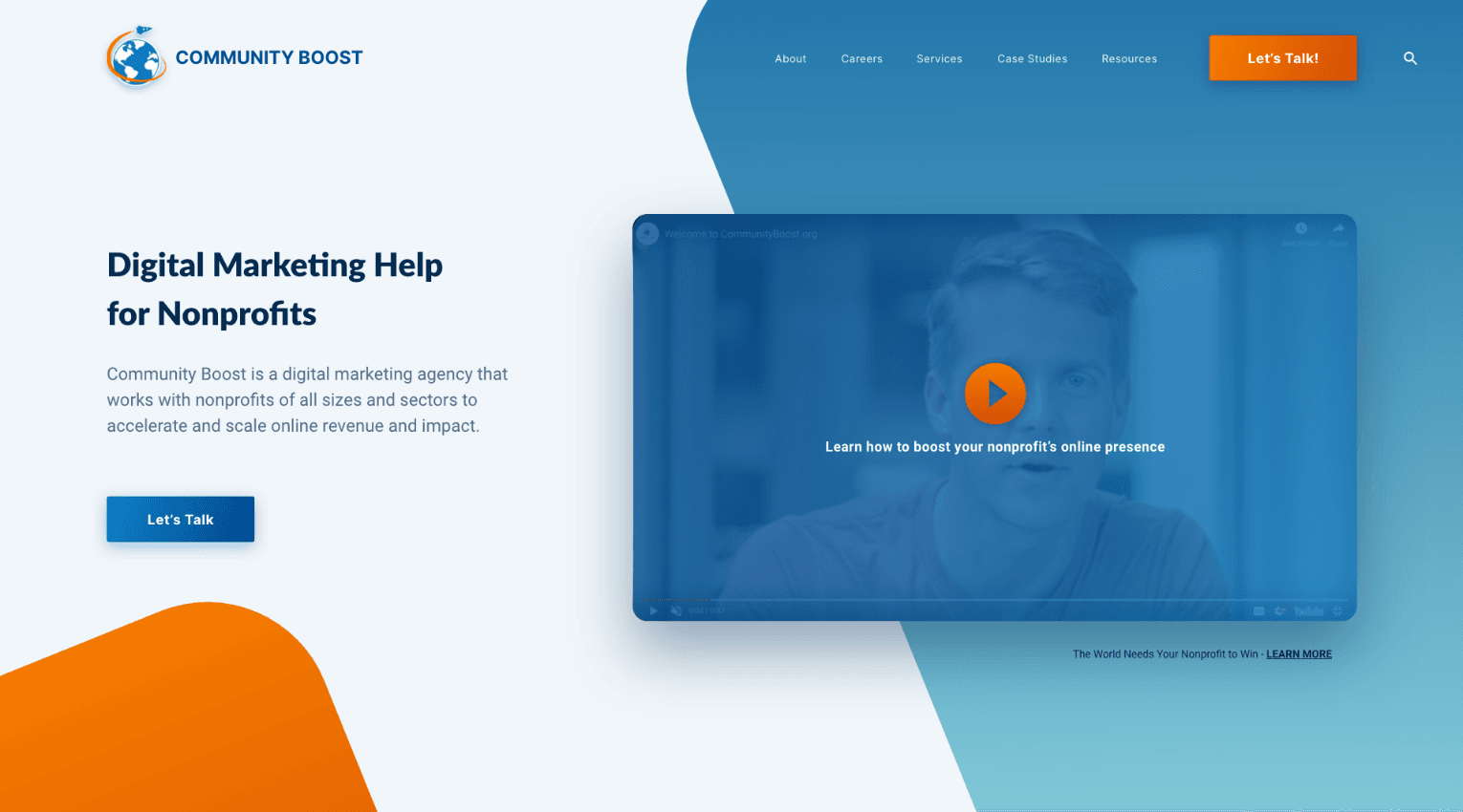
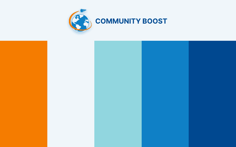
Updating the Color Palette
The original Community Boost brand featured a strong blue and orange as the primary brand colors. We updated these colors by slightly boosting their saturation, making them a little more bold and eye-catching. In color theory, blue represents trust, while a warm color like orange represents positivity and passion. They make a good pair both visually and emotionally.
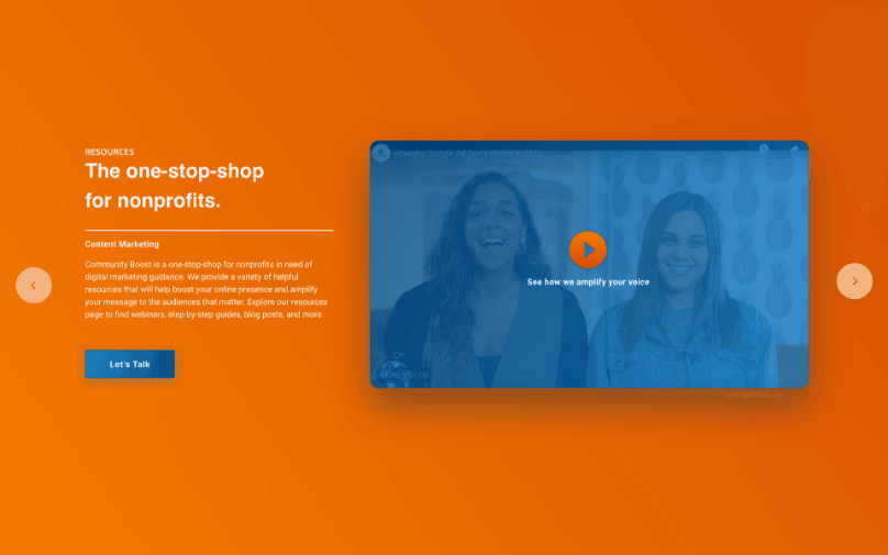
Creating a Lively Canvas
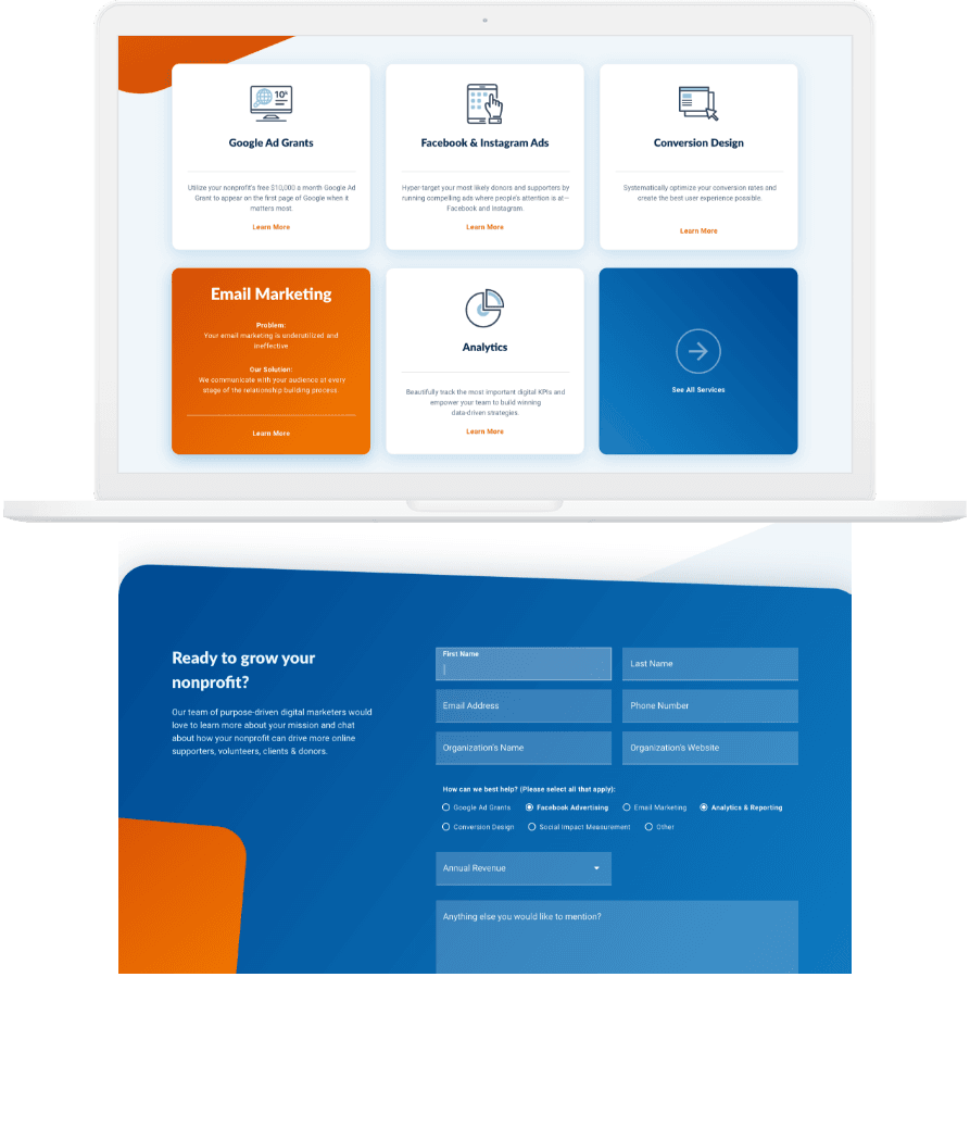
As we started designing the homepage of the site, we played around with creating a variety of subtle gradients with our new and improved color palette to represent the many facets of Community Boost. We used these gradients of color to create subtle movement and visual harmony that livens up the overall site design.
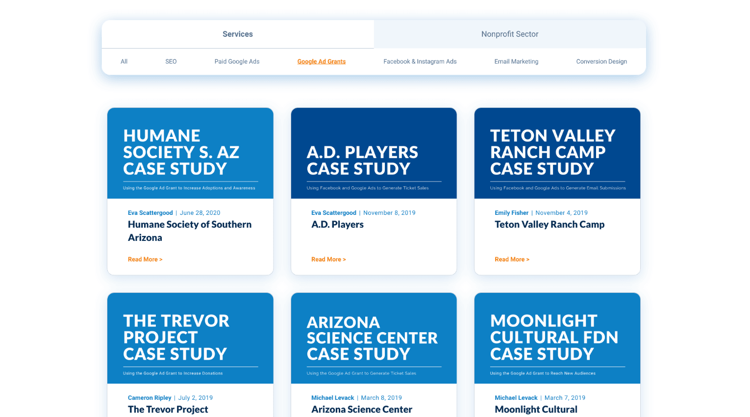
Showcasing Results
Community Boost had a robust library of case studies that they wanted to showcase on their new site, but needed a comprehensive filtering system to make the experience of sorting through the case studies as easy and as straightforward as possible. We ended up creating a two-tier filtering system, in which the user can first filter by general services or non-profit sector services, and then select categories within those two options.
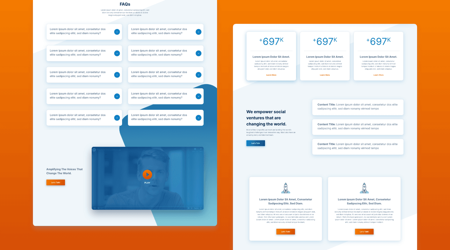
A Robust Flexible Template
With Community Boost’s case studies and services, the site was going to have a lot of interior pages. Instead of creating a unique page for each, we created what we call a “flexible interior,” or a template page that contains all the page sections and design elements needed to create a service single page or a case study. The client can easily mix and match these templated sections to build a page that best fits their content.
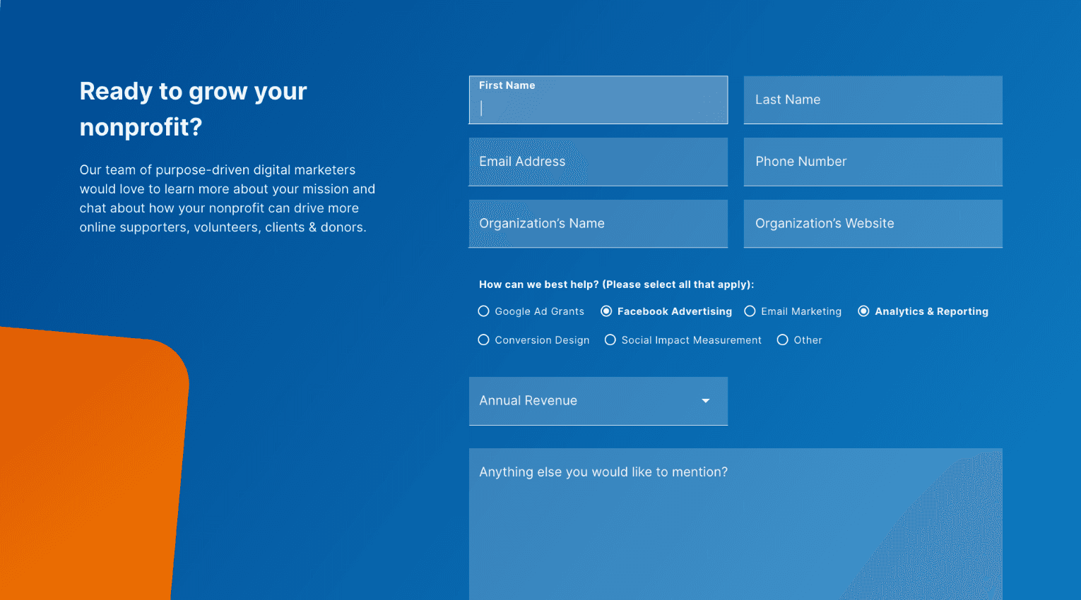
A Contact Form that Converts
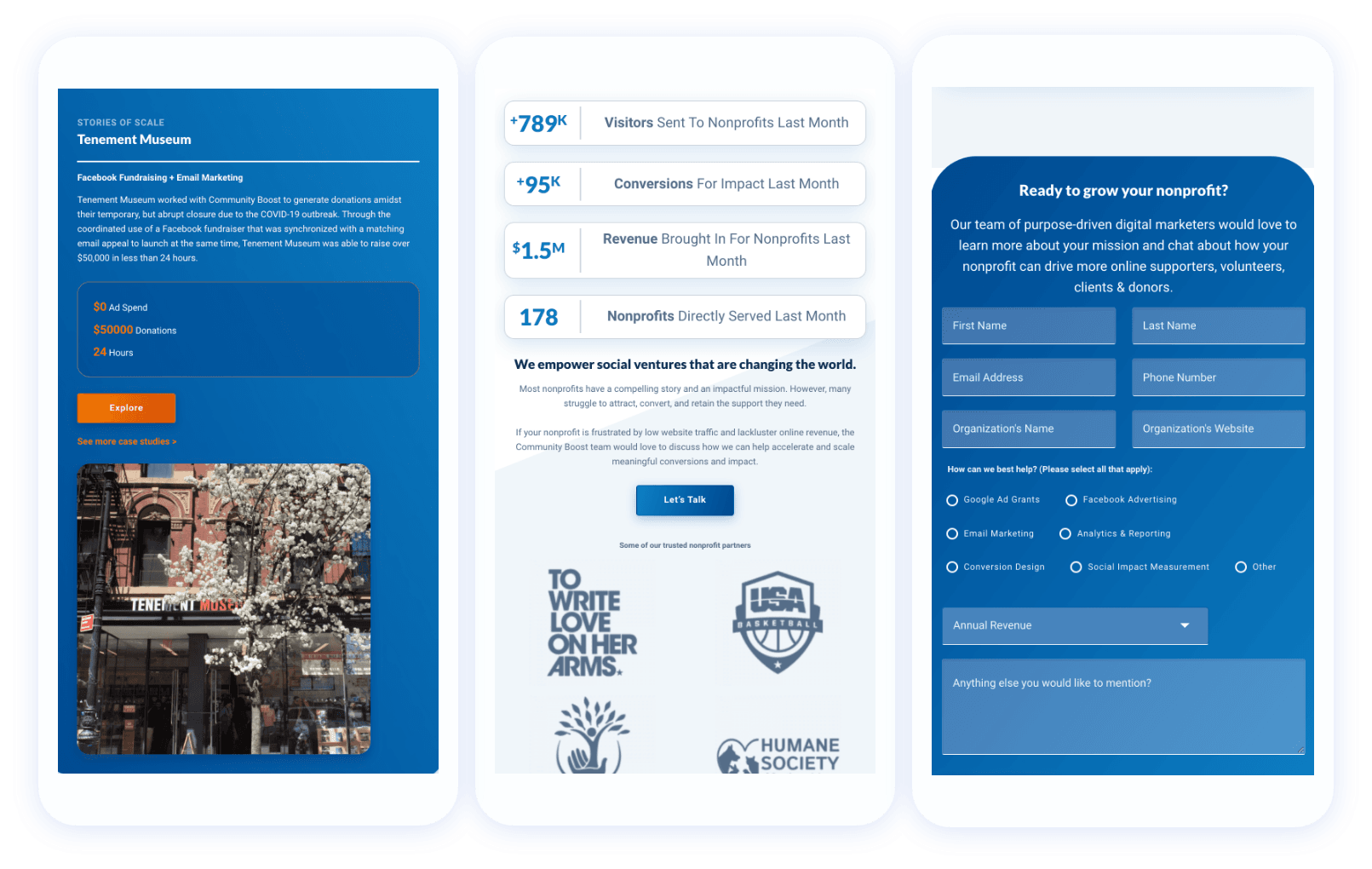
Community Boost’s most important call to action is to get in touch with them via their site’s contact form. In order to better streamline the contact process, we created a robust form that asks the user to fill out information about their organization and what type of help they’re looking for. This allows Community Boost to immediately get a sense of what their potential client is looking for.
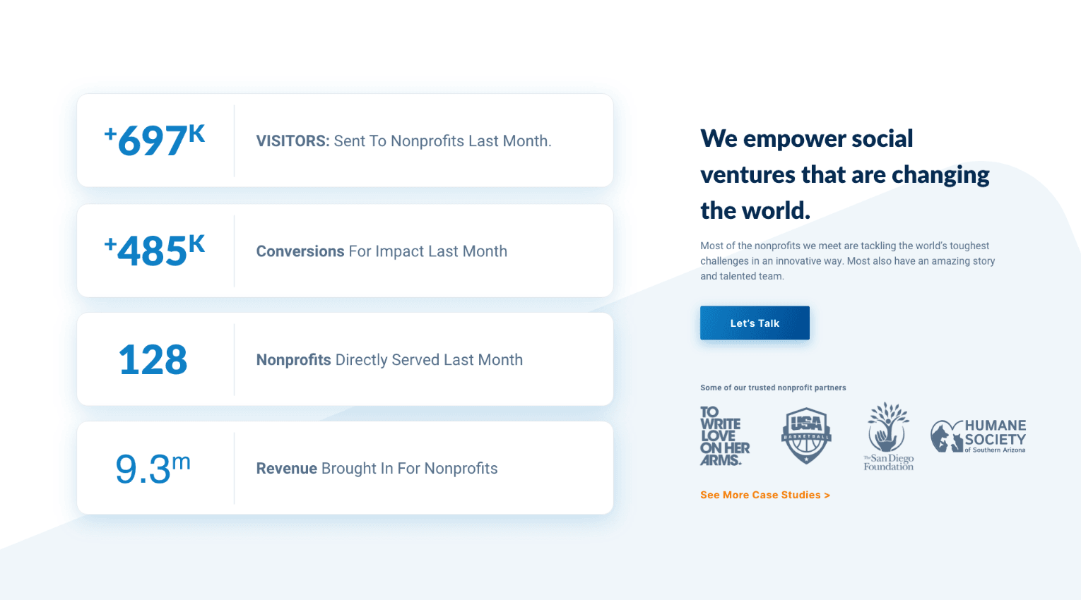
Making an Impact
Community Boost boasts some impressive numbers related to the impact they’ve made in helping nonprofits amplify their work. To highlight these numbers, we employed animated counters throughout the site in which their impact numbers tick upwards, drawing the users eye and attention to Community Boost’s results.
Let's work together to bring your vision to life.
PROJECT TEAM
Orion Alden
CREATIVE DIRECTOR
Hunter McPeak
DESIGNER
Maggie Nugent
Content Director
Jennifer Chew
PROJECT MANAGER
Alex Brown
Developer

Community Boost is more than your standard company website. It also acts as an incredibly robust and valuable library of resources for nonprofits. When you’re dealing with an audience that’s already feeling a bit left behind in the digital age, the last thing you want is to make them feel overwhelmed on a website where they’re looking for help. That meant that information architecture and user experience were paramount in this project. We took great care in thinking through every aspect of the sitemap and user experience to ensure it was intuitive and cohesive.
Jennifer Chew
Project Manager, side • sea
Explore What Community Boost Can Do!
Visit Site
Let’s talk!
See how we can elevate the
voice of your brand.
voice of your brand.
