

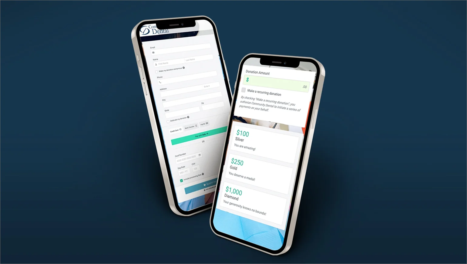
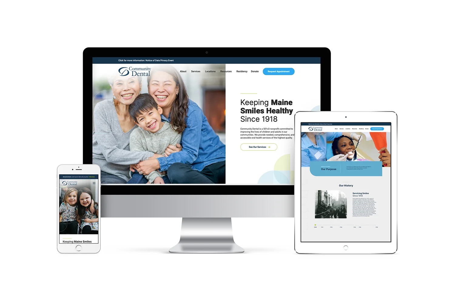
The client wanted to keep their existing logo but still wanted a brand refresh to look clean and sophisticated. We created a new color palette for them to use that is full of blues, green, and white. Blues have been shown to have a calming effect and are frequently used for organizations in the healthcare industry. And the bright green provides an eye-catching pop of color when used successfully.
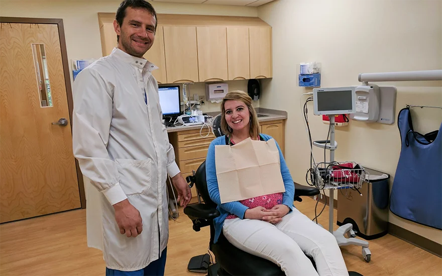
While stock photography is great and we use it a lot, we like to incorporate the client’s content whenever possible. Here you see Dr. Stanilov with one of his patients. We liked this image because it’s not only authentic, but it gives users a taste of what they would experience when they step into a facility.

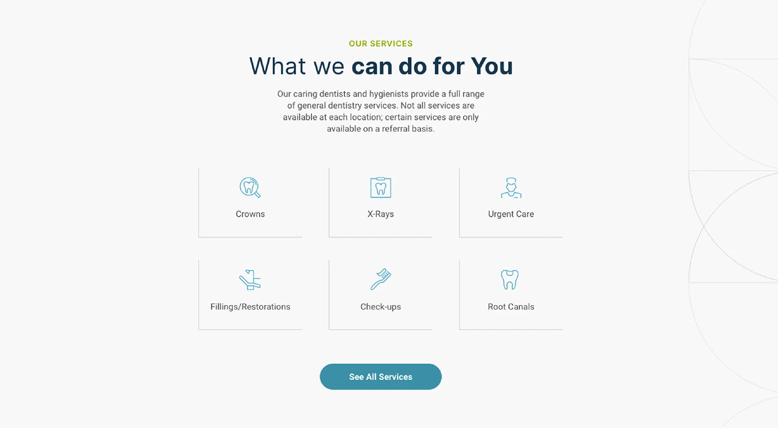
Inspired by their current logo, we played with shapes and colors to create beautiful patterns. These patterns were used in the background throughout their site to add some flair and match their visual identity. We used these shapes and colors throughout the site, but especially on the page that explains their residency program.


voice of your brand.

