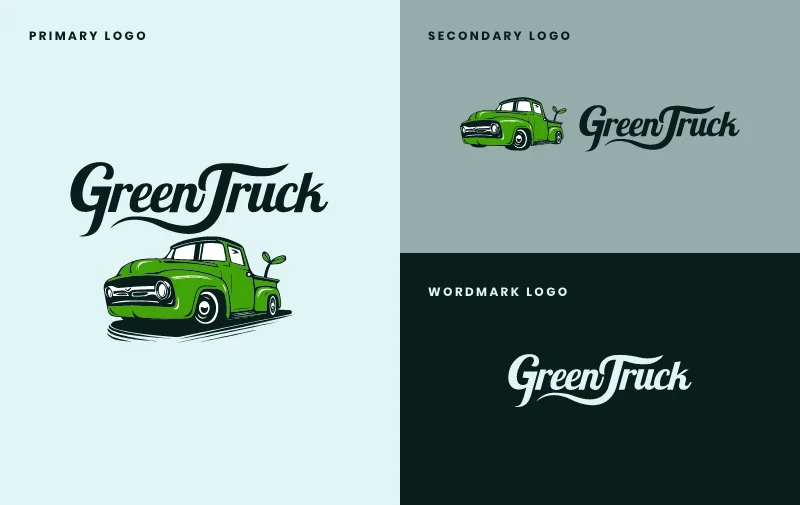
We were all big fans of Green Truck’s logo, but agreed it could use a slight update. Sometimes, even the smallest of tweaks can take logo design to the next level. We cleaned up the lines of the truck and created a smaller version of the logo with less detail so it wouldn’t appear too cluttered at a smaller size.
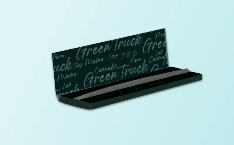
Green Truck liked the idea of branded patterns that represented each vertical of their operation: Farm, Lab, and Shops. Our design team got to work on putting together different icons and pattern designs that Green Truck could use on both their site and other marketing materials to help identify the various services and verticals they offer.
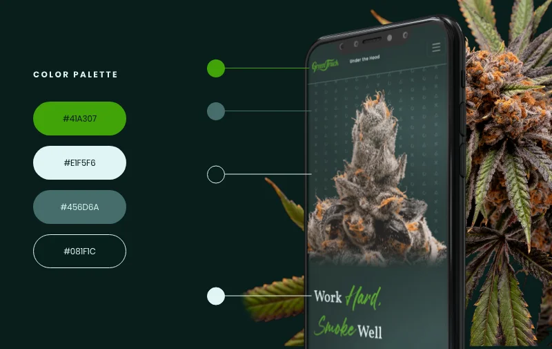
As more and more cannabis companies pop up in Maine, we start to notice popular design trends in the industry. We kept this in mind as we worked on a branding foundation that would differentiate Green Truck from the pack. While lots of cannabis companies rely on bright, clean color palettes, Green Truck wanted a darker, more theatrical and urban feel. Using dark green as our main brand color set the tone and really allowed Green Truck’s impressive imagery to pop on the page.
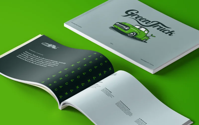
Green Truck’s final brand guideline is a compilation of typography, colors, iconography, and imagery that come together to create a cohesive and memorable brand. Green Truck can use the branding elements we created for them in all their marketing materials and merchandise going forward.



voice of your brand.

