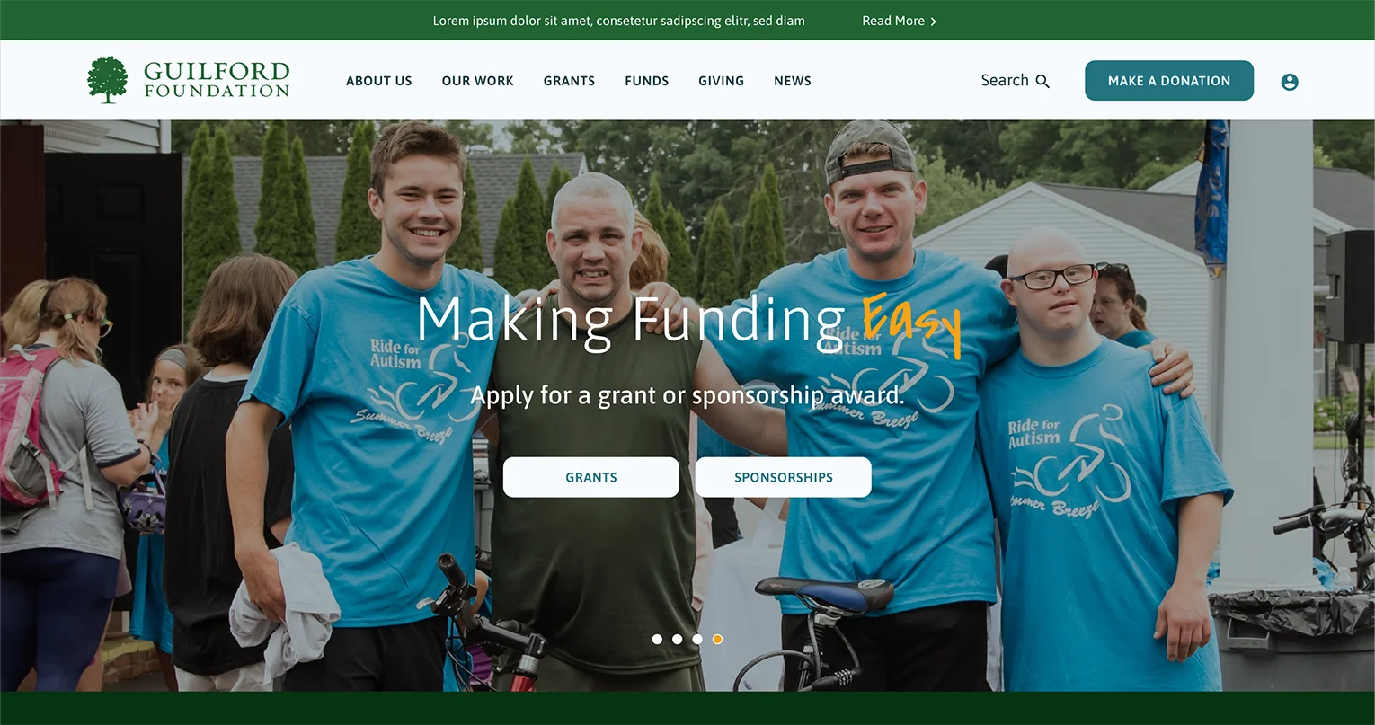
Showcasing an Existing Brand
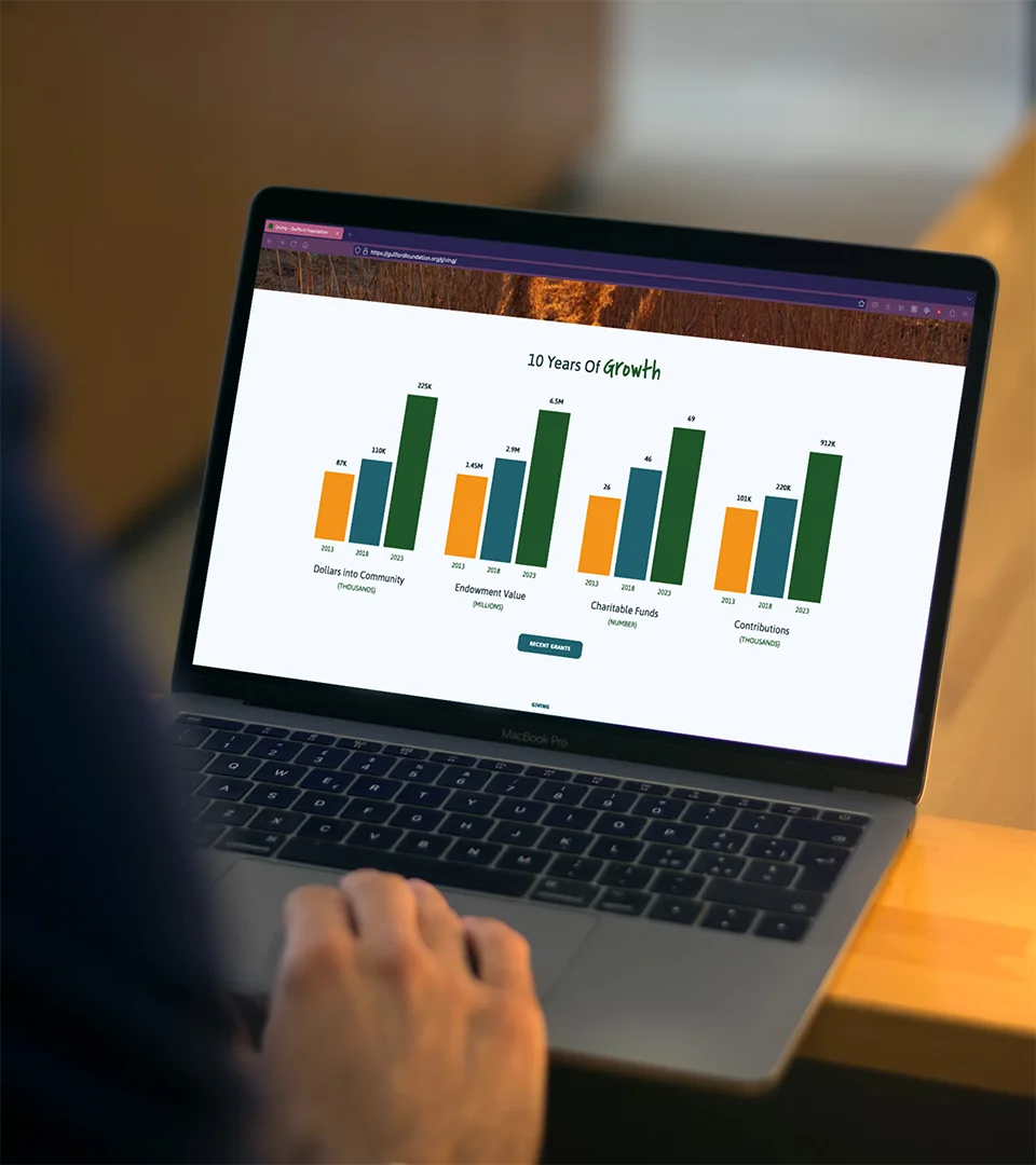
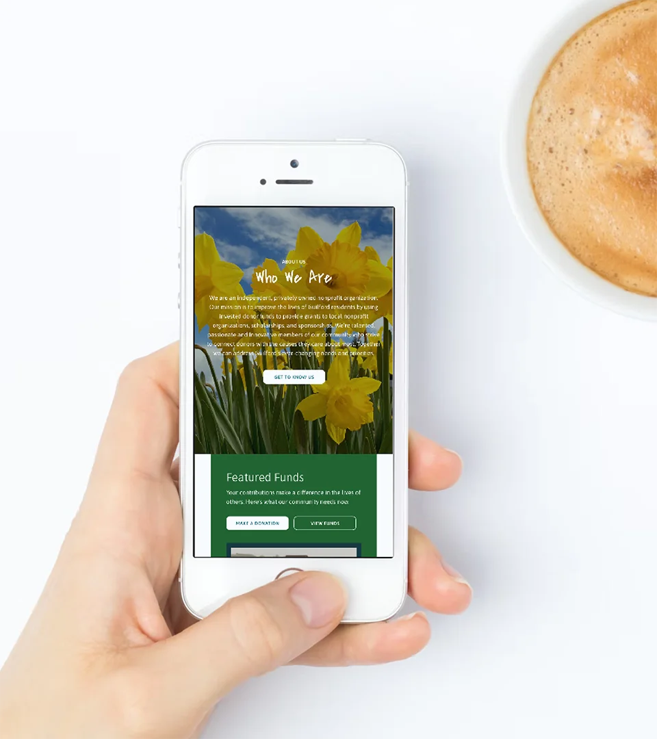
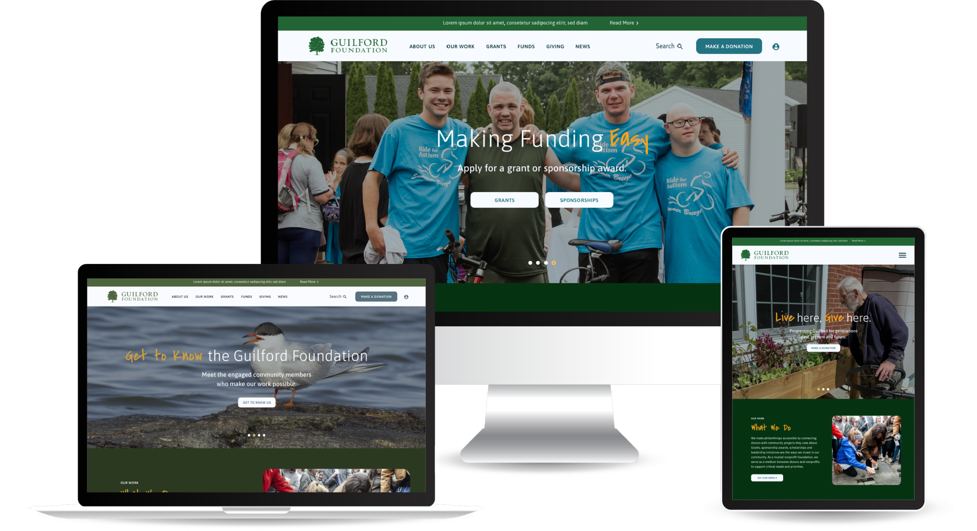
The Guilford Foundation wanted a refreshed visual identity but they wanted to stay true to their existing brand. We utilized their full color palette to cover the site in green, blue, and yellow hues for a cheerful and tranquil aesthetic. Inspired by their current logo, we used rounded corners on various site elements for a soft and welcoming look.
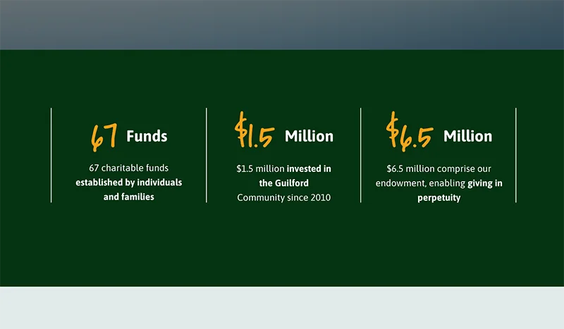
Typographic Mix of Sans Serif and Hand-Written Script
The Guilford logo uses a serif font to convey a traditional look and feel, which is a great choice for this trustworthy, established, and reliable organization. However, the Foundation itself mimics the open and welcoming energy of the town it serves. Utilizing both a sans serif and a handwritten typeface creates juxtaposition to convey both traditional yet approachable aesthetic.
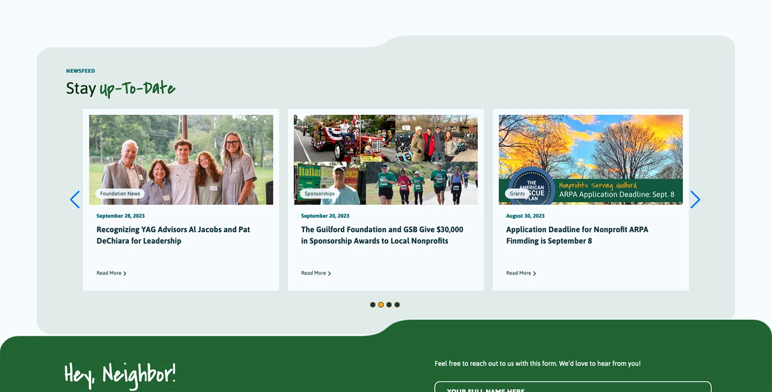
Rounded Corners and Notched Dividers
Rounded corners are psychologically associated with a sense of safety, approachability, and friendliness. They’re used in the logo and we wanted to carry this shape throughout the website. We kept playing and created notched containers that resemble file folders, representing the various projects the Foundation takes on. Plus, these containers draw your attention lower into the page.
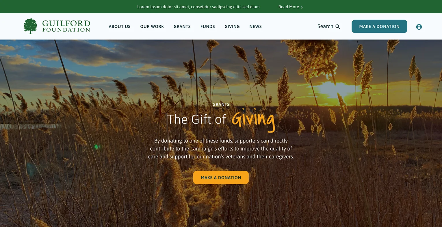
A Photogenic City
It’s important to show why people should care about Guilford as opposed to just telling them. The finishing touch included dramatic and vivid imagery, like this one from their Wildlife refuge in the marshes by the ocean. These pictures depict a quaint and charming town and make it easy for users to see the care the Foundation puts into it.
PROJECT TEAM
Orion Alden
CREATIVE DIRECTOR
Megan Lumenello
Content Director
Anja Sevo
Copywriter
Harry Foster
Marketing Associate
Yoon Kim
Designer
Tyler Moulton
Designer
Megan Mitchell
Senior Web Designer
Sasa Jovanovic
Developer
Tim Hunt
Junior Developer
Zane Griffin
Developer
Eric Fernandez
CTO
Luka Lazovic
QA Software Engineer
Enriching Guilford Now & for Generations to Come
The Guilford Foundation came to us needing a new website that maintains their identity, but gives them a fresh look. They needed streamlined functionality to collect donations for their various funds and an easy way to convey information so grantees know if they qualify for funding. We created a friendly and welcoming aesthetic that conveys the formality and warmth of the Guilford Foundation. With an optimized user experience, The Guilford Foundation can continue their incredible work enriching the lives of those in their community.
Want to Explore the Finished Product?
Visit Site
Let’s talk!
See how we can elevate the
voice of your brand.
voice of your brand.

