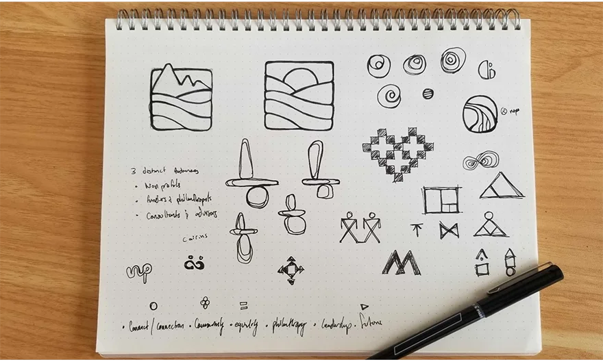
Maine Philanthropy Center • Non-profit
Sketching a Success Story of Rebranding
The Maine Philanthropy Center needed a brand refresh to ensure its standout online presence. At side•sea, we were thrilled to take on this creative challenge. From the first pencil sketches to the final vibrant brand reveal, we crafted a makeover that truly reflects the spirit of MPC's mission.
Branding
• 
Logo Design
• 
Messaging
• 
Web Design
HERE’S THE LOWDOWN
The Maine Philanthropy Center (MPC) is a place where big hearts meet big ideas. This hub connects people and organizations across Maine, all united in their mission to make a difference. With resources, training, and an incredible network, MPC’s generosity helps to transform good intentions into impactful actions. It's more than giving; it's giving smart and making every act of kindness count. Inspired by their story, we embarked on a journey of ultimate rebranding.
The Anatomy of MPC's Brand
Developing the branding book for MPC was like mapping the DNA of its brand identity. The design team explored concepts that were organic and conveyed a sense of community togetherness. This led to playful experiments with abstract shapes, ultimately forming the beautiful mountains of Maine. This guide serves as the cornerstone, detailing every aspect from logo usage to messaging.
From Basics to Brainstorms

At side•sea, the journey to bring MPC’s vision to life began with the simplest of tools: pencil and paper. Sketches were then digitized and further developed in black and white, paired with various fonts from a typography exploration. This stage helped identify what concepts worked and what typography resonated most with the client. Our creative process, rooted in tradition and simplicity, was the foundation for a successful rebranding strategy embodying MPC’s mission and values.

Paper to Pixel Perfection

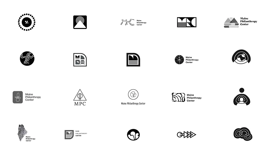
From sketch to screen, we transformed hand-drawn logos into multiple digital masterpieces. This blend of artistry and technology crafted various options, each a digital echo of the original sketch, yet highly unique. Working closely with the client, we picked one that kept the original’s charm and hit the heart of MPC’s mission. The final logo shines online, capturing MPC’s spirit on any screen.

Logo Variations for Any Platform
We then crafted a series of unique variations, designed to please any eye. The finalized logo features bright and energetic colors, with a warm, easy-to-read sans serif font. Various versions of this logo allow flexibility in use while staying "on brand." After finalization, a comprehensive brand guide was created, covering typography, logo, color application, and more. This guide ensures the integrity and consistency of MPC's brand across all platforms.
A Color Palette with Everyone in Mind
Choosing the ideal color palette involves more than just aesthetic appeal. It's about ensuring that the colors not only harmonize but also function effectively in practical scenarios, especially when thinking about ADA compliance. You want to select colors that have enough contrast with one another but also work in harmony, and tell a story in the most compelling way.
Visually Unique, Uniquely MPC

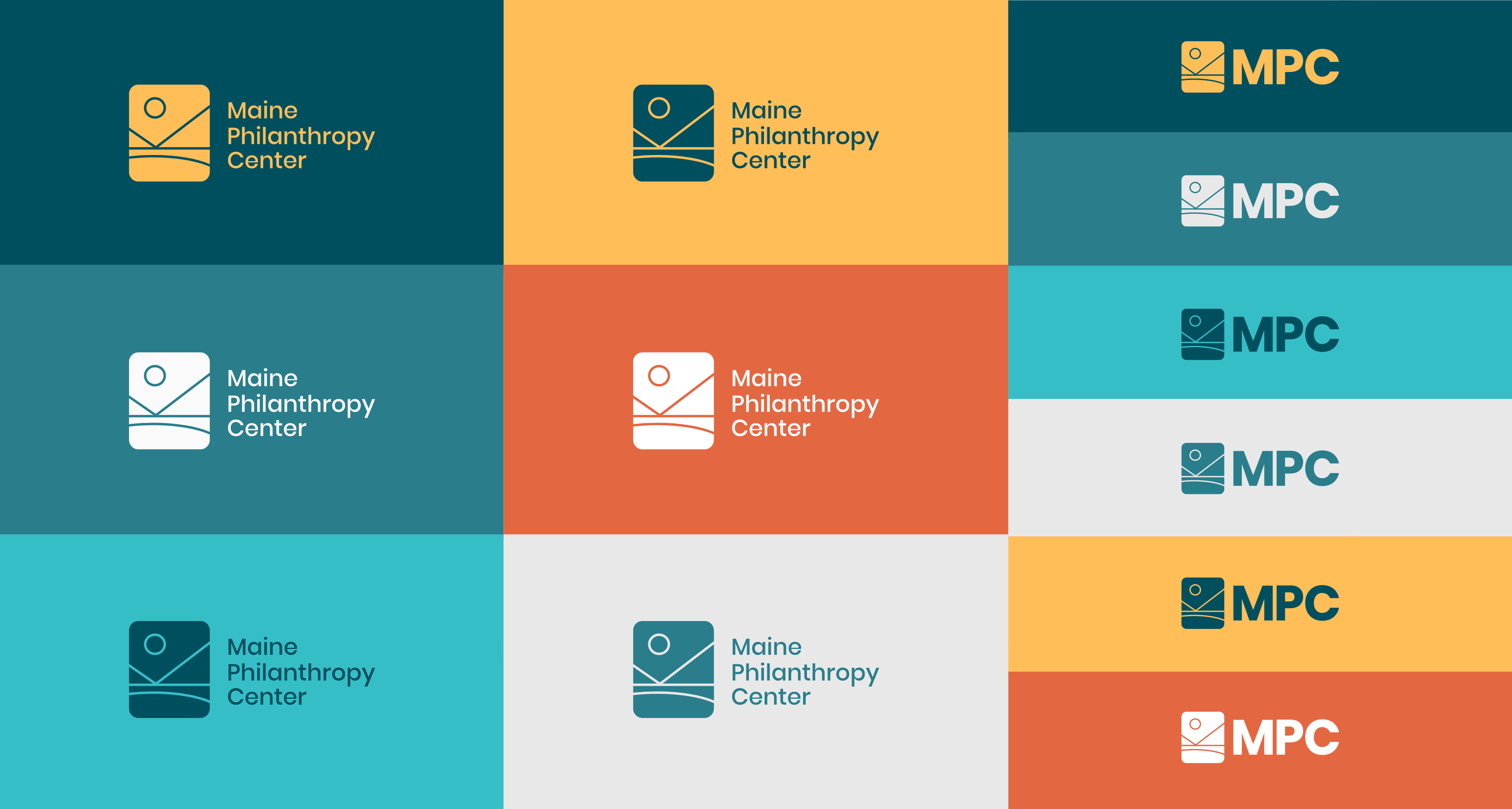
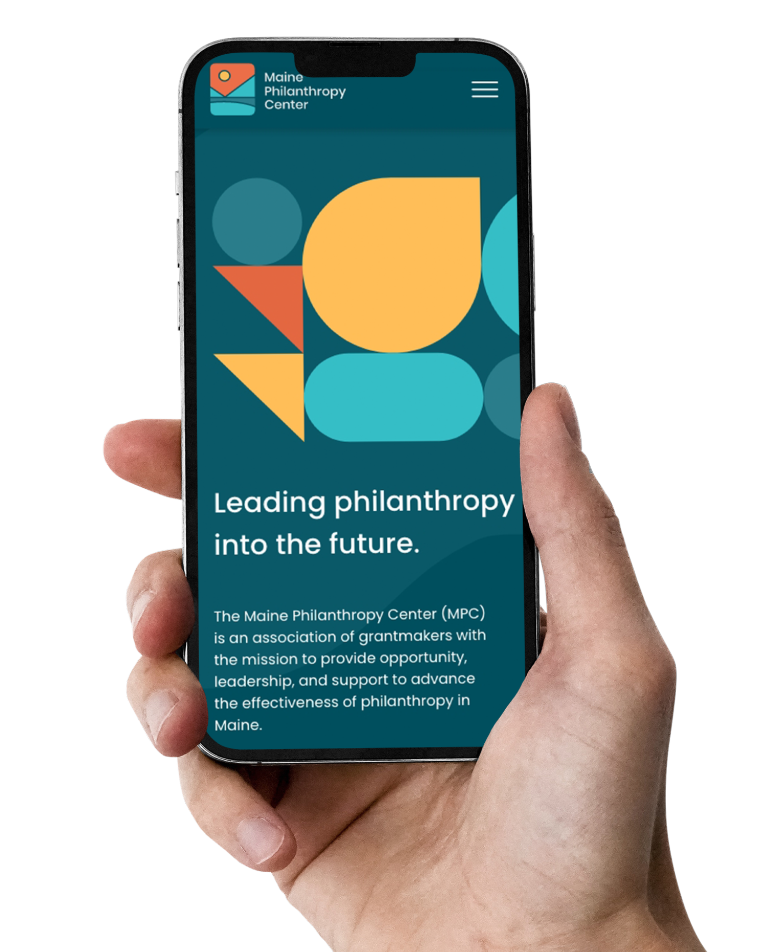
It’s always important to see how the logo can or will be used in real life situations like on merchandise or other promotional materials. This tests the logo’s integrity and ensures it works in print and digital.

Crafting Brand Harmony

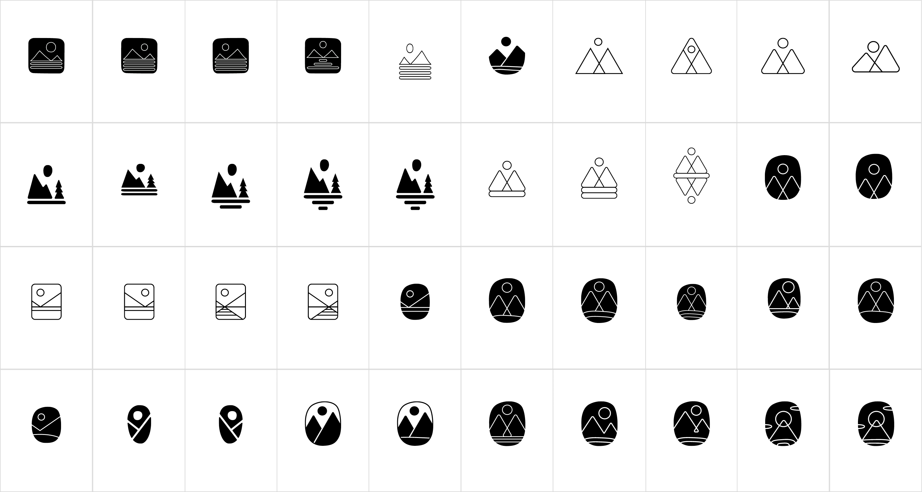
Just like choosing the perfect color palette, selecting the right shapes for rebranding is an art in itself. Think of it as crafting a signature melody, where every note contributes to the harmony. We delved into the finalized logo while extracting and experimenting with its elements to compose playful patterns and graphics. These designs, now part of MPC’s brand library, are versatile enough for use across websites, marketing materials, billboards, and more.

Let's work together to bring your vision to life.
PROJECT TEAM
Orion Alden
CREATIVE DIRECTOR
Maggie Nugent
Content Director
Hunter McPeak
DESIGNER
Elena Ovacharenko
DEVELOPER
Meet Side•Sea
In a vibrant journey of creativity and collaboration, side•sea and the Maine Philanthropy Center embarked on a rebranding adventure, starting from the humble beginnings of pencil sketches to a dynamic digital presence. Each step, from selecting the perfect logo to mixing the right color palettes and crafting messages that resonate, was a testament to the power of partnership and innovation. Together, we've not only refreshed a brand but also sparked the spirit of philanthropy in Maine.
Want to Explore the Finished Product?
Visit Site
Let’s talk!
See how we can elevate the
voice of your brand.