Revolutionizing the Union Experience: Crafting a User-Centric Digital Transformation for MSEA's Enhanced Website
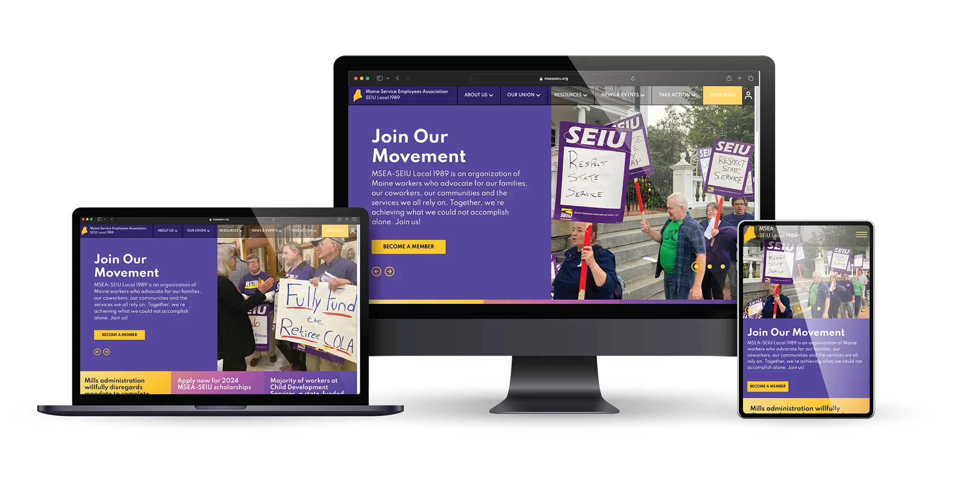
With technological changes, the old website wasn’t optimized or efficiently communicating with union members. They needed a strategic information architecture to make the website conversion-centric and intuitive. During the discovery phase, we identified three potential users: retirees who want to continue providing support, current members who need to view benefits and contracts, and potential members who need to know why they should join. Our primary focus was modernizing their site and crafting different experiences for each type of user.

Bold Type
Bold is the name of the game. For an action-oriented organization with solid messaging, the typeface needed to carry that same energy. Bold sans display type has been a staple of popular civil movements for over 100 years, so utilizing it throughout the site made sense, especially in strategic locations, to reinforce key messaging. These typefaces are often used to signify something clean, minimal, and modern, keeping the focus on the message itself.
Bold color palette backed by Bold action
MSEA’s unique color palette worked to our advantage. The design team utilized a color palette of various golds and purples to give the site a bright look. Purple represents wisdom, dignity, independence, and grace. Gold represents achievement, accomplishment, and triumph. These high-contrast colors create visual clarity and work well with naturally busy imagery.
PROJECT TEAM
Karla Harkness
Project Manager
Danielle Jackson
Project Coordinator
Maggie Nugent
Content Director
Orion Alden
CREATIVE DIRECTOR
Tyler Moulton
Designer
Lavan Gray
Designer
Zane Griffin
Developer
Embracing the digital age with state of the art technology
The Maine Service Employees Association (MSEA) started in 1943 when over 200 state workers gathered in the State House to form an organization that advocates for workers at work and in the Legislature. Technological changes made it harder to communicate with members, and they needed a modern solution. They required two gated portals - one for stewards and one for board members - to house relevant information like calendars, downloadable forms, and other resources. An updated aesthetic, bold typeface and contrasting colors bring the site to the 21st century. Social media connectivity makes it easy to see the hard work this organization is doing to benefit its members and community.

Want to Explore the Finished Product?
Visit Site
Let’s talk!
See how we can elevate the
voice of your brand.
voice of your brand.

