Nurtury Early Education • Nonprofit • Child Care
Where Kids and Communities Grow
Nurtury Early Education needed a robust, custom-built site with streamlined, simplified, and easily understood content. One of the main goals of this project was to create an interface allowing those seeking care to easily search among 140+ locations and find a child care provider near them with openings.
Messaging
• 
Web Design
HERE’S THE LOWDOWN
Nurtury Early Education is a leading provider of high quality child care services in the Greater Boston area. With over 145 years of experience, Nurtury serves more than 1,000 children in center-based programs and family child care settings. Their achievements during the last century are benchmarks in the evolution of early care and education in the United States, and through their center-based and family child care programs, they have touched generations of children and their families. This incredible organization gives Greater Boston’s youngest children in need, birth to age five, the opportunity to reach their full potential by investing in school readiness, promoting healthy development, and supporting families.
The Joy of Discovery
We first kicked off an extensive discovery process to get background information so we could take an informed approach moving forward. We conducted meetings with stakeholders to learn more about the organization’s strengths and weaknesses. Once we digested that information, we presented our findings and recommendations in a Brand Voice and Messaging Framework.
Playing With Shapes

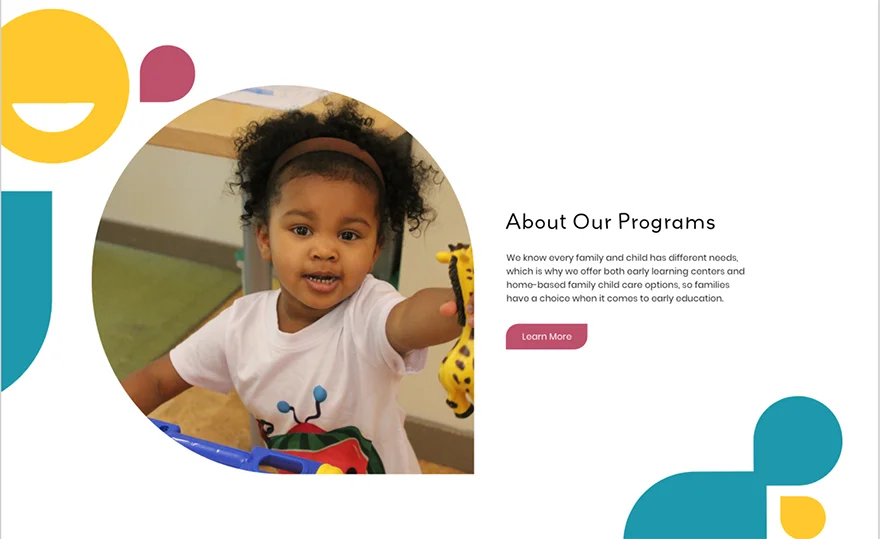
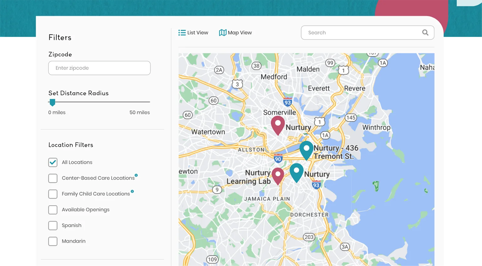
We always want to incorporate the client’s brand throughout the sites, and Nurtury is no different. Their current logo has a unique teardrop shape that we wanted to keep as a consistent element. To stay consistent with this visual identity, we decided to use this teardrop shape for various containers and brand patterns.

Passing Notes

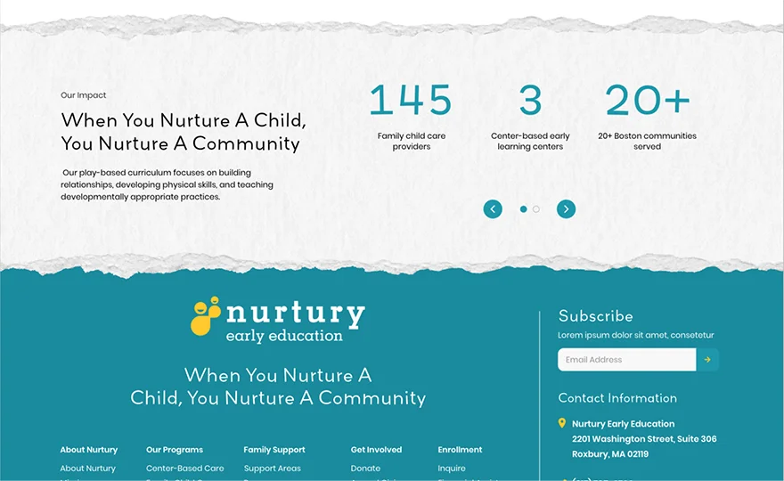
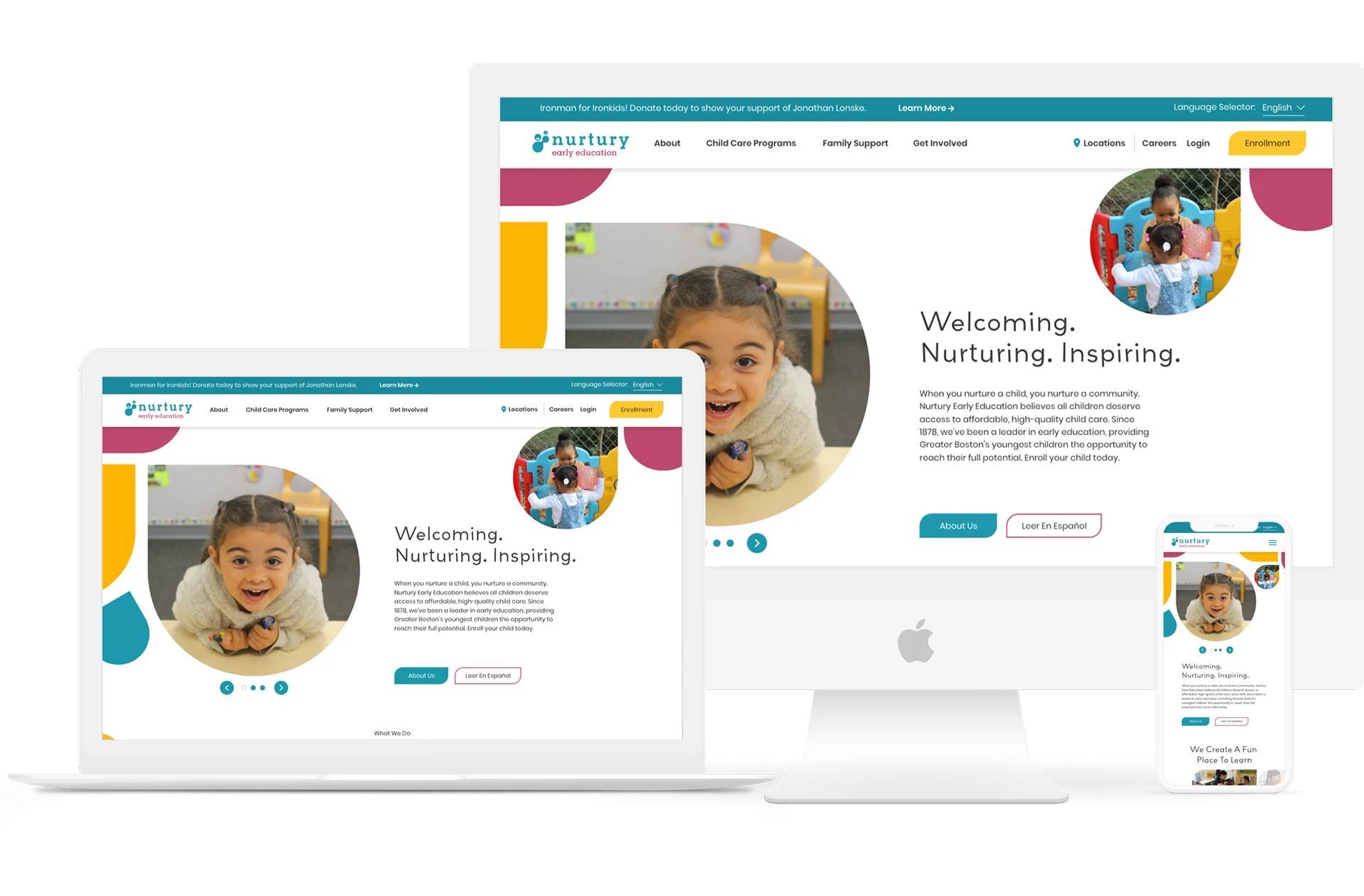
Because Nurtury is an early education organization, we wanted to keep a playful aesthetic. We utilized paper textures and handwritten typefaces to simulate hand-written notes like you would see in a classroom. This childlike imagery evokes a sense of nostalgia, giving users a sense of what they would experience in a classroom setting.

The Best of Both Worlds

Nurtury isn’t your cookie cutter early child care organization, so we wanted to continue playing with fun shapes wherever we could. In places where we would normally utilize rectangles with 90 degree corners or beveled edges, we combined both. We took inspiration from the teardrop logo to create circular droplet shapes. Not only is it unique, but it creates a family friendly visual experience.

A Nurturing Place To Learn
Nurtury offers both Center-Based Care and Family Child Care, so families have a choice regarding child care, with three center-based locations and over 140 family child care locations throughout Greater Boston. To streamline the process, we created a map feature with filters to show all the different locations and features so families can choose the best care for their children.
Painting A Picture
The strong brand styling even extends to the icons we opted to use. Nurtury’s icons use primary colors to not only stay within the color palette, but to evoke a sense of childhood without being cliche. The result is a playful way to convey concepts visually, which helps reinforce the message we are trying to communicate to a linguistically diverse audience.
Let's work together to bring your vision to life.
PROJECT TEAM
Orion Alden
CREATIVE DIRECTOR
Tyler Moulton
Designer
Megan Mitchell
Designer
Megan Lumenello
Content Director
Sasa Jovanovic
Developer
Meet Side•Sea
When You Nurture A Child, You Nurture A Community
Nurtury Early Education provides Greater Boston’s youngest children with the opportunity to reach their full potential. They needed a robust site that not only communicates the quality of care they’ve been providing for 145 years, but makes it easy for families to find the best location for them and enroll their children. We built off their established brand identity to create a functional site with a playful aesthetic to match this caring organization.
Want to Explore the Finished Product?
Visit Site
Let’s talk!
See how we can elevate the
voice of your brand.