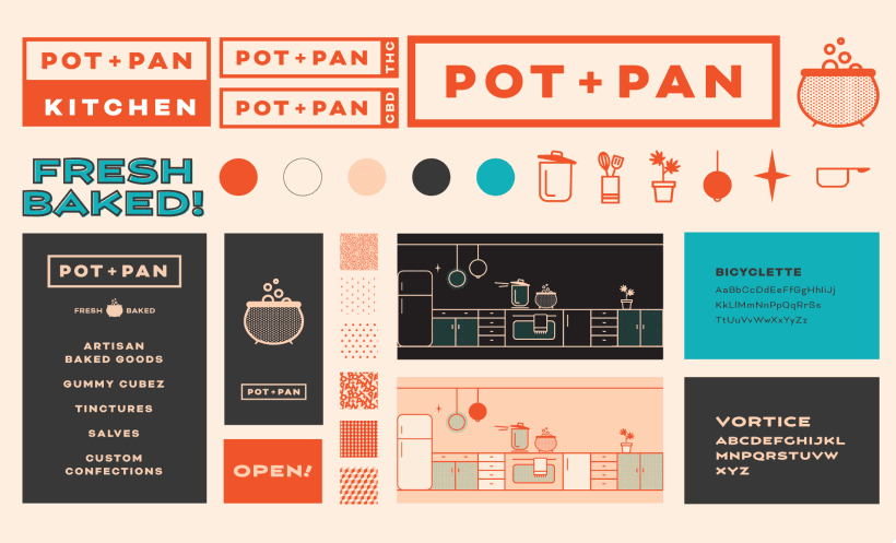
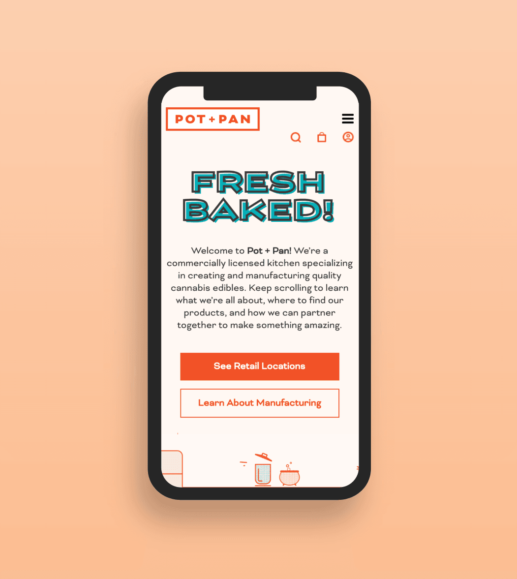
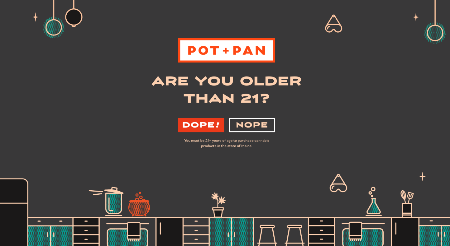
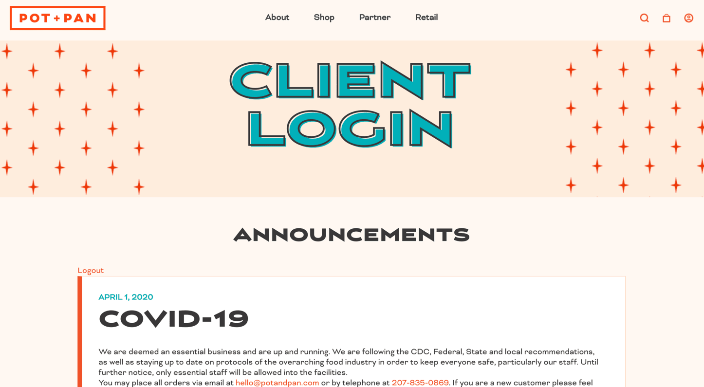
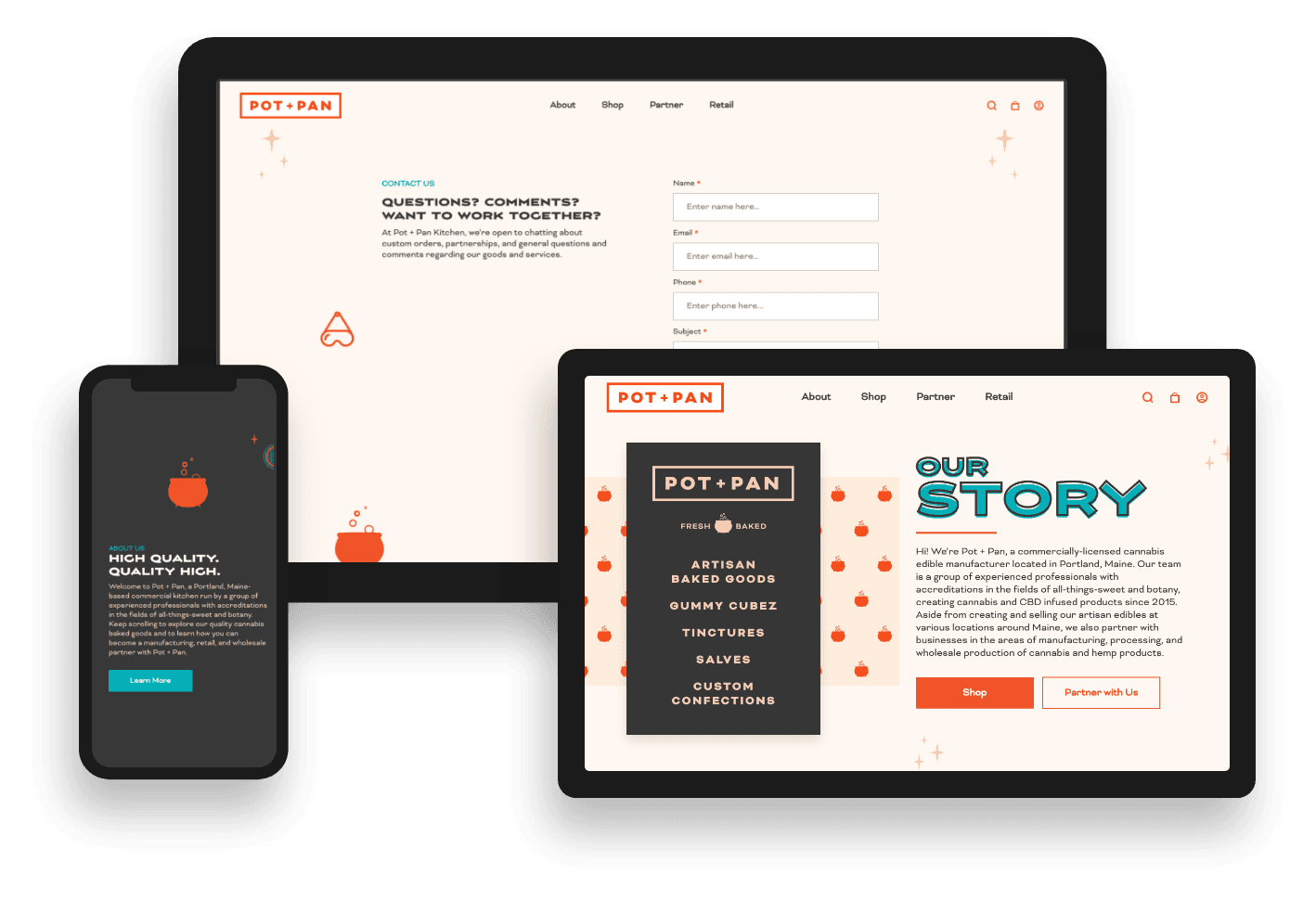
Presented with Might & Main’s beautiful packaging assets, our design team got to work at identifying which elements we could use on the site. We honed in on the retro kitchen elements, using these as the foundation of our color palette and overall design.
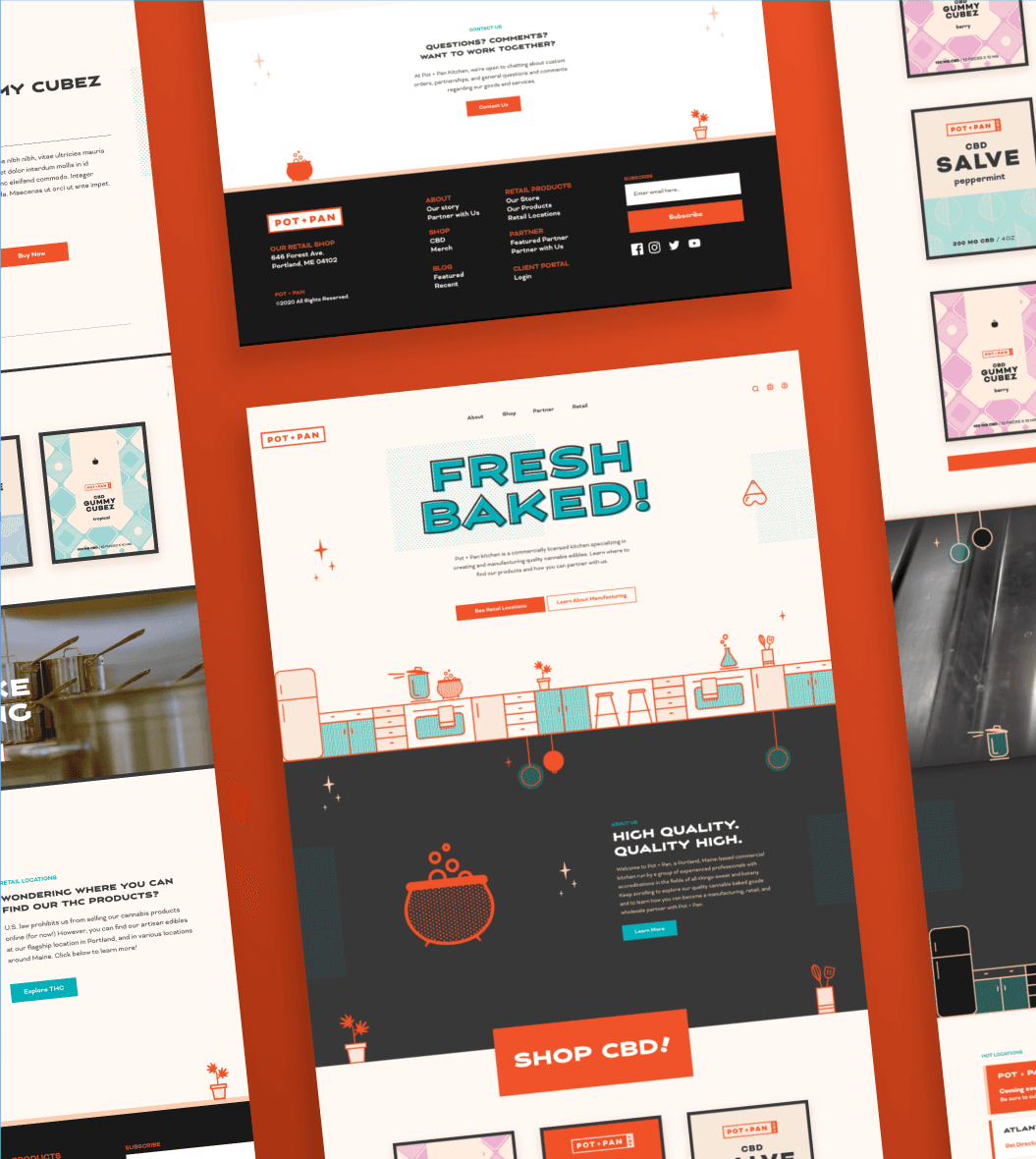
After identifying which brand elements we wanted to use, we decided to have a little fun with them. To create some movement in the hero banner and throughout the site, we added little bursts of animation. A rattling pot on a stove, a bubbling cauldron, and a beaker of effervescence inject each page with life.
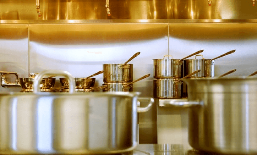
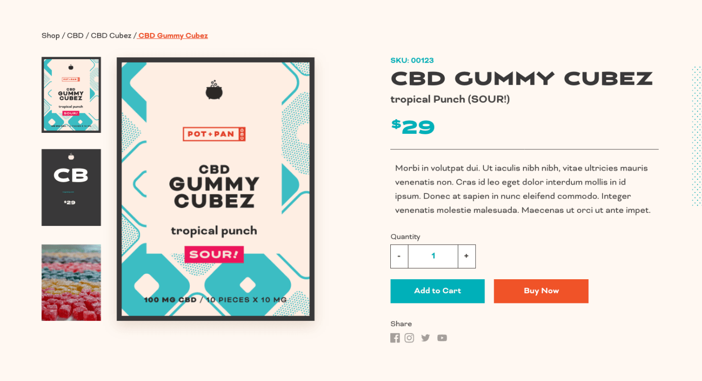
While we loved the way the illustrations looked on the site, we wanted to add a little realism for contrast, using Best Website Design practices. We selected some bright imagery and used the professional footage Pot + Pan had of their baking process, creating a nice balance between whimsical and professional.

voice of your brand.

