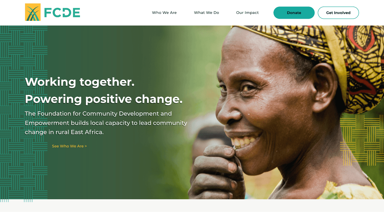
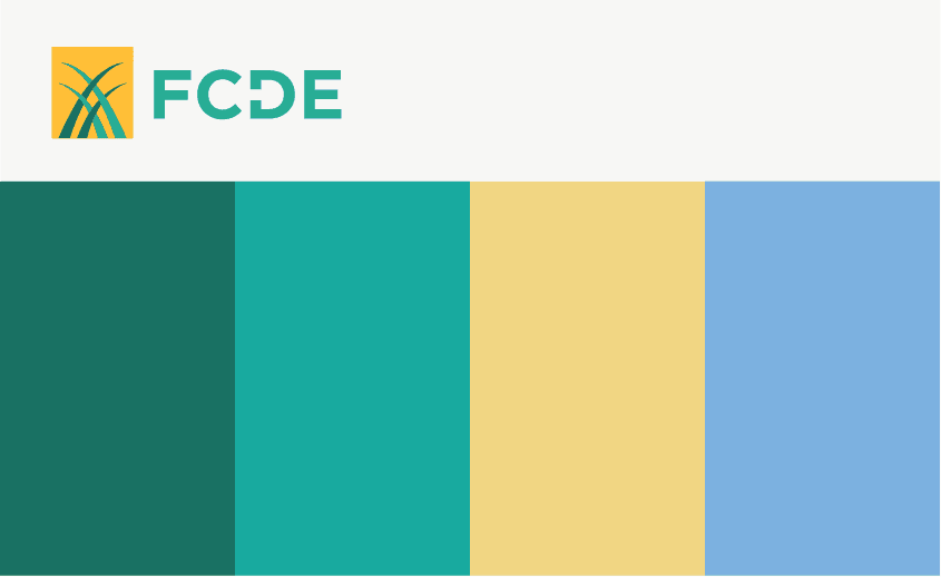
Creating a Vibrant Palette
As with every project, we started with a Creative Consultation and Information Architecture exercise to get a good understanding of FCDE’s preferred visual aesthetic, and to establish the basic structure of the site. FCDE recently had a new logo made, which we used as inspiration for the site’s color palette.
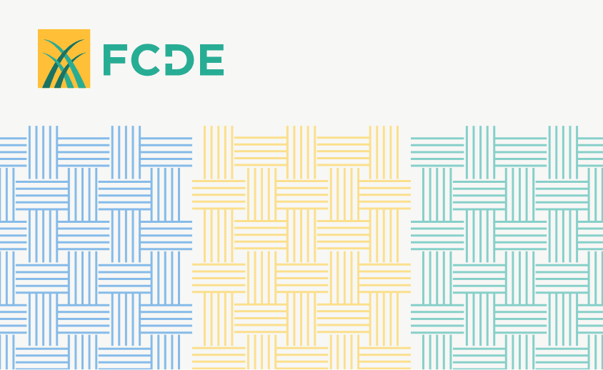
Weaving in a Flourish of Design
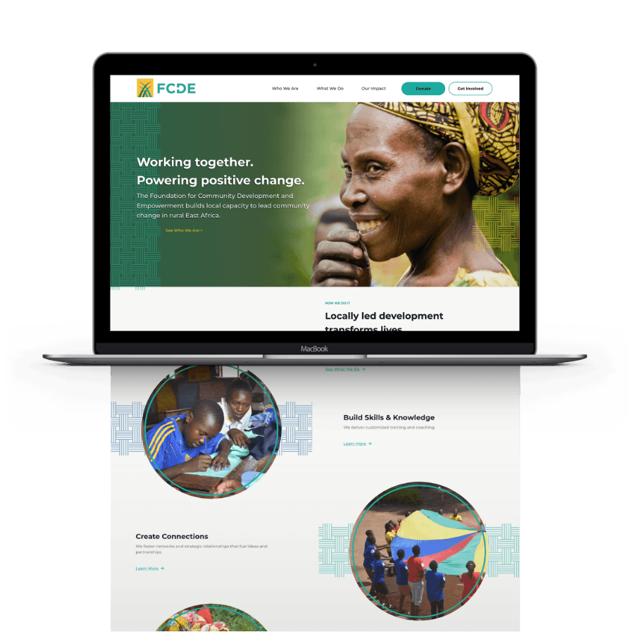
We ended up taking inspiration from FCDE’s old logo as well, which we caught a glimpse of at the beginning of the project. It featured a basket weave pattern, which we ended up pulling and using as a design flourish throughout the site. You’ll see the basket weave pattern framing content sections, breaking up white space, and guiding the users’ eyes down the page.
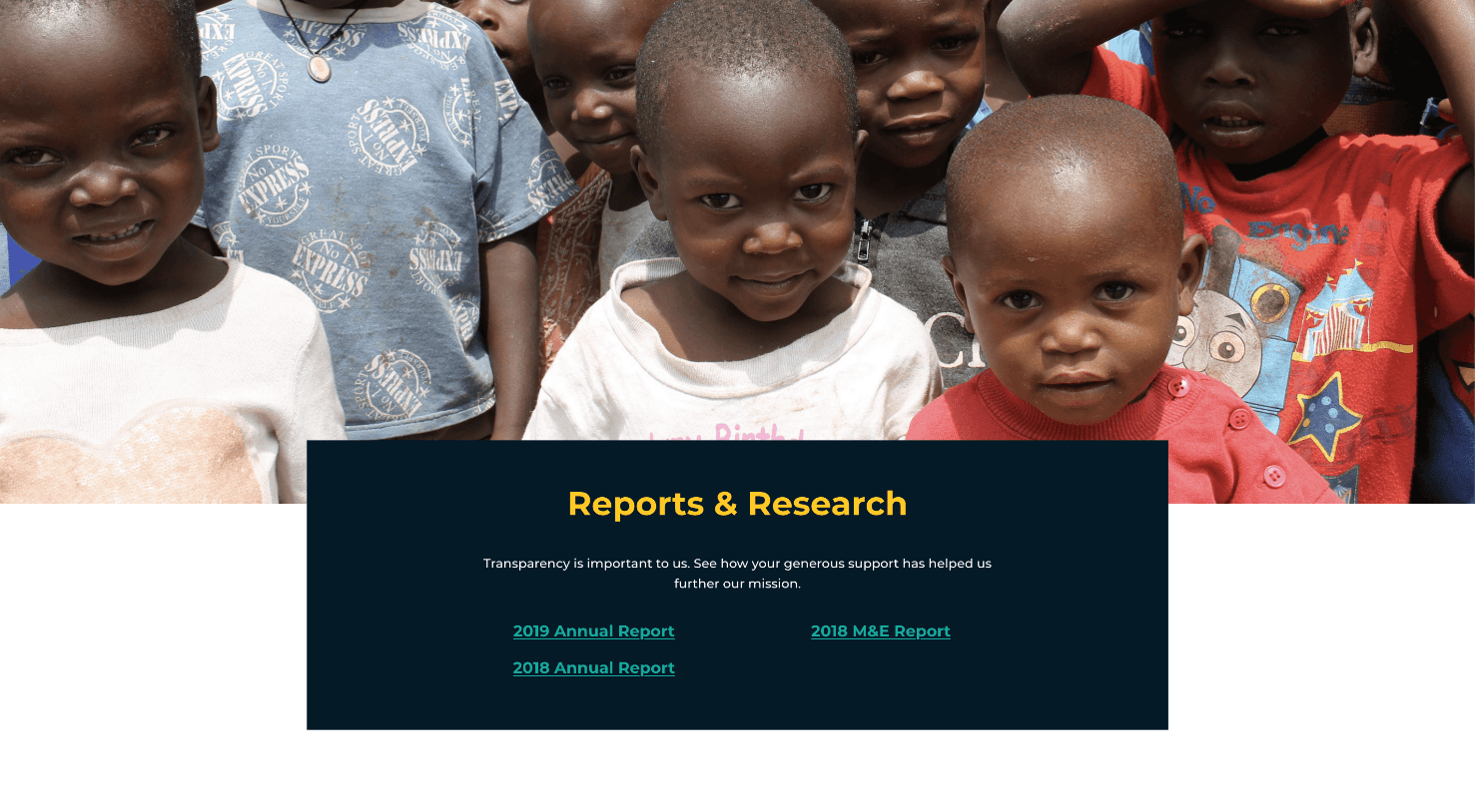
A Vivid Portrait of East Africa
Picking imagery was a vital part of creating the right aesthetic for the site. East Africa is known for its vibrant landscape and colors, and we wanted that to translate onto the page. This meant making sure we chose vivid, energetic imagery from the collection of photos FCDE gave us access to. We wanted the imagery, colors, and design flourishes to come together to create a bright and cohesive aesthetic that evoked the diverse culture of these east African countries.
Spotlighting Each Program
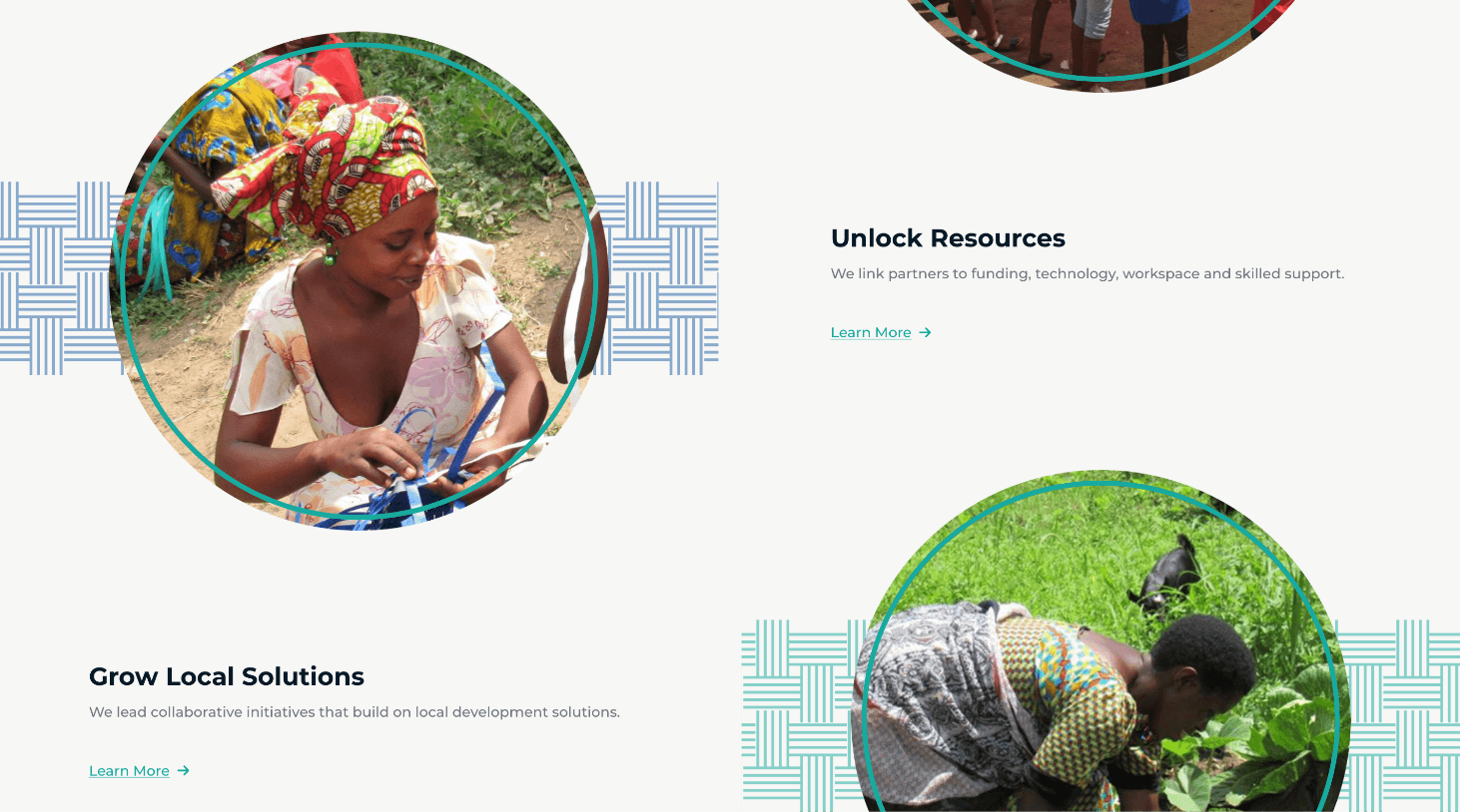
FCDE had four main programs through which they did their work. We created jumping in points to each of these programs throughout the site, making it easy for the user to explore each one. We again used the basket weave pattern and vibrant imagery to highlight each program portal.
Telling Their Stories
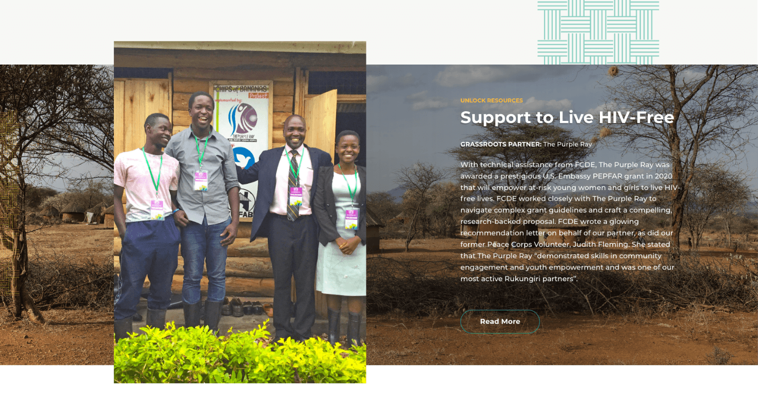
Each of the four programs had their own dedicated interior page. One of the most impactful parts of these pages were the Featured Stories, in which FCDE highlighted a community member who benefited from that particular program, or a local grassroots partner whose work had been amplified through the program. Featuring real life stories is one of the most powerful ways organizations can illustrate their impact.
A Grassroots Grid
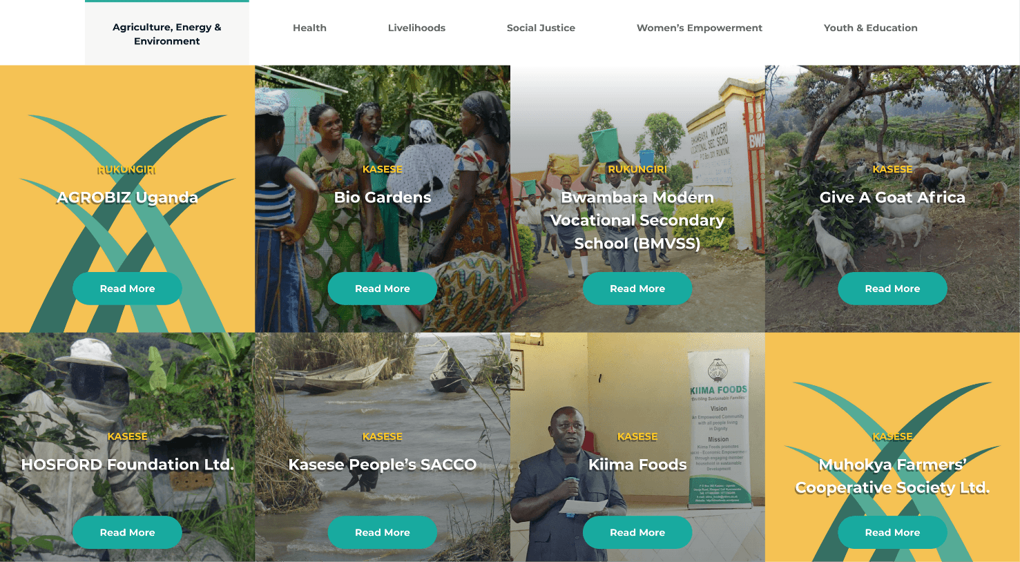
FCDE wanted to give ample space to feature all the amazing local grassroots partners they work with. We created this robust grid to house these partners and added filters so users could browse through the partners depending on the type of work they did. When a user clicks “Read More” on a particular tile, a pop-up appears with a brief description of the organization and a link to their website.
Adding a Hopsie Integration
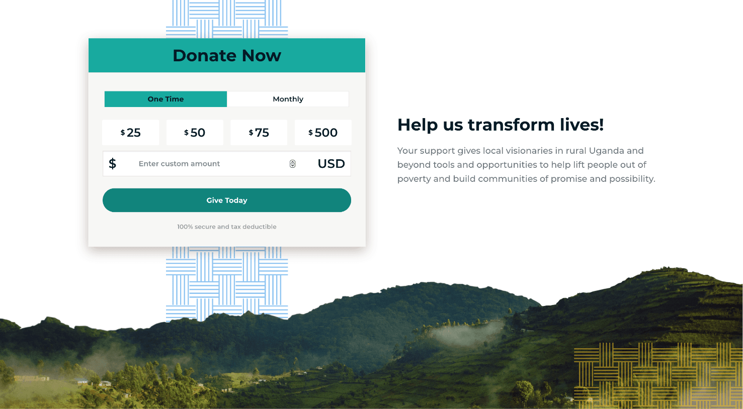
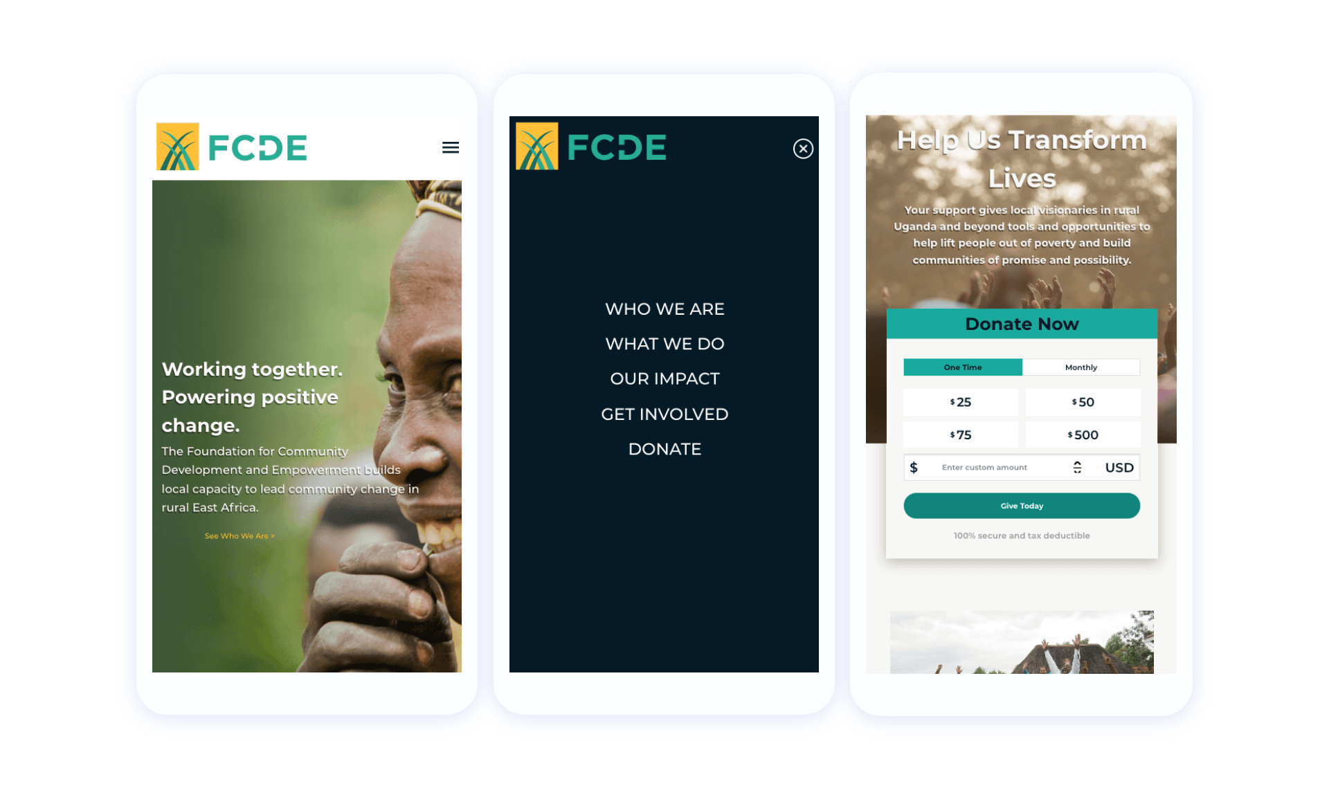
Since FCDE is a nonprofit, they needed strong calls to action to donate. We designed and integrated a Hopsie donation widget, which allows users to start the donation process directly on the site before being redirected to FCDE’s dedicated Hopsie page to submit the donation. Hopsie is side • sea’s proprietary fundraising platform.
Let's work together to bring your vision to life.
PROJECT TEAM
Orion Alden
CREATIVE DIRECTOR
Hunter McPeak
DESIGNER
Maggie Nugent
Content Director
Jennifer Chew
PROJECT MANAGER
Steve Stromick
Developer
Alex Brown
Developer

We always feel lucky when an organization comes to us with a library of beautiful imagery. It makes telling their story in a visual and emotional way so much easier and lends an authenticity to the design that you can't fake. We loved bringing together the color, landscape, and cultures of these countries in which FCDE works and creating a bright, vivid, authentic design aesthetic.
Orion Alden
Creative Director
Explore the FCDE Impact!
Visit Site
Let’s talk!
See how we can elevate the
voice of your brand.
voice of your brand.

