The Institute of Family-Owned Businesses • Non-profit • Membership Organization
Empowering Family-Owned Businesses Throughout Maine
The Institute of Family-Owned Businesses needed an accessible new website and messaging strategy. The primary goals of these projects were to engage users, increase conversions, and attract new family business owners, associate partners, and sponsors.
Messaging
• 
Web Design
HERE’S THE LOWDOWN
The Institute for Family-Owned Business is a nonprofit 501 (c) 3 organization committed to supporting, strengthening, and empowering family-owned businesses throughout the state of Maine. Through consulting, seminars, workshops, and networking, the Institute assists family-owned firms in meeting the unique managerial challenges and opportunities of operating and sustaining a successful family enterprise.
Sending the Right Message
Email-based newsletters are the chief means of communication. While members recognize the newsletter’s purpose and intent, updates went unnoticed due to the email format and frequency. The content team at side●sea analyzed the Institute’s various audiences, crafting messaging strategies, templates, and mockups for various channels that will increase conversions and move people through the sales funnel. Pictured here is a mockup Instagram ad for recruiting new members.
Giving New Life to an Old Logo

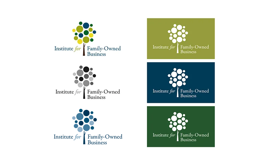
The Institute underwent a massive branding transformation. However, they wanted to keep parts of their old visual identity, especially the tree, which symbolizes both the families behind the businesses and the growth opportunities offered by the Institute. A logo redesign kept familiar elements while giving them a fresh new look. The design team created multiple versions of the logo for any use cases that may arise. Featured here are the one color and monochromatic variations.

A Professional Color Palette

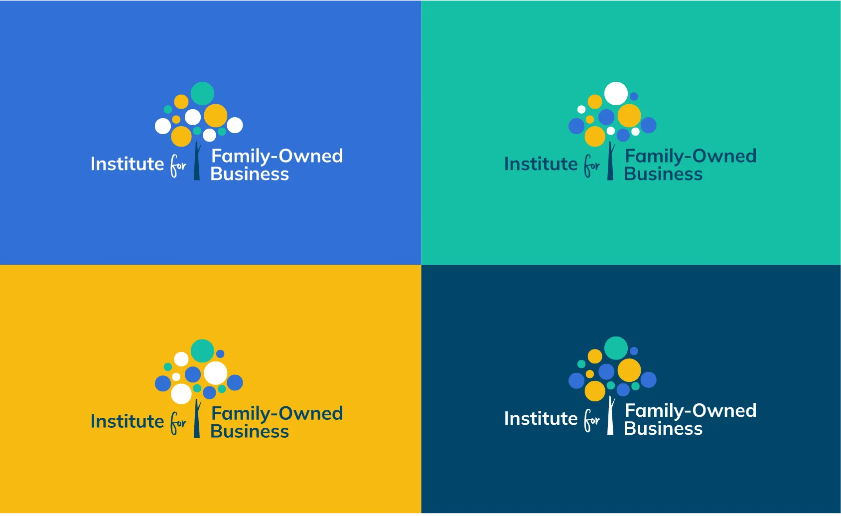
The Institute’s color palette consists of teals, blues, and yellows. These colors are found in nature and pair nicely with the tree in the logo. Blue represents intelligence, communication and trust. Gold is the color of achievement, accomplishment and triumph. Meanwhile, the soothing nature of teal invokes feelings of tranquility and serenity. It encourages open communication and clarity of thought. Altogether this palette conveys a bright, collaborative brand.

Sophisticated and Sincere

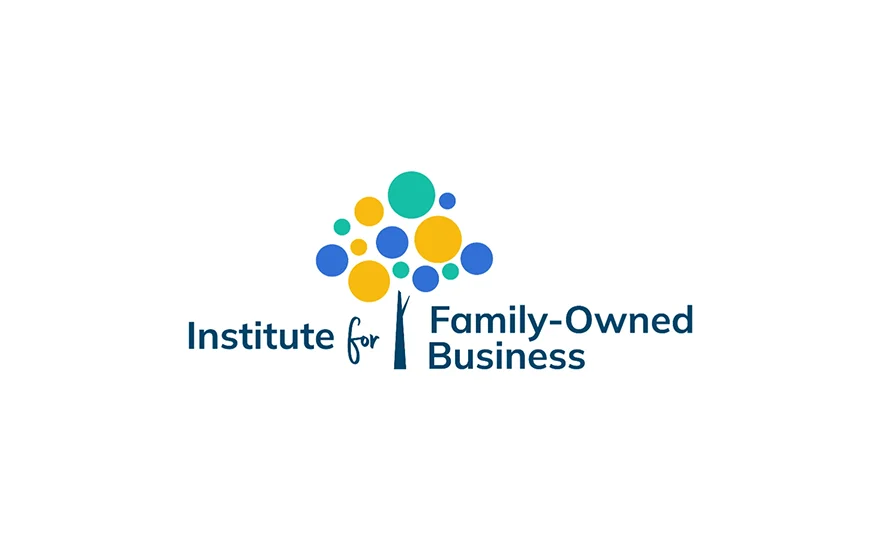
Sans serif fonts are used to convey modern sophistication for their minimal and simplistic design. They’re approachable and playful, often used to represent organizations that are timely and cutting edge. When paired with accents of casual handwriting, we get a logo that conveys a modern yet warm energy – perfect for a nonprofit that empowers family-owned businesses.

Meaningful Motifs

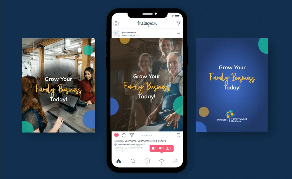
Rounded shapes tend to send a positive emotional message of harmony and protection. The circle is often used in a logo to represent unity, commitment, love, or community, which makes it a perfect shape for the Institute and the community of family business owners. Throughout the site, the design team utilized the circular motif from the logo as brand graphics, containers, and patterns.

A Re-Designed Directory

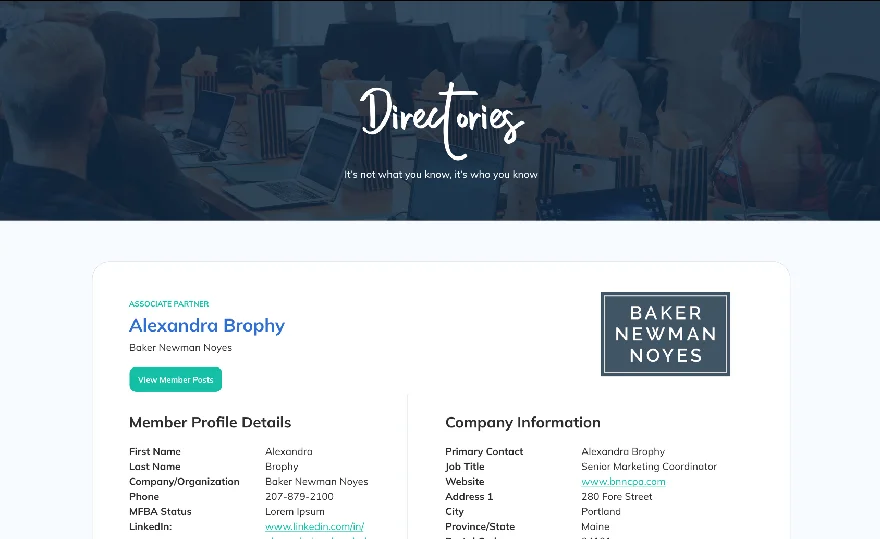
The Institute used to have three directories: one for members, one for associate partners, and one for sponsors. The content team streamlined these three directories and turned them into one. Users can select the appropriate filters and access the information they need in a way that isn’t overwhelming.

A Colossal Calendar of Events

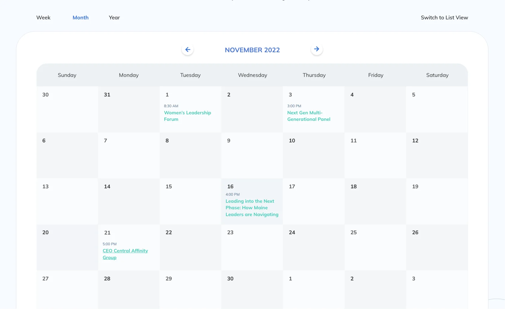
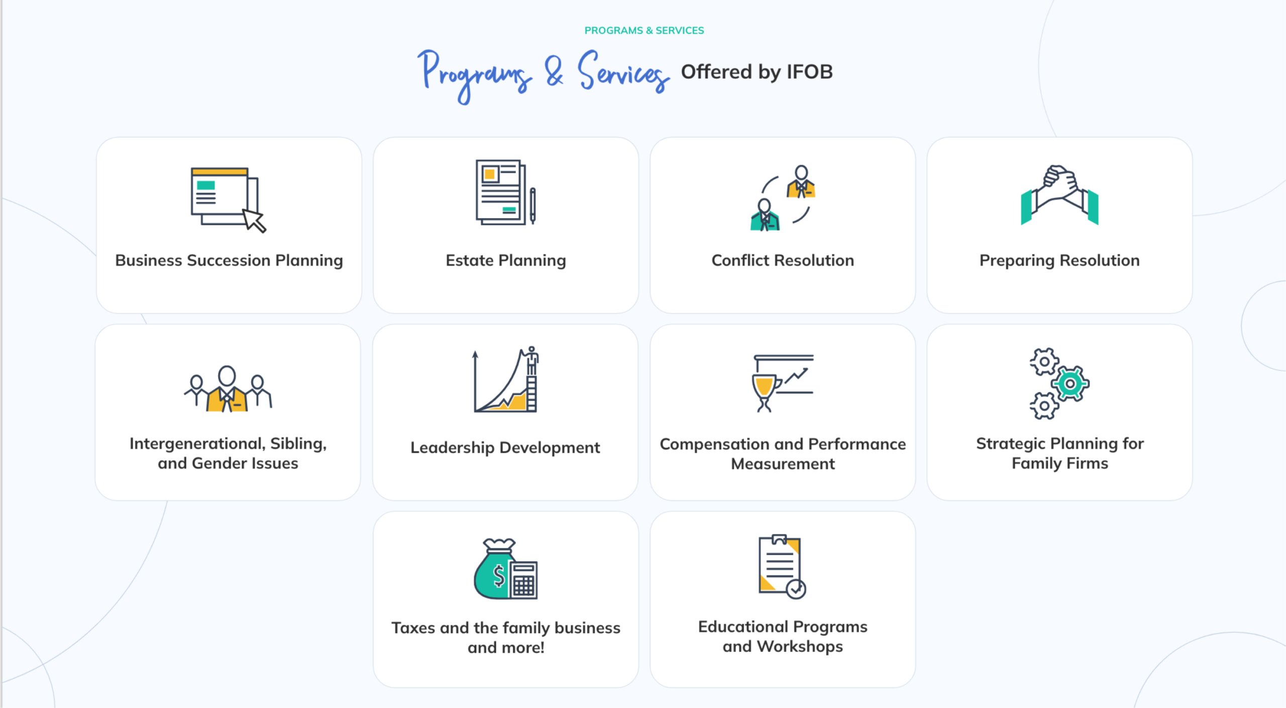
The Institute provides programs and services on issues that can benefit every family member and family-owned business. They have over 50 programs scheduled, from small facilitated meetings to open programs where they encourage everyone to attend. Giving them a multi-view calendar was imperative so users could look at upcoming events weekly, monthly, and yearly. 

Interesting Icons and Illustrations
The Institute offers numerous programs and services to its members. We wanted to represent everything visually so users could see everything at a glance. The design team utilized illustrations and icons with friendly but sophisticated brand styling to represent each of the Institute's services.
Spellbinding Stories
From press releases to programs, podcasts, and everything in between, the Institute always stays busy producing content for its members. Grids present a clean and easy-to-navigate site structure for showcasing extensive content. Each block in the grid leads to a single page with flexible content structures for users to gather more information.
Let's work together to bring your vision to life.
PROJECT TEAM
Danielle Jackson
Project Coordinator
Orion Alden
CREATIVE DIRECTOR
Megan Lumenello
Content Director
Anja Sevo
Copywriter
Harry Foster
Marketing Associate
Yoon Kim
Designer
Tyler Moulton
Designer
Milos Misic
Snr Developer
Sasa Jovanovic
Developer
Zane Griffin
Developer
Meet Side•Sea
Family-owned businesses have been coming to the Institute for assistance since 1994. Most members hear about it through word of mouth and join when they have a specific problem they need help with. The Institute needed an accessible new website and messaging strategy to engage users, increase conversions, and attract new family business owners, associate partners, and sponsors. After carefully reviewing background information, we crafted a messaging strategy to increase conversion rates for members, associate partners, and sponsors. side●sea prepared communications templates for various channels that are visually appealing and follow best practices. With a redesigned site, the Institute has a comprehensive visual identity and digital footprint that will allow it to continue serving family-owned businesses for generations.
Want to Explore the Finished Product?
Visit Site
Let’s talk!
See how we can elevate the
voice of your brand.