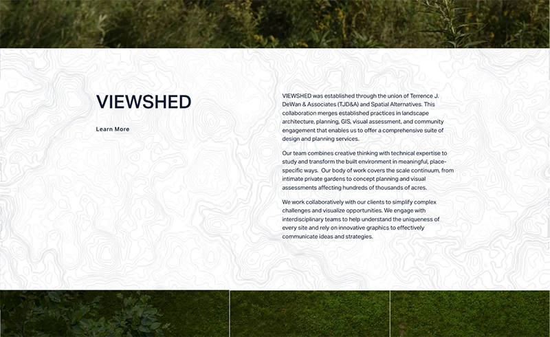
Choosing a background is always a challenge. For this section, we needed to fill whitespace in a simple way that would still make the text easier to read. So we opted for a minimal topographic pattern. Not only is it visually pleasing, but it mimics the creative and technical work Viewshed does for its clients.
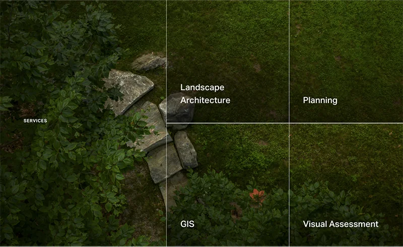
It’s possible to look at one thing in several different ways and have several different perspectives. Just as Viewshed looks at the land with different perspectives, we liked the idea of having one background image that has four tiles with links to a page for each service they provide.
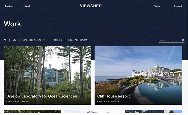
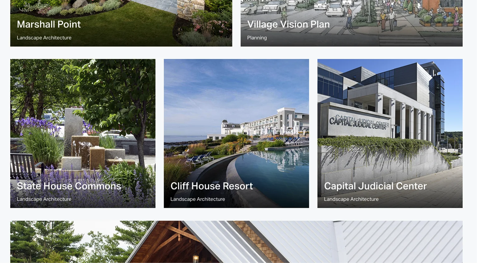
One of the most important elements of this project was creating a portfolio of the client’s previous work. In the portfolio, we have projects organized by the service provided, with a tab to view everything together. Users are able to see everything at a glance and fully realize Viewshed’s potential.
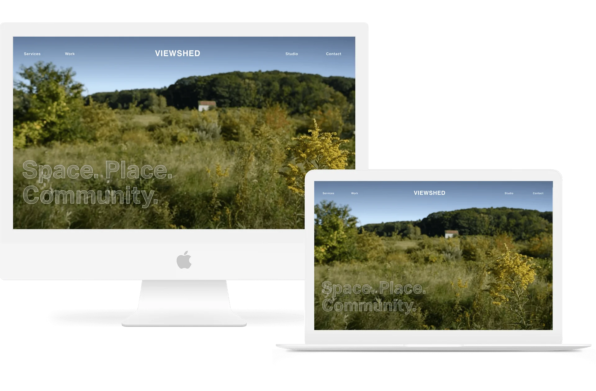
With a landing page showcasing their available services, users can see at a glance what Viewshed can do for them. Clicking on a block opens a service single page that provides more information regarding the service as well as links to specific portfolio pieces, making it easy to see this service in action. A minimal navigation bar simplified the user experience, ultimately leading to a contact form that streamlines communication. With this new tool, Viewshed can continue to offer a comprehensive suite of design and planning services.

voice of your brand.