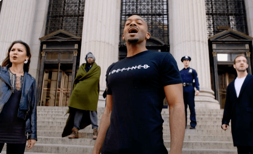
Design Inspired By Music
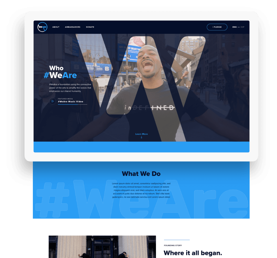
WeAre had already created a professionally produced music video, which immediately inspired our design team. We loved the close-up shots of a diverse array of faces, and pitched an idea to WeAre to reshoot those close-ups in a way that we could use for an interactive hero banner. They were on board, which led to a totally unique and captivating hero impression that sets an impressive tone for the rest of the site.
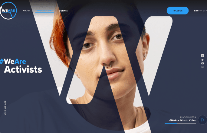
A Scrolling Experience that Performs
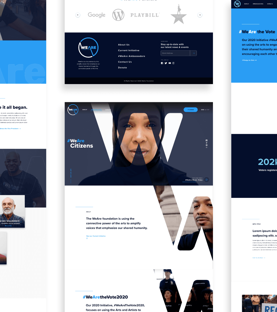
Because we were so happy with the video footage that WeAre supplied, we wanted to get as much mileage out of it as possible. We ended up creating a parallax scrolling experience on the homepage in which the video followed the user down the page, playing behind a cut-out of the organization’s logo.
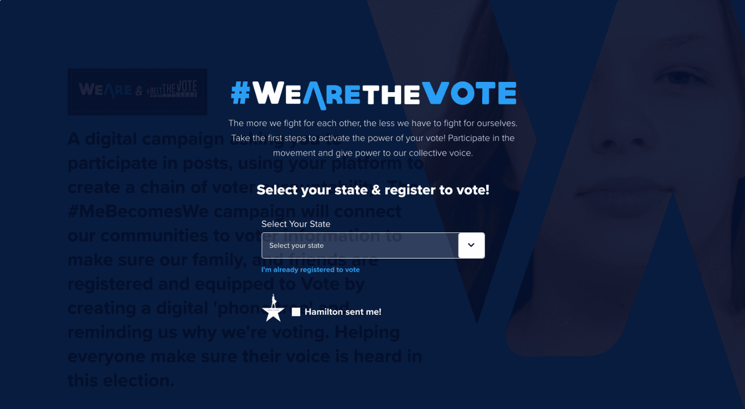
Building the Movement
One of the big focuses of the site at the time of its creation was getting users to register to vote. The main call to action was “I Pledge.” When the user clicked this button, rather than being redirected to a new page, a designed overlay popped up, allowing the user to select their home state and find the link to that state’s particular voter information site.
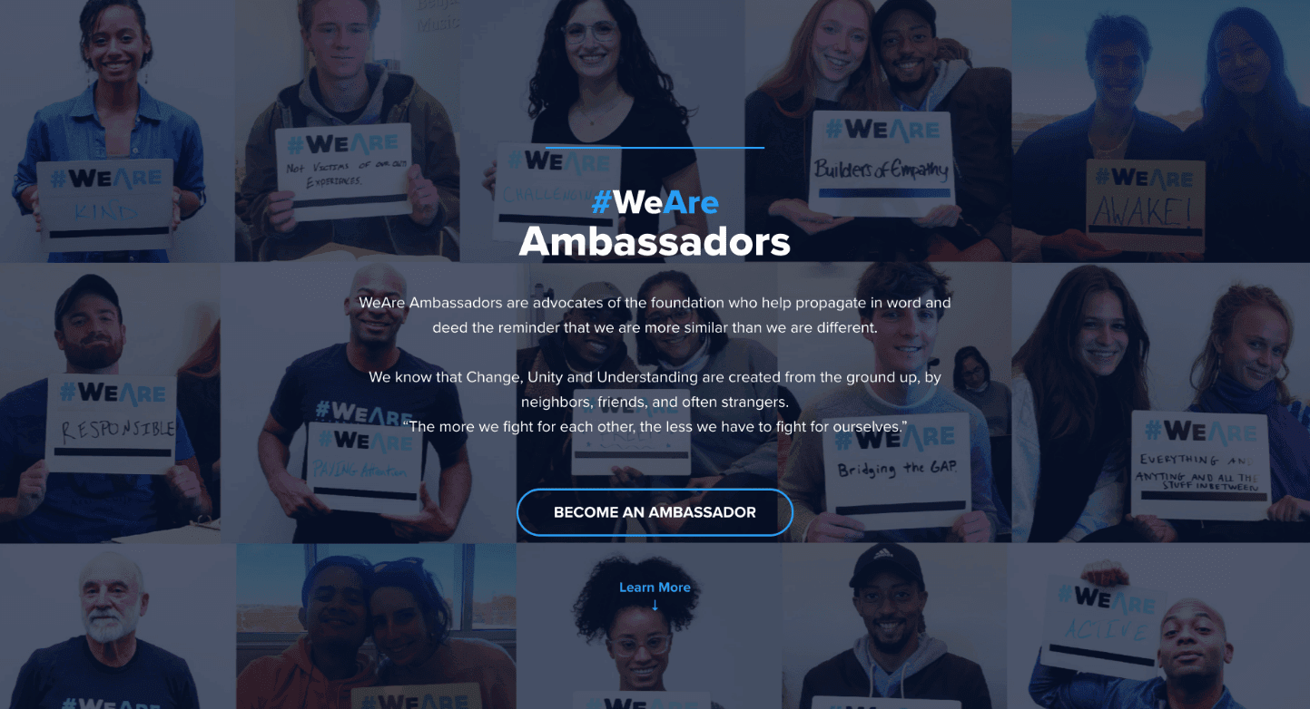
Creating a Community
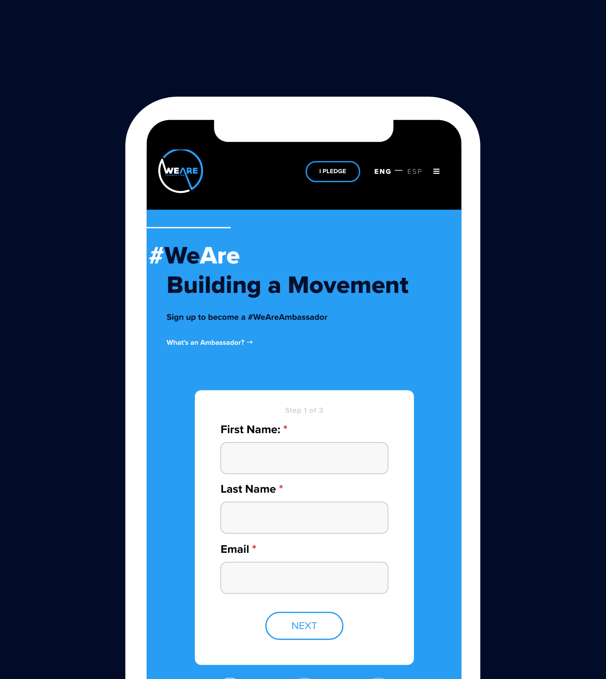
Another big call to action on the site was to sign up as a WeAre Ambassador -- basically an opportunity to volunteer your time to help propel the different WeAre campaigns and movements. We ended up creating an Ambassador sign-up form that allowed users to complete 3 different steps without ever leaving the page, creating for a seamless, incredibly low-barrier application process.
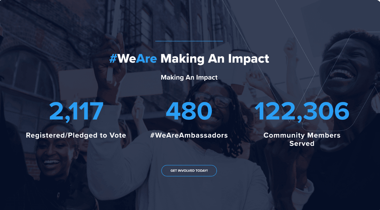
Tracking their Impact
In the nonprofit world, stats and impact counters are anything but frivolous design flourishes; nonprofits often have to prove their influence and effectiveness by the numbers in order to build credibility and trust with future donors and participants. That’s why we made sure we created an animated impact section, in which their numbers tick upward to show WeAre’s already expansive reach.
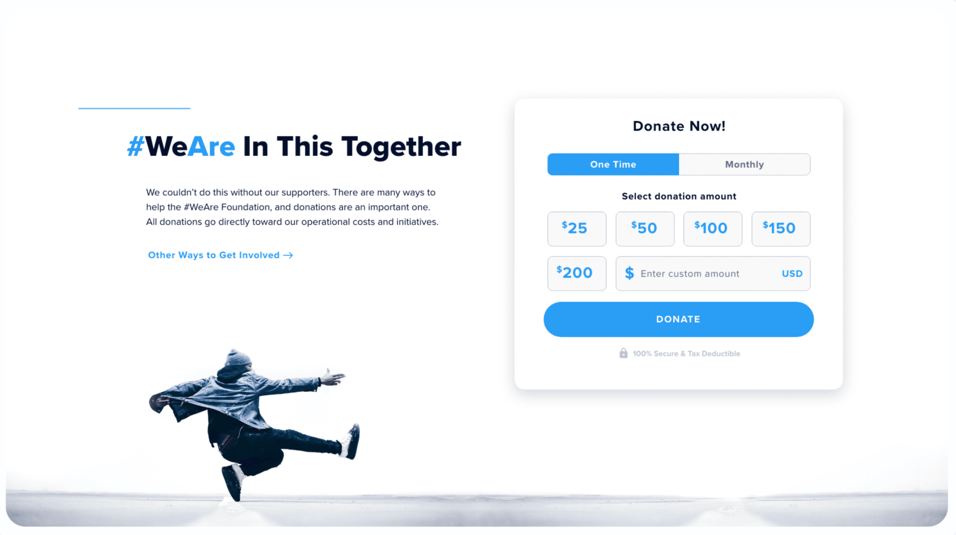
Streamlined Donation
Given the amount of nonprofits we work with and our proprietary donation platform, side•sea is no stranger to creating engaging donation experiences. At the end of such an interactive homepage, we again brought in imagery of a performer to keep the momentum up, and designed a branded, easy-to-use donation widget for a seamless donation experience.
Let's work together to bring your vision to life.
PROJECT TEAM
Ben Blodgett
Technical Lead
Orion Alden
CREATIVE DIRECTOR
Maggie Nugent
Content Director
Hunter McPeak
DESIGNER
Steve Stromick
Developer
Join the #WeAre movement.
Visit Site
Let’s talk!
See how we can elevate the
voice of your brand.
voice of your brand.

