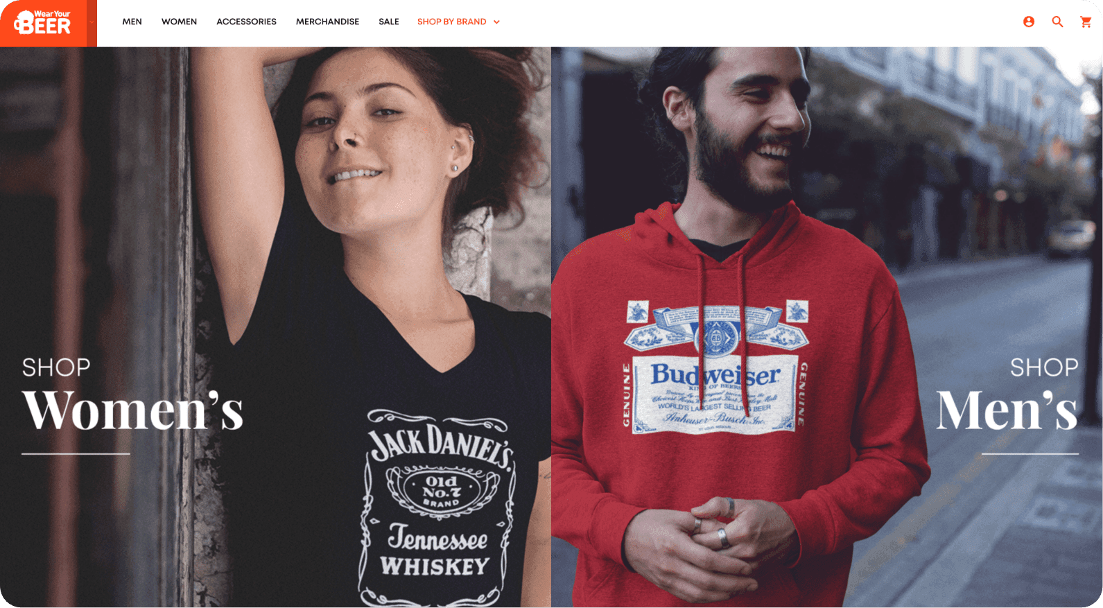
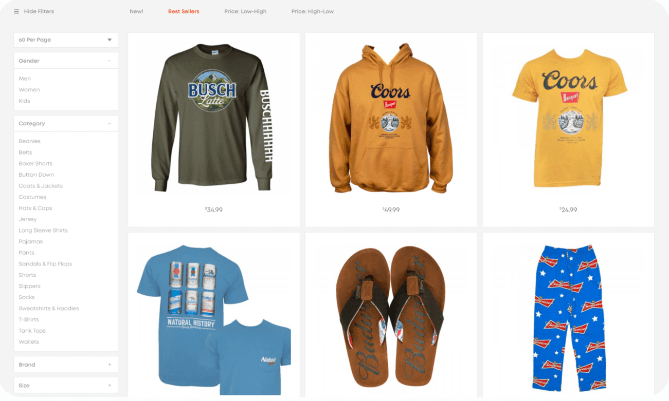
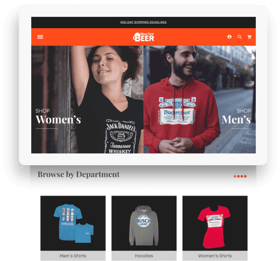
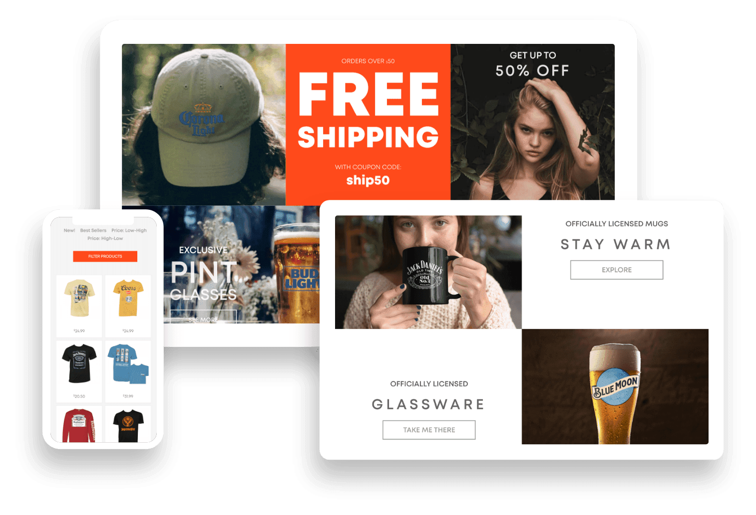
On the shop pages, we pulled in the ubiquitous product grid, but with modern design sensibilities – clean, vibrant, with robust filtering and categorization functionality, making it easy to find the product you want.
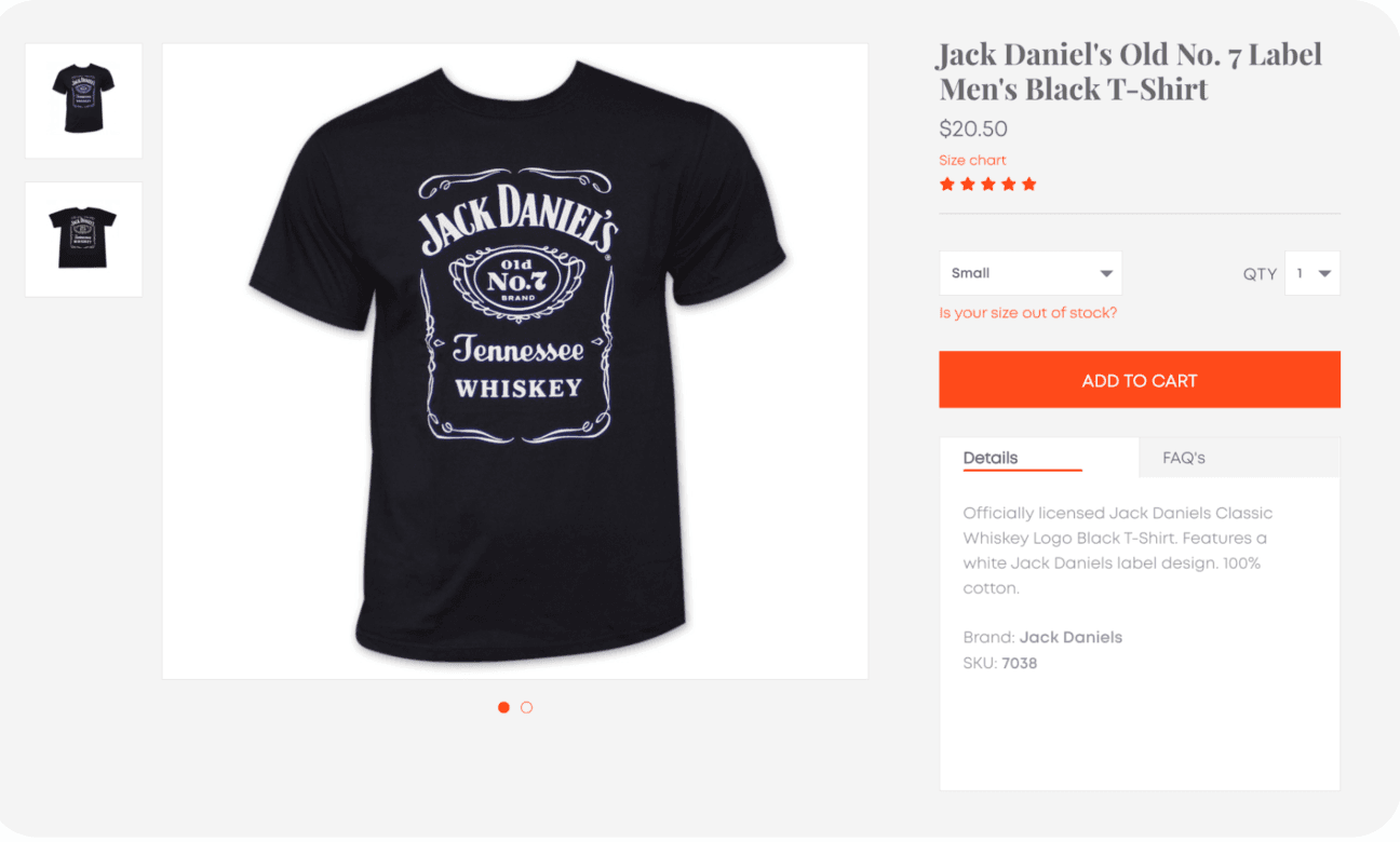
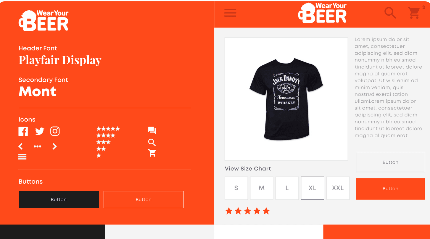
We put best UX practices to use on the product single pages as well, designing a clean, uncluttered page with clear calls to action. By using design thinking and analyzing the way a user interacts with UI elements like the dropdown menus, product ratings, size charts, etc., we created an intuitive and easy design layout in a relatively small area. Each product page has multiple image views, strong headers and concise descriptions, and a list of product reviews populated below the images and details.
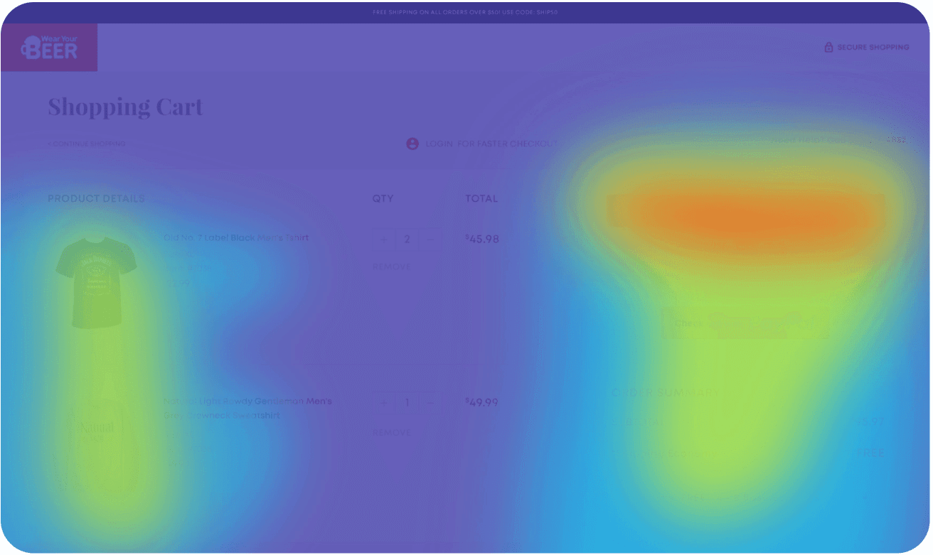
Our team of developers took on the huge task of developing a proprietary ecommerce platform for WYB. When it came to creating a checkout process, we studied other successful platforms like WooCommerce, Shopify, and Magento to create a process that exemplified all the best practices. By using heatmaps and detailed event analytics, we were able to optimize friction points and increase checkout conversion rates by 59.43%.
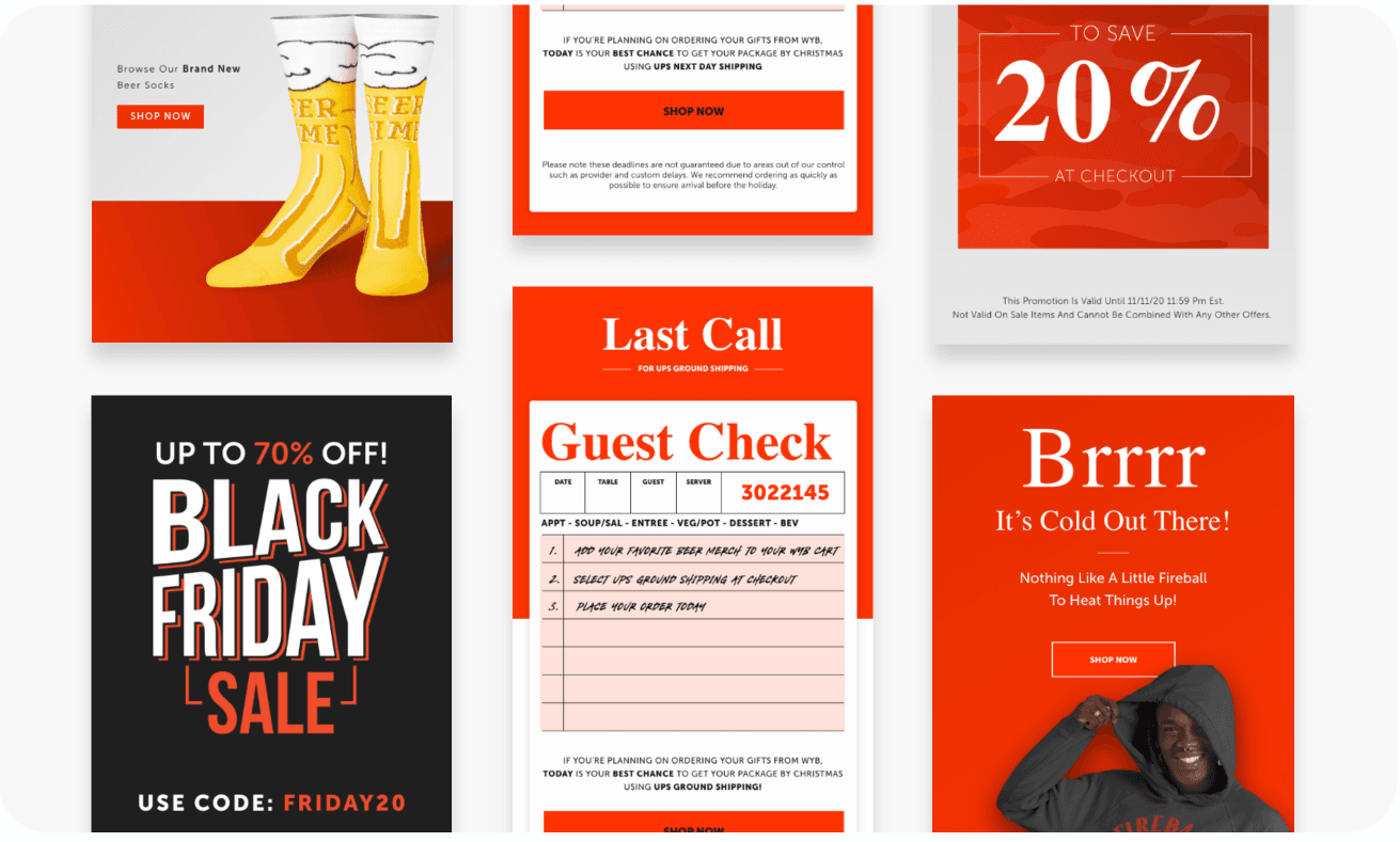
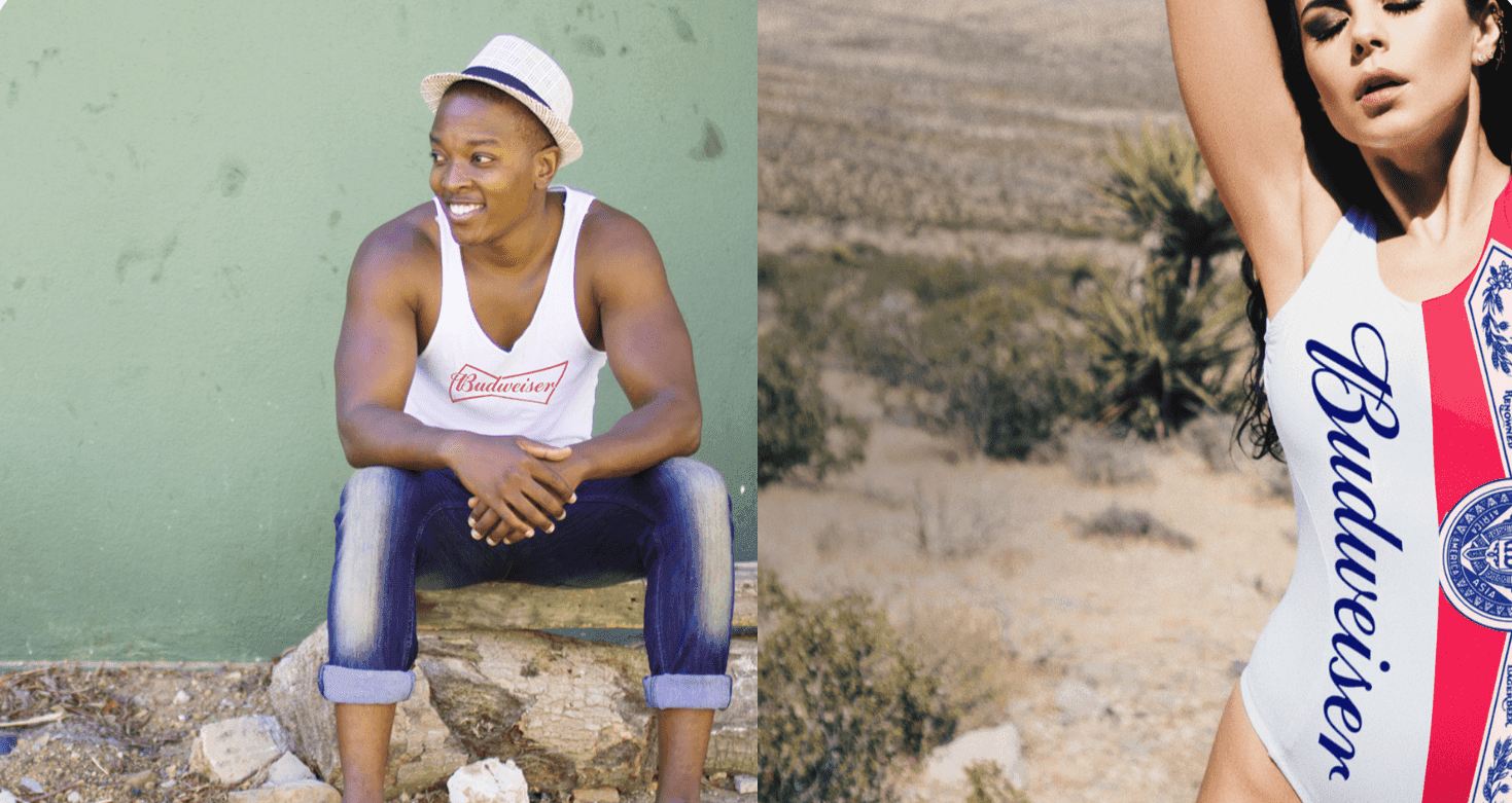
Another important piece of WearYourBeer’s refresh was their email marketing strategy. With an updated website experience, we needed strong email campaigns to match. We focused on conversion-centric design with compelling product and lifestyle imagery and bold and engaging messaging brought to life by strong typography choices. This updated aesthetic, paired with prominent calls-to-action, significantly boosted the open and conversion rates.
increase in revenue
increase in conversion
increase in new customers

voice of your brand.

