What's Your Grief • Non-profit
Grief Support for Every Day
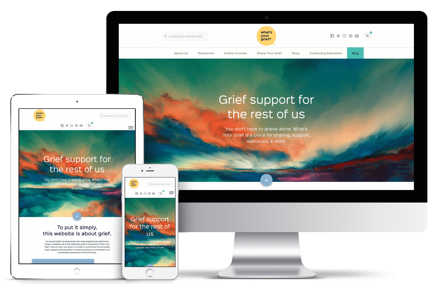
What’s Your Grief is a unique and important nonprofit that supports people who are grieving. We partnered with them to create a safe, comfortable online space for anyone, at any stage of grief.
Web Design
• 
Copywriting
• 
E-Commerce
HERE’S THE LOWDOWN
Grief is incredibly difficult, but it’s also inevitable. Everyone will experience loss in their lifetime, and in doing so, will have to reckon with the pain that comes with it. What’s Your Grief is an admirable organization that is helping people manage the everyday heaviness that comes with grieving. Because the internet is the most sure way to reach the largest number of people, What’s Your Grief’s operation is almost entirely online, with digital resources, a podcast, products, and a robust blog that serves as a center of their ongoing conversations about grieving. We partnered with the nonprofit to create a website to house their incredible work and the community that benefits from it.
Setting a Hopeful Tone

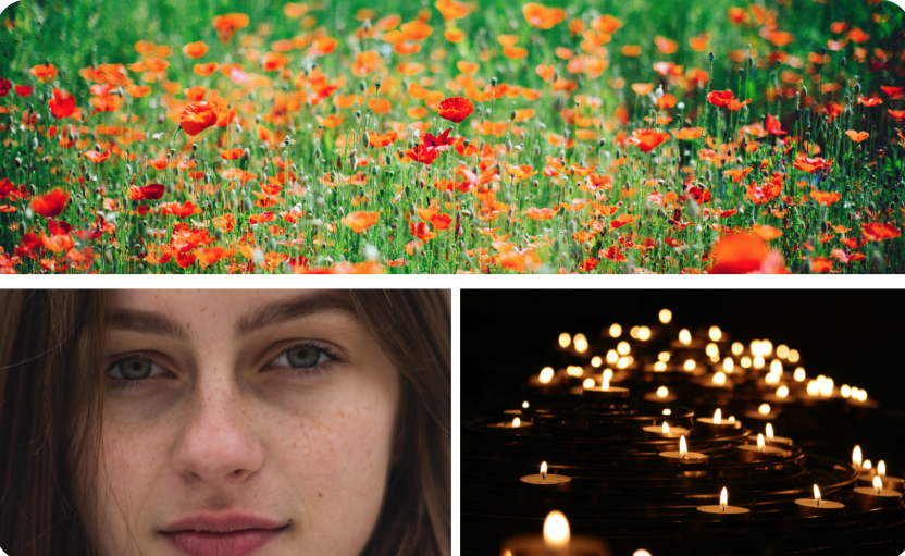
As always, we began the web design process with a thorough discovery process, talking with founders Eleanor and Litsa about their work and gauging their aesthetic preferences during a creative consultation that included different types of imagery, text, colors, and more. When dealing with a heavy subject like death and grief, color and imagery selection become integral to the success of the website.
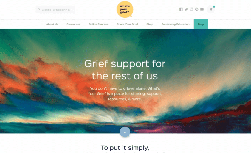
A Comfortable Place for Grief

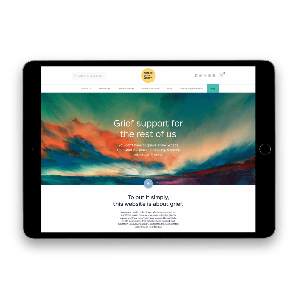
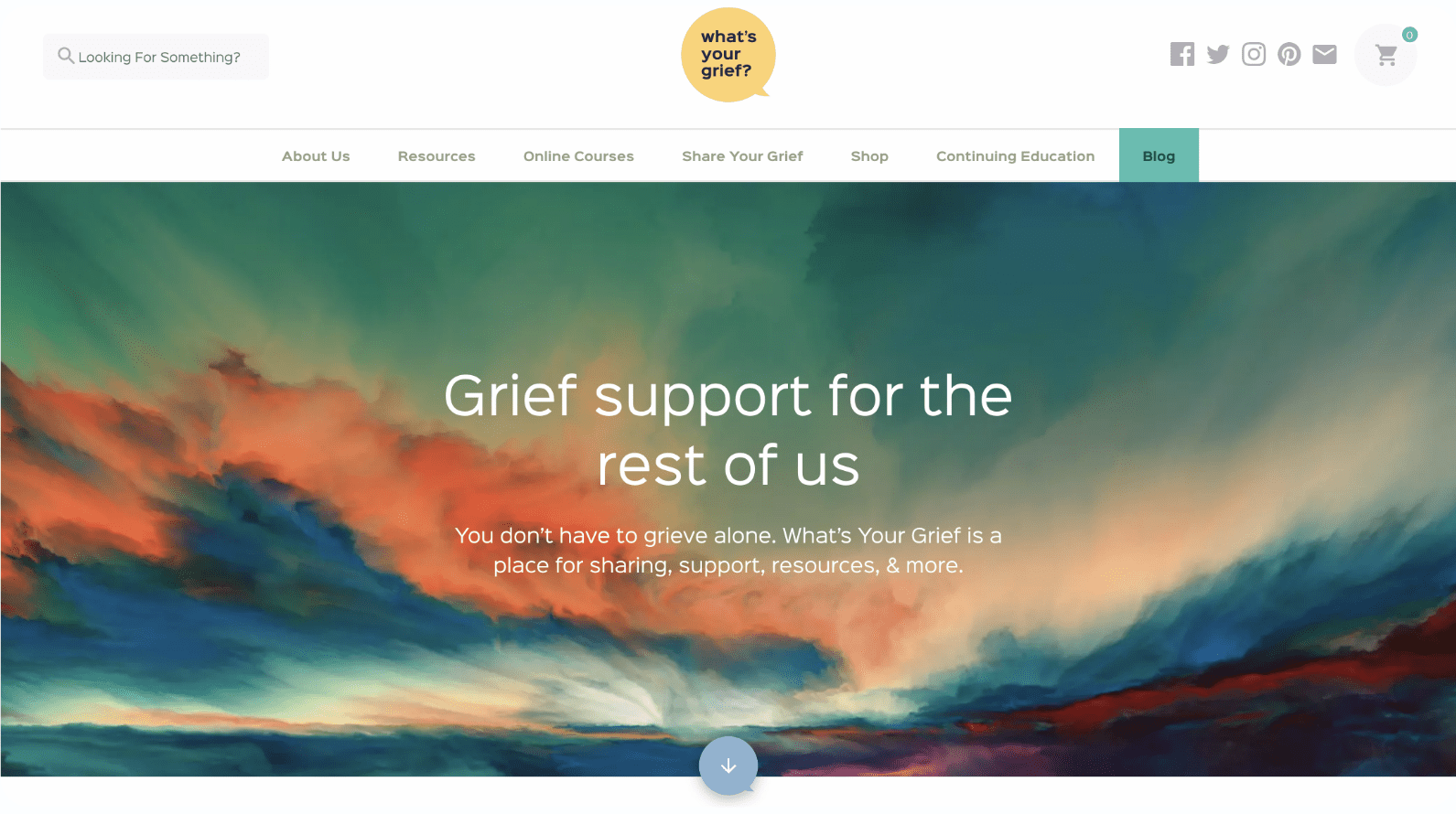
Once we had a clear understanding of What’s Your Grief’s purpose, our design team set to work on creating the hero impression. The hero impression sets the tone for the rest of the site and we knew we wanted to avoid any dark or sad imagery. We started looking at abstract art that alluded to the circle of life in nature, but left exact meaning open to interpretation. The art we used for banner imagery throughout the site is bright, vivid, and hopeful.
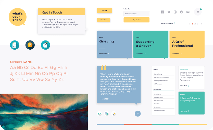
The Color of Optimism

We used color psychology to create the site’s overall color palette. Starting with yellow, a color most associated with optimism, we picked out two additional complementary colors. A minty green color, which is associated with stress relief, and blue, one of the world’s most universally loved colors, come together with the yellow to create a calming, peaceful, and welcoming palette.
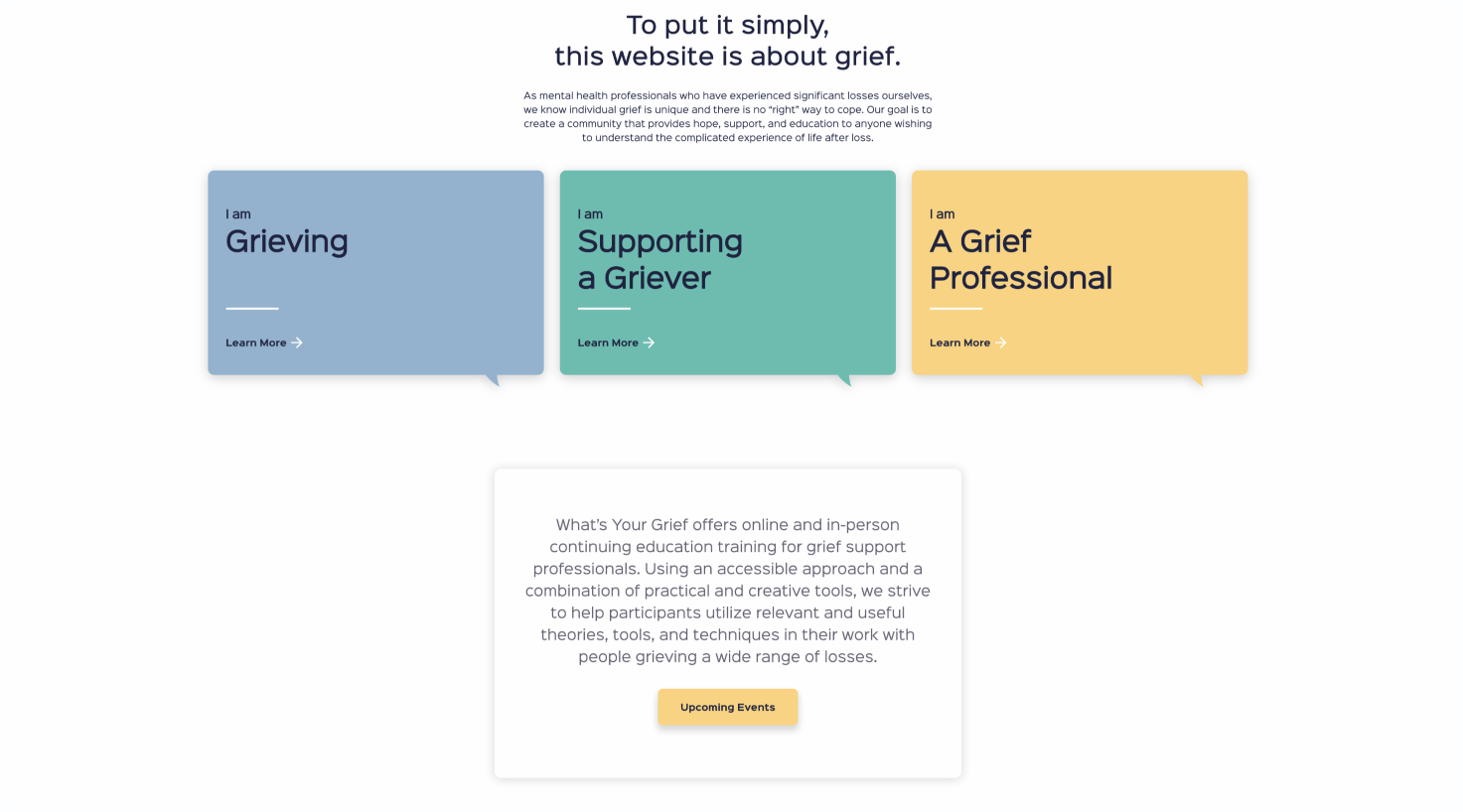
Find Your Starting Point
Information architecture was also an incredibly important part of this project, since WYG addresses three different audiences -- those who are grieving, those who are supporting a grieving, and those who work in an industry that deals with grief. We created these three jumping in points directly below the hero banner so that first-time users can get to where they need to go as efficiently as possible, leaving no room for confusion.
Finding your Resources
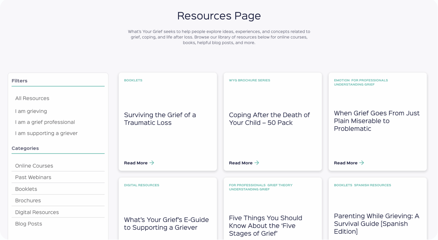
A big part of What’s Your Grief’s offerings are their resources which come in the form of blog posts, digital downloads, webinars, online courses, booklets, and more. When a user clicks on one of the three jumping-in points on the homepage, they’ll come to a resource grid pre-filtered by audience. The exploratory user can click through the filters to see all of WYG’s offerings.
Learn from the Best
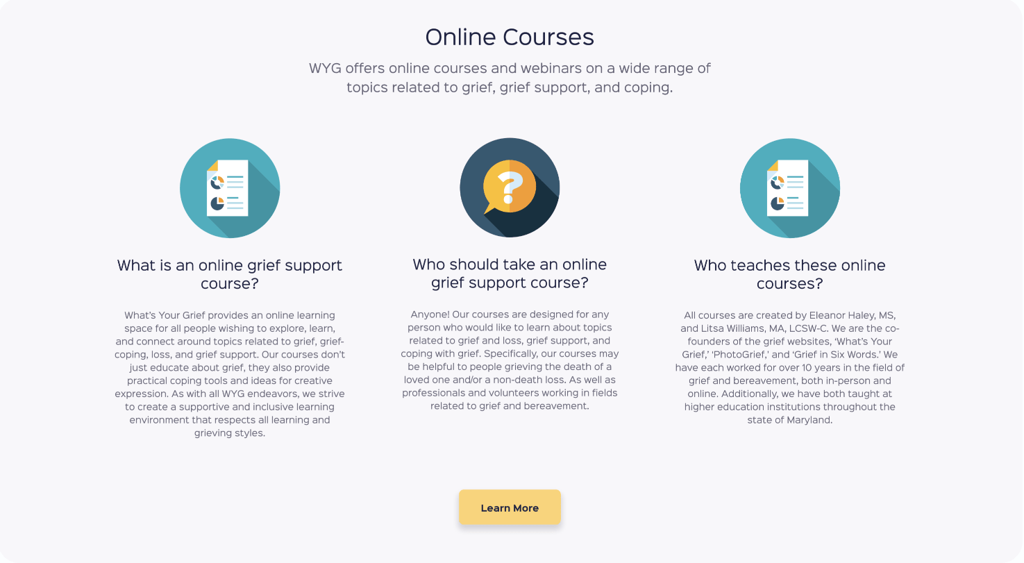
WYG offers online courses in dealing with grief, which we integrated into the site using a platform called Teachable. Course descriptions link out to the Teachable page, which then allows users to seamlessly enroll in the course and gain access to an in-depth course curriculum.
E-Commerce Integration
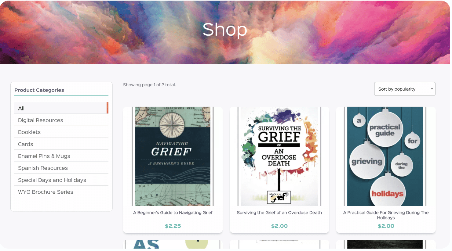
Some of WYG’s resources require purchasing, and they have various products for sale as well. This meant we needed to integrate e-commerce functionality into the site. We created an easy-to-use online store that users can filter by category and sort by price and popularity. We also implemented logic that allows user to buy products in bulk at a discounted price.
Share Your Grief
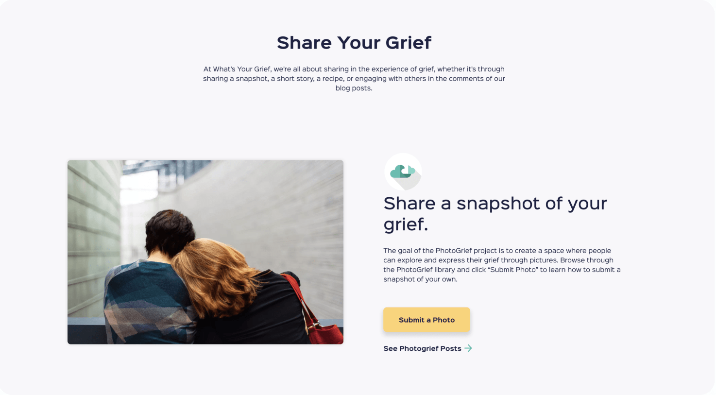
More than anything, What’s Your Grief is about finding a community of people going through the same thing you are. Share Your Grief is a page that allows users to submit photos, recipes, words, and secrets, giving them an outlet for their feelings and the opportunity to find people who are going through similar experiences.
Finding Your Community
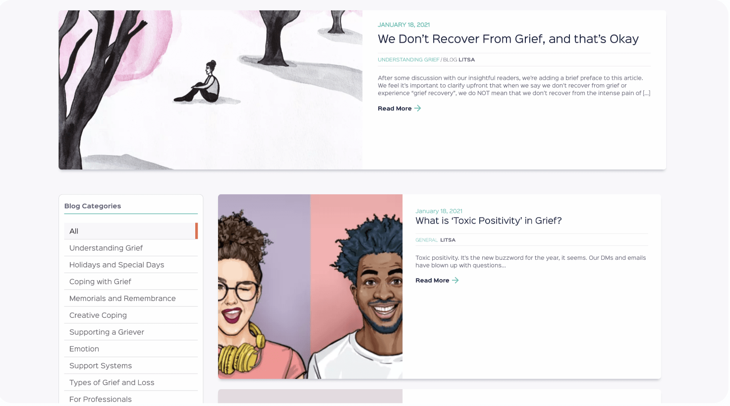
The most heavily trafficked part of WYG’s site is their blog, a robust resource that Eleanor and LItsa have been building for years. With an extensive category list, users can quickly find the subject matter that best fits their needs. A comment section on each post allows users to join in conversation.
Let's work together to bring your vision to life.
PROJECT TEAM
Orion Alden
CREATIVE DIRECTOR
Jennifer Chew
PROJECT MANAGER
Maggie Nugent
Content Director
Alex Brown
Developer
Hunter McPeak
DESIGNER
Meet Side•Sea
Lorem ipsum dolor sit amet, consectetur adipiscing elit. Aliquam convallis sollicitudin lorem non sollicitudin. Suspendisse finibus velit sapien, et faucibus justo vestibulum vitae. Sed commodo dictum pulvinar. Nullam id libero tortor. Sed bibendum dapibus nulla vitae tempor. In id nunc non nisi laoreet bibendum. Aliquam feugiat sed nulla vitae aliquam. Etiam non aliquet dolor.
Orion Alden
CREATIVE DIRECTOR
Ready to Explore the Finished Product?
Visit Site
Let’s talk!
See how we can elevate the
voice of your brand.