The Colors of Guatemala
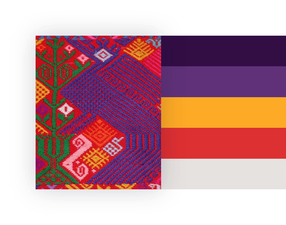
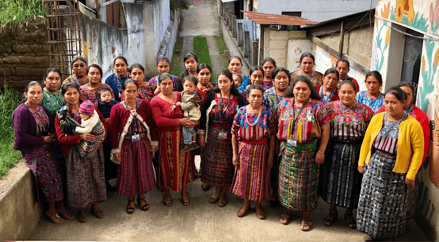
During our initial Creative Consultation with WJI, we spent a lot of time getting the color palette just right. Guatemala is a country that’s known for its vivid and bright colors, and we took inspiration from the fabrics of their traditional clothing.
An Optimistic, Welcoming Palette
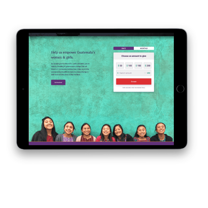
The color palette we ended up choosing used a deep purple as it’s primary base, while a bright red, teal, and yellow are used as friendly, eye-catching “pop” colors that come together to create a vibrant, optimistic color palette. Because WJI’s content is somewhat serious, we wanted to balance out the sometimes tough subject matter with a palette that would make people feel welcomed and safe.
Imagery that Engages
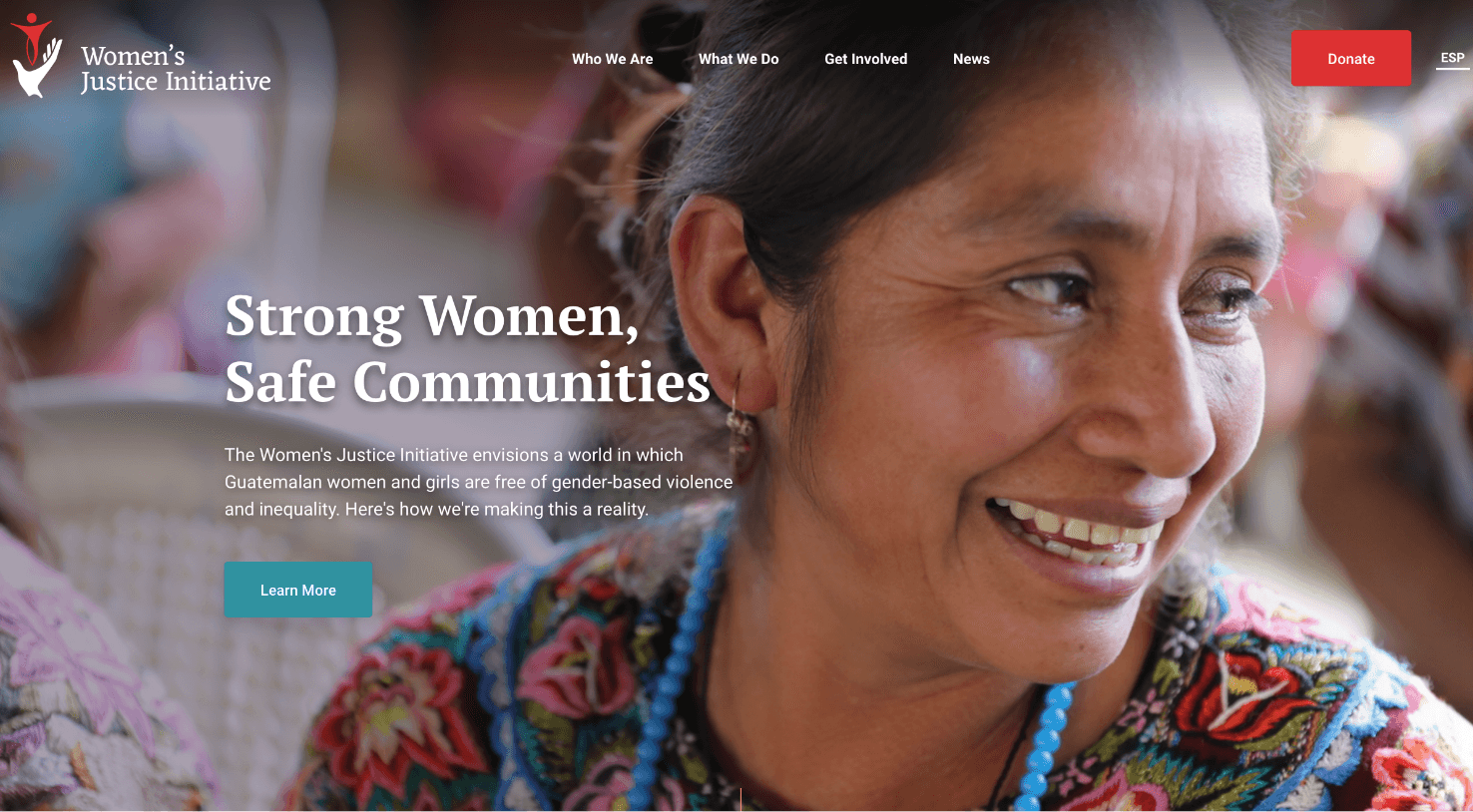
As we mentioned above, WJI came to us with some really amazing imagery of the people and communities they work with. Having access to these photos made it easy for our design team to create pages that were engaging and authentic. We also used beautiful landscape shots of Guatemala as background imagery in certain sections.
Dedicated Program Pages
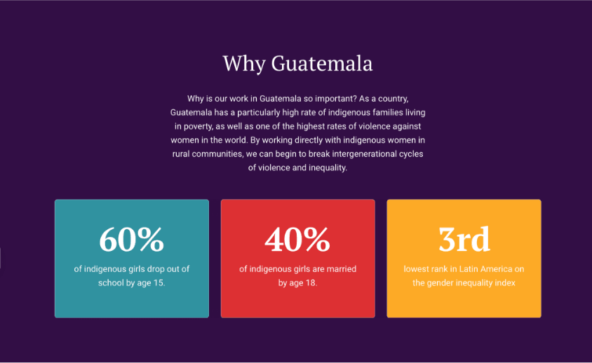
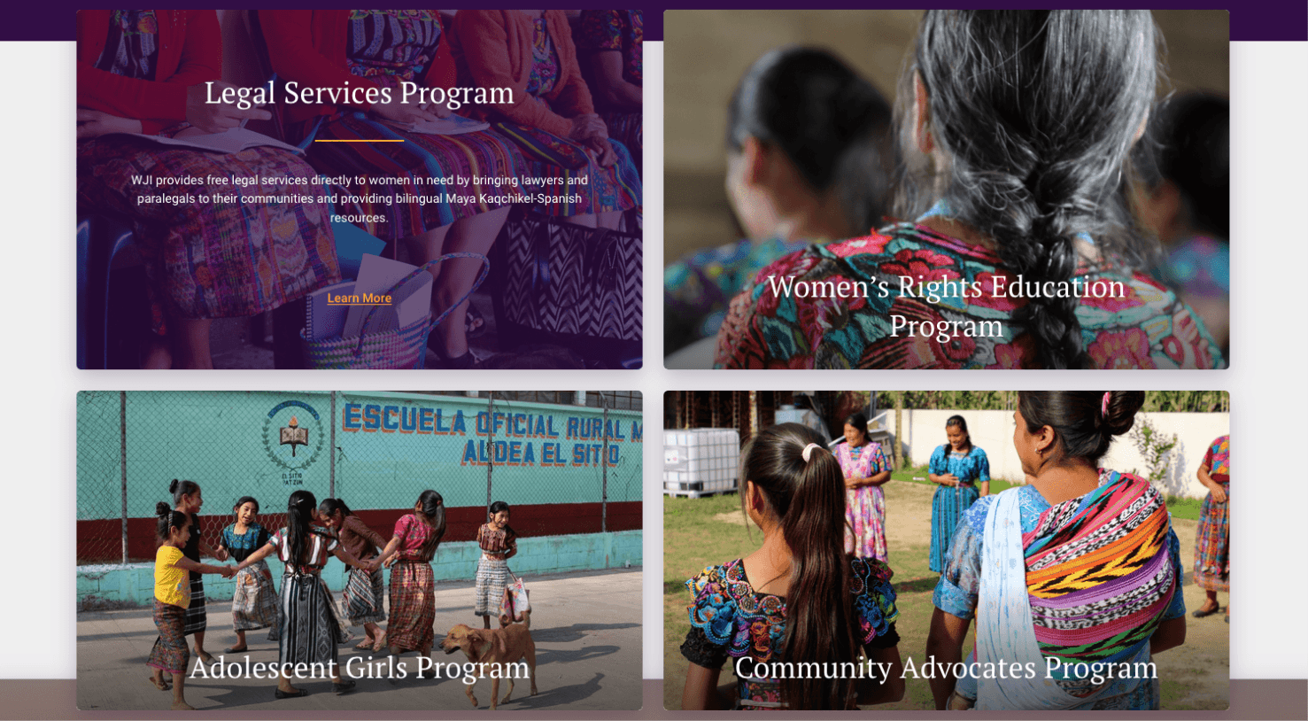
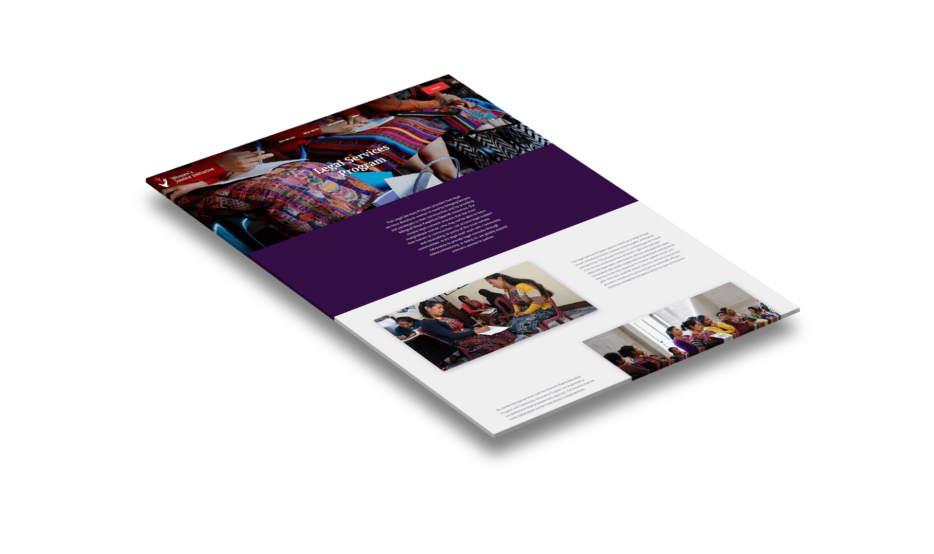
WJI offers four core services to women and girls in Guatemala. To make sure each program got enough real estate on the site, we gave each one its own interior page where WJI could feature videos, photos, stats, related news, and testimonials specific to that program.
In Their Own Words
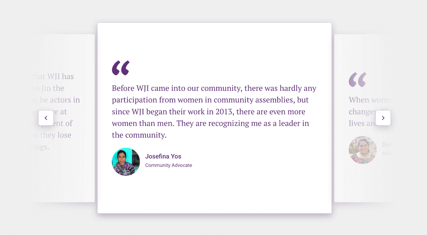
Testimonials are another great way to add authenticity and credibility to a website. We created a scroller of testimonials that allows WJI to add a small avatar of the person giving the testimonial. Being able to attribute a quote to a real person further legitimizes their review.
An Interactive Timeline
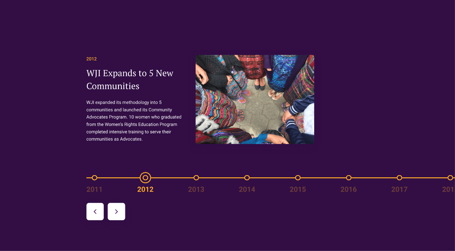
WJI has done a ton of work since its start in 2011. To help their audience visualize how far the organization has come, we created this interactive timeline that allows the user to scroll through the years and read about each of the significant milestones along the way.
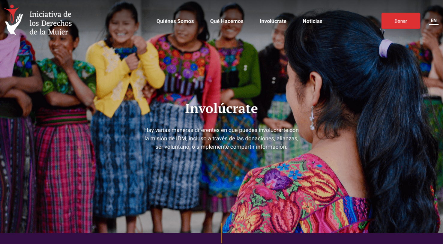
Serving a Bilingual Audience
While WJI is based in Guatemala, many of its donors are from other parts of the world. It was important that the site was accessible to both Spanish and English speakers. To address this, we created a language toggle at the top of each page and essentially duplicated the design so that every user would get the same experience, regardless of which language they chose.
Let's work together to bring your vision to life.
PROJECT TEAM
Orion Alden
CREATIVE DIRECTOR
Hunter McPeak
DESIGNER
Maggie Nugent
Content Director
Jennifer Chew
PROJECT MANAGER
Alex Brown
Developer

I always love projects that allow us to pull inspiration from geographies and cultures. The ability to use the colors, textures, and imagery from a country as beautiful as Guatemala gave us a wellspring of inspiration to build upon and gives the final design such an authentic feel.
Orion Alden
Creative Director
Ready to Explore the Finished Product?
Visit Site
Let’s talk!
See how we can elevate the
voice of your brand.
voice of your brand.
