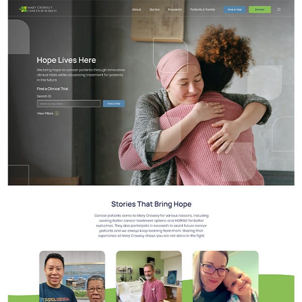
Web Design
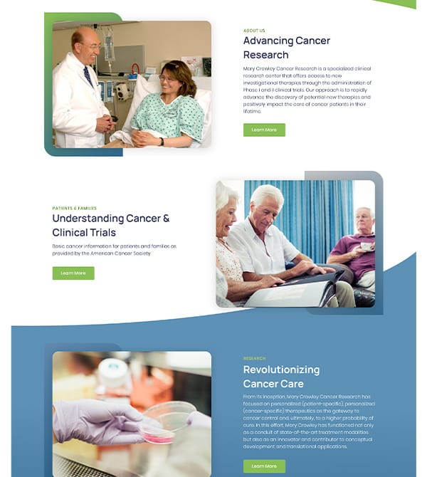
Mary Crowley’s mission is to bring hope to cancer patients through innovative clinical trials while advancing treatment for patients in the future. They were looking for a redesign of their website that showcased trial accessibility along with a straightforward approach to donations and essential patient information.
Explore case study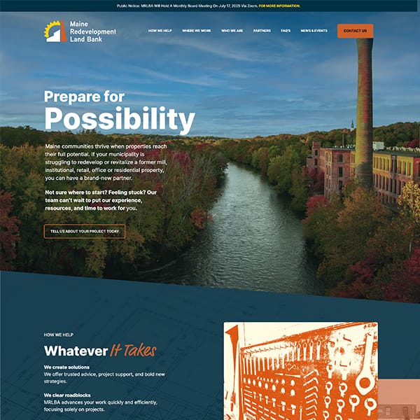
Web Design • E-Commerce
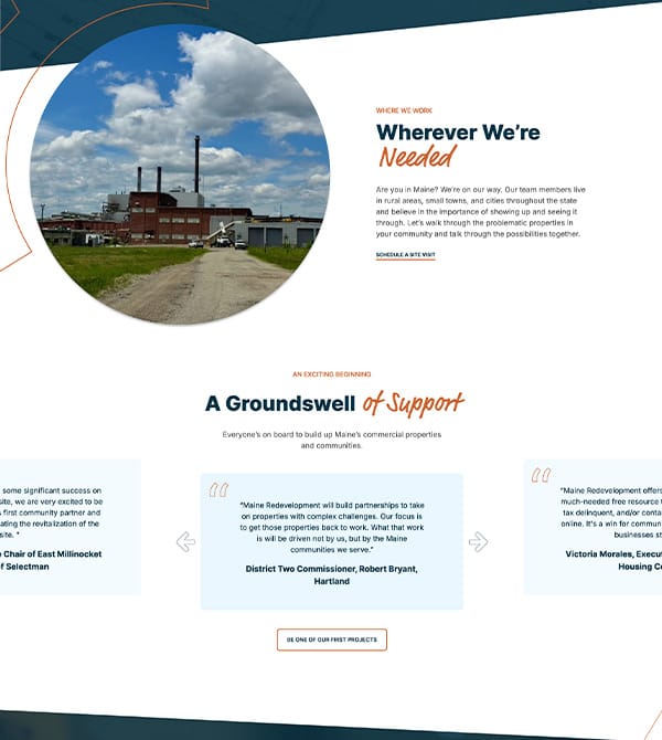
MRLBA needed a website that could bring their mission to life—combining a clear brand identity with engaging, accessible design to highlight their work, inspire action, and connect with diverse audiences across Maine.
Explore case study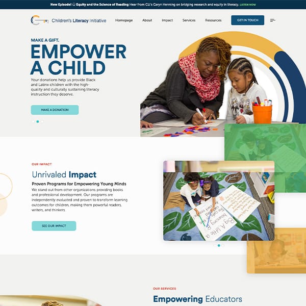
Web Design • Software Development
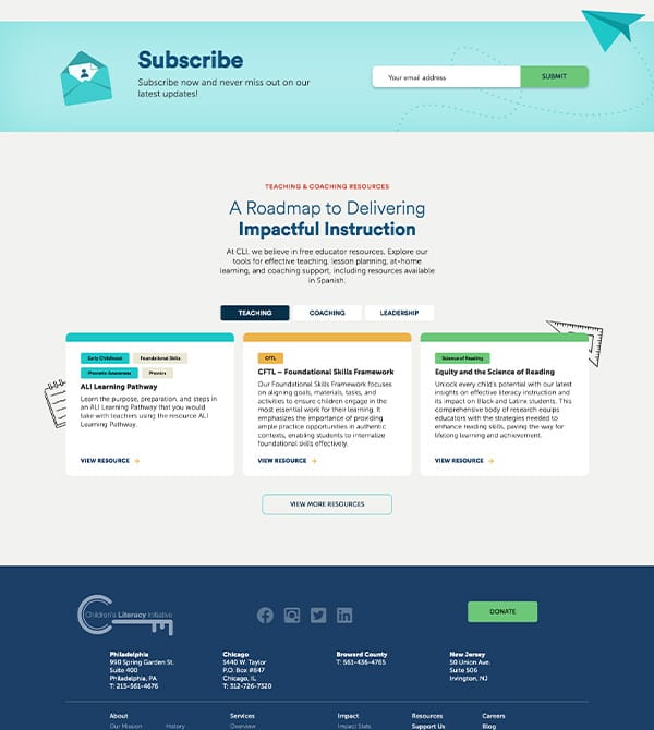
The Children's Literacy Initiative (CLI) required a modern, user-friendly website that not only highlighted their mission and impact but also provided a seamless e-commerce experience for making donations. The new site needed to be engaging, informative, and reflective of CLI's commitment to educational equity and culturally responsive teaching.
Explore case study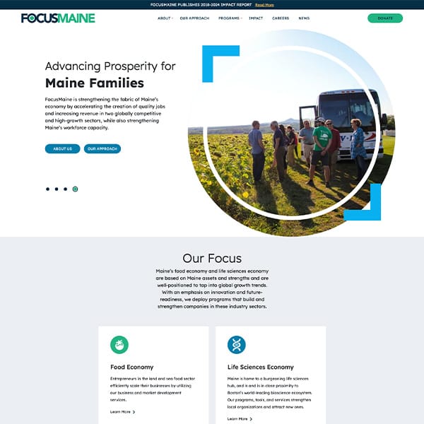
Branding • Logo Desing • Messaging • Web Design
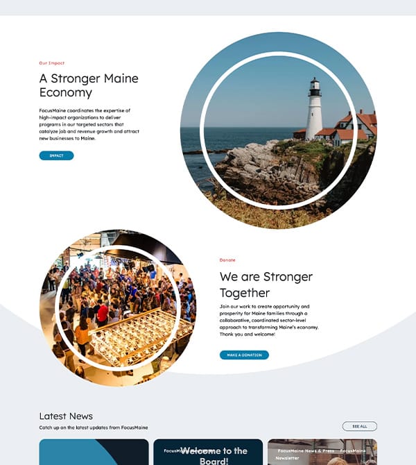
Distilling complex ideas into compelling, user-friendly content can be a challenge. FocusMaine needed a fresh approach to communicate their mission effectively.
Explore case study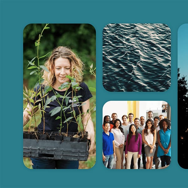
Branding • Logo Design • Messaging • Web Design
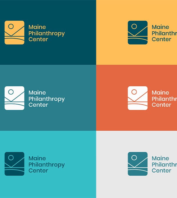
Maine Philanthropy Center (MPC) is a unique membership association bridging the philanthropy gap in Maine by connecting grantmakers to nonprofits and consultants. side●sea wanted to give them a logo, website, and brand to match their vibrant and ambitious energy.
Explore case study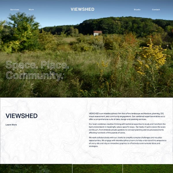
Messaging • Web Design
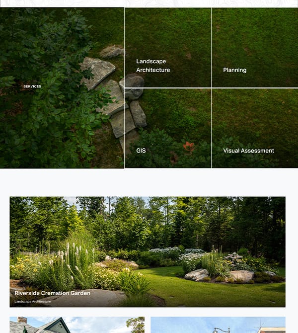
Viewshed came to side●sea for a beautiful website that not only explains their products and services, but helps them bring in new clients. They needed assistance explaining the value and solutions they provide.
Explore case study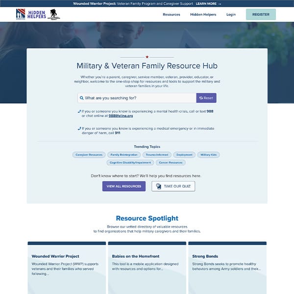
Web Design
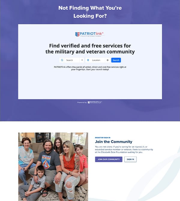
We partnered with the Family Resource Hub to convey their mission through a tailored online experience. They needed a website that builds trust and ensures easy access to resources for caregivers and veterans. This collaboration enhances accessibility, connecting military families with essential resources and nurturing a strong, supportive community.
Explore case study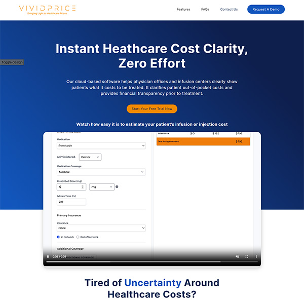
Web Design • Copywriting • Software Development
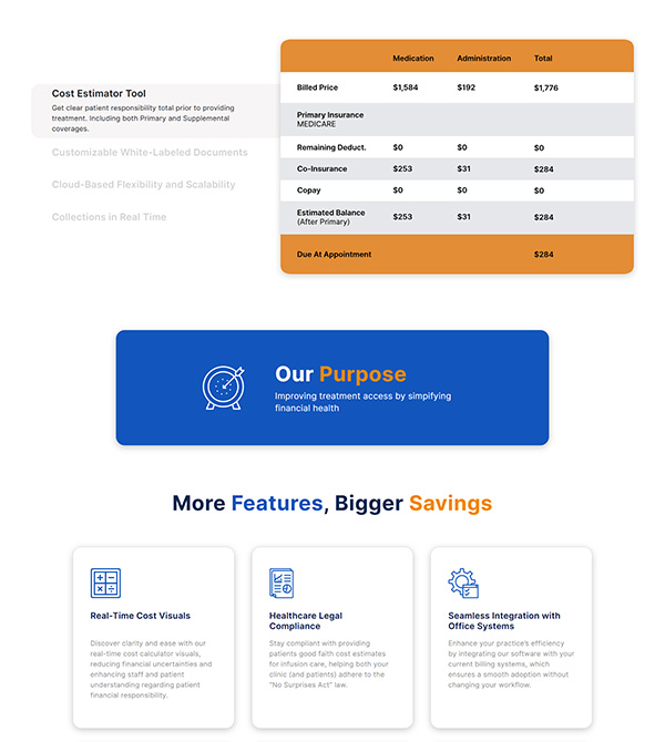
VividPrice required a customized landing page to highlight their cutting-edge software offerings. We designed a user-friendly platform that boosts engagement while ensuring a smooth integration with their current systems, providing a seamless user experience and elevating their online presence.
Explore case study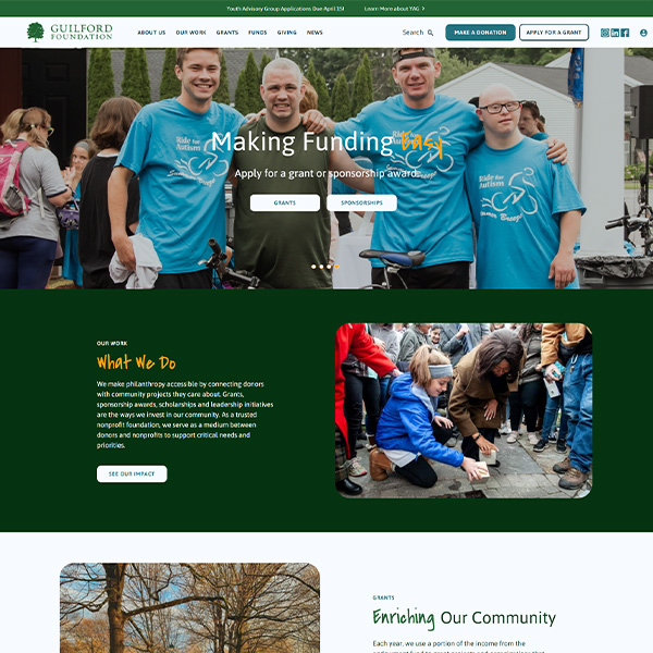
Web Design • Copywriting
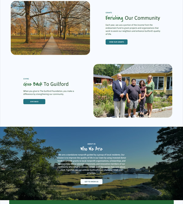
We partnered with the Guilford Foundation to create a new website that reflects this trusted, impactful, local, and committed organization. The site needed to showcase the organization’s impact and create compelling stories that compel users to make a donation. Grantees needed to be able to see available funding opportunities, know if they qualify, and easily apply.
Explore case study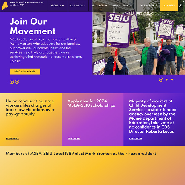
Web Design • Copywriting
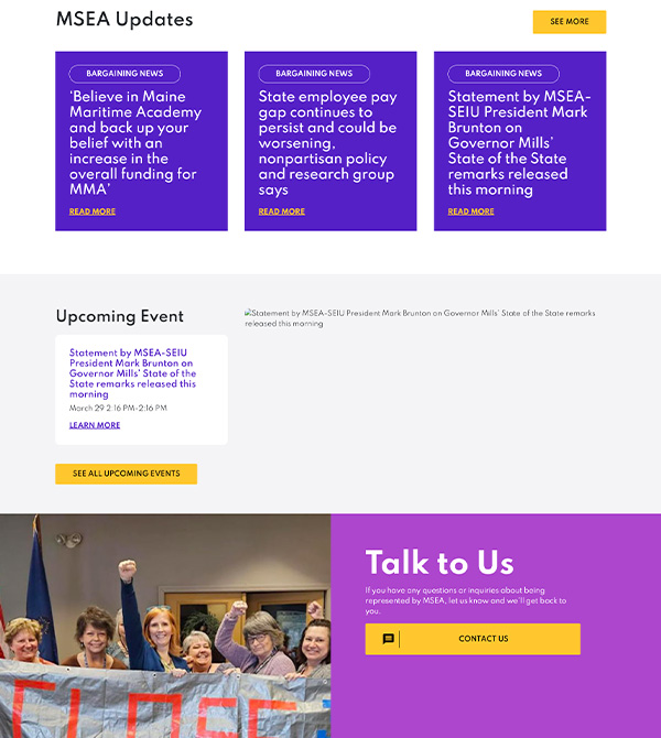
The Maine Service Employees Association (MSEA) came to side●sea for a new website to increase membership and showcase recent victories. It needed to be a place where union members could find information, success stories, events, and how to get involved. Plus, it needed to link to their social media accounts and have two separate gated portals.
Explore case study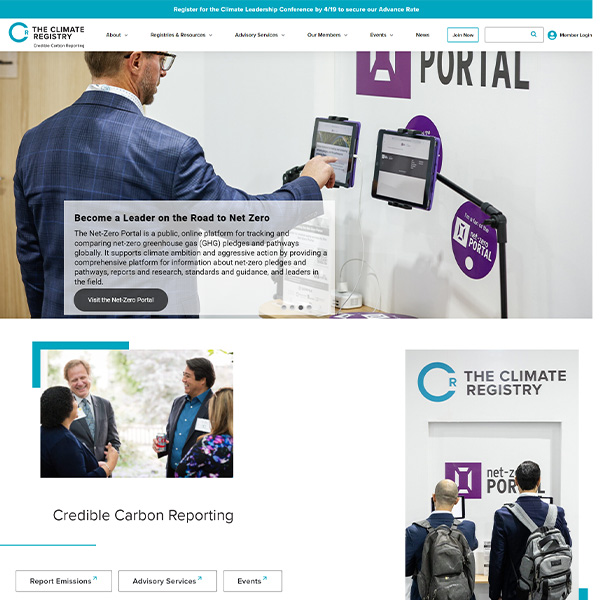
Messaging • Web Design
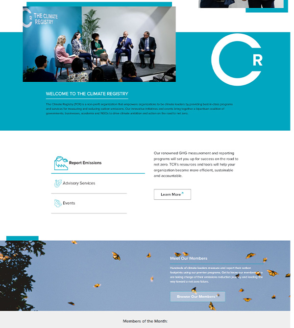
The Climate Registry and side·sea partnered up to create a website where members could log in to a member portal and access gated content. With lots of content, reports, and data, they needed a way to make it exciting and keep users engaged.
Explore case study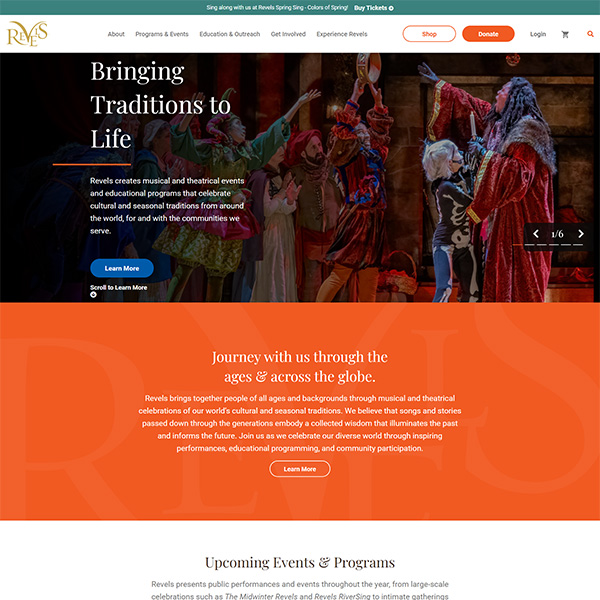
Branding • Web Design • Copywriting • Software Development
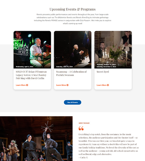
With so many unique cultures and traditions in the world, Revels needed our expertise in portraying them through a compelling and user-friendly website. Inspired by their sense of humanity and connection, we knew exactly how we could bring their ideas to life.
Explore case study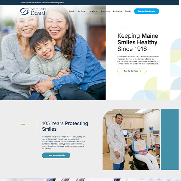
Web Design • Copywriting
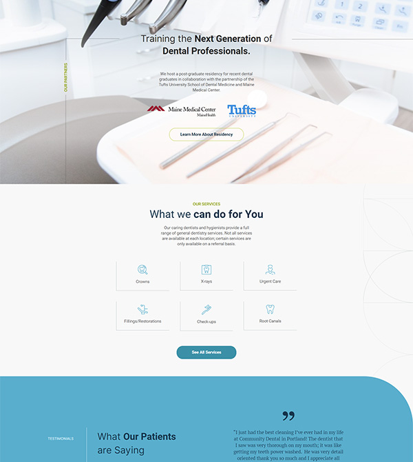
Community Dental needed a new website that would be easy for them to manage on the backend and focused on increasing the primary conversions: appointment scheduling, donations, recruitment of students, and a patient portal. With a long history, it needed tools to tell its story and highlight its impact over generations of Mainers. And to recruit medical students, it needed to explain its relationship with MaineMed and Tufts University and entice students to complete their residency there.
Explore case study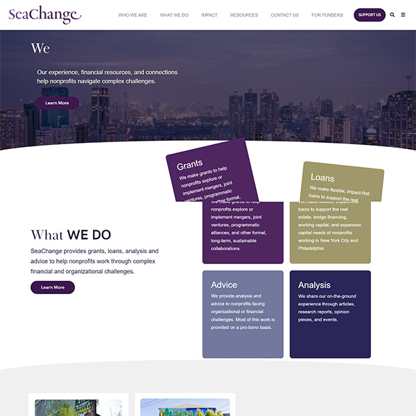
Web Design • Software Development • Copywriting
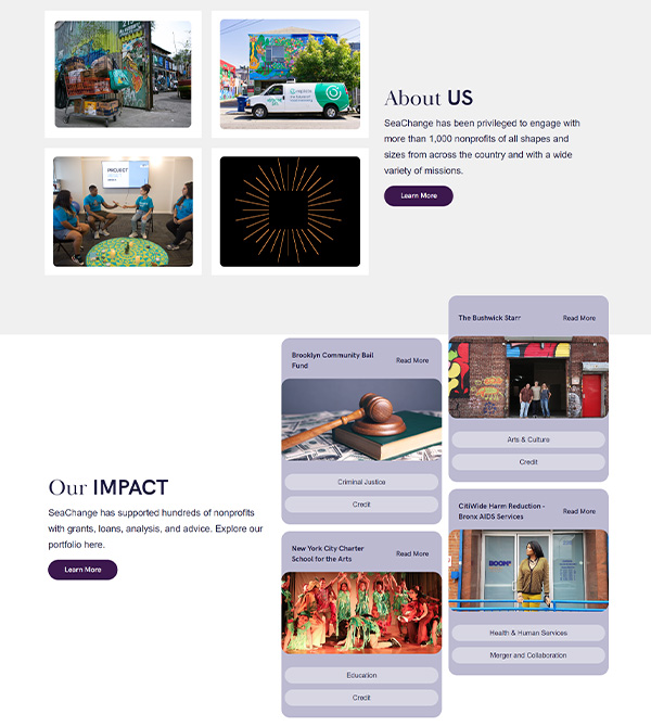
SeaChange wanted to make the organization more accessible and comprehensible to both nonprofits and donors through a website that’s inspiring and easy to navigate.
Explore case study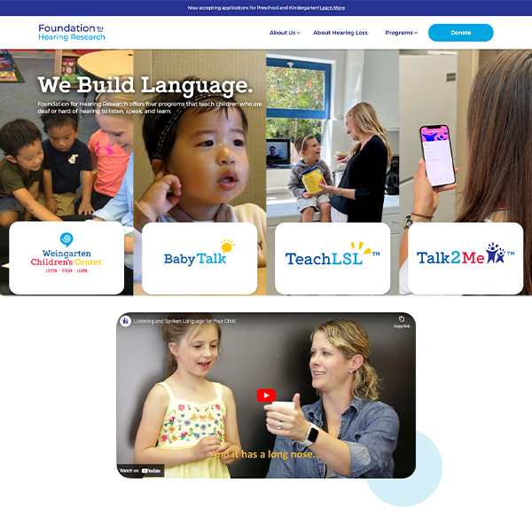
Web Design
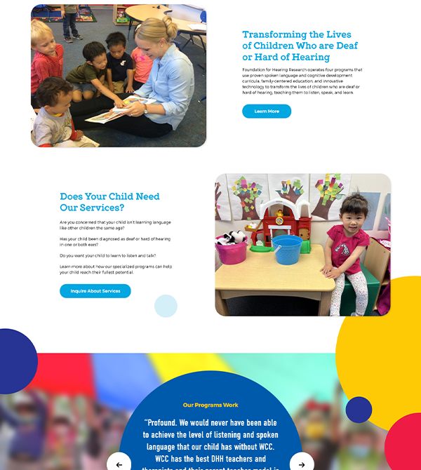
The Foundation for Hearing Research needed a robust, custom-built site. As an umbrella organization, they needed virtual real-estate to elaborate on the four programs they run and an easy way for families to enroll in these programs. They also needed to provide information and resources to families of deaf and hard of hearing children.
Explore case study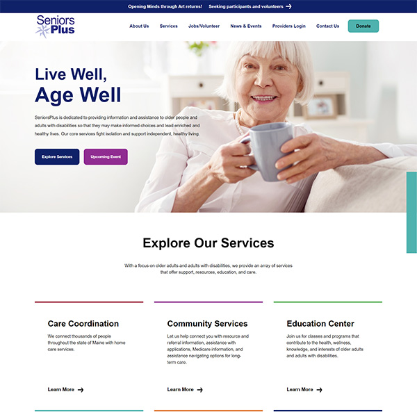

Web Design
SeniorsPlus was looking for a web design that’s easy to understand and navigate while showcasing the community and care that goes into the services they provide.
Explore case study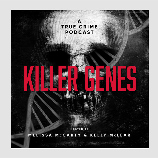
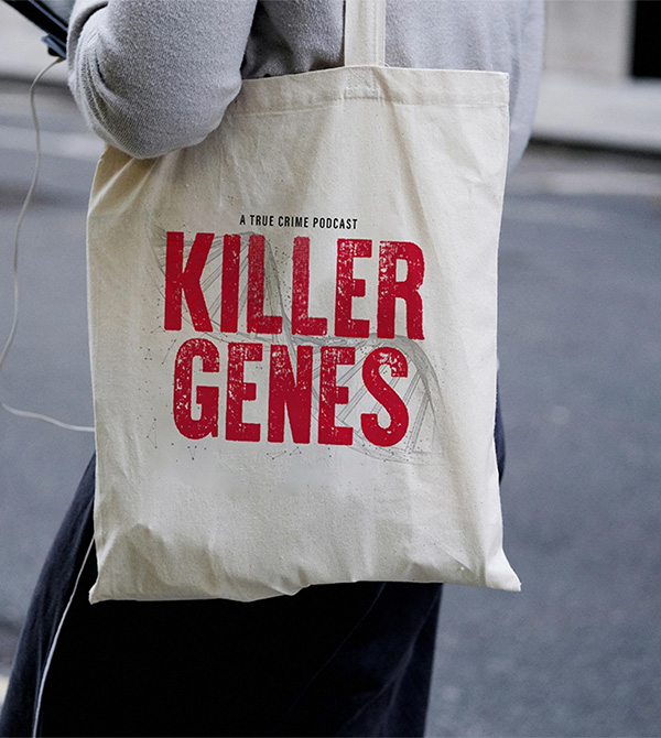
Podcast Covers • Copywriting
Crafting podcast covers is an art of distillation. Each cover is a meticulously crafted piece, harmonizing colors, typography, and imagery to capture attention in a crowded audio landscape. We’ve partnered with them to showcase their rapidly growing market online.
Explore case study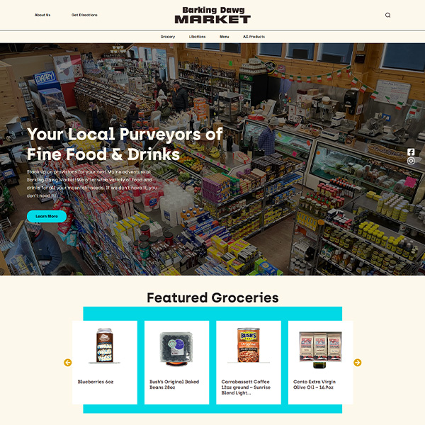
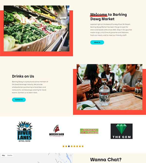
Web Design • Logo Design • E-Commerce
Barking Dawg Market was bought by new owners and needed a new website and logo to match. This required new site e-commerce functionality so customers could take advantage of curbside pickup and shipped orders with the potential to add delivery services.
Explore case study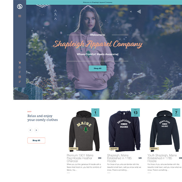
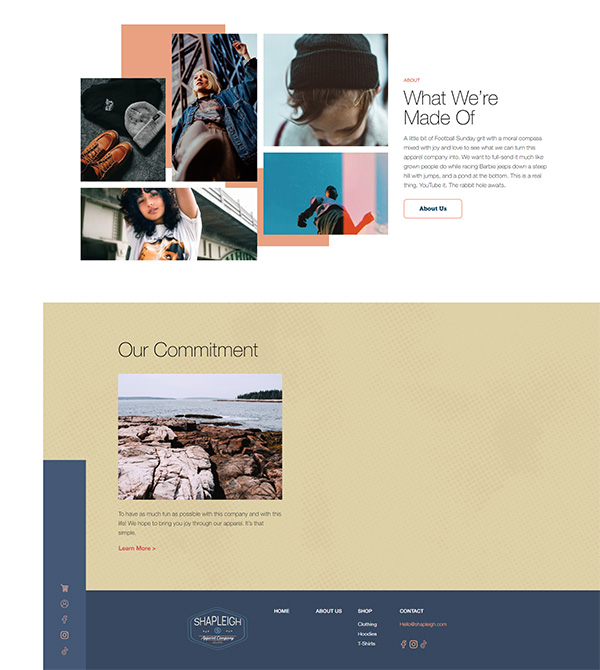
Logo • Branding • Web Design • Copywriting • Software Development
Shapleigh is known for its comfortable and stylish offerings, but they needed assistance showcasing it to the world. Luckily, at Sidesea, we're always ready with practical ideas for designing standout websites. So, we teamed up with Shapleigh and crafted a user-friendly e-commerce site.
Explore case study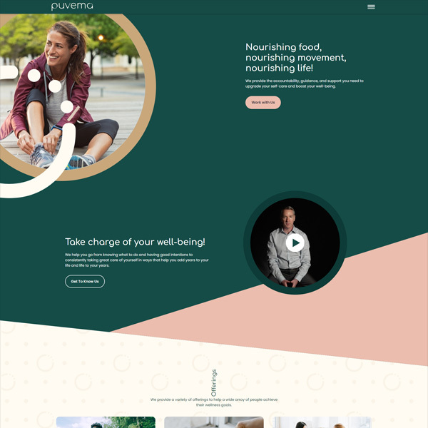
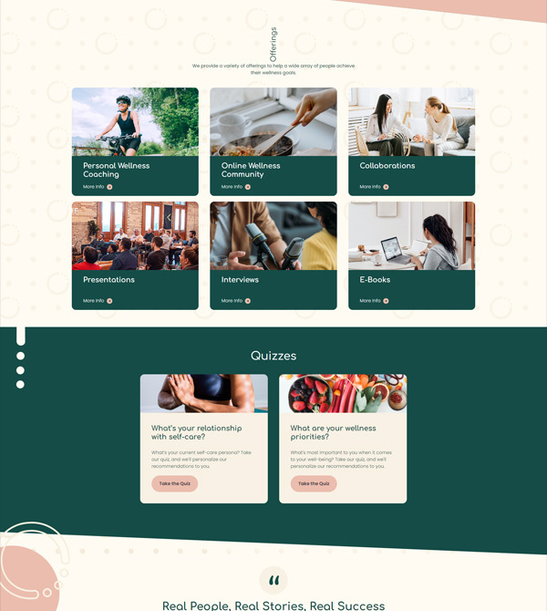
Branding • Logo Design • Software Development • Web Design • Copywriting
Puvema, a life-transforming wellness movement, needed assistance in creating a fresh-looking website to take everyone’s health journey to the next level. By harmonizing captivating visuals with compelling content, the Puvema website focuses on evidence-based approaches to holistic wellness. This ensures that all users can become the healthiest and happiest versions of themselves.
Explore case study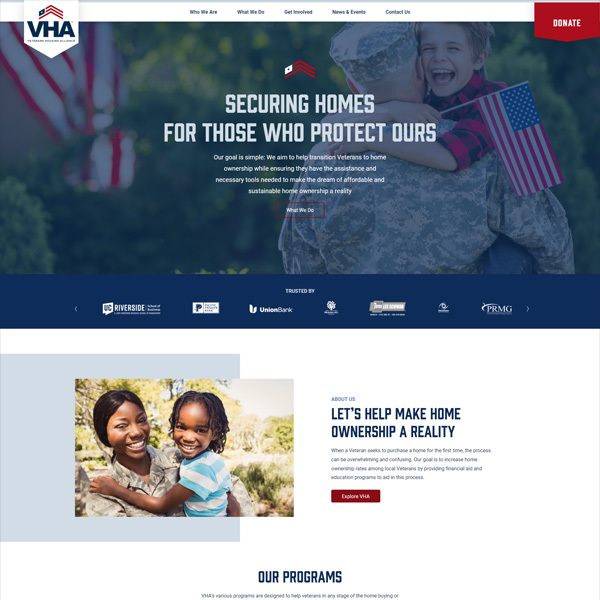
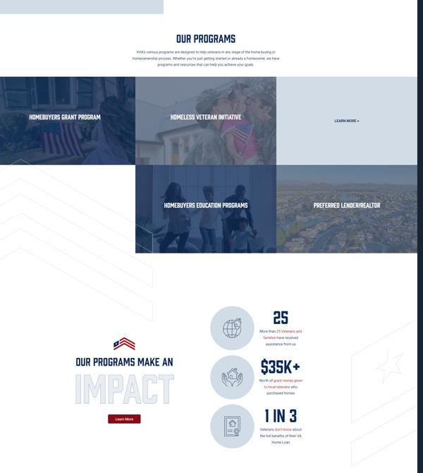
Web Design • Copywriting • Online Fundraising
Veterans Housing Alliance is a nonprofit organization dedicated to helping Veterans and Military personnel achieve homeownership. We collaborated with VHA to develop a user-friendly website that prominently features their programs, services, and online fundraising capabilities through the use of curated images and concise copy.
Explore case study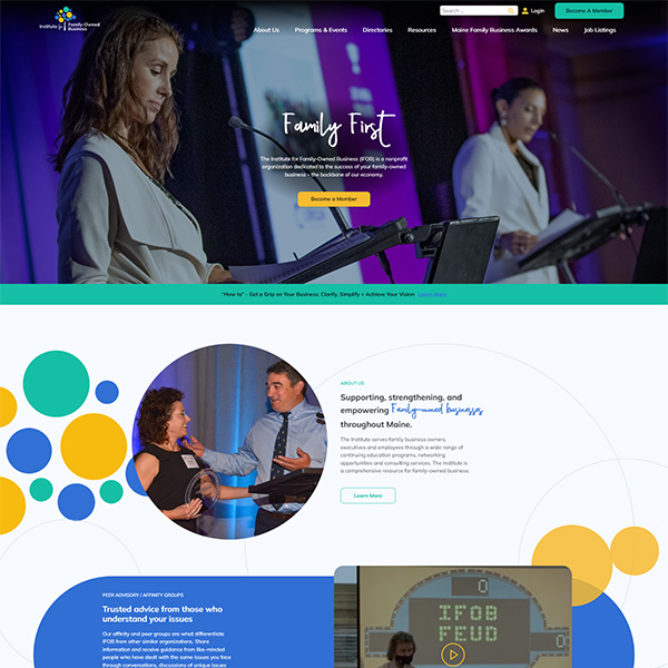
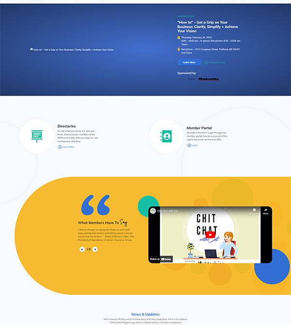
Messaging • Web Design
The Institute of Family-Owned Businesses needed an accessible new website and messaging strategy. The primary goals of these projects were to engage users, increase conversions, and attract new family business owners, associate partners, and sponsors.
Explore case study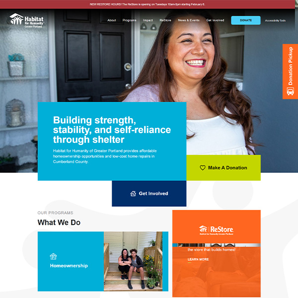
Web Design • Software Development • Copywriting
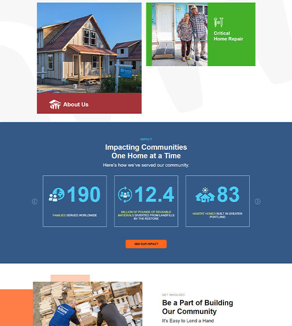
Habitat for Humanity and side•sea share the same passion - building incredible things that make a lasting impact. Habitat for Humanity helps people by building their homes, and we helped them build their dream website. They were looking for a standout website that would showcase their work in a user-friendly way, ensuring both donors and those in need of a new home find exactly what they are looking for.
Explore case study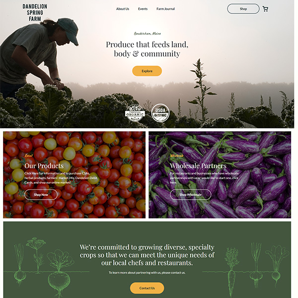
Web Design • Software Development • Copywriting
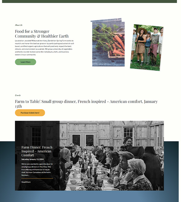
Dandelion Spring Farm’s produce is always as fresh as it gets, ready to feed the people of Maine. Their old website needed that same love and tending, and we were beyond excited to help them create a fresh, fruitful website.
Explore case study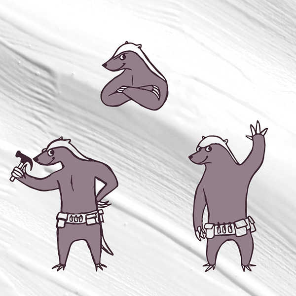
Branding • Logo Design
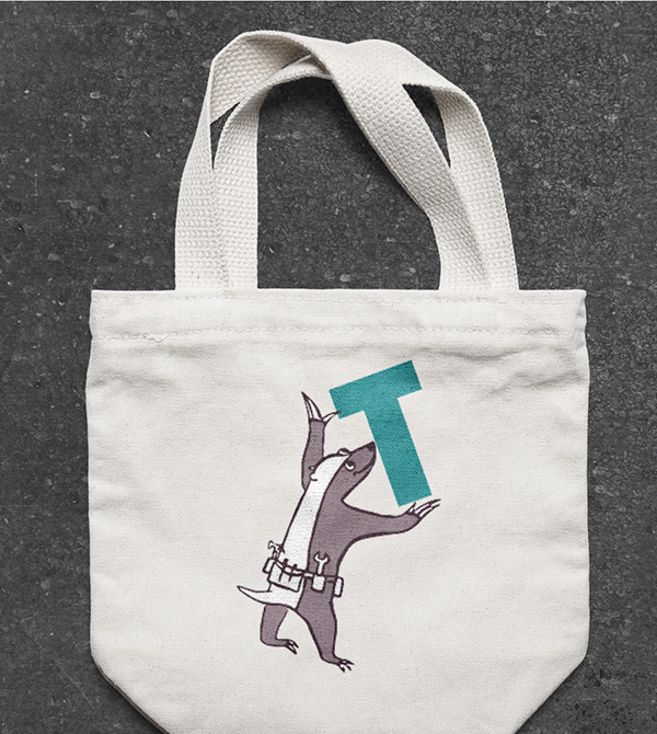
Main + Tenacious is a community that helps homeowners overcome any and all hiccups to home maintenance so that they can fully enjoy and relax in their home. They needed help crafting a brand that resonates with their audience and bringing their beloved mascot to life.
Explore case study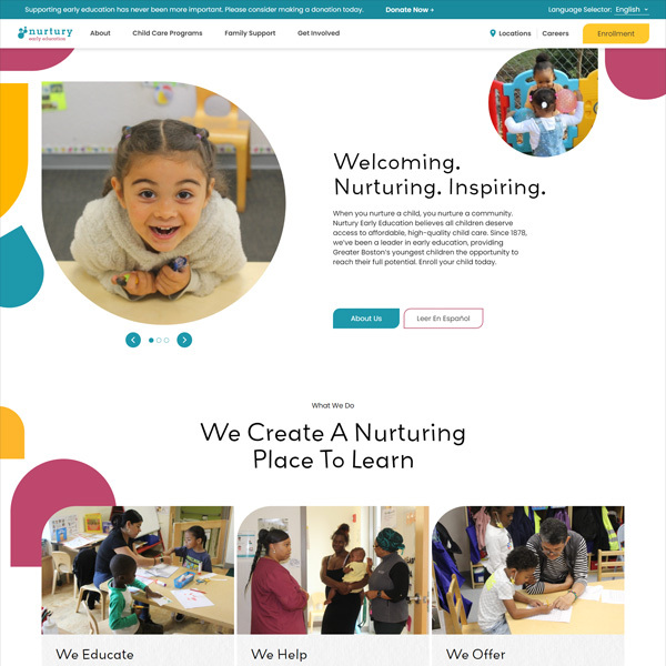
Messaging • Web Design
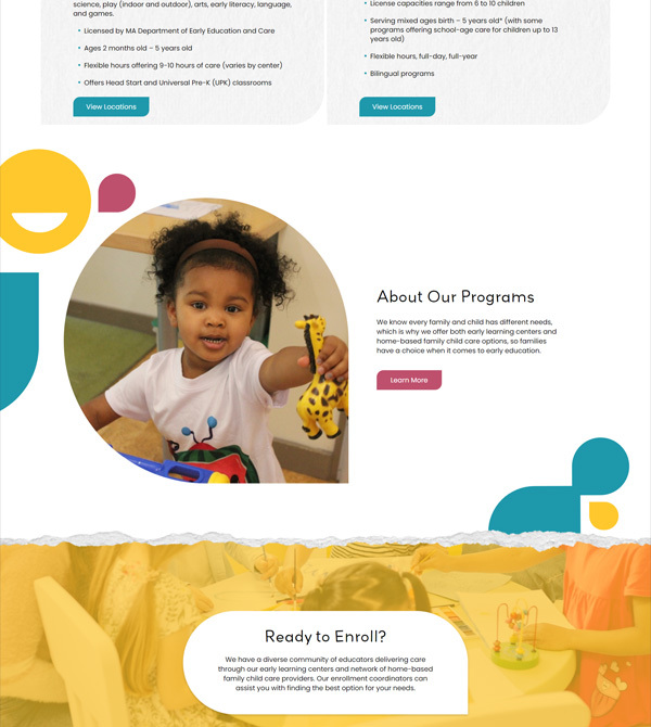
Nurtury Early Education needed a robust, custom-built site with streamlined, simplified, and easily understood content. One of the main goals of this project was to create an interface allowing those seeking care to easily search among 140+ locations and find a child care provider near them with openings.
Explore case study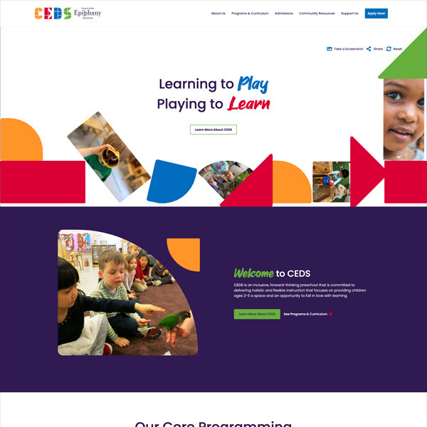
Web Design • Copywriting
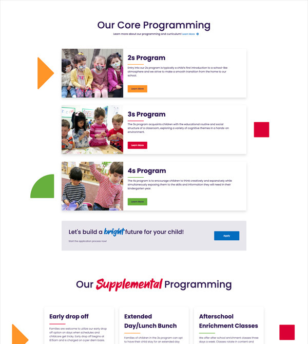
The Church of the Epiphany Day School, or CEDS for short, was looking for elevated branding and a new website that would reflect their values and help increase enrollment.
Explore case study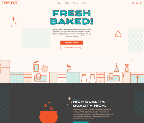
Web Design • Copywriting • Animation • Ecommerce
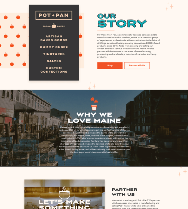
With the sale of recreational marijuana newly legal in the state of Maine, businesses like Pot + Pan are facing increased demand and a fresh new market of consumers.
Explore case study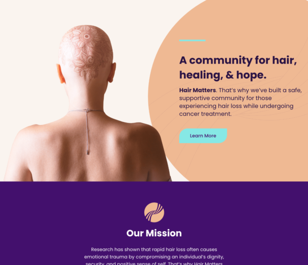
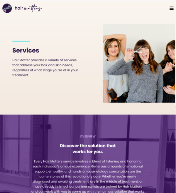
Branding • Logo Design • Messaging • Web design
Still in its early stages as a nonprofit, Hair Matters needed a strong brand and website as they built their community for cancer patients and hairstylists.
Explore case study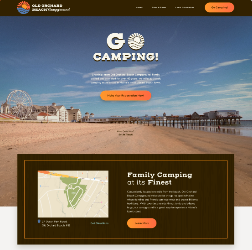
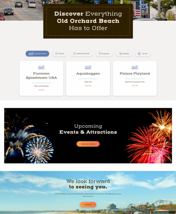
Logo design • Branding • web design
While camping is all about putting down your screen and enjoying nature, it’s still important for campgrounds like Old Orchard Beach Campground to have a sophisticated online presence.
Explore case study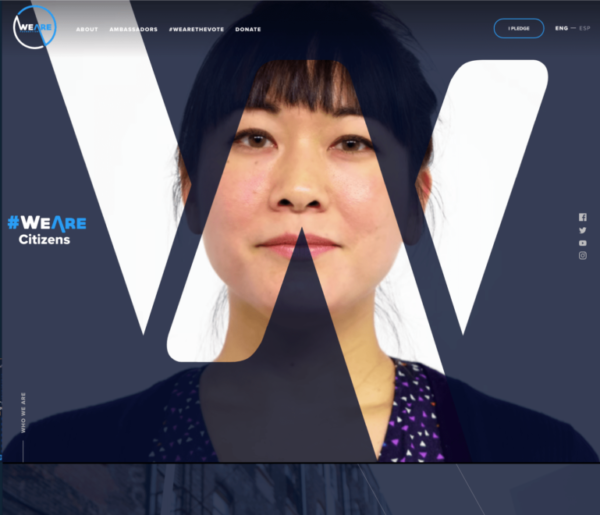
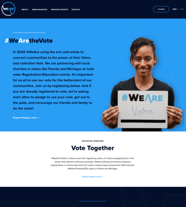
Branding • Art Direction • Messaging • Web Design
Working with an organization created by seasoned performers like WeAre, we knew we had to dream up a website that stole the show.
Explore case study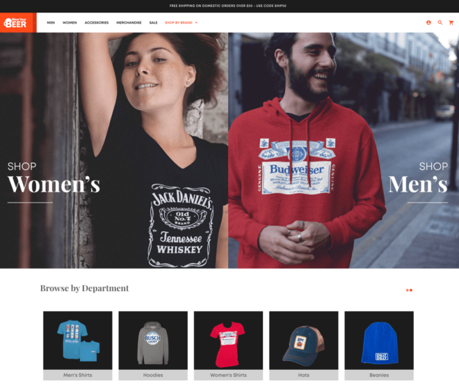
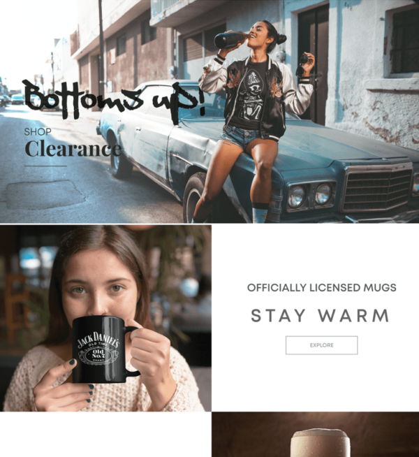
Branding • Web Design • E-Commerce • Software Development
Branding-wise, WYB needed a major refresh, which meant elevating its online presence to the level of other industry leaders.
Explore case study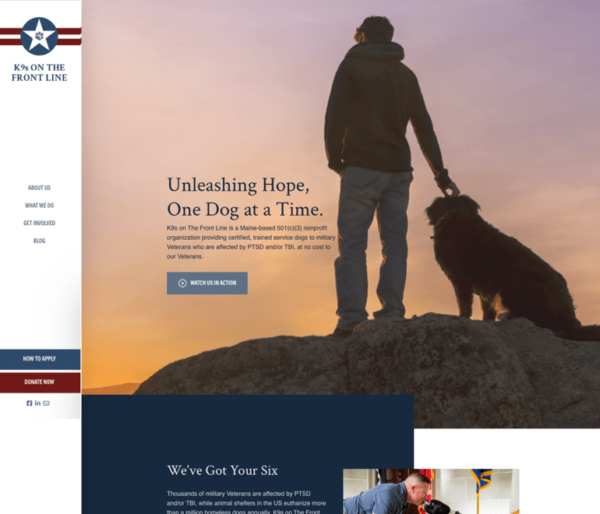
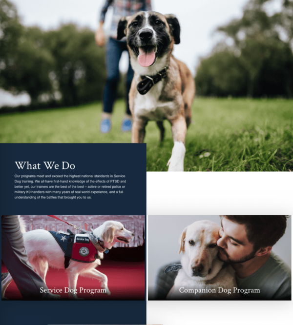
Web Design • Copywriting • Fundraising
K9s on The Front Line is an organization that serves both Veterans and dogs by using their resources and expertise to pair people struggling with PTSD with shelter dogs who need a home. They wanted to increase their fundraising and corporate sponsorships in order to expand their reach.
Explore case study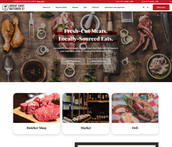
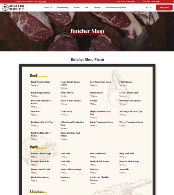
Web Design • Copywriting • E-Commerce
Like a lot of small businesses in the year 2020, Great East Butcher Company needed a more robust online presence and better functionality when it came to online ordering and curbside pickup.
Explore case study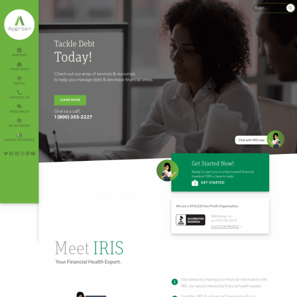
Web Design • Copywriting • Software Development • Branding
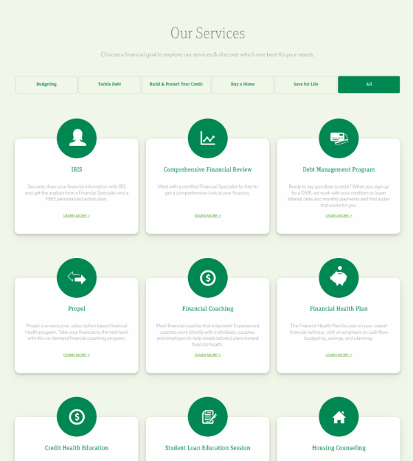
Apprisen is a nonprofit that helps people tackle their debt and forge a path to financial freedom. In order to make their services more accessible, they needed a new, modern website and web application.
Explore case study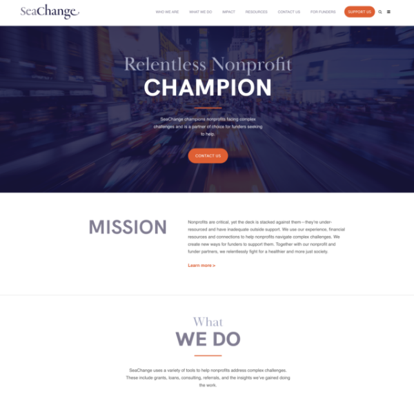
Web Design
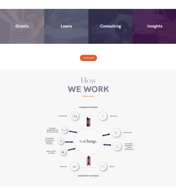
Finances are hard for anyone to navigate, let alone a boot-strapped nonprofit. SeaChange wanted their new website to be as accessible and inviting as possible, providing clear solutions and calls-to-action that wouldn’t intimidate prospective clients.
Explore case studyvoice of your brand.